Results matching “R”

Data and Web 2.0: "many eyes" from IBM

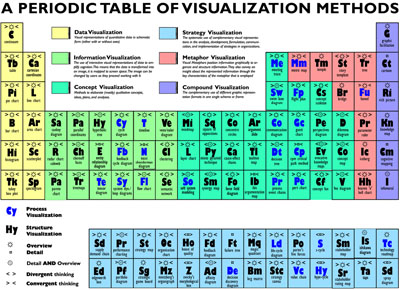
Jeff Heer reports that IBM has released their Many Eyes platform for browser-based data analysis. I have already written about Swivel, and there is another similar system called Data 360. However, the Many Eyes seems to be the most impressive of all, with very clean visualizations and numerous types of graphs, including, for example, social networks and maps.


manyeyes.png

Indecision and agency

I recently read Indecision by Benjamin Kunkel. It was hilarious--I can't wait to read more by him. Beyond this, I noticed two thing about the book that I didn't see mentioned in any reviews:

1. The book reminded me a lot of the work of Philip K. Dick, in particular that all the characters had agency. That is, each character had his or her own ideas and seemed to act on his or her own ideas, rather than merely carrying the plot along or providing scenery. Not to many books (or dramatic productions) have this feature. The funny comments by the various characters (while just "being themselves") contributed a lot to the book's humor.

2. Much was made of the main character's indecision, and how he finally becomes more decisive. But, reading between the lines, it's clear that indecision has been good to Dwight. He likes to be with women but is never quite sure he wants to be with whoever he's with, and (in the context of the book, at least) this just draws them in. It's the indecision--the not needing it--that makes him so appealing to these women. But then, at the end, when he decides he really does want to be with a particular person, she tells him no. At least in this aspect of Dwight's life, indecision worked better than the alternative.

The Machine Learning Department

Radev pointed me to this discussion by John Langford of Carnegie-Mellon's new Machine Learning department. I don't have much to add to the links and comments posted there, but I'm generally supportive of new academic departments, or else of letting existing departments become more flexible about requirements. I think Columbia's Statistics Department would improve by splitting into two separate departments:
- Applied Statistics
- Probability and Theoretical Statistics
or else becoming a single department of Statistics and Probability with formal tracks for students and faculty in the different subfields. As it is, the statisticians end up suffering through measure theory and the probabilists spend a lot of time teaching intro statistics to unhappy undergrads. I don't think there's anything wrong with statisticians learning measure theory, but in practice it takes valuable time and effort that they could instead be using to learn computer science, or economics, or some other sister discipline. (I agree, perhaps, with John's statement of "‘rogramming as the missing member of reading, ‘riting, and ‘rithmetic.")

Anyway, having a Machine Learning department sounds like a good idea if it means that the students and faculty there can have a bit more flexibility in what they can do. I also think of statistics as a branch of engineering but it's not usually in engineering schools. (Columbia has an operations research department in the engineering school but they also do a lot of theoretical probability; some sort of rejiggering seems possible to me, just as they moved Dallas out of the NFC East (I assume they've done that by now???) etc.)

Slightly related is the fact that it can be difficult to persuade statistics Ph.D. students to take courses in experimental design and sample surveys, even though these are huge application areas. And then there's this. My experience at Berkely taught me to be an intellectual pluralist.

Bayesian model selection

A researcher writes,

I have made use of the material in Ch. 6 of your Bayesian Data Analysis book to help select among candidate models for inference in risk analysis. In doing so, I have received some criticism from an anonymous reviewer that I don't quite understand, and was wondering if you have perhaps run into this criticism. Here's the setting. I have observable events occurring in time, and I need to choose between a homogeneous Poisson process, and a nonhomogeneous Poisson process, in which the rate is a function of time ( e.g., lognlinear model for the rate, which I'll call lambda).

I could use DIC to select between a model with constant lambda and one where the log of lambda is a linear function of time. However, I decided to try to come up with an approach that would appeal to my frequentist friends, who are more familiar with a chi-square test against the null hypothesis of constant lambda. So, following your approach in Ch. 6, I had WinBUGS compute two posterior distributions. The first, which I call the observed chi-square, subtracts the posterior mean (mu[i] = lambda[i]*t[i]) from each observed value, square this, and divides by the mean. I then add all of these values up, getting a distribution for the total. I then do the same thing, but with draws from the posterior predictive distribution of X. I call this the replicated chi-square statistic.

If my putative model has good predictive validity, it seems that the observed and replicated distributions should have substantial overlap. I called this overlap (calculated with the step funtion in WinBUGS) a "Bayesian p-value." The model with the larger p-value is a better fit, just like my frequentist friends are used to.

Now to the criticism. An anonymous reviewer suggests this approach is weakened by "using the observed data twice." Well, yes, I do use the observed data to estimate the posterior distribution of mu, and then I use it again to calculate a statistic. However, I don't see how this is a problem, in the sense that empirical Bayes is problematic to some because it uses the data first to estimate a prior distribution, then again to update that prior. I am also not interested in "degrees of freedom" in the usual sense associated with MLEs either.

I am tempted to just write this off as a confused reviewer, but I am not an expert in this area, so I thought I would see if I am missing something. I appreciate any light you can shed on this problem.

My thoughts:

I came across this video on making a taser from a disposible camera (following the link from Digg, from Buzzfeed, from Stay Free. I haven't tried it out yet, but it reminded me of a story that I'll tell sometime about my friend and diet author Seth.

Jeff Lax pointed me to this online article by Jeanna Bryner:

Higher education tied to memory problems later, surprising study finds

Going to college is a no-brainer for those who can afford it, but higher education actually tends to speed up mental decline when it comes to fumbling for words later in life.

Participants in a new study, all more than 70 years old, were tested up to four times between 1993 and 2000 on their ability to recall 10 common words read aloud to them. Those with more education were found to have a steeper decline over the years in their ability to remember the list, according to a new study detailed in the current issue of the journal Research on Aging. . . .

As Jeff pointed out, they only consider the slope and not the intercept. Pehaps the college graduates knew more words at the start of the study?

Here's a link to the study by Dawn Alley, Kristen Southers, and Eileen Crimmins. Looking at the article, we see "an older adult with 16 years of schooling or a college education scored about 0.4 to 0.8 points higher at baseline than a respondent with only 12 years of education." Based on Figures 1 and 2 of the paper, it looks like higher-educated people know more words at all ages, hence the title of the news article seems misleading.

The figures represent summaries of the fitted models. I'd like to see graphs of the raw data (for individual subjects in the study and for averages). It's actually pretty shocking to me that in a longitudinal analysis, such graphs are not shown.

Hans Rosling again

Cengiz Belentepe writes,

I’m trying to find a very interesting interactive presentation on demographics and sociology that I believe you posted a link to on your blog last year. I believe the professor who did the research was Scandinavian and also designed some special software to display the results but I’m not 100% sure. I know this description isn’t much to go on but if you do recall the presentation, I’d love to know the professor’s name and have a link to his presentation.

He's Hans Rosling, the software is Gapminder, and the link is here.

Unethical ethicists

Suresh sent along this item from Eric Schwitzgebel:

Ethics books are more likely to be stolen than non-ethics books in philosophy (looking at a large sample of recent ethics and non-ethics books from leading academic libraries). Missing books as a percentage of those off shelf were 8.7% for ethics, 6.9% for non-ethics, for an odds ratio of 1.25 to 1. [followed by analyses of various subsets of the data that confirm this result]

I'd like to see some data on how often these books are checked out before being stolen (or lost), but setting such statistical questions aside, I have to say that I've always been suspicious about ethics classes, in that I think it's natural for them to focus on the tough cases (true ethical dilemmas) rather than on the easier calls which people nonetheless get wrong. I'm not speaking with any expertise here, but my impression is that the most common ethical errors are clear-cut, where people do something they know (or should know) is unethical, but they think they won't get caught.

P.S. Here are my some of my more considered thoughts on ethics and statistics. (Also see Section 10.5 of my book with Deb.)

Andrew Oswald (see here and here) sends in this paper. Here's the abstract:

It has been known for centuries that the rich and famous have longer lives than the poor and ordinary. Causality, however, remains trenchantly debated. The ideal experiment would be one in which status and money could somehow be dropped upon a sub-sample of individuals while those in a control group received neither. This paper attempts to formulate a test in that spirit. It collects 19th-century birth data on science Nobel Prize winners and nominees. Using a variety of corrections for potential biases, the paper concludes that winning the Nobel Prize, rather than merely being nominated, is associated with between 1 and 2 years of extra longevity. Greater wealth, as measured by the real value of the Prize, does not seem to affect lifespan.

The natural worry here is a selection bias, in which people who die at age X are less likely to receive the prize (for example, if you die at age 60, but you would have received the prize had you lived past age 62). The authors address this using a survival-analysis approach to condition on the age at which the relevant scientists are nominated for or receive the prize.

Two years is a large effect, but at the same time I could imagine this difference occurring from some sort of statistical artifact, so I would't call such a study conclusive, but it adds to the literature on status, health, and longevity.

Explanation of the above title to this blog entry

Thinking more about the particular case of Nobel Prizes, I've long thought that the pain of not receiving the prize is far greater, on average, than the joy of receiving it. Feeling like you deserve the prize, then not getting it year after year . . . that can be frustrating, I'd think. Sort of like waiting for that promotion that never comes. Getting it, on the other hand, I'm sure is nice, but so many more eligible people don't get it than do (and the No comes year after year). I'd guess that it's a net reducer of scientists' lifespans.

Diversity in learning

Once I figure out how to do it, I'll be reorganizing the list of links and adding Seth's blog, but, in the meantime, here's a fascinating article on diversity in learning, where Seth describes a class assignment where he let students do whatever they wanted:

I [Seth] taught a class called Psychology and the Real World where the off-campus work essentially was the course. Students could do any off-campus work related to psychology – at least 60 hours of it during the 15-week semester. In addition, we met weekly for discussions and the students wrote three short papers. Eight students signed up. Their off-campus work was learning how to be a mediator, developing a television show about happiness, working at a shelter for battered women, working at a nursing home, talking with patients in a mental hospital for the criminally insane, taking care of two-year-old twins, tutoring high-school students, and making bereavement support calls. It was time well-spent.

I had a few thoughts:

1. This sounded a lot better than the class on left-handedness that Seth and I taught 12 years ago. The students liked the class OK but they certainly didn't do anything substantial on their own. But, even then, I recall Seth telling me that he thought a big problem with college courses, as they were usually configured, is that they have the goal of making the student as much like the instructor (or the textbook) as possible. It's a rare class where students' differing experiences and talents are appreciated. (One rare positive example among my own classes is my seminar with Shigeo, where it really works well that different students have different knowledge bases about political science. But in other classes it's been hard to make use of students' diversity.)

2. It's funny that only 8 students signed up, out of the 20,000 undergraduates at UC Berkeley. Setting aside selection issues, it sounds like at least a few more students would've benefited. But I have to say that it's hard to get good attendance in a non-required course. I recall that Mike Jordan said that he gets an enrollment of 125 in his Bayesian statistics course at Berkeley, which seems pretty impressive--I certainly don't get 125 in my classes here--but maybe it's required.

3. I somehow expect that this course wouldn't work so well if I \--or almost anyone else--were teaching it. Part of this is that Seth knows a lot about psychology, but it's also something about working with students. When I've tried to have students do open-ended projects, they've almost always done something pretty uninteresting (see Section 11.4.3 in Teaching Statistics: A Bag of Tricks for more on this). I remember discussing this with Seth several years ago. The conversation went something like this:

Me: Students generally pick uninteresting topics, skimp on the real work of data collection, and avoid any kind of random sampling or even systematic design, so I'm thinking I have to give them more structure, a better list of project topics, maybe assign them to projects.

Seth: Try giving them less structure and see what they come up with.

It seems that Seth's suggestion has worked--for him. I'll give it a try. But I still think I'll have to check their ideas and rule out the worst, such as comparisons of GPA's of athletes and nonatheletes, surveys of students about hours studying and drinking, etc etc. Actually, I really don't know what I should do about this.

4. Seth's article also has a bunch of hypotheses about evolution of various social behaviors. I neither believe nor disbelieve these things--I just don't know how to evaluate such things--but I think of them in a utilitarian sense as useful in helping Seth formulate hypotheses for his self-experimentation. Also, I like the Jane Jacobs references because I am also a big fan of her work (although maybe not all of it).

Futurist George Dvorsky included Bayesianism into the list of Must-know terms for the 21st Century intellectual:

Bayesian Rationality: Bayesian rationality is a probabilistic approach to reasoning. Bayesian rationalists describe probability as the degree to which a person should believe a proposition. They also apply Bayes' theorem when inferring or updating their degree of belief when given new information. Some scientists and epistemologists hope to replace the Popperian view of proof with a Bayesian view.

I agree (of course). Popperian falsification is just a special case of the Bayesian view: if the likelihood P(data|model) is zero (indicating that the data is impossible given the model), P(model|data) is zero, regardless of the prior. But the Bayesian approach offers some sort of a weighted preference among all the models that haven't been refuted yet, balancing the Ockhamist preference for simplicity through the prior and the desire for accuracy through the likelihood.

Distribution of statisticial techniques

After several years I have looked at Brad Efron's R. A. Fisher in the 21st century. He provides an interesting chart of statistical techniques:


efron%20statistics%20space.png

Another interesting chart is the following description of the different ideals that each school in statistics is pursuing:


efron%20ideals.png

Many readers might already be familiar with the frequentist and the Bayesian ideologies, but the fiducial approach is often a bit of a mystery. I like to explain as an analytic version of parametric bootstrap: assume that θ is the ML parameter estimate; now draw samples of the same size from θ, and do a ML estimate on each of them. This way you will obtain a distribution of θ-reestimates with a very similar function as the posterior distribution of θ had one adopted the Bayesian approach. I dislike the fact that we 'guess' the ML estimate of θ in the first place, however, and then proceed by assuming that it is true.

Jean-Luc pointed me to Anomaly Hunt; or, How To Write a Research Paper. This brings me to the vague topic of what is interesting. They say that you haven't understood a concept until you have been able to explain it to something as dumb as a computer. For that reason, a lot of my past research has dealt with how to take a philosophical concept, such as "interaction", and convert it into a mathematical device. It turned out that the interestingness of an interaction is captured by measuring the additional information we gain allowing two variables to jointly affect the outcome.

The most interesting scientific articles are those that update our internal models of the world the most. An average case does not affect the model much, but an outlier or an extreme event will affect it more: because it updates the our intuitive distribution more than would an average case.

Statistical models and spam

In the old days, internet technologies were developed for ethical well-behaved people. But when the hordes were unleashed on the internet, the old technologies could not cope with the bad behavior, but it has been very hard to change the underlying fabric of internet standards and protocols. Spam in particular is one of the most annoying problems. Spam filtering is an automated classification of messages (e-mails, but also blog comments, blog trackbacks, instant messages and so on) into the good (ham) and into the bad (spam).

The so-called Bayesian filtering has been popularized by Paul Graham in his essays A Plan for Spam and Better Bayesian Filtering a few years ago, but goes back to a Microsoft Research who first worked on detecting insults in 1997 and then junk in 1998. The traditional way of dealing with spam has been to identify individual words that seem to be overrepresented in spam (Viagra, free, money, casino, games). The appearance of each such word increases the log-odds that the email is spam. On the other hand, the appearance of words related to one's interests and work increases the log-odds that the email is spam. When we sum up all these log-odds, we obtain a score, which is used to classify the email. This approach is known as the naive Bayesian classification. Of course, "Bayesian" here is as in Bayes rule, not as in Bayesian statistics. Although models such as logistic regression and support vector machines would yield better accuracy for spam filtering, practitioners tell me that naive Bayes is still heavily used in practice because it scales to the huge collections of data: given a list of spam emails and a list of non-spam emails, we can figure out how much log-odds to add or subtract for each word (or some other aspect of the message, such a the number of all-uppercase words, or the maximum length of a sequence of exclamation marks).

My pet peeve with spam filtering is that it doesn't root the problem out. It merely provides an efficient broom to sweep it under the rug. The innocent users are paying for filtering and wasted internet bandwidth, have to keep separating emails into spam and ham, risk the loss of important emails due to spam filters, whereas the spammers incur practically no penalties, only profits. Furthermore, the adaptive aspect of filtering has been used in the adversarial strategy of Bayesian poisoning, where messages that will be classified as spam are made up of purely legitimate words, and where legitimate words are injected into the spam messages. Moreover, spammy messages are now stored in images, which cannot be easily filtered automatically. For these reasons, the effectiveness of spam filters has gone down over the past year or two. Until we get internet postage stamps, internet taxes and internet police, I would prefer vigilante approaches such as the notorious Make Love not Spam. But pessimists like to use the following cannot-solve-spam form.

It is still refreshing to observe new developments. I have come across a paper on the next generation of spam filtering techniques Spam Filtering Using Statistical Data Compression Models by some of my former colleagues. Andrej Bratko et al. have found that models based on individual letters outperform the models based on the word counts. For example, their method can employ the indentation pattern "> " which is far more frequent in legitimate emails than in spam. With sufficient training, they would also be able to detect misspellings and foreign languages. Although not rooting the problem out, they can still buy some time.

A taxonomy of visualizations

The Visual Literacy project has a wonderful taxonomy of visualizations formatted as a periodic table:

periodictablevisualization2.jpg

Each type of visualization is described in terms of four multi-level attributes:


  • high/low complexity of the visualization ("mass") [updated 1/11/07]

  • data/information/concept/strategy/metaphor/compound visualization

  • process/structure visualization

  • overview/detail/both

  • divergent(exploratory) / convergent(summary) thinking


While I find the examples of data visualization quite limited, it is interesting to see how much wider the scope of visualization is.

They also have a taxonomy/directory of visualization scholars.

I've had problems viewing it in Firefox (the pop-ups are empty), but it works fine in IE. I found this on Information Aesthetics.

Janet Rosenbaum writes:

New York City has recently required restaurants with uniform menus to post calorie content on their menus with a font size equal to the prices. This initiative may not decrease obesity, but if we're able to gather good data, posting calories on menus could help us better understand how people choose food.

Currently, we don't have a good understanding of how people choose what they eat. Observations of people's food choices through nutritional surveys and food diaries tell us only what people will admit to eating. Laboratory experiments tell us how people who volunteer for psychology experiments choose foods in a new environment, but may not generalize to larger populations in real life situations. Non-laboratory experiments with vending machines have found that people will buy more healthy foods when healthy food is "subsidized" and when less healthy food is "taxed", but nutritional information is not immediately available to subjects even in these experiments: the foods which were manipulated were pretty obvious candidates for healthy and unhealthy foods such as carrot sticks and potato chips.

We also don't know how much knowledge about food people have: when someone chooses a high calorie food, we don't know whether they have chosen that food in ignorance of its calorie content or despite its calorie content. Putting calories on the menu in a visible way gives consumers information which is more readily available than on food packages, and reduces the second problem: some people will read the calorie content of their food when making their choices, and the calorie content may influence their choices.

If calorie information becomes widespread, we could even begin to discuss an elasticity of demand according to both the price and calorie content of the food, as well as a willingness to pay for fewer calories. Just thinking about the McDonald's menu, people can minimize the number of calories they eat by choosing either the least expensive (basic hamburger + fries) or the most expensive items on the menu (salads, grilled chicken).

Some have speculated that posting calorie information on the menus won't affect behavior at all because people choosing to eat at places with unhealthy food can't expect lower calories, but that seems naive. After all, even people shopping at expensive stores are somewhat price sensitive, and all retailers go to lengths to make people feel as though they are getting a bargain.

The inclusion of calorie information on menus gives a tremendous opportunity for social scientists, if only we can get sales data suitable for a quasi-experiment (pre-post with control). Any ideas?

My first thought here is that I imagine that people who eat salad and grilled chicken at McDonalds are only at Mickey's in the first place because someone else in their party wants a burger and fries. There's got to be some information on this sort of thing from marketing surveys (although these might not be easily accessible to researchers outside the industry).

My other thought is that it would be great if the food industry and public health establishment could work together on this (see note 4 here).

Measuring model fit

Ahmed Shihab writes,

I have a quick question on clustering validation.

I am interested in the problem of measuring how well a given data set fits a proposed GMM [Gaussian mixture model]. As opposed to the notion of comparing models, this "validation" idea asserts that a GMM already represents a specific mixture of distributions, it already represents an absolute, so we can find out directly if the data fits that representation or not.

In fuzzy clustering, such validity measures abound. But it struck me that in the probabilistic world of GMMs our only measure is the actual sum of probabilities given by the GMM. The closer it is to one, the better. However, if the sum is say 0.69 it can be misleading; when the clusters do not match in populations the bigger cluster, even though it fits badly, adds substantially to the overall probability score and so the overall impression is that there is a good fit.

My reponse: I don't have much experience with these models, but I recommend simulating replicated datasets from the fitted model and comparing them (visually, and using numerical summaries) to the observed data, as discussed in Chapter 6 of Bayesian Data Analysis.

My other comment is that clusters typically represent chioces rather than underlying truth. For an extreme example, consider a simulation of 10,000 points from a unit bivariate normal distribution. This can certainly be considered as a single cluster, but it can also be divided into 50 or 100 or 200 little clusters (e.g., via k-means or any other clustering algorithm). Depending on the purpose, any of these choices can be useful. But if you have a generative model, then you can check it by comparing replications to the data.

Income, religious attendance, and voting

We've been extending our work on income and voting to include religion as well. For example:

superplot.png

MS, OH, and CT represent poor, middle-income, and rich states, respectively, and the red, blue, and gray lines on each plot represent frequent church attenders, occasional church attenders, and nonattenders.

Rch people vote more Republican and church attenders vote more Republican, but in addition, the difference between church attenders and nonattenders is greatest among rich people in poor states (as in the Mississippi graph above).

To get more understanding of the patterns of income and religion by state, here's state average religious attendance vs. state average income, with the colors indicating states that went for Bush or Gore in 2000:

st.rel.inc.png

There's a negative correlation, but also regional patterns, with the western states (except for Utah), some northeastern states, and some others below the main line.

And here are the within-state correlations between income and religious attendance (again plotted vs. state average income):

corr.st.rel.inc.png

Religious attendance is positively correlated with income in Mississippi (for example) but negatively correlated in Connecticut. Thus, the zero correlation between income and Republican voting in Connecticut ("What's the matter with Connecticut") is partly explained by the fact that poor people in Connecticut are more religious than rich people in Connecticut. (But this doesn't tell the whole story, as we can see from the graphs at the top of this entry.)

Anyway, we're thinking more about this--other factors to consider are religious denomination, urban/suburban/rural, and ethnicity. Our original goal was to understand the pattern that richer voters go Republican, but richer states support the Democrats, but now there are many more patterns to figure out.

By the way, if you're planning to use our new book in a class this winter/spring, you should email me directly so I can make sure your students get copies of the book.

cover.gif

Our book is finally out! (Here's the Amazon link) I don't have much to say about the book here beyond what's on its webpage, which has some nice blurbs as well as links to the contents, index, teaching tips, data for the examples, errata, and software.

But I wanted to say a little about how the book came to be.

I don't want to hear about it

The 1/4-power transformation

I like taking logs, but sometimes you can't, because the data have zeroes. So sometimes I'll take the square root (as, for example for the graphs on the cover of our book). But often the square root doesn't seem to go far enough. Also it lacks the direct interpretation of the log. Peter Hoff told me that Besag prefers the 1/4-power. This seems like it might make sense in practice, although I don't really have a good way of thinking about it--except maybe to think that if the dynamic range of the data isn't too large, it's pretty much like taking the log. But then why not the 1/8 power? Maybe then you get weird effects near zero? I haven't ever really seen a convincing treatment of this problem, but I suspect there's some clever argument that would yield some insight.

Here's my first try: a set of plots of various powers (1/8, 1/4, 1/2, and 1, i.e., eighth-root, fourth-root, square-root, and linear), each plotted along with the logarithm, from 0 to 50:

4powers.png

OK, here's the point. Suppose you have data that mostly fall in the range [10, 50]. then the 1/4 power (or the 1/8 power) is a close fit to the log, which means that the coefficients in a linear model on the 1/4 power or the 1/8 power can be interpreted as muliplicative effects.

On this scale, the difference between either of these powers and the log occurs at the low end of the scale. As x goes to 0, the log actually goes to negative infinity, and the powers go to zero. The big difference betwen the 1/8 power and the 1/4 power is that the x-points near 0 are mapped much further away from the rest for the 1/4 power than for the 1/8 power.

An argument in favor of the 1/4-power transformation thus goes as follows:

First, the 1/4 power maps closely to the log over a reasonably large range of data (a factor of 5, for example from 10 to 50). Thus, an additive model on the 1/4-power scale approximately corresponds to a multiplicative model, which is typically what we want. (In contrast, the square-root does not map so well, and so a model on that scale is tougher to interpret.)

Second, on the 1/4-power scale, the x-points near zero map reasonably close to the main body of points. So we're not too worried about these values being unduly influential in our analysis. (In contrast, the 1/8-power takes x=0 and puts it so far away from the other data that I could imagine it messing up the model.)

Could this argument be made more formally? I've never actually used the 1/4 power, but I'm wondering if maybe it really is a good idea.

P.S. Just to clear up a few things: the purpose of a transformation, as I see it, is to get a better fit and better interpretability for an additive model. Students often are taught that transformations are about normality, or about equal variance, but these are chump change compared to additivity and interpretability.

2006 retrospective

Checking on progress:

1. I finished a few.

2. I was not particularly successful here. Easier said than done, I suppose.

3. I'd give myself a solid B on this one.

4. The guys at the bike shop did this one. Also fixed my front brake, which apparently was hanging on by literally one strand of cable.

5. Yep.

6. No comment.

7. Nope. But did get a paper accepted on my struggles in this area.

8. Not yet. This one's a push to 2007.

9. Don't recall.

10. Nope. But I didn't get any further behind, either. Gotta work harder recording the amusing incidents.

11. Didn't do so well on this one (even though, by the look of it, it seems like the easiest of resolutions).

12. Enough unfinished business here that I don't think I need anything new for 2007. Well, ok, here's one: I'd like to go to the movies at least once.

Some fun number crunching of words

from Mark Liberman here.

I ran across this interesting interview with Mark "Smiley" Glickman. He discusses the Glicko and Glicko-2 rating systems which are based on dynamic Bayesian models. From a statistical perspective, some of the most interesting discussion comes near the middle of the interview where he discusses the chess federation's ongoing project to monitor average ratings, and the challenge of comparing ratings of people in different years. The bit at the very end is also interesting--it reminds me of the claim I once heard that a chess player, if given the option of being a better player or having a higher rating, would choose the higher rating. One of the difficulties of numerical ratings or rankings is that people can take them too seriously, and Glickman discusses this.

High-dimensional data analysis

I came across this talk by David Donoho (see also here for more detail) from 2000. I was disappointed to see that he scooped me on the phrase "blessing of dimensionality" but I guess this is not such an obscure idea.

More interesting are the different perspectives that one can have on high-dimensional data analysis. Donoho's presentation (which certainly is still relevant six years later) focuses on computational approaches to data analysis and says very little about models. Bayesian methods are not mentioned at all (the closest is slide #44, on Hidden Components, but no model is specified for the components themselves). It's good that there are statisticians working on different problems using such different methods.

Donoho also discusses Tukey's ideas of exploratory data analysis and discusses why Tukey's approach of separation from mathematics no longer makes sense. I agree with Donoho on this, although perhaps from a different statistical perspective: my take on exploratory data analysis is that (a) it can much more powerful when used in conjunction with models, and (b) as we fit increasingly complicated models, it will become more and more helpful to use graphical tools (of the sort associated with "exploratory data analysis") to check these models. As a latter-day Tukey might say, "with great power comes great responsibility." See this paper and this paper for more on this.

I was also trying to understand the claim on page 14 on Donoho's presentation that the fundamental roadblocks of data analysis are "only mathematical." From my own experiences and struggles (for example, here), I'd interpret this from a Bayesian perspective as a statement that the fundamental challenge is coming up with reasonable classes of models for large problems and large datasets--models that are structured enough to capture important features of the data but not so constrained as to restrict the range of reasonable inferences. (For a non-Bayesian perspective, just replace the word "model" with "method" in the previous sentence.)

Diana S. Grigsby-Toussaint writes,

I recently came across your "Statistical Modeling, Causal Inference, and Social Science" website in my attempt to determine the best analysis for my research. As there were some inquiries about whether GEE is a better approach than multilevel modeling, I was hoping you could help with my dilemma.

I am interested in neighborhood (defined as census tract) influences on childhood diabetes risk in the city of Chicago. Although I have a little over 1200 cases, ~40% of my tracts have only 1 case, and the average number of cases per tract is 5. GEE has been suggested as the better approach to HLM, but I am not getting much support for this option....any suggestions for the best approach or articles that might provide some insight?

My quick response: see here.

My longer response:

Bruce McCullough writes,

The probability of getting brain cancer is determined by the number of younger siblings. So claim some scientists, according to an article published in the current issue of The Economist.

I have ordered your book so that I can read more about controlling for intermediate outcomes, but I am not yet confident enough to tackle it myself. Perhaps you might blog this?

I'll give my thoughts, but first here's the scientific paper (by Altieri et al. in the journal Neurology), and here are the key parts of the news article that Bruce forwarded:

Distributions of rankings

A few postings ago, Andrew wondered about the shape of the long tail. OneEyedMan's comment reminded us that the extensive NetFlixPrize dataset contains information about almost half a million users' ratings on almost 20000 movies. It's an excellent playground, although I was told that the data was corrupted.

So, I was happy to notice Ilya Grigorik's analysis of the distributions of the dataset. In particular, the average user seems to be centered at 3.8 (on a scale from 1-5), indicating that people do try to watch movies they like. But the uneven distribution of score variance across users indicates that one could model the type of user, perhaps with a mixture model:

I must also note that NetFlix users have an incentive to score movies even with lukewarm scores, which moderates the above distribution. On most internet sites that allow users to rank content, the extreme scores (1 or 5) are overrepresented: some people make the effort to write a review only when they are very unhappy and want to punish someone, or when they are very happy and want to reward or recommend the work to others.

Another interesting source of rating distributions is the Interactive Fiction Competition results page: it has numerous histograms of scores for individual IF works.

Just in time for the holidays

Aleks forwarded this along:

atomic-energy-lab-01.jpg

The entries themselves were pretty funny, but I also liked the comment on the atomic energy kit entry by the guy with "a comfortable six-figure salary." Maybe if he'd had a little less radiation exposure as a child, he'd have a comfortable seven-figure salary by now . . .

Playing around a bit with the income-voting data (see here for a couple pictures and links to our paper, or here for an example of journalistic confusion, or here for lots more), we made the following maps, which show our estimates of what would have happened in the 2000 election if they had only counted the votes of people in different income categories:

rb by income.png

I came across this article by the late Leo Breiman from 1997, "No Bayesians in foxholes." It's fun sometimes to go back and see what people were saying nearly a decade ago. This one is particularly interesting because it presents a strongly anti-Bayesian position which used to be common in statistics (see, for example, various JRSS-B discussions during the 70s and 80s) but you don't really hear about anymore. Breiman wote:

The Current Index of Statistics lists all statistics articles published since 1960 by author, title, and key words. The CIS includes articles from a multitude of journals in various fields—medical statistics, reliability, environmental, econometrics, and business management, as well as all of the statistics journals. Searching under anything that contained the word “data” in 1995–1996 produced almost 700 listings. Only eight of these mentioned Bayes or Bayesian, either in the title or key words. Of these eight, only three appeared to apply a Bayesian analysis to data sets, and in these, there were only two or three parameters to be estimated.

Actually, our toxicology paper appeared in the Journal of the American Statistical Association in 1996--how could Breiman have missed that one (our model had 90 parameters, and the paper had a detailed discussion of why the prior distribution was needed in order to get reasonable results)? Was he restricting himself to papers with "data" in their keywords? Putting "data" as a keyword in an applied statistics paper is something like putting "physics" as a keyword in a physics paper!

OK, OK . . .

The case for objective Bayesian analysis

I read this article by Jim Berger. I agree with much of it, except that I think he unnecessarily privileges certain improper prior distributions. More and more, I'm thinking it makes sense to have noninformative (or weakly-informative) prior distributions that are proper but vague (see here, for example). In addition, I think Berger's approach would be improved by model checking. Objective Bayesian analysis can be so much more effective when its worst excesses are curbed via model checking. See this paper from the International Statistical Review for some theory and Chapter 6 of our Bayesian book for some examples.

Bill Harris has a fun little calculation of a conditional probability using three different data sources. Could be a good example for teaching intro probability or basic Bayesian inference.

Here's the abstract for a talk by Dr. Albert Tarantola, Institut de Physique du Globe de Paris:

While the conventional way for making inferences from observations goes through the use of conditional probabilities (via de Bayes identity), there is an alternative. It consists in introducing some new definitions in Probability Theory (image and reciprocal image of a probability, intersection of two probabilities), that are accompanied by a compatibility property. The resulting theory is simple, accepts a clear Bayesian interpretation, and naturally incorporates the Popperian notion of falsification (for us, falsification of models, not of theories). The applications of the theory in the domain of inverse problems shall be discussed.

Unfortunately I can't make the talk. I can't figure out what he's saying in the abstract, but the topic interests me. If anybody knows more about this, please let me know.

P.S. Brian Borchers writes,

Tarantola has been writing about Bayesian approaches to geophysical inverse problems for some time. He has recently (2005) published a book on inverse problem theory (Inverse Problem Theory and Methods for Model Parameter Estimation, SIAM 2005) that you might find interesting.

The "image of a probability" doesn't appear in the SIAM book, but it is the topic of Tarantola's new book, "Mapping of Probabilities". You can download a draft (or at least the first two chapters) from his web site at http://www.ipgp.jussieu.fr/~tarantola/

Jimmy's weight over time

What do I like best about this graph?

jimmy.jpg

Keith pointed me to these pictures on Curtis McMullen's webpage. My favorite is this one (which I previously saw on Yuval's door at Berkeley):

biketracks.gif

(Although I can't figure out why it's classified under Topology.)

There's lots of other cool stuff there, including this cascade of bifurcations:

Stephen Jessee sent me this paper (joint work with Doug Rivers) on party identification and voting. He writes,

I [Jessee] show that most people do in fact have some level of policy ideology that has an important effect on their voting behavior. The influence of party identification, however, is also quite strong. Judging from the baseline of Downsian policy voting, I show that independents, even those with lower levels of political sophistication, perform quite well on average, and engage in essentially unbiased spatial policy voting. Partisans of similar levels of sophistication, by contrast, are systematically pushed away from more rational decision rules and seem to be making biased choices in translating their policy preferences into vote choices. On the whole, it seems clear that party identification operates more as a systematic bias than a profitable heuristic.

Continuing, Jessee writes,

Interpreting p-values

Dan Goldstein made this amusing graph:

pval.gif

in discussing this paper.

Columbia Science Fellows

Chris Wiggins pointed me to this interesting-looking book by Sarah Igo:

Americans today "know" that a majority of the population supports the death penalty, that half of all marriages end in divorce, and that four out of five prefer a particular brand of toothpaste. Through statistics like these, we feel that we understand our fellow citizens. But remarkably, such data--now woven into our social fabric--became common currency only in the last century. Sarah Igo tells the story, for the first time, of how opinion polls, man-in-the-street interviews, sex surveys, community studies, and consumer research transformed the United States public.. . . Tracing how ordinary people argued about and adapted to a public awash in aggregate data, she reveals how survey techniques and findings became the vocabulary of mass society--and essential to understanding who we, as modern Americans, think we are.

As a survey researcher, this looks interesting to me. Parochially, I'm reminded of our own observation that in the 1950s it was more rational to answer a Gallup poll than to vote. Nowadays, most of us are participants as well as consumers of surveys.

Sarah Croco writes:

Radford is speaking in the statistics seminar on Monday 11 Dec (noon at 903 Social Work Bldg, for you locals):

Constructing Efficient MCMC Methods Using Temporary Mapping and Caching

I [Radford] describe two general methods for obtaining efficient Markov chain Monte Carlo methods - temporarily mapping to a new space, which may be larger or smaller than the original, and caching the results of previous computations for re-use. These methods can be combined to improve efficiency for problems where probabilities can be quickly recomputed when only a subset of `fast' variables have changed. In combination, these methods also allow one to effectively adapt tuning parameters, such as the stepsize of random-walk Metropolis updates, without actually changing the Markov chain transitions used, thereby avoiding the issue that changing the transitions could undermine convergence to the desired distribution. Temporary mapping and caching can be applied in many other ways as well, offering a wide scope for development of useful new MCMC methods.

This reminds me of a general question I have about simulation algorithms (and also about optimization algorithms): should we try to have a toolkit of different algorithms and methods and put them together in different ways for different problems, or does it make sense to think about a single super-algorithm that does it all?

Usual hedgehog/fox reasoning would lead me to prefer a toolkit to a superalgorithm, but the story is not so simple. For one thing, insight can be gained by working within a larger framework. For example, we used to think of importance sampling, Gibbs, and Metropolis as three different algorithms, but they can all be viewed as special cases of Metropolis (see my 1992 paper, although I guess the physicists had been long aware of this). Anyway, Radford keeps spewing out new algorithms (I mean "spew" in the best sense, of course), and I wonder where he thinks this is all heading.

P.S. The talk was great; slides are here.

Redblue for locals

I'm speaking Monday 11 Dec, 4:30pm at the City University of New York Graduate Center (365 Fifth Avenue at 34th Street). Location is room 9204, on the 9th floor (not the Kimmel Center, room 907, which is what I'd posted earlier). Here's the announcement, here's the paper, here's the graph:

superplot_var_slopes_annen_2000.png

and here's the abstract:

I guess Rich Little wasn't available

This is just pitiful . . . from an ad in the New Yorker:

The New Yorker Humor on the slopes at Beaver Creek Featuring Dennis Miller

Need a lift this winter? Join the laughter in Beaver Creek, Colorado. On the last weekend in February, The New Yorker Promotion Department's Humor on the Slopes event fills the famed destination with three days of highly elevated comedy. Resort to laughter with performances by comedians including Dennis Miller, appearances by New Yorker cartoonists, a comedy-film sneak preview, and much more.

Yeah, yeah, I know, that's how they can afford to pay Ian Frazier and the rest of the gang. But still . . .

On the other hand, Harold Ross was from Aspen so maybe it all makes sense.

P.S. Yes, "Dennis Miller" is in boldface in the original.

P.P.S. Typo fixed.

Jose von Roth writes,

The long tail and the fat head

There's a lot of talk about the long tail--for example, there are a zillion books out there, each selling a few copies a week (hey--those are my books out there in the tail!), and a zillion blogs out there, each getting a few hits a day (hey--that's our blog out there...). We're no longer in the era of mass consumption, etc etc.

I was wondering: who are the consumers of the long-tail items? I'd conjecture that the people who buy books in the long tail are, on average, buyers of many books. Similarly, I'd conjecture that the rarefied few who read our blog read many other blogs as well. In contrast, the average buyer of a bestseller such as The Shangri-La Diet might not be buying so many books, and, similarly, the average reader of BoingBoing might be reading not so many blots.

Or maybe I'm wrong on this, I don't know. I'm picturing a scatterplot, with one dot per book (or blog), on the x-axis showing the number of buyers (or readers), on the y-axis showing the average number of books bought (or blogs read) per week by people who bought thiat book (or read that blog). Or maybe there's a better way of looking at this.

The question is: is the "long tail" being driven by a "fat head" of mega-consumers?

Swivel: Web 2.0 and Data

The latest craze on the internet is the migration of applications from desktop to the Web. The latest is "Swivel": the internet archive for data, something I have written about before. While there is not much to be seen at the site, TechCrunch has some intriguing snapshots:

I guess that one can upload the data, access data that others have posted, and perform some simple types of analysis. It might not sound much, but having a database of data will remove the need for people to provide summaries of it. Anyone interested in the problem can perform the summaries for himself. This will make data analysis much more approachable than before. This can also become competition to existing spreadsheet and statistical software, and a platform for deploying recent research: it is often frustrating for a researcher in statistical methodology how difficult it is to actually enable users to benefit from the most recent advances in the research sphere.

RSS

I am sometimes asked how to get an RSS feed from this blog. I've been told you can do it here.

Sample size and self-efficiency

Xiao-Li Meng is speaking this Friday 2pm in the biostatistics seminar (14th Floor, Room 240, Presbyterian Hospital Bldg, 622 West 168th Street). Here's the abstract:

One of the most frequently asked questions in statistical practice, and indeed in general quantitative investigations, is "What is the size of the data?" A common wisdom underlying this question is that the larger the size, the more trustworthy are the results. Although this common wisdom serves well in many practical situations, sometimes it can be devastatingly deceptive. This talk will report two of such situations: a historical epidemic study (McKendrick, 1926) and the most recent debate over the validity of multiple imputation inference for handling incomplete data (Meng and Romero, 2003). McKendrick's mysterious and ingenious analysis of an epidemic of cholera in an Indian village provides an excellent example of how an apparently large sample study (e.g., n=223), under a naive but common approach, turned out to be a much smaller one (e.g., n<40) because of hidden data contamination. The debate on multiple imputations reveals the importance of the self-efficiency assumption (Meng, 1994) in the context of incomplete-data analysis. This assumption excludes estimation procedures that can produce more efficient results with less data than with more data. Such procedures may sound paradoxical, but they indeed exist even in common practice. For example, the least-squared regression estimator may not be self-efficient when the variances of the observations are not constant. The morale of this talk is that in order for the common wisdom "the larger the better" be trusted, we not only need to assume that data analyst knows what s/he is doing (i.e., an approximately correct analysis), but more importantly that s/he is performing an efficient, or at least self-efficient, analysis.

This reminds me of the blessing of dimensionality, in particular Scott de Marchi's comments and my reply here. I'm also reminded of the time at Berkeley when I was teaching statistical consulting, and someone came in with an example with 21 cases and 16 predictors. The students in the class all thought this was a big joke, but I pointed out that if they had only 1 predictor, it wouldn't seem so bad. And having more information should be better. But, as Xiao-Li points out (and I'm interested to hear more in his talk), it depends what model you're using.

I'm also reminded of some discussions about model choice. When considering the simpler or the more complicated model, I'm with Radford that the complicated model is better. But sometimes, in reality, the simple model actually fits better. Then the problem, I think, is with the prior distribution (or, equivalently, with estimation methods such as least squares that correspond to unrealistic and unbelievable prior distributions that do insufficiant shrinkage).

Gueorgi pointed us to this website on name frequencies. Gueorgi writes,

Given a first and last name, it estimates the number of people in the US with the same name. They take the data from the 1990 Census and make an assumption that the first and last name are uncorrelated. There is a brief section on accuracy here. It might be a bit silly, but at least provides an easy way to look up of Census name frequencies (assuming their scripts work correctly). >From a research perspective, if such a website proves popular, perhaps one could use the same basic idea and produce better estimates by including first x last name correlation, and maybe add the functionality to collect user data like basic demographics, etc. to use with "how many x's you know" surveys.

Wow, the ">From" in his email really takes me back . . .

Anyway, for first names, I prefer the Baby Name Voyager, which has time series data and cool pink-and-blue graphics, but it is convenient to have the last names too. By assuming independence, I think this will overestimate the people named "John Smith" and underestimate the people named "Kevin O'Donnell," (I once looked up John Smith in the white pages and found that, indeed, it's less common than you'd expect from independence. Which makes sense, since if you're named Smith, you'll probably avoid the obvious "John." Unless it's a family name, or unless you have a sense of humor, I suppose.)

But Matt comments:

Also, I think this might be a good tool for teaching undergrads. In my class we just covered the basic rules of probability and I tried to get across the idea of independence of events. A name like Jose Cruz provides a good examples of things that are not independent.

I'm down with that. And it could be a cool class project to do some checking of phone directories. The violation of independence is reminiscent of the dentists named Dennis.

Overdispersed Poisson regression

Manuel Spínola from the Instituto Internacional en Conservación y Manejo de Vida Silvestre at the Universidad Nacional in Heredia, Costa Rica, writes,

Charitable giving and defaults

I was thinking more about a framework for understanding these findings by Arthur Brooks on the rates at which different groups give to charity. Some explanations are "conservatives are nicer than liberals" or "conservatives have more spare cash than liberals" or "conservatives believe in charity as an institution more than liberals." (My favorite quote on this is "I'd give to charity, but they'd spend it all on drugs.")

But . . . although I think there's truth to all of the above explanations, I think some insight can be gained by looking at this another way. Lots of research shows that people are likely to take the default option (see here and here for some thoughts on the topic). The clearest examples are pension plans and organ donations, both of which show lots of variation and also show people's decisions strongly tracking the default options.

For example, consider organ donation: over 99% of Austrians and only 12% of Gernans consent to donate their organs after death. Are Austrians so much nicer than Germans? Maybe so, but a clue is that Austria has a "presumed consent" rule (the default is to donate) and Germany has an "explicit consent" rule (the default is to not donate). Johnson and Goldstein find huge effects of the default in organ donations, and others have found such default effects elsewhere.

Implicit defaults?

My hypothesis, then, is that the groups that give more to charity, and that give more blood, have defaults that more strongly favor this giving. Such defaults are generally implicit (excepting situations such as religions that require tithing), but to the extent that the U.S. has different "subcultures," they could be real. We actually might be able to learn more about this with our new GSS questions, where we ask people how many Democrats and Republicans they know (in addition to asking their own political preferences).

Does this explanation add anything, or am I just pushing things back from "why to people vary in how much they give" to "why is there variation in defaults"? I think something is gained, actually, partly because, to the extent the default story is true, one could perhaps increase giving by working on the defaults, rather than trying directly to make people nicer. Just as, for organ donation, it would probably be more effective to change the default rather than to try to convince people individually, based on current defaults.

Conservatives are nicer than liberals

Boris pointed me to this book by Arthur Brooks, who looked at statistics on charitable giving from several surveys between 1996 and 2004. Some findings:

On average, religious people are far more generous than secularists with their time and money. This is not just because of giving to churches—religious people are more generous than secularists towards explicitly non-religious charities as well. They are also more generous in informal ways, such as giving money to family members, and behaving honestly.

The nonworking poor—those on public assistance instead of earning low wages—give at lower levels than any other group. Meanwhile, the working poor in America give a larger percentage of their incomes to charity than any other income group, including the middle class and rich.

A religious person is 57% more likely than a secularist to help a homeless person.

Conservative households in America donate 30% more money to charity each year than liberal households.

If liberals gave blood like conservatives do, the blood supply in the U.S. would jump by about 45%.

I have a few quick thoughts:

1. These findings are interesting partly because they don't fit into any simple story: conservatives are more generous, and upper-income people are more conservative [typo fixed; thanks, Dan], but upper-income people give less than lower-income people. Such a pattern is certainly possible--in statistical terms, corr(X,Y)>0, corr(Y,Z)>0, but corr(X,Z)<0)--but it's interesting.

2. Since conservatives are (on average) richer than liberals, I'd like to see the comparison of conservative and liberal donations made as a proportion of income rather than in total dollars.

3. I wonder how the blood donation thing was calculated. Liberals are only 25% of the population, so it's hard to imagine that increasing their blood donations could increase the total blood supply by 45%.

4. The religious angle is interesting too. I'd like to look at how that interacts with religion and ideology.

5. It would also be interesting to see giving as a function of total assets. Income can fluctuate, and you might expect (or hope) that people with more assets would give more.

We're looking forward to getting into these data and making some plots. (Boris suggested the secret weapon.)

P.S. Bruce McCullough points out Jim Lindgren's comments here on the study, questioning Brooks's reliance on some of his survey data.

P.P.S. Also see here for more of my thoughts.

One of my favorite points arose in the seminar today. A regression was fit to data from the 2000 Census and the 1990 Census, a question involving literacy of people born in the 1958-1963 period. The result was statistically significant for 2000 and zero for 1990, which didn't seem to make sense, since presumably these people were not changing much in literacy between the ages of 30 and 40. The resolution of this apparent puzzle was . . . the difference between the estimates was not itself statistically significant! (The estimate was something like 0.003 (s.e. 0.001) for 2000, and 0.000 (s.e. 0.002) for 1990. So both data points were consistent with an estimate of 0.002 (for example). But at first sight, it really looked like there was a problem.

P.S. These was a small effect, as can be seen by the fact that it was barely statistically significant, even though it came from the largest dataset one could imagine: the Chinese census. Well, just a 1% sample of the Chinese census, but still . . .

Maybe people in India aren't so happy as we thought. The British Psychological Society Research Digest points to this press release:

Adrian White . . . analysed data published by UNESCO, the CIA, the New Economics Foundation, the WHO, the Veenhoven Database, the Latinbarometer, the Afrobarometer, and the UNHDR, to create a global projection of subjective well-being: the first world map of happiness. . . . The meta-analysis is based on the findings of over 100 different studies around the world, which questioned 80,000 people worldwide. . . . It is worth remembering that the UK is doing relatively well in this area, coming 41st out of 178 nations. Further analysis showed that a nation's level of happiness was most closely associated with health levels (correlation of .62), followed by wealth (.52), and then provision of education (.51). The three predictor variables of health, wealth and education were also very closely associated with each other, illustrating the interdependence of these factors. There is a belief that capitalism leads to unhappy people. However, when people are asked if they are happy with their lives, people in countries with good healthcare, a higher GDP per captia, and access to education were much more likely to report being happy. We were surprised to see countries in Asia scoring so low, with China 82nd, Japan 90th and India 125th. These are countries that are thought as having a strong sense of collective identity which other researchers have associated with well-being. It is also notable that many of the largest countries in terms of population do quite badly. With China 82nd, India 125th and Russia 167th it is interesting to note that larger populations are not associated with happy countries.

My first thought upon reading this was amusement at the statement, "the UK is doing relatively well in this area, coming 41st out of 178 nations." They're so modest in the U.K.! Can you imagine someone in the U.S. being happy about being ranked 41st?

For a more scholarly take on all this, you can check out this article by Helliwell and Putnam and this article by Helliwell.

Missing-data imputation is to statistics as statistics is to research: a topic that seems specialized, technical, and boring--until you find yourself working on a practical problem, at which point it briefly becomes the only thing that matters, the make-it-or-break-it step needed to ensure some level of plausibility in your results.

Anyway, Grazia pointed me to this paper by a bunch of my friends (well, actually two of my friends and a bunch of their colleagues). I think it's the new state of the art, so if you're doing any missing-data imputation yourself, you might want to take a look and borrow some of their ideas. (Of course, I also recommend chapter 25 of our forthcoming book.)

Pretty funny:

A twice-fired cop who got her job back after being sacked in 1992 isn't entitled to a third stint with the NYPD, a state appeals court has ruled. Angela Willis - who was canned in 1995, only to be reinstated and fired again in 2004 - had her latest bid to keep her job unanimously rejected by a five-judge panel. The state Appellate Division ruling, which upheld her ouster by a Police Department trial, was made public yesterday. Willis had originally been dropped from the NYPD 11 years ago for sick leave abuse, racking up 40 absences. But she successfully sued to get reinstated. She then repeatedly ran afoul of her bosses during her second term in the NYPD. Police brass suspended her in 2000 for allegedly impeding the investigation of a Queens murder, in which her SUV was allegedly used as the getaway car. Six months later, she was charged with showing up to work drunk and with a forged doctor's note. She was suspended and police later moved to fire her. Willis sued the NYPD last year in federal court, charging that she had been fired for making harassment complaints. But the suit was withdrawn earlier this year.

But I still think this was funnier.

Bayesian diagnostics for time series models

Thomas Trimbur sent the following question:

In a comment on this entry, Thom writes,

I'm not convinced that what we call happiness is a single thing. We could probably divide it into (at least) two concepts - local happiness "this instant" and general happiness. I think that having children relates more to the latter (or possibly towards a related concept like fulfilment).

Beyond that you'd need a theoretical account of happiness to make sense of what's going on. The (naive) economic analysis is that happiness leads to inaction, but the some theories of emotion propose the opposite (with evidence in support). For example the broaden and build theory of emotion proposes that the evolutionaty function of positive emotions is to build resources - so you'd maybe expect happy people to plan for the future (whereas we know very unhappy people don't).

I'm especially interested in his second comment--the point about action and inaction is something I'd never thought about. From an economic standpoint, if you are at a maximum of relative happiness, you would want to do what it takes to stay there (which might be inaction, but it might be to work your tail off, if, for example, you're happy but in major dept). For unhappy people, one could try a reverse explanation: if you're unhappy despite everything you've tried, then maybe giving up seems like the best alternative.

Is democracy good for the poor?

I ran across this paper by Michael Ross. Here's the abstract:

Many scholars claim that democracy improves the welfare of the poor. This article uses data on infant and child mortality to challenge this claim. Cross-national studies tend to exclude from their samples nondemocratic states that have performed well; this leads to the mistaken inference that nondemocracies have worse records than democracies. Once these and other flaws are corrected, democracy has little or no effect on infant and child mortality rates. Democracies spend more money on education and health than nondemocracies, but these benefits seem to accrue to middle- and upper-income groups.

This is an interesting idea. One of their key points is the datasets that are usually analyzed have missing-data patterns that bias the results. I am sympathetic toward this reasoning. Another issue is controlling for systematic differences between countries, so that the analysis is looking at countries that have transitions to and from democracy. I'm thinking that it might make sense to have two separate models for the two different transitions. Also, I'm wondering whether it would make sense to look at longer time lags. I have no quick solutions here, but it seems like it would be a good problem for a student to look at, to reanalyze the data and see what turns up.

On a more substantive direction, the last part of the paper has some discussion of why democracy might not be so great for the poor. But since the results are all comparisons with non-democracies, I'd think there should be some disucssion of the choices made by non-democratic regimes. (Or maybe this is there, and I'm just unfamiliar with this research area.)

Immigration and relative happiness

Steven Levitt points to a report by Kate Holton comparing self-reported happiness levels in different countries. Holton wrote:

Young people in developing nations are at least twice as likely to feel happy about their lives than their richer counterparts, a survey says. Indians are the happiest overall and Japanese the most miserable. According to an MTV Networks International (MTVNI) global survey that covered more than 5,400 young people in 14 countries, only 43 percent of the world's 16- to 34-year-olds say they are happy with their lives. MTVNI said this figure was dragged down by young people in the developed world, including those in the United States and Britain where fewer than 30 percent of young people said they were happy with the way things were. . . . "The happier young people of the developing world are also the most religious," the survey said. The MTVNI survey took six months to complete and resulted in the Wellbeing Index which compared the feelings of young people, based on their perceptions of how they feel about safety, where they fit into society and how they see their future. Young people from Argentina and South Africa came joint top in the list of how happy they were at 75 percent. The overall Wellbeing Index was more mixed between rich and poor. India came top followed by Sweden and Brazil came last.. . . The 14 countries included in the survey were Argentina, Brazil, China, Denmark, France, Germany, India, Indonesia, Japan, Mexico, South Africa, Sweden, the UK and the U.S.

Levitt basically says he doesn't believe these results because, as he puts it,

Economists have a notion called “revealed preference.” By looking at people’s actions, you can infer how they feel. Applied to this MTV survey, if their measure of happiness or Wellbeing Index were meaningful, then I would expect that we would see a steady flow of unhappy young people from the United States and the United Kingdom immigrating to happy places like South Africa and Argentina and Wellbeing places like India.

History tells us that the flow of immigrants has always been and continues to be in the other direction, which to an economist, is the strongest evidence that whatever people are looking for, developed countries like the United States are where they are finding it.

I don't know the details of the survey; for example, maybe the pollsters have more difficulty reaching unhappy people in some countries than others. But let's assume that it's doing a good job of getting people's attitudes. Levitt writes that "people make many mistakes in forecasting what will or will not make them happy in the future," but I don't see why this invalidates survey responses about current happiness levels. If anything, it would suggest that emigrants to the U.S. are, possibly mistakenly, basing their decisions on estimates of future happiness (or maybe possibilities for their children). I would think that, from an economist's perspective, it would be completely reasonable for a currently-happy person in India (say) to come to the U.S. in anticipation of future happiness for self and family. Even if this anticipation turns out to be wrong, the decision to emigrate will be based on the feelings at that time, not on their future happiness levels.

Beyond this, I wonder if Levitt is falling into a "Simpson's paradox" trap of confusing within-group and between-group comparisons. The Indians who emigrate to America are not a random sample of Indians, and so it is possible for (a) Indians to be happier than Americans, and (b) Indian immigrants to become happier when moving to America. (But, given that people can make mistakes in forecasting their future happiness, I don't know that (b) is true.)

To put it another way, I don't plan to emigrate to India. But, even if the average Indian is happier than the average American, it doesn't mean that I'd be happier if I were to emigrate. It's the difference between correlation (the observed pattern of Indians and Americans) and causation (what would happen to an individual person if he or she were to move).

Anyway, I don't mean to belabor the point, it's just something I'd think an economist would be more aware of. Or, more likely, there's another twist to the argument that I'm missing (for example, some reasoning about equilibria).

In summary . . .

Undervotes in Florida

Michael Herron pointed me to this paper by Laurin Frisina, James Honaker, Jeffrey Lewis, and himself, "Ballot Formats, Touchscreens, and Undervotes: A Study of the 2006 Midterm Elections in Florida". Here's the abstract:

The 2006 midterm elections in Florida have focused attention on undervotes, ballots on which no vote is recorded on a particular contest. This interest was sparked by the high undervote rate—more than 18,000 total undervotes out of 240,000 ballots cast—in Florida’s 13th Congressional District race, a race that, as of this paper’s writing, was decided by 369 votes. Using precinct-level voting returns, we show that the high undervote rate in the 13th Congressional District race was almost certainly caused by the way that one county’s (Sarasota’s) electronic touchscreen voting machines placed the 13th Congressional District race above the Florida Governor election on a single screen. We buttress this claim by showing that extraordinarily high undervote rates were also observed in the Florida Attorney General race in Charlotte and Lee Counties, places where that race appeared below the Governor race on the same screen. Using a statistical imputation model to identify and allocate excess undervotes, we find that there is a roughly 90 percent chance that the much-discussed Sarasota undervotes were pivotal in the very close 13th Congressional District race. Greater study and attention should be paid to how alternatives are presented to voters when touchscreen voting machines are employed.

Tyler Cowen points to Robin Hanson who points to this paper by Olson, Vernon, Harris, and Jang, "The heritability of attitudes: a study of twins". Robin writes, summarizing the paper,

your differing attitudes on abortion, birth control, immigrants, gender roles, and race are mostly due to your genes, while your attitudes toward education, capitalism and punishment are due to your life experiences.

This interested me for two reasons:

1. The variation in political attitudes is inherently interesting--there is clearly a wide range of acceptable political beliefs in any society, and they can't simply be explained in terms of individual or group interests. And it's well known that your party ID is predictable from the party ID of your parents.

2. From a statistical perspective, I'm suspicious of sharp dividing lines such as in Robin's quote (A,B,C are mostly due to genes, X,Y,Z are mostly due to life experiences). In my experience, data don't usually separate things so clearly, but people can get confused by using statistical significance as an arbitrary criterion.

I'll give the abstract of the Olson et al. paper, then my thoughts. Here's the abstract:

Named variables

I always tell students to give variables descriptive names, for example, define a variable "black" that equals 1 for African-Americans and 0 for others, rather than a variable called "race" where you can't remember how it's defined. The problem actually came up in a talk I went to a couple of days ago: a regression included a variable called "sex", and nobody (including the speaker) knew whether it was coding men or women.

P.S. Yet another example occurred a couple days later in a different talk (unfortunately I can't remember the details).

P.P.S. I corrected the coding mistake in the first version of the entry.

P.P.S. Check out Keith's story in the comments.

Categorizing continuous variables

Jose von Roth writes,

Working in the tradition of R. A. Fisher

The following appeared in an email list:

"Everyone is fundamentally alike"

Alex Tabarrok links to this interview with Emily Oster, an economist who is studying ways of mitigating Aids in Africa. This is an area I know nothing about, but the following paragraphs caught my eye:

anthropologists, sociologists, and public-health officials . . . believe that cultural differences—differences in how entire groups of people think and act—account for broader social and regional trends. AIDS became a disaster in Africa, the thinking goes, because Africans didn't know how to deal with it.

Economists like me [Oster] don't trust that argument. We assume everyone is fundamentally alike; we believe circumstances, not culture, drive people's decisions, including decisions about sex and disease.

My quick comment on this is that everyone may be fundamentally alike, but apparently the culture of anthropology, etc., is associated with different attitudes than the culture of economics. (One could make a selection argument, of course, that people with attitudes like Oster's drift toward economics, and that people with the other attitudes drift toward anthropology, etc.--but that wouldn't fit with the assumption that "everyone is fundamentally alike." And I think it would be extreme and implausible cynicism to think that anthropoligists etc. and economists have different attitudes simply because of different incentive structures in their fields.)

A more measured response might be to say that political scientists accept that people sometimes have fundamentally different attitudes and interests (i.e., are not "fundamentally alike" in many social settings) and that social and political institutions can affect how they interact.

Circumstances and culture: are they like weather and climate?

This is not to say that I disagree with Oster on the substance of her argument. The key distinction, using her terminology, seems to be "circumstances" vs. "culture"--and at some level, "culture" is just a series of circumstances (or, conversely, the "circumstances" you see are affected by your culture). Political scientists would throw in the word "institutions" in here somewhere too, but it's the same general point.

Just to be clear: I'm not trying to be critical of Oster here--what I'm trying to do is understand the different attitudes in different social sciences, and the effects these have on research claims. In economics, as in many fields, I think that having a strong methodological preference can be helpful in focusing one's research. (That's the attitude I've always taken about Bayesian methods: if you work hard at constructing a good model, and you check it against data, you can learn a lot. But it helps to have that commitment to pushing the Bayesian approach hard and being willing to work with it.) Similarly, I expect that Oster's strong assumptions about individual behavior and strong affiliation with "economism" (an analogy to "Bayeisanism"?) can help her make progress by clarifying her thinking and giving her the fortitude to work out the full implications of her ideas.

How does this play out in practice? You can take a look at the following two articles:

On Explaining Asia’s “Missing Women”: Comment on Das Gupta by Emily Oster. Paper here.

Cultural versus Biological Factors in Explaining Asia's "Missing Women" by Monica Das Gupta. Paper here.

I have not tried to evaluate the competing arguments (hey, I'm busy too!), just to give these as a possible example of different approaches taken by economists and public-health researchers. I think the quote about people being fundamentally alike doesn't really come into play here, but perhaps these papers do illustrate different ways of studying a social phenomenon.

Greg Huber spoke on this last week. Here's the paper, and here's the abstract:

Do presidential campaign advertisements mobilize, inform, or persuade citizens? To answer this question we exploit a natural experiment, the accidental treatment of some individuals living in non-battleground states during the 2000 presidential election to high levels or one-sided barrages of campaign advertisements simply because they lived in a media market adjoining a competitive state. . . . In contrast to previous research, we find little evidence that citizens are mobilized by or learn from presidential advertisements, but strong evidence that they are persuaded by them. . . . Our research suggests that political advertising functions, in part, like propaganda, rather than as a purely benign source of information.

I don't have anything to add right now on the substance of this paper: the methods seem reasonable and the result is plausible. My only comment is about the discussion after the talk: several people (incluidng me) asked why it was considered surprising that advertising persuades. Huber responded that, in the specialized academic literature on political advertising, there has been a consensus in favor of the view (false, in Huber's estimation) that political advertising mobilizes but does not persuade. This seems like one of these cases where the less sophisticated view is more correct than the subfield experts'. Why can this be? For one thing, the experts may have too much of an investment in their particular theoretical framework.

I have noticed something similar in the voting power literature, where the experts in this subfield basically have it all wrong (for extended discussion of this point, see our BJPS article). I really have no idea how to communicate with the "voting power" people: their whole set of assumptions is so flawed, but I feel that they can't really hear what I'm saying (even if they were to listen; another difficulty, as far as I can tell, is getting people to notice). But political scientists outside of this subfield don't really take voting power very seriously (that's an appropriate attitude, actually).

Also, a couple of little comments on the Huber and Arceneaux paper:

D pointed me to this great multilevel modeling example:

By living in a well-to-do neighborhood, poor people increase their risk of death, according to a new study by School of Medicine researchers to be published in the December issue of the American Journal of Public Health. . . researchers found that death rates were highest among people of low socioeconomic status who also lived in affluent neighborhoods. That finding surprised the researchers, but "every way we looked at the data, we found the same result" . . .

Previous studies have shown that neighborhood plays an important role in an individual's health. Most studies have found that people fare better in high-income neighborhoods. The Stanford study is unique because it combined individual economic status with neighborhood status to produce a more detailed picture of the issue.

The researchers discovered the trend by analyzing data from another study that looked at the incidence of heart disease risk factors in California between 1979 and 1990. The study followed 8,200 men and women from 82 neighborhoods in Monterey, Modesto, Salinas and San Luis Obispo over 17 years.

The researchers used income and education to determine individual socioeconomic status. They then divided people into low, moderate or high socioeconomic groups. Similarly, the researchers classified neighborhoods as being of low, moderate or high socioeconomic status.

The study found that over time, the differences in death rates among the groups became more pronounced. After 17 years, 19 out of every 1,000 women of low socioeconomic status who lived in wealthier neighborhoods had died, compared with 11 of every 1,000 from poorer neighborhoods. The trend was similar, but less dramatic in men.

They found that age as well as a number of risk factors, such as obesity, hypertension and smoking, did not account for their results. There were also no differences in the causes of death, which were largely due to chronic diseases, the researchers said. They also found that access to neighborhood goods and services, such as health care, grocery stores, parks and gyms, did not explain their findings. . . .

The funny thing is that the graphs in the news article don't fully tell the story. They should plot death rates vs. socioeconomic status, with three separate lines on the graph, one for each neighborhood. They can then use different-sized circles to show the number of people in each category (i.e., the "superplot," as we did here).
(I also assume they controlled for age, although I didn't see that mentioned in the news article.)

Is the brain doing MCMC?

Jean-Luc points me to Mysterious 'Neural Noise' Actually Primes Brain for Peak Performance:


In the November issue of Nature Neuroscience, the Rochester study shows that the brain's cortex uses seemingly chaotic, or "noisy," signals to represent the ambiguities of the real world—and that this noise dramatically enhances the brain's processing, enabling us to make decisions in an uncertain world.

"You'd think this is crazy because engineers are always fighting to reduce the noise in their circuits, and yet here's the best computing machine in the universe—and it looks utterly random," says Alex Pouget, associate professor of brain and cognitive sciences at the University of Rochester. [...]

"We've known for several years that at the behavioral level, we're 'Bayes optimal,' meaning we are excellent at taking various bits of probability information, weighing their relative worth, and coming to a good conclusion quickly," says Pouget. "But we've always been at a loss to explain how our brains are able to conduct such complex Bayesian computations so easily." [...]

"The cortex appears wired at its foundation to run Bayesian computations as efficiently as can be possible," says Pouget. His paper says the uncertainty of the real world is represented by this noise, and the noise itself is in a format that reduces the resources needed to compute it. Anyone familiar with log tables and slide rules knows that while multiplying large numbers is difficult, adding them with log tables is relatively undemanding.

Sociology of economics, part 2

The article cited here ("Young children aged between two and four years believe that you only have to hide your head to become invisible – if your legs are on view, it doesn’t matter, you still can’t be seen") is cool (and so unsurprising that I'm a bit surprised that it's news), and it's certainly psychology, but why is it characterized as "behavioral economics"? It seems cognitive (not behavioral), and I don't see the connection to economics at all!

Sociology of economics, part 1

Economists sure are competitive (at least, based on this sample of size 1).

Bayesian inference of the median

Median often feels like an ad hoc calculation, not like an aspect of a statistical model. But in fact, median actually corresponds to a model. Last week, Risi and Pannagadatta at the Columbia machine learning journal club reminded me that L1 norm of the data is minimized at the point of the median. But the L1 norm and Laplace distribution are closely related (to be elaborated later), and the median effectively corresponds to the mu parameter of the Laplace distribution.

For example, let's assume a very flat prior on the Laplace parameters and data [1,2,10]. The posterior distribution of mu, as obtained through WinBUGS is shown in the histogram below. The MAP peak is at about 2, and we can see that it's hard to estimate the median with so little data:

bayesian median.png

I am sure that someone has thought of this before, but it's easier to reinvent it than to track it down. Let me now elaborate on the connection between norms and distributions.

Cool Lego stuff

Here.

thinker_thumb.JPG

Apparently people now make Lego sculptures with moving parts:

clock_5.jpg

My favorite quote is about the desk:

The most interesting thing about this project was not the design of it . . . No, the part that took the most thought was the economy of pieces. While this desk was obviously costing the company a pretty penny, they still had a budget to consider, so I had to design the color scheme such that the bricks were used in a proportion which matched the Blue Tub distribution as closely as possible.

Edward Tufte on the midterm elections

There's an interesting thread on the 2006 elections at Ask E.T., starting on May 9 and continuing to after the election. Also, unrelated to the election, the thread contains this pretty picture (cited in the Gerber and Malhotra paper):

tufte.gif

Social Interaction and Urban Sprawl

Tyler Cowen links to an article by Jan Brueckner and Ann Largey that finds that people in suburbs have more social interaction than people in cities. Here's the abstract:

Various authors, most notably Putnam (2000), have argued that low-density living reduces social capital and thus social interaction, and this argument has been used to buttress criticisms of urban sprawl. If low densities in fact reduce social interaction, then an externality arises, validating Putnam’s critique. In choosing their own lot sizes, consumers would fail to consider the loss of interaction benefits for their neighbors when lot size is increased. Lot sizes would then be inefficiently large, and cities excessively spread out. The paper tests the premise of this argument (the existence of a positive link between interaction and density) using data from the Social Capital Benchmark Survey. In the empirical work, social interaction measures for individual survey respondents are regressed on census-tract density and a host of household characteristics, using an instrumental-variable approach to control for the potential endogeneity of density.

I'll have to read through this more carefully. To start with, I'd like to see some simple comparisons and scatterplots (average # friends of people who live in rural area, towns, suburbs, and cities). I'm sure there's a good reason for the regressions in the article, but, as always, I'd understand and trust results such as their Table 3 much better if I could first see some data patterns. It looks like the data are publicly available, so it shouldn't be a problem to do these analyses.

We're actually planning to do similar analyses with the data we've collected using the General Social Survey. One of our conjectures is that people living in cities have more acquantainces but fewer people they trust, compared to people who live in smaller communites. I'd always thought this would be consistent with Putnam's work on cohesive communities.

Dragomir Radev (who's visiting Columbia this year from the University of Michigan) is teaching this interesting-looking course this spring on search engine technology. He said that one of the assignments will be to build your own search engine, and another might be to build that machine that can figure out what you're typing just by listening to the sound of your keystrokes. It looks pretty cool--it's too bad it's offered at 6pm so I can't make it.

On a barely related note: the class meets once per week for two hours. I know that people often find this sort of once-a-week schedule convenient, but it's been my impression that research shows that people learn better from more frequently-scheduled classes. I usually do twice a week. I'd prefer meeting three times per week, but Columbia doesn't seem to do much of that anymore. According to Dave Krantz, when he was a student at Yale way back when, some of the courses would be Mon Wed Fri, and others would be Tues Thurs Sat. That's a bit too rigorous for my taste, but I wouldn't mind teaching some Mon Wed Fri courses.

P.S. Drago clarifies:

I [Drago] didn't say that I would give an assignment about recognizing what is typed. I said that this could be a nice course project.

The actual assignments that I am planning to give will be chosen from this list.

- build a search engine
- build a spam recognition system
- perform a text mining analysis of a large data set such as the Enron mail corpus or the Netflix movie recommendation data set
- perform an analysis of a large networked data set such as a snapshot of the web graph (e.g., write code to compute pagerank).

I would imagine that each student can only do 2 or 3 of them.

Then each student will also have to propose an independent course project where the sky is the limit. Some ideas include cross-lingual information retrieval, text summarization, question answering, identifying online communities, information propagation in blogs, etc.

Income and voting in 2006

Somebody asked us about our "red-state, blue-state" results (the pattern that we found in the 2000 and 2004 elections, in which income and Republican voting are highly correlated in poor states such as Mississippi, moderately correlated in medium states such as Ohio, and not at all correlated in rich states such as Connecticut--hence the title of our paper, "What's the Matter with Connecticut"; also see pretty picture here), and whether anything similar happened in 2006.

We're still looking for raw polling data; the closest we could find were these House exit poll results from CNN.com, which are broken down by income and region. Here are the results:

regions06.png

It's tougher to see this since we don't have the individual states, but income is indeed more correlated with Republican vote in the South and Midwest, and less so on the coasts, which fits our "red state, blue state" story.. (The income categories from the poll are 0-15,000, 15-30,000, 30-50,000, 50-75,000, 75-100,000, 100-150,000, and 150-200,000, and 200,000+; for sample size reasons we combined the two highest categories.)

John Kastellec checked the election results and found the Democrats to have received 54.8% of the average district vote, not 56%, as I had posted a couple of days ago. (My mistaken calculation of 56% was based on combining two different data sources which apparently counted third-party votes differently.)

The other thing we discussed in that previous entry was the distinction between average district vote and total vote share. The Democrats won in districts with, on average, lower turnout:

turnout06.png

It turns out that the actual election outcome fit our predicted seats-votes curve:

sv06.png

Finally, John made some histograms of vote shares:

hists06.png

Lots of close races, it seems.

  1 2 3 4 5 6 7 8 9 10 11 12 13 14 15 16 17 18 19 20 21 22 23 24 25 26 27 28 29 30 31 32 33 34 35 36 37 38 39 40 41 42 43 44 45 46 47 48