Following the link from Jon Baron's site, I found this interesting blog from the American Journal of Bioethics.
42
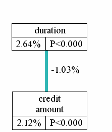
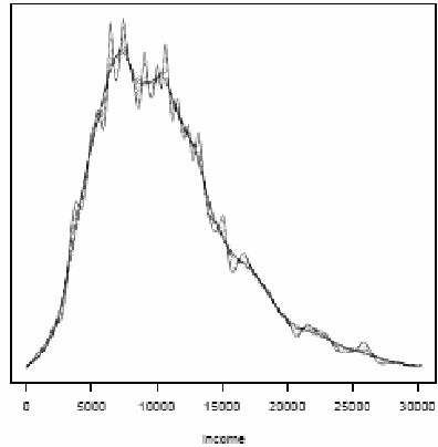
Figure 1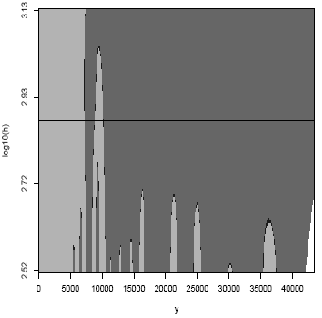
Figure 2
Results matching “R”
Interpretation of regression coefficients is sensitive to the scale of the inputs. One method often used to place input variables on a common scale is to divide each variable by its standard deviation. Here we propose dividing each variable by two times its standard deviation, so that the generic comparison is with inputs equal to the mean +/- 1 standard deviation. The resulting coefficients are then directly comparable for untransformed binary predictors. We have implemented the procedure as a function in R. We illustrate the method with a simple public-opinion analysis that is typical of regressions in social science.
Here's the paper, and here's the R function.
Standardizing is often thought of as a stupid sort of low-rent statistical technique, beneath the attention of "real" statisticians and econometricians, but I actually like it, and I think this 2 sd thing is pretty cool.
The posters for the second mid-Atlantic causal modeling conference have been listed (thanks to Dylan Small, who's organizing the conference). The titles all look pretty interesting, especially Egleston's and Small's on intermediate outcomes. Here they are:
Continue reading Interesting-looking posters on mediation in causal inference.
Aleks pointed me to this report by Scott Keeter of the Pew Research Center. First the quick pictures:
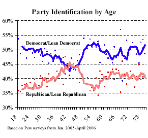
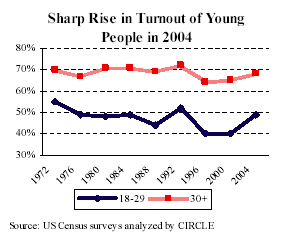
These should not be a surprise (given that there are tons of surveys that ask about age, voting, and party ID) but it's interesting to see the pictures. Peak Republican age is about 46--that's a 1960 birthday, meaning that your first chances to vote were the very Republican years of 1978 and 1980, when everybody hated Jimmy Carter.
The Pew report also had information on political participation:
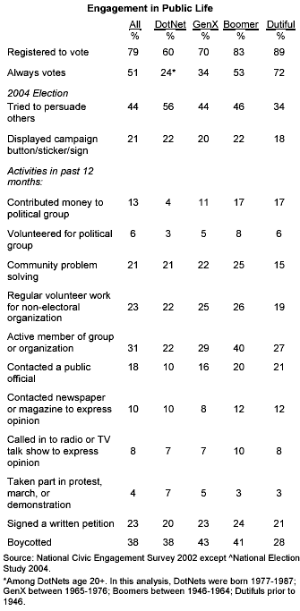
As expected, the under-30s vote a lot less than other Americans. But a lot more of them try to persuade others, which is interesting and is relevant to our studies of political attitudes in social networks.
P.S. The graphs are pretty good, although for party id vs age, I would get rid of those dotted lines and clean up the axes to every 10% on the y-axis and every 10 years on x. The table should definitely be made into a graph. The trouble is, it takes work to make the graph and you wouldn't really get any credit for doing it. That's why we'd like a general program that makes such tables into graphs.
I thought this was amusing.
Iven Van Mechelen told me about this postdoctoral research position in the psychology department at the University of Leuven. They're a great research group; I went on sabbatical there 10 years ago and have been collaborating with them since (here's my favorite paper of ours).
Here the paper, coauthored with Jeff Fagan and Alex Kiss, which will appear in the Journal of the American Statistical Association (see earlier entry). We analyzed data from 15 months of street stops by NYC police in the late 1990s. The short version:
- Blacks (African-Americans) and hispanics (Latinos) were stopped more than whites (European-Americans) in comparison to the prevalence of each group in the population.
- The claim has been made that these differences merely reflect differences in crime rates between these groups, but there was still a disparity when instead the comparison was made to the number of each group arrested in the previous year.
- The claim has been made that these differences are merely geographic--that police make more stops of everyone in high-crime areas--but the disparity remained (actually, increased) when the analysis also controlled for the precinct of the arrest.
In the years since this study was conducted, an extensive monitoring system was put into place that would accomplish two goals. First, procedures were developed and implemented that permitted monitoring of officers’ compliance with the mandates of the NYPD Patrol Guide for accurate and comprehensive recording of all police stops. Second, the new forms were entered into databases that would permit continuous monitoring of the racial proportionality of stops and their outcomes (frisks, arrests).
Monte Carlo is the ubiquitous little beast of burden in Bayesian statistics. Val points to the article by Nick Metropolis "The Beginning of the Monte Carlo Method." Los Alamos Science, No. 15, p. 125, 1987 about his years at Los Alamos (1943-1999) with Stan Ulam, Dick Feynman, Enrico Fermi and others. Some excerpts:
Continue reading History of Monte Carlo.
I've become increasingly convinced of the importance of treatment interactions--that is, models (or analyses) in which a treatment effect is measurably different for different units. Here's a quick example (from my 1994 paper with Gary King):
But there are lots more: see this talk.
Given all this, I was surprised to read Simon Jackman's blog describing David Freedman's talk at Stanford, where Freedman apparently said, "the default position should be to analyze experiments as experiments (i.e., simple comparison of means), rather than jamming in covariates and even worse, interactions between covariates and treatment status in regression type models."
Well, I agree with the first part--comparison of means is the best way to start, and that simple comparison is a crucial part of any analysis--for observational or experimental data. (Even for observational studies that need lots of adjustment, it's a good idea to compute the simple difference in averages, and then understand/explain how the adjustment changes things.) But why is is it "even worse" to look at treatment interactions??? On the contrary, treatment interactions are often the most important part of a study!
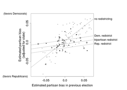
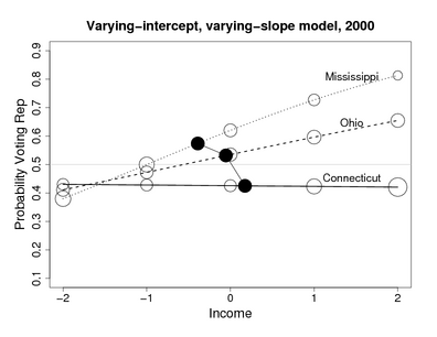
I've already given one example--the picture above, where the most important effect of redistricting is to pull the partisan bias toward zero. It's not an additive effect at all. For another example that came up more recently, we found that the coefficient of income, in predicting vote, varies by state in interesting ways:
Now, I admit that these aren't experiments: the redistricting example is an observational study, and the income-and-voting example is a descriptive regression. But given the power of interactions in understanding patterns in a nonexperimental context, I don't see why anyone would want to abandon this tool when analyzing experiments. Simon refers to this as "fritzing around wtih covariate-asjustment via modeling" but in these examples, interactions are more important than the main effects.
Interactions are important
Dave Krantz has commented to me that it is standard in psychology research to be intersted in interactions, typically 3-way interactions actually. The point is that, in psychology, the main effects are obvious; it's the interactions that tell you something.
To put it another way, the claim is that the simple difference in means is the best thing to do. This advice is appropriate for additive treatment effects. I'd rather not make the big fat assumption of additivity if I can avoid it; I'd rather look at interactions (to the extent possible given the data.)
Different perspectives yield different statistical recommendations
I followed the link at Simon's blog and took a look at Freedman's papers. They were thought-provoking and fun to read, and one thing I noticed (in comparison to my papers and books) was: no scatterplots, and no plots of interactions! I'm pretty sure that it would've been hard for me to have realized the importance of interactions without making lots of graphs (which I've always done, even way back before I knew about interactions). In both the examples shown above, I wasn't looking for interactions--they were basically thrust upon me by the data. (Yes, I know that the Mississippi/Ohio/Connecticut plot doesn't show raw data, but we looked at lots of raw data plots along the way to making this graph of the fitted model.) If I hadn't actually looked at the data in these ways--if I had just looked at some regression coefficients or differences in means or algebraic expressions--I wouldn't have thought of modeling the interactions, which turned out to be crucial in both examples.
I know that all my data analyses could use a bit of improvement (if only I had the time to do it!). A first step for me is to try to model data and underlying processes as well as I can, and to go beyond the idea that there's a single "beta" or "treatment effect" that we're trying to estimate.
Gregor writes:
Continue reading Bayesian inference for finite sample size.
Through Robert Israel's sci.math posting I've found an excellent online resource, especially for many statistical topics: Encyclopaedia of Mathematics. It seems better than the other two better-known options Wolfram MathWorld and Wikipedia. Another valuable resource Quantlets has several interesting books and tutorials, especially on the more financially oriented topics; while some materials are restricted, much of it is easily accessible. Finally, I have been impressed by Computer-Assisted Statistics Teaching - while it is of introductory nature, the nifty Java applets make it worth registering.
Phil pointed me to this fun graph:
Preparing data for use, converting it, cleaning it, leafing through thick manuals that explain the variables, asking collaborators for clarifications takes a lot of our time. The rule of thumb in data mining is that 80% of the time is spent on preparing the data. Also, it is often painful to read bad summaries of interesting data in papers when one would want to actually examine the data directly and do the analysis for oneself.
While there are many repositories of data on the web, they are not very sophisticated: usually there is a ZIP file with the data in some format that yet has to be figured out. Today I have stumbled upon Virtual Data System that provides an open source implementation of a data repository that enables one to view variables, the distribution of their values in the data, perform certain types of filtering, all through the internet browser interface. An example can be seen at Henry A. Murray Research Archive - click on Files tab and then on Variable Information button. Moreover, the system enables one to cite data similarly as one would cite a paper.
A similar idea developed for publications a few years earlier is GNU EPrints, which is a system of repositories of technical reports and papers that almost anyone can set up. Having used EPrints, I was frustrated by the inability to move data from one repository to another, to have some sort of a search system that would span several repositories, to have integration with search and retrieval tools such as Citeseer.
But regardless of the problems, such things are immensely useful parts of the now-developing scientific infrastructure on the internet. There would be wonders if even 5% of the money that goes into the antiquated library system was channelled into the development of such alternatives.
David Berri very nicely gave detailed answers to my four questions about his research in basketball-metrics. Below are my questions and Berri's responses.
Continue reading Basketball update.
Carrie links to a Wall Street Journal article about scientific journals that encourage authors to refer to other articles from the same journal:
John B. West has had his share of requests, suggestions and demands from the scientific journals where he submits his research papers, but this one stopped him cold. . . After he submitted a paper on the design of the human lung to the American Journal of Respiratory and Critical Care Medicine, an editor emailed him that the paper was basically fine. There was just one thing: Dr. West should cite more studies that had appeared in the respiratory journal. . . . "I was appalled," says Dr. West of the request. "This was a clear abuse of the system because they were trying to rig their impact factor." . . .The result, says Martin Frank, executive director of the American Physiological Society, which publishes 14 journals, is that "we have become whores to the impact factor." He adds that his society doesn't engage in these practices. . . .
From my discussions with Aleks and others, I have the impression that impact factors are taken more seriously in Europe than in the U.S. They also depend on the field. The Wall Street Journal article says that impact factors "less than 2 are considered low." In statistics, though, an impact factor of 2 would be great (JASA and JRSS are between 1 and 2, Biometrics and Biometrika are around 1). Among the top stat journals are Statistics in Medicine (1.4) and Statistical Methods in Medical Research (1.9), which are considered OK but not top stat journals. You gotta reach those doctors (or the computer scientists and physicists; they cite each other a lot).
A question came in which relates to an important general problem in survey weighting. Connie Wang from Novartis pharmaceutical in Whippany, New Jersey, writes,
I read your article "Struggles with survey weighting and regression modeling" and I have a question on sampling weights.My question is on a stratified sample design to study revenues of different companies. We originally stratified the population (about 1000 companies) into 11 strata based on 9 attributes (large/small Traffic Volume, large/small Size of the Company, with/without Host/Remote Facilities, etc.) which could impact revenues, and created a sampling plan. In this sampling plan, samples were selected from within each stratum in PPS method (probabilities proportionate to size), and we computed the sampling weights (inverse of probability of selection) for all samples in all strata. In this sampling plan, sampling weights for different samples in the same stratum may not be the same since samples were drawn from within each stratum not in SRS (simple random sample) but in PPS/census.
Continue reading Survey weights and poststratification.
Writing this last item reminded me that a friend once used the phrase "straw person," with a perfectly straight face, in conversation. I told him that in my opinion it was ok to say "straw man" since it's a negative thing and so non-sexist to associate it with men.
I've been thinking about this because we're doing the final copyediting for our book . . . there are some words you just can't use because people get confused:
- "which" and "that": Some people, including copy editors, are confused on this; see here for more on the topic). The short answer is that you can use "which" pretty much whenever you want, but various misinformed people will tell you otherwise.
- "comprise": I once had a coauthor correct my manuscript by crossing out "comprise" and replacing with the (wrong) "is comprised of." I try to avoid the word now so that people won't think I'm making a mistake when I use "comprise" correctly.
- "inflammable": This one has never come up in my books, but I've always been amused that "inflammable" means "can catch fire." But it sounds like it means "nonflammable," so now we just use "flammable" to avoid confusion.
- "forte": According to the dictionary, it's actually pronounced "fort,", not "fortay." But everybody says "fortay," so I can either use it wrong, like everybody else, or say "fort" and leave everybody confused. I just avoid it.
- "bimonthly": I think by now you know where I'm heading on this one. Again, I just avoid the word (on the rare occasions that it would arise).
- "whom": I never know whether I should just use "who" and sound less pedantic.
- splitting infinitives: I do this when it sounds right, even when (misinformed) people try to stop me.
By the way, my copy editor has been great. He's made lots of unncessary comments (for example, on "which" and "that") but I just ignore these. More importantly, he's found some typos that I hadn't caugh.
People sometimes ask me how to combine ecological regression with survey data. This paper by Jackson, Best, and Richardson, "Improving ecological inference using individual-level data" from Statistics in Medicine seems like it should be very useful. Here's the abstract:
In typical small-area studies of health and environment we wish to make inference on the relationship between individual-level quantities using aggregate, or ecological, data. Such ecological inference is often subject to bias and imprecision, due to the lack of individual-level information in the data. Conversely, individual-level survey data often have insufficient power to study small-area variations in health. Such problems can be reduced by supplementing the aggregate-level data with small samples of data from individuals within the areas, which directly link exposures and outcomes. We outline a hierarchical model framework for estimating individual-level associations using a combination of aggregate and individual data. We perform a comprehensive simulation study, under a variety of realistic conditions, to determine when aggregate data are sufficient for accurate inference, and when we also require individual-level information. Finally, we illustrate the methods in a case study investigating the relationship between limiting long-term illness, ethnicity and income in London.
Mouser sent along this link to an applet that simulates World Cup outcomes.
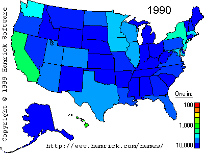
While looking for the Willis distribution (which was mentioned in Mandelbrot's classic paper on taxonomies), Aleks found this, which linked to this site. For example, here's the frequency of the last name Lo, by state:
Not as fun as the baby name site but still somewhat cool.
A few weeks ago, I posted an entry about a bad graphical display of financial data; specifically, which asset classes have performed well, or badly, by year. Here's the graphic:
I pointed out that although this graphic is poor, it's not easy to display the same information really well, either. For instance, a simple line plot does a far better job than the original graphic of showing the extent to which asset classes do or don't vary together, and which ones have wilder swings from year to year, but it's also pretty confusing to read. Here's what I mean:
I suggested that others might take a shot at this, and a few people did.
Continue reading Displaying Financial Data, redux.
[See update at end of this entry.]
Jeff Lax pointed me to the book, "Discrete choice methods with simulation" by Kenneth Train as a useful reference for logit and probit models as they are used in economics. The book looks interesting, but I have one question. On page 28 of his book (go here and click through to page 28), Train writes, "the coefficients in the logit model will be √1.6 times larger than those for the probit model . . . For example, in a mode choice model, suppose the estimated cost coefficient is −0.55 from a logit model . . . The logit coefficients can be divided by √1.6, so that the error variance is 1, just as in the probit model. With this adjustment, the comparable coefficients are −0.43 . . ."
This confused me, because I've always understood the conversion factor to be 1.6 (i.e., the variance scales by 1.6^2, so the coefficients themselves scale by 1.6). I checked via a little simulation in R:
I read Malcolm Gladwell's article in the New Yorker about the book, "The Wages of Wins," by David J. Berri, Martin B. Schmidt, and Stacey L. Brook. Here's Gladwell:
Weighing the relative value of fouls, rebounds, shots taken, turnovers, and the like, they’ve created an algorithm that, they argue, comes closer than any previous statistical measure to capturing the true value of a basketball player. The algorithm yields what they call a Win Score, because it expresses a player’s worth as the number of wins that his contributions bring to his team. . . .In one clever piece of research, they analyze the relationship between the statistics of rookies and the number of votes they receive in the All-Rookie Team balloting. If a rookie increases his scoring by ten per cent—regardless of how efficiently he scores those points—the number of votes he’ll get will increase by twenty-three per cent. If he increases his rebounds by ten per cent, the number of votes he’ll get will increase by six per cent. . . . Every other factor, like turnovers, steals, assists, blocked shots, and personal fouls—factors that can have a significant influence on the outcome of a game—seemed to bear no statistical relationship to judgments of merit at all. Basketball’s decision-makers, it seems, are simply irrational.
I have a few questions about this, which I'm hoping that Berri et al. can help out with. (A quick search found that this blog that they are maintaining.) I should also take a look at their book, but first some questions:
Continue reading How can and should we interpret regression models of basketball?.
I came across this paper. Could someone please convert all the tables into graphs? Thank you.
Rafael pointed me toward some great stuff at the UCLA statistics website, including a page on Multilevel modeling that's full of great stuff (No link yet to our forthcoming book, but I'm sure that will change...) It would also benefit from a link to R's lmer() package.
Fixed and random (whatever that means)
One funny thing is that they link to an article on "distingushing between fixed and random effects." Like almost everything I've ever seen on this topic, this article treats the terms "random" and "fixed" as if they have a precise, agreed-upon definition. People don't seem to be aware that these terms are used in different ways by different people. (See here for five different definitions that have been used.)
del.icio.us isn't so delicious
At the top of UCLA's multilevel modeling webpage is a note saying, "The links on this are being superseded by this link: Statistical Computing Bookmarks". I went to this link. Yuck! I like the original webpage better. I suppose the del.icio.us page is easier to maintain, so it's probably worth it, but it's too bad it's so much uglier.
Aleks sent me these slides by Jan de Leeuw describing the formation of the UCLA statistics department. Probably not much interest unless you're a grad student or professor somewhere, but it's fascinating to me, partly because I know the people involved and partly because I admire the UCLA stat dept's focus on applied and computational statitics. In particular, they divide the curriculum into "Theoretical", "Applied", and "Computational". I think that's about right, and, to me, much better than the Berkeley-style division into "Probability", "Theoretical", and "Applied". Part of this is that you make do with what you have (Berkely has lots of probabilists, UCLA has lots of ocmputational people) but I think that it's a better fit to how statistics is actually practice.
It's also interesting that much of their teaching is done by continuing lecturers and senior lecturers, not by visitors, adjuncts, and students. I'm not sure what to think about this. One of the difficulties with hiring lecturers is that the hiring and evaluation itself should be taken seriously, which really means that experienced teachers should be doing the evaluation. So I imagine that getting this started could be a challenge.
I also like the last few slides, on Research:
Continue reading Building a statistics department.
Marcia Angell has an interesting article in the New York Review of Books on the case of Vioxx, the painkiller drug that was withdrawn after it was found to cause heart attacks. (She cites an estimate of tens of thousands of heart attacks caused by the use of Vioxx and related drugs, referring to Eric J. Topol, "Failing the Public Health—Rofecoxib, Merck, and the FDA," The New England Journal of Medicine, October 21, 2004.) Angell writes,
In late 1998 and early 1999, Celebrex and then Vioxx were approved by the FDA. They were given rapid "priority" reviews—which means the FDA believed them likely to be improvements over drugs already sold to treat arthritis pain. Was that warranted? Neither drug was ever shown to be any better for pain relief than over-the-counter remedies such as aspirin or ibuprofen (Advil) or naproxen (Aleve). But theory predicted that COX-2 inhibitors would be easier on the stomach, and that was the reason for the enthusiasm. As it turned out, though, only Vioxx was shown to reduce the rate of serious stomach problems, like bleeding ulcers, and then, mainly in people already prone to these problems, a small fraction of users. In other words, the theory just didn't work out as anticipated.Furthermore, people vulnerable to stomach ulcers could probably get the same protection and pain relief by taking a proton-pump inhibitor (like Prilosec) along with an over-the-counter pain reliever. So the COX-2 inhibitors did not really fill an unmet need, despite the one seemingly attractive claim made in favor of them.
She also goes into detail on conflict of interest in the FDA advisory committees, and recommends that the FDA shouldn't approve new drugs so hastily. This sounds like a good recommendation for Vioxx etc. (tens of thousands of heart attacks doesn't seem good). But how many drugs are there on the other side--effective drugs that are still waiting for approval? I'm curious what Angell's colleagues at the Harvard Center for Risk Analysis would say. Would it be possible to have an approval process that catches the Vioxx-type drugs but approves others faster?
Jonathan Zaozao Zhang writes,
For the dataset in my research, I am currently trying to compare the fit between a linear (y=a+bx) and a nonlinear model y=(a0+a1*x)/(1-a2*x).The question is: For the goodness of fit, can I compare R-squared values?(I doubt it... Also, the nls command in R does not give R-squared value for the nonlinear regression) If not, why not? and what would be a common goodness of fit measure that can be used for such comparsion?
My response: first off, you can compare the models using the residual standard deviations. R^2 is ok too, since that's just based on the residual sd divided by the data sd. Data sd is same in 2 models (since you're using the same dataset), so comparing R^2 is no different than comparing residual sd.
Even simpler, I think, is to note that model 2 includes model 1 as a special case. If a2=0 in model 2, you get model 1. So you can just fit model 2 and look at the confidence interval for a2 to get a sense of how close you are to model 1.
Continuing on this theme, I'd graph the fitted model 2 as a curve of E(y) vs x, showing a bunch of lines indicating inferential uncertainty in the fitted regression curve. Thien you can see the fitted model and related possibilities, and see how close it is to linear.
Jason McDaniel writes with a question about using spatial lag regression models for studying voting patterns by ethnic group. I'll give his question, then my (brief) reply.
Jason writes:
Continue reading Spatial correlation models.
Awhile ago I had some comments about how, in the best works of alternative history, the alternative world is not "real," that in an underlying sense, our world is the real one. Just to update on this, I sent my thoughts to the great John Clute, who had the following response:
I think it's a neat formulation of at least something of what goes on in the best Alternative History novels, though I tend to think of it more as an involuntary (or elated, or knowing) insertion of a touch of Yin into the Yang. I think the best sf books do tend to wrestle with what I'd call (hey, why not) Minotaur-bearing labyrinth of the "real", and that the best of them tend to make use of that engagement. But a different focus of energy also operates: the enormously powerful urge of the good writer to realize the imagined thing. BRING THE JUBILEE loses some of its poignance and grasp if we think that the world in which it begins is somehow less real, in the imagined matrix of the tale, than the world in which it ends; though it is at the same time clear that the reader is in a "privileged" position as regards his understanding of the nature of the reality of the world "created".In fact, I think the best angle of understanding of the issues you're addressing may be in reader theory: that the reader is in a particularly privileged, and exposed, and delicate position vis a vis the reality register of any alternative world story; and will be remarkably sensitive to any Yin within the Yang. Something like this is true of any reading experience of fiction (though I find your statement that "in a sense, all novels are alternate histories" true but maybe a bit masking of the readerly issues foregrounded here); but clearly, the stakes are much higher and more visible in the alternate/alternative world story.
As I commented in blog entry, I think that this sort of analysis can be helpful in understanding the "potential outcomes" formulation of causal inference.
The excellent Infosthetics blog, which usually focuses at the intersection between information and art, today linked to this Timeline of Trends and Events ranging from 18th century to now and includes projections of the future for a number of variables: political power, economic development, wars, ecology and environment. I have always been impressed by such integrative attempts, for example the synchronoptical summaries of world history, or Karl Hartig's charts.
Although you might find the display cluttered, the wealth of information is worth it. Of course, it would be nice to have an interactive system for zooming into such time series, aligning them, reordering them, superimposing different time series, and so on. It is just a question of time. Moreover, with the abundance of data, our ability to model many kinds of it, the future of history may lie in statistical-graphical summarization.
[Added Karl Hartig's charts]
The first thing we do when looking at the summaries of a regression model is to identify which variables are the most important. In that respect, we should distinguish the importance of a variable on its own and the importance of variable as a part of a group of variables. Information theory in combination with statistics allows us to quantify the amount of information each variable provides on its own, and how much does the information provided by two variables overlap.
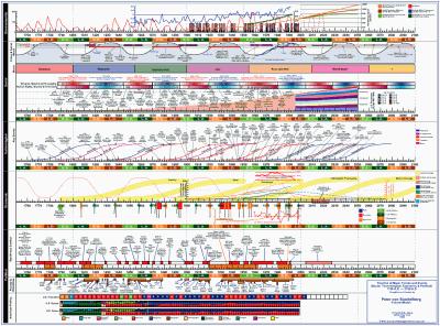
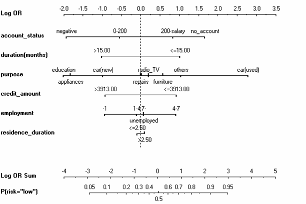
I will use the notion of the nomogram from two days ago to explain this on the same example of a customer walking into a bank and applying for credit. The bank has to decide whether it will accept or reject a credit. Let us focus on two variables, credit duration and credit amount. We can perform logistic regression for only one variable at a time, but display the effect function on the same nomogram. This looks as follows:
In fact, this is a visualization of the naive Bayes classifier, using loess smoother as a way of obtaining the conditional probability densities P(y|x). But regardless of that, we can see a relatively smooth almost-linear increase in risk, both with increasing duration and with increasing credit amount. In that respect, both variables seem to be about equally good, although duration is better, partly due to the problems with credit amount being leftwards skewed, so the big effects for large credits are somewhat infrequent.
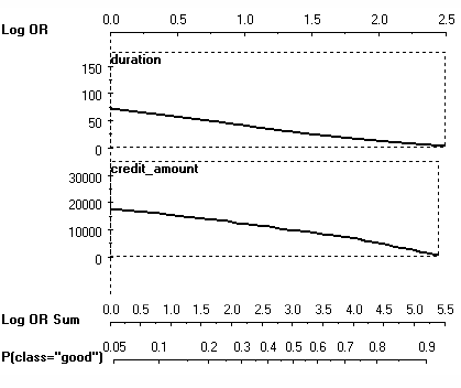
But this is not the right way of doing regression: we have to model both variables at the same time. As the scatter plot shows, they are not independent:
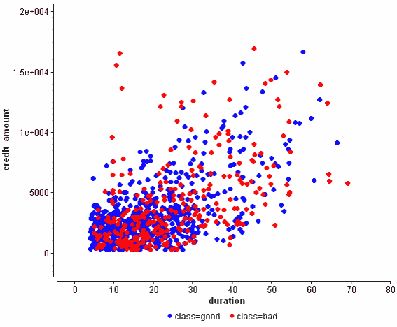
This plot also seems to show that both of them are of comparative predictive power. But now consider the nomogram of the logistic regression model:
 >
>
The coefficient for the credit amount has shrunk considerably! This holds even if we performed Bayesian logistic regression and took the posterior mean as a summary of the correlated coefficients. Why was the credit amount that shrank and not the duration? I find the resolution of the logistic regression model somewhat arbitrary, in the spirit of "winner takes all".
A different interpretation is to use mutual and interaction information as to clarify what is going on. Consider this summary:
The meaning is as follows:
- Duration alone explains 2.64% of the entropy of the risk.
- Credit amount alone explains 2.12% of the entropy of the risk.
- There is a 1.03% overlap between the information both of them provide.
The only problem with this approach is that one needs to construct a reliable joint model of all three variables at the same time as to be able to estimate these information quantities.
More information about this methodology appears in my dissertation.
A guest post by Maria Grazia Pittau:
Rather than revelling in the dolce vita, Italians are battling with the carovita (the high cost of living), Newspaper headlines warn that the "Middle class has gone to hell" and "Italians don't know how they will make it to the end of the month" The Guardian, Tuesday, December 28, 2004.
Considerable progress has been made in empirical research to measure the degree of polarization in the income distribution, not properly captured by inequality indexes. In general, "given any distribution of income, the term polarization means the extent to which a population is clustered around a small number of distant poles" (Esteban, 2002, p.10). How many poles and how distant they are can be regarded as structural features of the whole income distribution. Kernel densities are very good at answering these questions, since features as location, multi-modality and spread can be observed simultaneously. The choice of the bandwidth parameter h is a crucial issue in kernel density since it governs the degree of smoothness of the density estimate. Kernel density estimation can model the data in lesser or finer detail, depending on the extent of smoothing applied.
For income data an adaptive bandwidth is suggested, that is a bandwidth varying along the support of the data-set allows one to reduce the variance of the estimates in areas with few observations (generally, in the tails of the distribution), and to reduce the bias of the estimates in areas with many observations (generally, in the middle of the distribution). The analysis based on kernel density relies to a great extent on the visual impression. When the visual impression seems to corroborate the presence of more than one mode in the distribution, further investigation should be devoted in identifying the sub-populations cluster around the modes.
But are the modes really there? Or are just spurious artifact of the data?
To assess which observed features in the income distribution are "really there", as opposed to being spurious sampling artifact we follow the Sizer approach (Chaudhuri and Marron, 1999, 2000). The SiZer is a graphical tool for the display of significant features with respect to location and bandwidth through assessing the SIgnificant ZERo crossing of the derivatives.
The main advantage of the SiZer is that, for a wide range of bandwidths, it looks at how changes in the bandwidths affect a particular location of the empirical distribution. It searches for the robustness of the shapes at varying bandwidths instead of focusing on a "true" underlying curve.
An important feature is a "bump". The role of SiZer is to attach significance to these bumps. When a bump is present there is a zero crossing of the derivative of the density smooth and the bump is statistically significant (a mode) when the derivative estimate is significantly positive to the left and significantly negative to the right. Analogously, for a dip.
The SiZer approach has two graphical components: A family of nonparametric curves indexed by the smoothing parameter, scale space surface, and the SiZer map that displays significant features with respect to location and bandwidth through assessing the SIgnificant ZERo crossing of the derivatives. The SiZer map displays information about the positivity and negativity of the derivative of the kernel estimator. Each point in the map represents a point indexed by the location in the horizontal axis (x) and by the bandwidth on the vertical axis (h). For a resolution level h, the estimated derivative of the kernel estimation is significantly positive (negative) when all the points within a given confidence interval are positive (negative), that is the (gaussian) kernel distribution is significantly increasing (decreasing) at that location.
Figure 1
Figure 1 represents the scale space surface that is an overlaid family of empirical kernel distributions, each corresponding to a different bandwidth. The family plot gives the idea that no single bandwidth can explain all the information available in the data. The corresponding SiZer map sheds more lights on the crucial question of which modes are statistically significant at any given level of resolution.
Figure 2
Figure 2 reports the net annual disposable Income in Italy in 2002 of all the members of the household after tax and social security transfers for different bandwidths. Household incomes are adjusted for different household sizes. Household incomes are reported in 1995 prices using the consumption deflator of the national accounts.
The SiZer map in Figure 2 has the horizontal axis, y, which represents the household equivalent income, and the vertical axis, log10 (h) represents the bandwidth. The log10 scale used for the bandwidth in the map is chosen to display smooths that are more equally spaced. The horizontal black line represents the optimal (pilot) bandwidth.
The portions of the display are colour-coded: a color, say light gray, when the derivative is significantly positive; a different color, dark gray, when the derivative is significantly negative. The points at which the derivative is not significantly positive or negative appear in the black region of the SiZer map.
The two modes of the Italian income distribution in 2002 are detected for a wide range of bandwidths. These two modes are located around 7,201 euros and 10,254 euros, indicating the presence of two groups of households in Italy: a poor and a rich group. So, the SiZer approach provides a graphical counterpart of measures of polarization to continuous distributions, applied in Duclos et al. (2004). Although number and location of the modes cannot directly linked to the degree of polarization, the emergence of multiple modes, their intensity and separateness, may help relating the changes in the shape of distributions to changes in the polarization measurements.
Regression coefficients are not very pleasant to look at when listed in a table. Moreover, the value of the coefficient is not what really matters. What matters is the value of the coefficient multiplied with the value of the corresponding variable: this is the actual "effect" that contributes to the value of the outcome, or with logistic regression, towards the log-odds ratio. With this approach, it is no longer necessary to scale variables prior to regression. A nomogram is the visualization method based on this idea.
An example of a logistic regression model of credit risk, visualized with a nomogram is below:
We can see that the coefficients for the nominal (factor) variables are grouped together on the same line. The intercept is implicit through the difference between the dashed line and the 0.5 probability axis below. The error bars for individual parameters are not shown, but they could be if we desired. We can easily see whether a particular variable increases or decreases the perception of risk for the bank.
It is also possible to display similar effect functions for nonlinear models. For example, consider this model for predicting the survival of a horse, depending on its body temperature and its pulse:
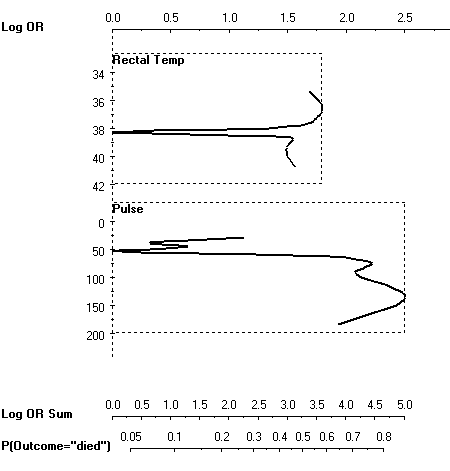
As soon as the temperature or pulse deviate from the "standard operating conditions" at 50 heart beats per minute and 38 degrees Celsium, the risk of death increses drastically.
Both graphs were created with Orange. Martin Mozina and colleagues have shown how nomograms can be rendered for the popular "naive" Bayes classifier (which is an aggregate of a bunch of univariate logistic/multinomial regressions). A year later we demonstrated how nomograms can be used to visualize support vector machines, even for nonlinear kernels, by extending nomograms toward generalized additive models and including support for interactions. Frank Harrell has an implementation of nomograms within R as a part of his Design package (function nomogram).
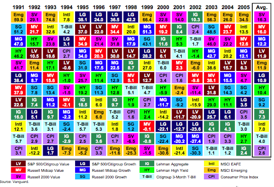
The Vanguard Group is a corporation that manages a bunch of mutual funds, and probably does some other stuff too. I have money in several of their mutual funds, and receive performance updates from them. This graphic was in one of those updates:
The idea, I guess, is to be able to see which asset classes have done relatively well or poorly over time: within each year, the best-performing asset class is at the top and the worst is at the bottom. If you pick out a single color, it's barely possible to follow how it has performed (relatively) by seeing where it sits in each year...sort of mentally connecting the boxes into a line graph. For instance, look at the dark blue "LG" (a group of "growth" stocks defined by Citigroup), which was the top-performing set of stocks from 1995-1998 inclusive, but then dropped to third-from-the-bottom for 2000-2002. The last column shows the average gain over the whole time period.
This is a very bad graphic. Although the actual performance for each class in each year is given numerically, the graph itself gives no information about this, which is after all the most important characteristic of an investment. Being at the top of the chart might mean you gained 75% (1993) or 7.8% (1994). An investment that was eighth on the list might be just a bit worse than the one that was fourth on the list (1992) or might be far worse (2000).
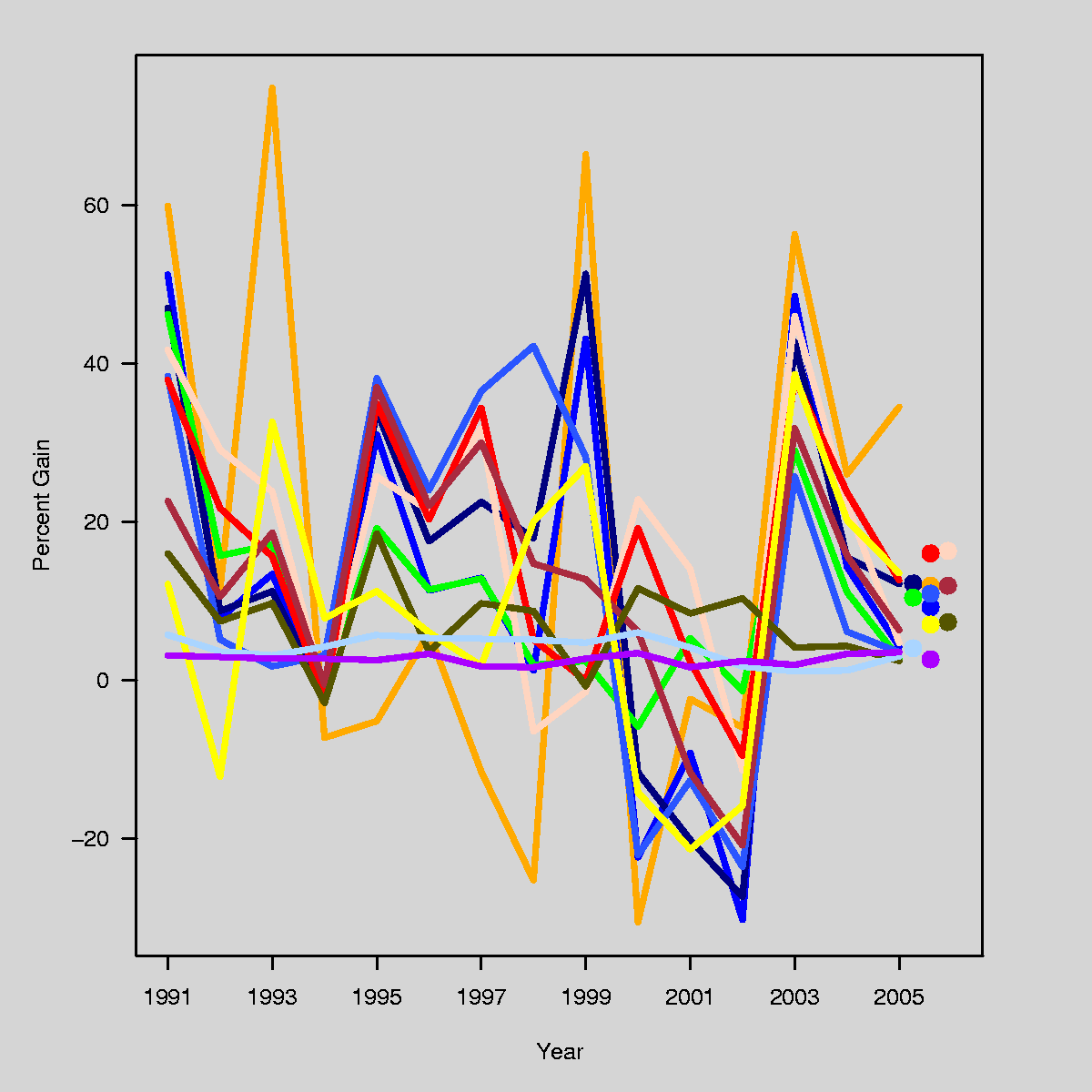
The graphic above is horrible, but It is not trivial to make a good graphic that displays the same data. I just spent 30 minutes on it, producing the following:
I tried to use approximately the same colors, but didn't work too hard at it....the color key from the previous graphic sort of works, except that the flesh color on my graph should be hot pink. (I have to get some real work done today, so sue me.) I made the background a light gray to make the light-colored lines show up better; if I wanted to spend more time I would change the light colors to something more intense.
It would take some work to use this graph to figure out "which was the 5th-best-performing asset class in 2001", which is something that is easy to tell from the Vanguard graphic. But at least this [;py conveys some information about the magnitudes of the ups and downs. And look at the T-bills (light blue), just chugging along at their steady 1- to 5-percent gain each year...contrast this with their dramatic ups and downs on the Vanguard graphic.
But if I were Vanguard, I wouldn't send out my version of the graph either. It has lots of problems. A big problem is that the dynamic range of the yearly gains and losses is far wider than the average gains and losses (a fact not conveyed by the Vanguard graphic unless you look at the numbers themselves), so the dots at the end of my graphic, which indicate the average gain, would overlap if I didn't add some offset in the x-direction. Also, I would have preferred to use those dots to provide a legend that matches the color to the asset class, but there's no room since the text would overlap.
I would be interested in seeing what people come up with, as a better alternative to these plots. Why not download the data file and see what you can come up with?
Machine translation technology has finally become useful and accessible for everyone to use. The technology is based on statistical matching of phrases has increased the quality and the spectrum of supported languages. There is an active community of researchers working at the intersection of Bayesian statistics and language, e.g., BayesNLP.
Good examples of translation tools are SYSTRAN (also at Babel) and Google Translate (also available on the Google Toolbar, making it very handy). Both have good support for most European languages, Arabic and Chinese.
Sometimes, there are interesting differences between the English news sources in a region (such as Asia Times, English Al-Jazeera) and those written in local languages (Alexa's Top 500 list is a good starting point for identifying popular web sites around the world). The local languages would have been off-limits to most foreigners, but with machine translation technology this is no longer the case. Seeing the impact of the internet in just 10 years, I am optimistic about the potential of machine translation in helping the world communicate better.
I will apply machine translation to to the Arabic version of Al-Jazeera news. It seems that the Arabic version of the news is shorter and agency-like, whereas the English version is longer and follows the English/American style of reporting. I will also examine the quality of two different machine translation utilities: it seems that Google Translate is doing a better job than SYSTRAN. While the translation is imperfect, practically all the material can definitely be understood even if one has no knowledge of the other language.
Continue reading Machine translation and global news.
Edward Tufte pointed me to this article, looking back on his papers from the 1970s on midterm elections and seats-votes curves.
I've been interested in seats and votes since I was in grad school in the 1980s and so I was aware of his poli sci papers at that time; coincidentally, my brother gave me a copy of his first book back in the 80s because he just thought I'd like it. My favorite Tufte book is his second, because I've been very strongly influenced by the "small multiples" idea (which I've since been told has appeared in the work of Bertin as well, and then Tufte gave a reference to Scheiner from 1613). I used to love graphs with many lines on a single plot (or many different points, using symbols and colors to distinguish), but now I like to use small multiples whenever possible, even using somewhat arbitrary divisions to make graphs clear; for example, see Figure 2 here or, for a purer example, Figure 1 here.
My recent research involves using graphs to understand fitted models. Statisticians tend to focus on graphs as methods of displaying raw data, but I think models themselves can be better understood graphically; for example, in our red-state, blue-state paper.
My only Tufte-related story is from our paper on reversals of death sentences, Figures 2 and 3 of which show the "pipeline" from homicides, to arrests, to prosecutions, to sentencing, to judicial review, to execution. My collaborator had a friend, a graphic artist, who wanted to make a "Napoleon's march"-style graph of the death sentencing pipeline. It didn't look so good, however. Two problems: (1) no geographic dimension, which is what made the Napoleon graph so distinctive; (2) lots and lots of missing data (cases still under review) which throws off the picture. So in the end I was happier with the flowchart-like diagram we made. Although I'm sure something better could have been done.
In an interesting article on medical malpractice in the New Yorker (14 Nov 2005, p.63), Atul Gawande writes,
I have a crazy-lawsuit story of my own. In 1990, while I was in medical school, I was at a crowded Cambridge bus stop and an elderly woman tripped on my foot and broke her shoulder. I gave her my phone number, hoping that she would call me and let me know how she was doing. She gave the number to a lawyer, and when he found out that it was a medical-school exchange he tried to sue me for malpractice, alleging that I had failed to diagnose the woman's broken shoulder when I was trying to help her. (A marshal served me with a subpoena in physiology class.) When it became apparent that I was just a first-week medical student and hadn't been treating the woman, the court disallowed the case. The lawyer then sued me for half a million dollars, alleging that I'd run his client over with a bike. I didn't even have a bike, but it took a year and a half-and fifteen thousand dollars in legal fees-to prove it.
This made me wonder: why didn't Gawande sue that lawyer right back? If he didn't have a bike, that seems like pretty good evidence that they were acting fradulently, maliciously, etc. I could see why he might want to just let things slide, but it it took a year and a half and $15,000, wouldn't it make sense to sue him back? I'm sure I'm just revealing my massive ignorance about the legal system by asking this.
P.S. Gawande's article is of statistical and policy interest, as he discusses the cost-benefit issues of medical malpractice law.
In comments here, Alexis writes,
Your post prompts me to ask you something i've been wondering about ever since i began learning about NON-regression-based approaches to causal inference: namely, why do virtually all statistically-oriented political scientists think that regression-based/MLE methods are giving them the correct answers in observational settings? after all, we have long known (since at least the Rubin/Cochran papers of 1970s) that regression is often (and quite possible *generally*) unreliable in observational settings.Do we have a single example of a non-trivial observational dataset wherein we can show that regression analysis produces the result that would have been obtained in a randomized experiment? We have lots of examples that show regression fails this test (here i'm thinking of dehejia/wahba/lalonde, etc.) where is the definitive empirical success story? there should be many success stories, given the universality of the methodology-- but i don't know of a single one.
In your blog, you write:
"(Parochially, I can point to this [link to gelman paper] and this [link to gelman paper] as particularly clean examples of causal inference from observational data, but lots more is out there.)
I do not doubt that your linked papers (which i have not read) are excellent and rigorous examples of applied regression analysis. but my question is, how is it that these papers validate a regression-based approach to causal inference? what do you know of the "correct answer" in these cases, aside from your regression-based estimates?
My response:
1. Matching and regression are different methods but ultimately are doing the same thing, which is to compare outcomes on cases that differ in the treatment variable while being as similar as possible on whatever pre-treatment covariates are around. Regression relies (and takes advantage of) linearity in the response surface, whereas matching is (potentially) nonparametric.
2. Matching is particularly relevant when the treatment and control groups do not completely overlap--matching methods will exclude the points outside the overlap region, with the understanding that the causal inference applies only to this region of overlap. Rubin's thesis discussed why matching is improved if followed by regression.
3. In each of the examples I've worked on (most notably, estimating the effect of incumbency and the effect of redistricting), there was essentially complete overlap of treatment and control groups.
4. In their usual formulations, matching and regression both assume ignorability and thus ignore biases due to selection based on unmeasured variables.
5. In my particular examples, I don't have external validation, however the results make sense when looked at from various directions (see, for example, our comparison of various estimates in our 1990 AJPS paper).
P.S. See some lively discussion in the comments.
Holly writes,
I am interested in where children live when their parent is incarcerated. It turns out that there is a major gender difference in that when the father is incarcerated the child tends to live with the other parent, but when the mother is incarcerated the child tends to go to other relative or agency care. In the data set I have, information (albiet limited) is available on up to 11 children of the incarcerated parent. What I think I have here is a two level model where at level 1 the child's age and gender are predictors (as older children may end up living on their own), and at level 2 the variables are those of the incarcerated parent. My question concerns the two level non-linear (multinomial logit) model. My concern is at level 1. I understand that if a household only has one child, it "borrows strength" from other households with more children to estimate the level 1 model. Is that correct? So if there are two individual level predictors and usually one, two or three children with about 1000 parents, the two level model would be estimable? The outcome variable is polytomous with 5 categories: live with other parent, live with other relatives, live in agency or foster care, other care arrangement, and live on own. All children in this analysis are under age 18.
My response: yes, you should be able to estimate this model with no problems. You should also consider interactions between the level 1 and level 2 predictors.
The Federal Reserve Bank of Minneapolis has an interesting article by Douglas Clement from 2001 about cost-benefit analysis in pollution regulation.
I'm generally a fan of cost-benefit analysis and related fields, for use in setting government policies. Andrew, Chia-Yu Lin, Dave Krantz, and I once wrote a decision-analysis paper with a large cost-benefit component, that someone said is "the best paper I have seen on decision-making under uncertainty in a public health context" (thanks, mom!). But this article mentions the fact that the Clean Air Act explicitly forbids costs from being considered in setting pollutant standards, and then goes on to discuss this seemingly ridiculous fact...in a way that basically convinced me that eh, maybe cost-benefit analysis in this context isn't necessary after all.
The usual problems are cited: it's hard to figure out how to evaluate some costs and some benefits in terms of dollar costs (or any other common scale), there is no agreed "value of a life", yada yada. Standard stuff. In the aforementioned decision analysis paper, we avoided many of these issues by comparing several policies (for radon monitoring and mitigation), including the current one; thus, we could find policies that save more lives for less money, and be confident that they're better than the current one, without having to claim that we have found the optimum. But if you're trying to do something new, like set a maximum value for a pollutant that has never previously been regulated, then our approach to avoiding the "value of a life" issue won't work.
But in addition to the usual suspects for criticizing cost-benefit analysis, the article mentions a few others. For instance:
(1) "Potential benefits of a policy are often calculated on the basis of surveys of people's willingness to pay for, say, a better view of the Grand Canyon, an extra year of life or avoidance of cancer. But critics argue that willingness to pay hinges, in part, on ability to pay, so that cost-benefit analysis is fundamentally dependent on the equity issues it professes to avoid."
(2) "Indeed, Breyer, in his American Trucking concurrence, said that the technology-forcing intent of laws like the Clean Air Act makes determining costs of implementation “both less important and more difficult. It means that the relevant economic costs are speculative, for they include the cost of unknown future technologies. It also means that efforts to take costs into account can breed time-consuming and potentially unresolvable arguments about the accuracy and significance of cost estimates.” In short, it makes cost-benefit analysis itself less likely to pass a cost-benefit test."
(3) "In an article titled “The Rights of Statistical People,” Heinzerling argues that analysts have created the entity of a “statistical life” in order to facilitate cost-benefit analysis, but the concept essentially strips those lives of their human rights. We don't allow one person to kill another simply because it's worth $10 million to the killer to see that person dead and because society may measure that person's worth at less than $10 million, she argues; then why should regulatory policy be based on a similar principle?"
Item (1) could be handled within a cost-benefit analysis (by defining an 'equity score' and assigning a trade-off between dollars and equity, for example); item (2) just suggests that cost-benefit analysis can be so uncertain and so expensive that it's not worth the effort, but that doesn't seem true for regulations with implications in the billions of dollars --- heck, I'll do a cost-benefit analysis for 1/1000 of that, and that's a real offer. Item (3) is a real ethical question that challenges the heart of cost-benefit analysis, and I'll need to think about it more.
I'm tempted to go on and list items (4), (5), and (6), but read the article yourself. Among the people quoted is a Columbia economics prof, by the way. (In case you, the reader, don't know: Andrew teaches at Columbia).
Overall, my view seems to be fairly close to that of someone quoted in the article:
====
“My own justification for using cost-benefit analysis in common-law decision-making,” wrote Richard Posner, “is based primarily ... on what I claim to be the inability of judges to get better results using any alternative approach.” And he recommends that the acknowledged moral inadequacy of the Kaldor-Hicks criteria—its neglect of distributional equity—should be addressed by simply employing cost-benefit as a tool for informing policymakers, not as a decision-making imperative.
“This may seem a cop-out,” Posner admitted, “as it leaves the government without a decision rule and fails to indicate how cost-benefit analysis is to be weighted when it is merely a component of the decision rule.” But “I am content to allow the usual political considerations to reinforce or override the results of the cost-benefit analysis. If the government and the taxpayer and the voter all know—thanks to cost-benefit analysis—that a project under consideration will save 16 sea otters at a cost of $1 million apiece, and the government goes ahead, I would have no basis for criticism.”
=====
Of course, more typically we would think that the project will save between 3 and 40 sea otters at a cost of $200K to $6 million each, or whatever. But I agree with the general idea.
P.S. I was pleased to see Seth's book at #101 on Amazon today. Only 91 slots below the Twinkies Cookbook (and 5 below the Sonoma Diet and 3 below the South Beach Diet, but I'm sure that will change...).
Seth wrote something here about Jane Jacobs and her relevance to experimental psychology. He mentions her book, Cities and the Wealth of Nations, which I too enjoyed reading.
I have one question, though, which perhaps the economists in the audience can anwer. I recall two messages from that book.:
(1) Certain cities produce great wealth and that it is the natural and unfortunate result of national tax and economic policies to bleed the cities dry until they can no longer be productive, leading to national decline.
(2) Import substitution is a good thing because it leads to dense networks of local factories and suppliers.
But I seem to recall reading somewhere that import substitution is very much out of favor among economists. Was Jacobs wrong on that one?
According to the Washington Post, "Florida had seen just 17 confirmed fatal alligator attacks in the previous 58 years. In less than a week, there appears to have been three."
How strange is this? 17 attacks in 58 years is about 0.3 attacks per year. But there are a lot more people in Florida now than there were 58 years ago or even 25 years ago, so we might expect the rate of attacks to be increasing with time (though I don't know if that's true). Suppose the current "true" rate is 1 attack per year, or 0.02 per week. In that case, given that there is one attack, the odds of having two more within a week would seem to be roughly 0.0004. (We look at the question this way because we are interested in the question "what is the probability of having three attacks in the same week", not "what is the probability of having three attacks in this particular week.")
So according to this crude estimate, 3 fatal alligator attacks in a week is indeed an extremely unlikely occurrence, although not spectacularly so. There could be some important modifiers, though. For instance, maybe there is a seasonality to alligator attacks, either because alligators are more aggressive at some times of year or because more people do risky activities during some times of the year.
On a related subject, I'm never exactly sure how to think of these "freakish coincidence" stories. We'd be having this same sort of discussion if instead there had been three fatal bear attacks in a week in Oregon, or three fatal shark attacks in Hawaii, or three fatal mountain lion attacks in California, or whatever, so maybe a "three fatal something attacks in a week" story shouldn't be all that rare. On the other hand, it does seem worthwhile trying to figure out if anything has changed in Florida that would make gator attacks a lot more common, because 3 in a week sure seems exceptional.
Jodi Nearns writes,
I recently employed hierarchical generalized linear modeling for my dissertation and I did have a case in which I added a predictor to a model and the Tau of my random intercept increased. I was searching on the web and saw that you will be having a book published in the Fall that included this very topic. I was curious if you would be willing to tell me why this happens or if you could direct me to a paper that discusses this?
In classical regression, adding a predictor can only decrease the residual variance (except for the minor increase that can occur from reducing the degrees of freedom by 1 and thus dividing by n-k-1 instead of n-k in the variance calculation). But in a multilevel model, adding an individual predictor can sometimes make the group-level variance go up. This can happen when the individual-level predictor is negatively correlated with the group coefficient.
Here's the relevant section from the book (including a pretty picture).
Here's a pretty graph (from Steven Levitt, who says "found on the web" but I don't know the original source):
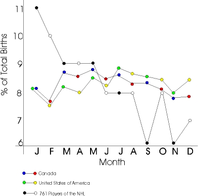
This is a good one for your stat classes. My only suggestions:
1. Get rid of the dual-colored points. What's that all about? One color per line, please! As Tufte might say, this is a pretty graph on its own, it doesn't need to get all dolled up. Better to reveal its natural beauty through simple, tasteful attire.
2. Normalize each month's data by the #days in the month. Correcting for the "30 days hath September" effect will give a smoother and more meaningful graph.
3. Something wacky happened with the y-axis: the "6" is too close to the "7". Actually, I think it would be fine to just label the axis at 6, 8, 10,... Not that it was necessarily worth the effort to do it in this particular case, just thinking about this one to illustrate general principles. Ideally, the graphing software would make smart choices here.
4. (This takes a bit more work, but...) consider putting +/- 1 s.e. bounds on the hockey-player data. Hmm, I can do it right now....761/12 = 63, so we're talking about relative errors of approximately 1/sqrt(63)=1/8, so the estimates are on the order of 8% +/- 1%.
P.S. See Junk Charts for more.
Dominique Lord writes,
My area of research is in highway safety and most of my work has been on the development of statistical models for modeling motor vehicle collisions (I have a good knowledge of statistics, but I am not a statistician). Unfortunately, the types of databases we use are often plagued by the two characteristics above. Consequently, statistical models (Poisson and Poisson-gamma in particular) estimated using the MLE or full-Bayes methods are likely to be biased.
His paper is here. (And here's his earlier paper.)
I don't have much to say here except that, since model fit is a concern, I'd like to see some posterior predictive checks--that is, simulations of fake datasets from the fitted model--which can then be compared, visually and otherwise, to the actual data being fit. That is probably the most helpful suggestion I can give. Also, at the technical level, I would avoid those gamma(.01,.01) hyperprior distributions--these are nothing but trouble.
Tian was looking up some data on names for the next step of our project on using names to estimate individual network sizes, and she found the number of newborns with each name who were given Social Security numbers in each decade. In recent years, she saw the expected 51% boys, but in the early 1900s, many more newborn girls than boys got Social Security numbers:
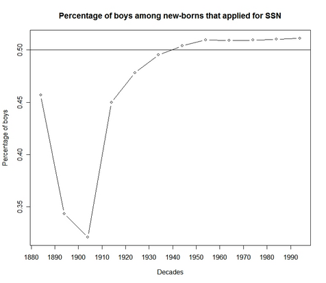
Tian writes, "I am looking forward to some freaknomics-type answer from your blog visitors."
I just finished reading Dick Berk's book, "Regression analysis: a constructive critique" (2004). It was a pleasure to read, and I'm glad to be able to refer to it in our forthcoming book. Berk's book has a conversational format and talks about the various assumptions required for statistical and causal inference from regression models. I was disappointed that the book used fake data--Berk discussed a lot of interesting examples but then didn't follow up with the details. For example, Section 2.1.1 brought up the Donohue and Levitt (2001) example of abortion and crime, and I was looking forward to Berk's more detailed analysis of the problem--but he never returned to the example later in the book. I would have learned more about Berk's perspective on regression and causal inference if he were to apply it in detail to some real-data examples. (Perhaps in the second edition?)
I also had some miscellaneous comments:
Continue reading Richard Berk's book on regression analysis.
A quick summary of last year's mini-conference on causal inference (held at Columbia) is here, and here's the schedule for last year's meeting.
Below is the schedule for this year's mid-Atlantic causal modeling conference, organized by Prof. Dylan Small at the University of Pennsylvania. I think Jennifer will be speaking on our work studying the NYC public schools, although I don't see that in the title.
Continue reading Mid-Atlantic Causal Modeling Conference.
I'm working on a paper discussing the impact of candidate polarization on party's capacity to predict the vote. Most people think that if candidates polarize, partisanship will seem stronger. I disagree. I discuss why below. I'd love to hear some comments.
Evidence of partisan resurgence exists since the 1960's and 1970's among the United States electorate . Particularly, party seems to have a greater capacity to predict the vote now than ever seen in survey data. If true, the long lamented partisan dealignment has ended and a new partisan voter presents itself for analysis. Consider, however, that party's capacity to predict the vote is partially dependent upon the ideological positions
of the major party candidates in an election. Why is this true? A series of hypotheticals will guide us.
Continue reading Mass Partisan Resurgence and Candidate Polarization.
I am in Vegas for a couple of days, to give a talk. A few observations:
0. I'm shocked -- shocked! -- to find gambling going on here.
1. Some casinos have blackjack tables that pay 3:2 for a blackjack; others pay 6:5. As far as I could tell, there are no other differences in the rules at these casinos. Since blackjacks are not all that rare --- about 5% of hands --- one would think that players would just walk across the street to a casino that offers the better odds. Maybe some players do, but many do not.
2. Card counting would take considerable practice, even using the "high-low" method that just keeps a running count of the difference in the number of high versus low cards that have been dealt. In a few minutes of trying to keep track while watching a game -- much less playing it -- it was very easy to accidentally add rather than subtract, or miss a card, and thus mess up the count. Don't count on paying for your Vegas vacation this way, no matter how good a statistician you are, at least unless you practice for a few hours first.
3. Actual quote from an article called "You can bet on it: How do you beat the casino?", by Larry Grossman, in the magazine "What's On, the Las Vegas Magazine": "For a slot player the truly prime ingredient to winning is the luck factor. All you have to do is be in the right place at the right time. No other factor is as meaningful as luck when you play the slots." Forsooth!
4. Also from the Grossman "article": "Certain games played in the casino can be beaten, and not just in the short term. The winnable ones are these: blackjack, sports betting, race betting and live poker." Seems reasonable and maybe correct.
5. The toilets in "my" hotel/casino (the oh-so-classy Excalibur) seem to waste water almost gratuitously. I can understand why they want swimming pools, and giant fountains that spray water into the desert air...but does having a really water-wasting _toilet_ convey some sort of feeling of luxury?
Here's some discussion by Martin Ternouth and others on organizing office space. I've actually started to use the blog as a way to store interesting ideas. It has the advantage of forcing me to work in full sentences. Storing things in email is a mess.
Following my discussion with Radford (see the comments of this recent entry), I had this brief back-and-forth with Bob O'Hara regarding adaptive updating and burn-in in Bugs.
Me: I want to automatically set all adaptive phases to the burnin period.
Bob: Wouldn't it make more sense to do this the other way round, and set the burn-in to the largest adaptive phase? I don't know how Andrew decided what they should be, but at least some thought went into setting them.
The longest is 4000, which I haven't found to be too large: my experience is that the models that are slow enough for this to be a problem tend to be ones which take some time to burn in anyway.
Me: 4 reasons:
1. In debugging, it's very helpful to run for 10 iterations to check that everything works ok and is saved as should be.
2. Sometimes it doesn't take 4000 iterations to converge.
3. With huge datasets, I sometimes want to just run a few hundred and get close--I don't have time to wait until 10000 or whatever.
4. If I actually need to run 50,000, why not adapt for 25,000? That will presumaby be more efficient, no?
Tyler Cowen links to a paper by David Romer on football coaches' fourth-down decisions (punt, go for a field goal, or go for a first down or touchdown). Apparently a coach would increase the probability of winning the game by going for the first down or toouchdown much more often, and punting and going for the field goal much less often.
I've heard this beforem--that "going for it" is the "percentage play"--and Romer asks in this paper why should it be. After all, the economic incentives clearly favor the idea of winning games. It seems like a huge Moneyball-style opprotunity, the pro-sports equivalent of the famous $20 on the street in that joke about the 2 economists. And, for that matter, "going for it" on 4th down is a more exciting play, so it should make the fans happy (as compared to Moneyball-like strategies such as being patient at the plate and drawing walks, which arguably are so boring as to potentially lose fans).
Conservatism everwhere
As Romer points out, the conservative strategy of football coaches is a general case of conseratism in decision making that appears in many contexts in the Kahneman-Slovic-Tversky literature. I like the term "conservatism" here and think it preferable to "risk aversion," a term that is so vague as to have no meaning anymore, I think.
At least from anecdotal evidence (e.g., stories about Woody Hayes), my impression is that football coaches are conservative in other ways too, and maybe these attitudes go toghether. In any case, my impression from reading Bill James and Moneyball is that sports decisions are often made more on flashy numbers than on more relevant data analysis. (I'm sure that this is true of the rest of us too in making our decisions--the sports coaches are just in the embarrassing position of having more hard data available.)
A rational reason for conservatism in this case
In the particular example of fourth-down conversion, somebody--I think it was Bill James--pointed out a possibly rational reason for coaches to be conservative. The argument goes as follows: if a strategy succeeds and the game is won, everyone's happy. The real issue comes when it fails. If the coach did the standard strategy and fails, then hey, it's too bad, but everyone (well, everyone but George Steinbrenner) knows you can't win 'em all. But if the coach does something that is perceived to be "radical" and it fails, then he looks bad and is much more easily Monday-morning-quarterbacked. Even if the probability of winning is higher under the radical strategy, the medium-term expected payoff (i.e., probabability that the coach keeps his job at the end of the season) could be higher under the conservative strategy.
How does this differ from Romer's theory? Romer suggests a risk-aversion based on probability of winning. In my theory, the "default strategy" plays a key role. There is path dependence and an economic moitivation to follow the default strategy. (This is in addition to the much-observed psychological pheoomenon that people do the default, even at significant personal financial costs.) Romer doesn't mention the idea of defaults in his paper but I think that's the next step in studying the phenomenon of conservatism in decision making.
I'm curious what Hal Stern thinks of all of this.
A few years ago, I was at a mini-conference on information aggregation in decision making, at which there was a lot of discussion of group decision-making procedures, and individual strategies in group decision contexts. I was bothered that there was a lot of talk about decision-making rules, but not so much about the ways that rules interact with the types of decision problems, which I categorized as:
1. combining information (as in perception and estimation tasks)
2. combining attitudes (as in national elections)
3. combining interests (as in competitive games and distributive politics)
I considered three different group-decision scenarios: (1) "inference," (2) "difference of opinion," and (3) "conflict of interest," and discussed demarcation points to identify the scenarios. My claim is that different information-combining strategies are appropriate in these different scenarios, and that blurring these distinctions (for example, thinking of the "marketplace of ideas" or analogizing from Arrow's theorem of preferences to rules for ranking Google pages) can mislead.
For more, see pages 16-26 of this set of slides.
Martyn Plummer edited the most recent issue of R News, and it's focused on Bayesian computation. Jouni and Sam and I have 2 articles there (one on Bayesian software validation and one on Bayesian data analysis (as opposed to simple Bayesian inference) in R). But here I'll give some quick comments on the other articles in the issue.
Continue reading New issue of R News on Bayesian inference.
Suresh Krishna has a question about hierarchical models for neural response data:
Continue reading Modeling neural response data.
Statistics and economics have similar, but not identical, jargon, that overlap in various confusing ways (consider "OLS," "endogeneity," "ignorability," etc., not to mention the implicit assumptions about the distributions of error terms in models).
To me, the most interesting bit of terminological confusion is that the word "marginal" has opposite meanings in statistics and economics. In statistics, the margin (as in "marginal distribution") is the average or, in mathematical terms, the integral. In economics, the margin (as in "marginal cost") is the change or, in mathematical terms, the derivative. Things get more muddled because statisticians talk about the marginal effect of a variable in a regression (using "margin" as a derivative, in the economics sense), and econometricians work with marginal distributions (in the statistical sense). I've never seen any confusion in any particular example, but it can't be a good thing for one word to have two opposite meanings.
P.S. I assume that the derivation of "margin," in both senses, is from the margin of a table, in which case either interpretation makes sense: you can compute sums or averages and place them on the margin, or you can imagine the margin to represent the value at the next value of x, in which case the change to get there is the "marginal effect."
Andy and I (along with David Park, Boris Shor and others) have been working on various projects using multilevel models. We find these models are often optimal, particularly when dealing with small sample sizes in groups (individuals in states, students in schools, states in years, etc.). Many social scientists who come from an econometric background are skeptical of multilevel models because they model varying intercepts with error (often called random effects). With modeled varying intercepts, there's the possibility that the predictors will correlate with the varying intercepts problematically. Andy and I wrote a paper discussing how this can be solved. Download file
Continue reading Fitting Multilevel Models When Predictors and Group Effects Correlate.
I'm sorry to see that the Journal of Theoretical Biology published an article with the fallacy of controlling for an intermediate outcome. Or maybe I'm happy to see it because it's a great example for my classes. The paper is called "Engineers have more sons, nurses have more daughters" (by Satoshi Kanazawaa and Griet Vandermassen) and the title surprised me, because in my acquaintance with such data, I've seen very little evidence of sex ratios at birth varying much at all. The paper presents a regression in which:
- the units are families
- the outcome is the number of sons in the family (they do another regression where the outcome is the number of dauhters)
- the predictor of interests are indicators for whether the parent's occupation is "systematizing" (e.g., engineering) or "empathazing" (e.g., nursing)
- the regression also controls for parent's education, income, age, age at first marriage, ethnicity, marital status, and number of daughters (for the model predicting the # of sons) or number of sons (for the model predicting # of daughters).
The coefficients of "systematizers" and "empathizers" are statistically significant and large (i.e., "practically significant") and the authors conclude that systematizers are much more likely to have boys and empathizers are much more likely to have girls, and then back this up with some serious biodetermistic theorizing (e.g., referring to occupations as "brain types"!).
But, but, but . . . their results cannot be interpreted in this way!
The problem is that their analysis controls for intermediate outcomes (a problem which I noted in another study of sons and daughters, although in that case the fallacy had only minor effects on the results). Controlling for total #kids of the other sex is a huge problem since different people may very well go for another kid or not after having one son, or one daughter, or whatever. In addition, income is an intermediate outcome (to the extent we think of occupation as a "treatment") so it does not make sense to compare two people with different occupation-classes and the same income. Also, occupation itself is intermediate, in that one might, for example, decide to become a social worker after having a girl. Divorce is another intermediate outcome (as has in fact been studied).
The funny thing is that the authors almost . . . almost . . . saw the problem, when they wrote:
when we control for all the variables included in our equations, those who have more biological daughters have fewer biological sons, and those who have more biological sons have fewer biological daughters. This seems to suggest that parents specialize in producing children of one sex or the other, some producing mostly or exclusive boys, and others producing mostly or exclusively girls.
Well, yeah. No biological explanation needed here: just think (for simplicity) of what the data would look like if every couple had 1 kid, or 2 kids. The actual data are a mixture of different numbers of kids, and there's no reason ahead of time to expect these regression coefficients to be zero--even if (as is roughly the case), the sex of babies born is completely random.
I'm sorry to see that this slipped by peer review, but I'm really sorry to see that it got slashdotted.
P.S. As a bonus point, the paper presents regression results to four significant digits (e.g., 03498 +/- .1326).
P.P.S. Juicy sociobiological quote: "Thus, it pays parents in good conditions to bet on male rather than female offspring." Perhaps they should have done a study in Las Vegas and checked out the actual betting odds...
P.P.P.S. OK, I'm sorry for making fun of the study. I've proven a false theorem myself (well, I guess "proved" isn't the right word), glass houses and all that.
P.P.P.P.S. Just to bring this to a close: the authors make "the following novel prediction: individuals who have Type S brains should have more sons than daughters, while individuals who have Type E brains should have more daughters than sons" [italics in the original]. But they never check this (as far as I can see)! They just run regressions.
This is truly an example of the tyranny of statistical methodology: if only these biologists (well, actually one of them is at an Institute of Management and another is at a Center for Gender Studies) had calculated some simple averages, they might have learned something, but through fancy regression they were led astray.
The vigorous discussion here on hypothesis testing made me think a bit more about the motivations for significance tests. Basically, I agree with Phil's comment that there's no reason to do a hypothesis test in this example (comparing the average return from two different marketing strategies)--it would be better to simply get a confidence interval for each strategy and for their difference. But even with confidence intervals, it's natural to look at whether the difference is "statistically significantly" different from zero.
As Phil noted, from a straight decision-analytic perspective, significance testing does not make sense. You pick the strategy that you think will do better--it doesn't matter whether the difference is statistically significant. (And the decision problem is what to do, not what "hypothesis" to "accept.")
But the issue of statistical significance--or, perhaps better put, the uncertainty in the confidence interval--is relevant to the decision of whether to gather more data. The more uncertainty, the more that can be learned by doing another experiment to compare the treatments. But if the treatments are clearly statistically significantly different, you already know which is better and there's no need to gather more data.
In reality, this is a simplification--if you really can clearly distinguish the 2 treatments, then it makes sense to look at subsets of the data (for example, which does better in the northeast and which does better in the midwest), and continue stratifying until there's too much uncertainty to go further. But, anyway, that's how I see the significance issue here--it's relevant to decisions about data collection.
In the acknowledgments for his new book, Seth writes,
When I [Seth] was unsure about what to do--and this happened a lot--I would phone Marian [his book editor] and ask. I'm a little amazed how often I agreed with her suggestions.
Actually, I don't think he should be so amazed. I've found almost all comments to be helpful when writing books. Commenters have different perspectives than I do, they see things I miss, and of course I'm free to ignore the comments I disagree with. So I'm not surprised that I agree with most of their suggestions.
P.S. I don't always find anonymous referee reports from journals to be helpful, however. I think the main problem with referees is that they're too focused on acceptance/rejection rather than on improving the article. When I send someone the draft of my book, they know it's going to be published, and they know their comment has the opportunity to make a change in something that will actually be read by thousands of people. This is a good motivator for them to try to say something useful.
Gordon Dare writes with an interesting example of the kind of statistics question that comes up all the time but isn't in the textbooks:
I took survey sampling with you a few years ago. I would be grateful if you could help me with with a hypothesis test problem. I work in a direct mail company and would like to know if the difference in results in two groups are significant. Here are the details:group1: 50,000 custs mailed a catalog. Of these 100 purchased and the mean of their $ spend was $50 with a standard deviation of $10.
group2: 50,000 custs mailed a catalog. Of these 120 purchased and the mean of their $ spend was $55 with a standard deviation of $11.
I did extensive research but am still confused as to what N I should use to test if there is a significant difference between these two means ($50 and $55). Is it the 50,000 or the 100? Should I use the $0 for the non-buyers to calculate the mean and SD. If so, with so much nonbuyers how should I cater for such a skewed distribution or is this not an issue?
My response:
Continue reading Direct mail marketing problem.
Mike Shores did his analysis of political bias in teachers' essay grading and had some questions:
Continue reading Political bias in high school teachers' essay grading?.
Chris forwarded me this article on the disagreement between economists Lott and Levitt on the topic of crime. In summary, Lott thinks that carrying guns helped reduce crime in some places (and supports this assertion by data). On the other hand, Levitt thinks that legalizing abortion helped reduce crime (and also supports this assertion by data). What's notable about the extent of this disagreement is the defamation lawsuit described in the article.
The type of analysis I like a lot is Phil Henshaw's detailed analysis of what happened with the crime in the NYC. Although this picture of data by precinct (reproduced below) seems to give a lot of support that it was neither guns nor abortions, but a political/police crackdown, along with a tremendous amount of complexity around it. Phil's time series of crime from 1960's to now also provide an interesting explanation for the original increases in crime: the crime bubble's rise was through the events between 1968 and 1972 (although the pre-1965 data might invalidate this observation). In the present context, I should also mention Gladwell's tipping points.
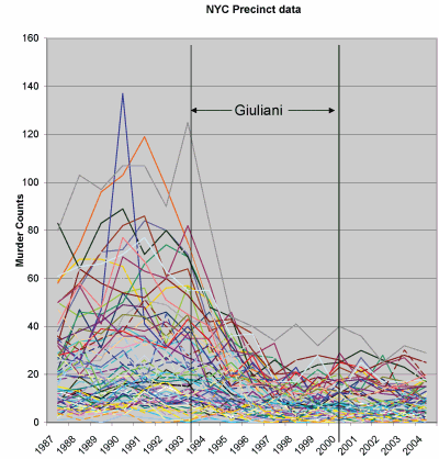
Those who wish to check state-level data for themselves can use
From BPS Research Digest, a link to a study that found a group people with Tourette's syndrome to outperform control subjects on an eye-movement task: 'The researchers said the patients’ superior performance at the task “may reflect a compensatory change in which the chronic suppression of tics results in a generalised suppression of reflexive behaviour in favour of increased cognitive control”.'
My only criticism of the news article is that, in writing, "they actually have greater cognitive control than healthy people," there is the implication that people with Tourette's are unhealthy, which doesn't seem quite right to me.
P.S. On an unrelated note: the BPS digest has several links, including one to this cool Deception Blog.
Date: Wed, 19 Apr 2006 13:46:11 -0400
From: patrick.e.flanagan@census.gov
Subject: Job Opportunity at Bureau of the Census
The job listed below may be of interest to those with Bayesian background.
Job: DSMD-2006-0018 & DSMD-2006-0019
Job Position: 1529 Mathematical Statistician
Job Description: Mathematical Statistician, GS-1529-14, Leader of the
Small Area and Population Estimates Methods
Staff in the Demographic Statistical Methods Division
Job grade: GS-14
Close Date: 04/27/2006
Salary Range: $91407.00-$118828.00
1 vacancy at Washington DC Metro Area, DC (Suitland, MD)
Follow this link to the job listed above:
https://jobs.quickhire.com/scripts/doc.exe/rundirect?Org=1&Job=6365
This position is also listed with USAJobs website
http://www.usajobs.opm.gov as Control Number 642688
Patrick Flanagan
Assistant Division Chief
Demographic Statistical Methods Division
Bureau of the Census
Atiba Pertilla writes,
I read your paper "Rich state, poor state, red state, blue state" with a great deal of interest. I think it's very important to cut through facile generalizations about income levels and voting behavior.That said, I would like to know if you've ever thought of looking at
housing costs as one way of controlling for variation in economic
conditions from one part of the country to another. In other words, a
$60,000 salary can provide you a lot more house in Laramie, Wyoming
than it does in Marin County, California. I know that your argument is
in part about people's perception of their income relative to those
richer and poorer than them, but it seems important to note that the
standard of living provided by a certain income is likely to vary
considerably from one part of the country to another regardless of how
people perceive their income relative to the folks in the next
subdivision over.Data that might help you investigate this possibility could be taken
from HUD's studies of fair market rent conditions around the country.
My reply:
Continue reading Sorry, but . . . more on red and blue states.
George Kahrimanis commented on my paper on the boxer and the wrestler, writing:
First, a matter of presentation. The scenario that accounts for the condition `X=Y' is implausible as a story. That is, the friend knowing the results but only telling us that X=Y. Imo the impact of your argument will increase if you simply assume a conditional bet: "(1,1) vs. (0,0)" (the other two possible outcomes just void this bet).The second remark is also about strengthening the impact of your argument, by means of describing some problem context for which the robust Bayes framing is appropriate, and another problem context for which the Dempster framing is appropriate.
If you are interested, I shall show you two examples of problem contexts.
My response:
1. I'd be interested to hear the two examples, of course.
2. Another way of framing the boxer-wrestler paper--perhaps a better way to frame it--would be to line up the two examples:
(a) betting on the boxing/wrestling match
(b) betting on a coin flip.
Each of these is 50/50 bet (assuming complete ignorance about the fight, as discussed in the paper); the puzzle is, how can they be distinguished operationally. (The answer, as discussed in the paper, is by considering what would happen by conditioning on more information.)
A Pew Research Center study (linked to from sycophant) finds a "Lake Wobegon effect" in how Americans perceive obesity:
Americans believe their fellow Americans have gotten fat. They consider this a serious national problem. But when they think about weight, they appear to use different scales for different people.Nine-in-ten American adults say most of their fellow Americans are overweight. But just seven-in-ten say this about "the people they know." And just under four-in-ten (39%) say they themselves are overweight.
These sliding assessments are drawn from a Pew Research Center telephone survey conducted from February 8 through March 7 among a randomly selected, representative national sample of 2,250 adults.
The survey finds that most Americans, including those who say they are overweight, agree that personal behavior - rather than genetic disposition or marketing by food companies - is the main reason people are overweight. In particular, the public says that a failure to get enough exercise is the most important reason, followed by a lack of willpower about what to eat. About half the public also says that the kinds of foods marketed at restaurants and grocery stores are a very important cause, and roughly a third say the same about the effect of genetics and heredity.
The report is interesting (although they could do much much better in their data displays). It reminds me of the surveys showing misperception of the populations of ethnic minorities and immigrants.
Rafael pointed me to this link:

I can't quite figure out what's on that wall, but I wonder if it could be ordered a bit so that anomalies would show up more (as in the cover image of Bayesian Data Analysis).
I can't remember where I saw the link to this page but it looks pretty good to me. Most of the entries are from 2000 and 2001 but are none the worse for that. It has sections on:
1. Data Input/Output
2. Working with data frames: Recoding, selecting, aggregating
3. Matrices and vector operations
4. Applying functions, tapply, etc
5. Graphing
6. Common Statistical Chores
7. Model Fitting (Regression-type things)
8. Packages: Where do I find....
9. Misc. web resources not listed in main R materials (?)
10. R workspace
11. Interface with the operating system
12. Stupid R tricks: basics you can't live without
13. Misc R usages I [Paul Johnson] find interesting
After seeing Larry Bartels present
Attitudes about what presidents can do for the economy
But the general perceptions about Presidents and the economy have changed over time.
Mark Aguiar and Erik Hurst write that, since 1965,
leisure for men increased by 6-8 hours per week (driven by a decline in market work hours) and for women by 4-8 hours per week (driven by a decline in home production work hours). This increase in leisure corresponds to roughly an additional 5 to 10 weeks of vacation per year, assuming a 40-hour work week.
Without actually reading the article (that would reduce my all-important leisure time), I'll give my thought about how these results could be consistent with the findings of Juliet Schor about the "overworked American" (following the link from Tyler Cowen's entry that alterted me to the Aguiar and Hurst article).
Could it be that middle-aged people (such as myself) find ourselves working more each year and taking on more responsibilities, thus perceiving an "overworked American" phenomenon even if it's not occurring on average. That is, suppose that each of us is becoming a bit more overworked each year, but then at the endpoints, overworked middle-aged people are being replaced by young people with more free time. This would feel like increasing overworkedness for each of us, but on average, the workload would remain the same. (Mathematically, this is just a within/between discrepancy that arises in the so-called ecological fallacy.)
It looks like Aguiar/Hurst and Schor would disagree on other aspects of the problem (not just this statistical technicality), but my point here is: suppose Aguiar/Hurst are right. Then I could see how Schor's results would be plausible to reviewers who find their own workloads increasing.
P.S. Writing the blog is work, not leisure. But I like my work.
Phil spotted this one, from the Associated Press:
Researcher: Tectonic Plates Slowly Moving
This could be interesting:
APPLIED MATHEMATICS COLLOQUIUMTuesday, April 18
2:45-3:45 PM
Room 214 MuddEfficiency of flapping flight: birds vs. planes
Jane Wang, Cornell UniversityFlapping and fixed wing provide two means to fly. Birds and insects have evolved to employ the first method and we have succeeded in using the second. We do not know, however, whether and which one is more efficient. In this talk, I will define and discuss the aerodynamic efficiency of flapping flight both in models and in insect flight. In particular, I will focus on lessons learned from dragonfly flight and free falling paper.
The United States is amidst a war in Iraq. Entry into the war by the U.S. was justified on multiple grounds. One such justification was the connection between Al Qaeda and Iraq. Political leaders have described an Iraq that has provided aid and comfort to terrorist operatives. As late as June 17, 2004, Vice President Richard Cheney argued, “There clearly was a relationship. It’s been testified to. It goes back to the early ‘90s. It involves a whole series of contacts, high-level contacts with Osama Bin Laden and Iraqi intelligence officials.” The issue continues to be debated. What has gone largely unnoticed is a bit of history that closely links Al Qaeda with the situation in Iraq in a fashion rarely discussed.
Continue reading Al Qaeda and Iraq: An Under Explored Link.

Books


Recent Comments