Results matching “R”

Seats-votes curve for 2006

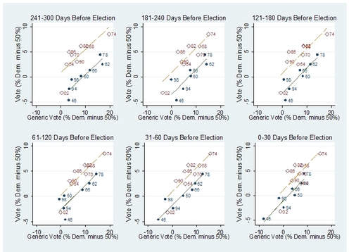
This is actually the curve John Kastellec estimated for 2006 using the 2004 election data (it's in our paper):

sv2006_from_2004.png

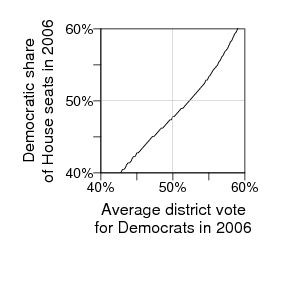
But the curve as estimated from the 2006 elections (once we have all the data in a convenient place) will look similar. It's basically consistent with what happened (with 56% of the vote, the Democrats got a bit more than 53% of the seats).

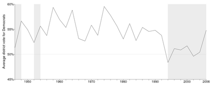
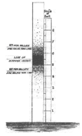
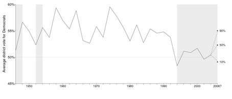
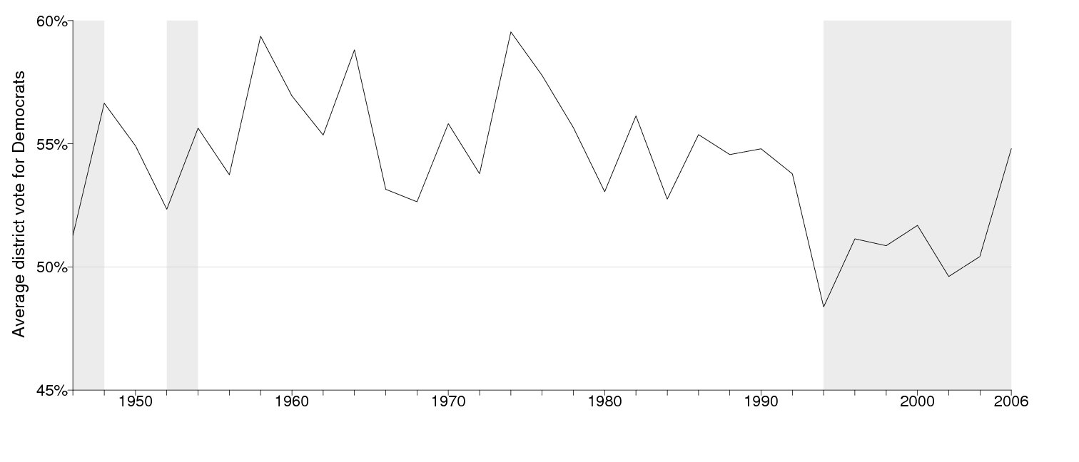
The historical pattern of votes is shown here. In 2006, the Democrats matched their historical performance in the 1960s-1980s in votes, but not in seats.

Our 1991 paper has more background on historical seats-votes curve.

Update: The numbers changed a bit since this entry was posted the other day. The Democrats got 55% of the average district vote, not 56%. (The confusion came because we used numbers from the New York Times that counted third-party votes in a different way than we did, I think; see note at the end of this entry.)

Back to the main story:
The Democrats' victory in the 2006 election has been compared to the Republicans' in 2004. But the Democrats actually did a lot better in terms of the vote. The Democrats received 54.8% of the average district vote for the two parties in 2006, whereas the Republicans only averaged 51.6% in 1994.

There was a big jump in 2006. Here's the time series:

postelection.png

(Bigger version is here.) The shaded areas on the graph show the periods where Republicans have controlled the House. The 2006 outcome of 55% for the Democrats is comparable to their typical vote shares as the matjority party in the decades preceding the 1994 realignment.

54.8% of the vote, 53.3% of the seats

Even with their large vote majority, the Democrats only received 53.3% of the seats in the House. This is as we and Bafumi et al. anticipated. More info on the seats-votes relationship is in our recent paper. (For example, had the Republicans received 54.8% of the vote in 2006, we estimate they would've won about 245 seats.)

By the way, the Democrats' 54.8% share of the two-party vote tracks closely with the "generic congressional vote" in which they were getting 56% in the polls (that is, 52.1%/(52.1% + 40.6%)).

Technical notes

We actually calculate average district votes by imputing 75% for uncontested races (to represent the strength that the party might have had if the district had been contested; the 75% comes from computing the average vote in districts just before and just after being uncontested, based on historical data), so we needed to make corrections for uncontesteds. In 2004, we have 31 uncontested Democrats and 37 uncontested Republicans: the average district vote for the Democrats was 50.5% using our correction (or 50.0% if you simply plug in 100% for uncontested races). In 2006, there were 45 uncontested Democrats and 10 uncontested Republicans, yielding an average district vote of 54.8% using our correction (or 56.8% if you simply plug in 100%). The 56.8% number is more dramatic but I think it overstates the Democrats' strength in giving them 100% in all those districts.

Another option is to use total vote (see here) rather than average district vote. We discuss this in Section 3.3 of our paper (in particular, see Figure 4). The short answer is that we use average district vote because it represents total support for the parties across the country. The Democrats tend to do better in lower-turnout districts and so their total vote is typically slightly lower than their average district vote. See the scatterplot here.

Funniest campaign reporting

From Michael Finnegan in the LA Times, with a straight face:

The margin (Poizner beat the Democrat, 51% to 39%, with more than 10% favoring other candidates) suggests that Bustamante's TV ads highlighting the rotund lieutenant governor's weight loss failed to build voter confidence in his qualifications to regulate insurers.

A convenient random number generator

Adam Sacarny noticed some dice in my office today and we came up with a good idea for a web-accessible random number generator: Put a die in a clear plastic box attached to something that can shake it. Train a video camera on the box, and pipe it to some digit-recognition software. Then whenever someone clicks on a button on the website, it shakes the box and read off the number. (We can use one of those 20-sided dice with each digit written twice, so we get a random number between 0 and 9.) Pretty convienent, huh?

I'd like to set this up but I assume somebody's done it already. In any case it's not nearly as cool as that program that figures out what you're typing by listening to the sounds of the keystrokes.

Jeronimo Cortina, Rodolfo de la Garza, and Pablo Pinto find, surprisingly, that the ability to speak both English and Spanish has a surprisingly small association with income among Hispanics in the U.S., with the association actually being negative for managerial jobs. They write,

These findings are troubling for several reasons. They suggest that the difference in earnings may be the consequence of discrimination in labor markets. Alternatively, it is plausible that lower wages may reflect the extent to which Spanish-speaking Latinos including those who are fluent in English, receive educational services of lower quality than Hispanics that speak English only only, and even non-Hispanic whites despite similar education attainment levels.

From a statistical perspective, this sort of analysis is interesting because it is of the "dog that didn't bark" variety: not finding an expected effect, which implies that there must be something cancelling the underlying pattern (of better skills--in this case, bilinguilism--yielding higher incomes). The regressions control for a bunch of variables (education, sex, age, citizenship, region, and occupation category). I wouldn't mind seeing an analysis using matching as well. It's a challenging problem to think of causally, since the point is that they're not simply estimating the causal estimate of biligual ability--they're actually trying to demonstrate that the model has a omitted variables.

And, of course, ...

My debugging advice

debugging.png

I wanted to post the above picture because this is advice I'm giving all the time. The asterisk on the lower right represents the scenario in which problems arise when trying to fit the desired complex model. The dots on the upper left represent successes at fitting various simple versions, and the dots on the lower right represent failures at fitting various simplifications of the full model. The dotted line represents the idea that the problems can be identified somewhere between the simple models that fit and the complex models that don't.

Typically, we start at the upper left (with simple models we understand) and the lower right (the models we're trying to fit), and we debug by moving from both ends toward the middle to find where things break down.

(from chapter 19 of the new book)

Why it's rational to vote (rerun)

In anticipation of tomorrow's election, I'd like to repost this entry from 2004 explaining why it's rational to vote. I was talking there about the Presidential election but the argument is relevant for Congress also (that is, if you, unlike me, would have the chance to vote in any closely contested elections):

The chance that your vote will be nationally decisive is, at best, about 1 in 10 million. So why vote?

Schematic cost-benefit analysis

To express formally the decision of whether to vote:

U = p*B - C, where

U = the relative utility of going and casting a vote
p = probability that, by voting, you will change the election outcome
B = the benefit you would feel from your candidate winning (compared to the other candidate winning)
C = the net cost of voting

The trouble is, if p is 1 in 10 million, then for any reasonable value of B, the product p*B is essentially zero (for example, even if B is as high as $10000, p*B is 1/10 of one cent), and this gives no reason to vote.

The usual explanation

Actually, though, about half the people vote. The simplest utility-theory explanation is that the net cost C is negative for these people--that is, the joy of voting (or the satisfying feeling of performing a civic duty) outweighs the cost in time of going out of your way to cast a vote.

The "civic duty" rationale for voting fails to explain why voter turnout is higher in close elections and in important elections, and it fails to explain why citizens give small-dollar campaign contributions to national candidates. If you give the Republicans or Democrats $25, it's not because you're expecting a favor in return, it's because you want to increase your guy's chance of winning the election. Similarly, the argument of "it's important to vote, because your vote might make a difference" ultimately comes down to that number p, the probability that your vote will, in fact, be decisive.

Our preferred explanation

We understand voting as a rational act, given that a voter is voting to benefit not just himself or herself, but also the country (or the world) at large. (This "social" motivation is in fact consistent with opinion polls, which find, for example, that voting decisions are better predicted by views on the economy as a whole than by personal financial situations.)

In the equation above, B represents my gain in utility by having my preferred candidate win. If I think that the Republicans (or the Democrats) will benefit the country as a whole, then my view of the total benefit from that candidate winning is some huge number, proportional to the population of the U.S. To put it (crudely) in monetary terms, if my candidate's winning is equivalent to an average $100 for each person (not so unreasonable given the stakes in the election), then B is about $30 billion. Even if I discount that by a factor of 100 (on the theory that I care less about others than myself), we're still talking $300 million, which when multiplied by p=1/(10 million) is a reasonable $30.

Some empirical evidence

As noted above, voter turnout is higher in close elections and important elections. These findings are consistent with the idea that it makes more sense to vote when your vote is more likely to make a difference, and when the outcome is more important.

As we go from local, to state, to national elections, the size of the electorate increases, and thus the probability decreases of your vote being decisive, but voter turnout does not decrease. This makes sense in our explanation because national elections affect more people, thus the potential benefit B is multiplied by a larger number, canceling out the corresponding decrease in the probability p.

People often vote strategically when they can (in multicandidate races, not wanting to "waste" their votes on candidates who don't seem to have a chance of winning). Not everyone votes strategically, but the fact that many people do is evidence that they are voting to make a difference, not just to scratch an itch or satisfy a civic duty.

As noted above, people actually say they are voting for social reasons. For example, in the 2001 British Election Study, only 25% of respondents thought of political activity as a good way to get "benefits for me and my family" whereas 66% thought it a good way to obtain "benefits for groups that people care about like pensioners and the disabled."

Implications for voting

First, it can be rational to vote with the goal of making a difference in the election outcome (not simply because you enjoy the act of voting or would feel bad if you didn't vote). If you choose not to vote, you are giving up this small but nonzero chance to make a huge difference.

Second, if you do vote, it is rational to prefer the candidate who will help the country as a whole. Rationality, in this case, is distinct from selfishness.

See here for the full paper (joint work with Aaron Edlin and Noah Kaplan) to appear in the journal, Rationality and Society.

Serenity prayer (rerun)

This (sent to me several months ago by Will Fitzgerald) is so great I had to run it again:

ser-venn-ity.png

Here's the background on it.

Civil liberties and war

Adam Berinsky is presentjng this paper at the New York Area Political Psychology Meeting today. I don't have much to say about the content of the paper, except that a key issue would seem to me to be framing: are civil liberties a luxury (as our math professors would say in college when proving a theorem, "culture") that we can't afford in wartime, or are civil liberties a form of security that is needed more than ever during a war? I would think that many of the controversies about civil liberties--in policy discussions and in public opinion--depend on this framing.

In any case, I have some comments about the graphs in the paper. First, I like how the paper follows in the Page and Shapiro tradition of presenting results graphically rather than as tables. For the Berinsky paper, I'd recommend more consistency in the presentation, basically displaying the information, wherever possible, as line plots with time on the x-axis. This parallelism will make the paper easier to read, I think--partly because the graphs can be made physically small and thus fit into the text better, also because a compact display allows more information to be displayed and be made visible in one place (so that the reader--and the researcher--can see more comparisons and learn more).

In detail:

MCMC question

Steve Wang writes,

Persistence of red/blue illusions

Boris sent this in:

Andy Stern, president of the Service Employees International Union--and himself an Ivy League graduate--recently said that the perception of Democrats as "Volvo-driving, latte-drinking, Chardonnay-sipping, Northeast, Harvard- and Yale-educated liberals" isn't a perception at all, but rather "the reality. That is who people see as leading the Democratic Party. There's no authenticity; they don't look like them. People are not voting against their interests; they're looking for someone to represent their interests."

In this case, the reporter (Thomas Edsall) is not making the mistake (as did Michael Barone and others earlier) but rather is reporting others' take on the issue. Actually introduces a different point, which is Dem (or Rep) leaders, as compared to Dem (or Rep) party members. No doubt that the leaders of both parties (as of just about all organizations) are richer than the general membership. It's considered to be more of a problem for the Dems, however, possibly because the Democrats are supposed to be "the party of the people." The fact that the Republicans are led by "Benz-driving, golf-playing, Texas, Harvard- and Yale-educated conservatives" is not such a problem because, in some sense, the Republicans never really claim to be in favor of complete equality.

"Loss aversion" isn't always

This entry by Will Wilkinson reminded me of something that's bugged me for awhile, which is the use of term "loss aversion" to describe something that I'd rather call "uncertainty aversion," if that. (Wilkinson doesn't actually do this thing that irritates me--he actually is talking about loss aversion, referring to actual aversion to loss--but he reminds me of this issue.)

As I wrote before,

If a person is indifferent between [x+$10] and [55% chance of x+$20, 45% chance of x], for any x, then this attitude cannot reasonably be explained by expected utility maximization. The required utility function for money would curve so sharply as to be nonsensical (for example, U($2000)-U($1000) would have to be less than U($1000)-U($950)). This result is shown in a specific case as a classroom demonstration in Section 5 of a paper of mine in the American Statistician in 1998 and, more generally, as a mathematical theorem in a paper by my old economics classmate Matthew Rabin in Econometrica in 2000. . . .

Matt attributes the risk-averse attitude at small scales to "loss aversion." As Deb points out, this can't be the explanation, since if the attitude is set up as "being indifferent between [x+$10] and [55% chance of x+$20, 45% chance of x]", then no losses are involved. I attributed the attitude to "uncertainty aversion," which has the virtue of being logically possible in this example, but which, thinking about it now, I don't really believe.

Right now, I'm inclined to attribute small-stakes risk aversion to some sort of rule-following. For example, it makes sense to be risk averse for large stakes, and a natural generalization is to continue that risk aversion for payoffs in the $10, $20, $30 range. Basically, a "heuristic" or a simple rule giving us the ability to answer this sort of preference question.

There was some discussion of this on the blog last year. To recap briefly, no, I don't think this example is loss aversion, since no losses are involved. Yes, you could shift the problem by subtracting, to get losses, but that's not how it's framed. Getting back to the $40,$50,$60 example: if you want, you can say that the very mention of the $50 makes anything less seems like a loss, but I don't see it. I think the evidence is that people react to actual losses much more strongly than to a non-gain.

Risk aversion. No, it's loss aversion. No, it's uncertainty aversion. No, it's rule-following.

Anyway, my problem here is with "loss aversion" used in an automatic way to summarize various aspects of irrationality (such as avoidance of expected monetary value for small dollar amounts). My take on it (which is probably historically inaccurate) was that decision scientists first simply assumed that people used expected monetary value. Then they coined the term "risk aversion" and associated it with concave utility functions. Simple calculations (such as mine and Matt's, mentioned above) made it clear to many people (eventually everyone, I hope) that the typical non-EMV attitudes cannot be sensibly fit into an expected-utility framework. This led to ideas such as prospect theory which had aspects of expected utility but with biases caused by framing, confusions about probability, loss aversion, and so forth.

Now loss aversion is the catchphrase--and I agree, it's an improvement on the now-meaningless "risk aversion"--but I think it's silly to apply "loss aversion" to settings with no losses. Really, in some of these settings, I don't see "aversion" at all but rather a preference for certainty (perhaps "uncertaintly aversion") or even just the following of a rule.

The big issue

The big issue pointed out implicitly by Wilkinson (and others) is that people often seem to respond to the trend rather than the absolute level of the economy. I'm certainly not meaning to imply that, in battling over terminology, I'm resolving these deeper issues. My goal here is simply to point out that some commonly-used terms can have misleading implications.

Regarding Wilkinson's actual entry, his discussion is interesting, but I'm confused by his main point, which seems to be:
(a) Middle-class Americans shouldn't be so scared about losses--they'd still be able to get by OK on half their incomes.
(b) By being less afraid of losses, a middle-class American could take more risks which could result in a doubling of his or her income.
But, if point (a) is true, and you could easily live on half, then what's the motivation to double your income? Shouldn't we all just be taking more vacations?

I'm not trying to disagree with Wilkinson's point that many people's economic lives might not be so precarious as they think--as he puts it, middle-class Americans get a lot of things for free. I just don't see why this implies that people should be taking more risks.

Here's a nice description of our project (headed by Lex van Geen) to use cell phones to help people in Bangladesh to lower ther arsenic exposure.

phone.jpg

Further background is here.

Computer scientists fear voting fraud

I came across this detailed article on problems with electronic voting systems by Jon Stokes: How to steal an election by hacking the vote (also available as PDF). Some of the academics working on detecting this problem are Walter Mebane and Jasjeet Sekhon. But of course, one can be subtler than this. The ACM (Association for Computing Machinery) is active in pointing out problems, and numerous articles can be found with a Google query.

voting.png

Model diagnostics

From the Bayes-News list, Alexander Geisler writes,

My letter to the New Yorker

Dear Editors,

Ian Frazier ("Snook," October 30th) writes, "you will find suprisingly often that people take up professions suggested by their last names." In an article called "Why Susie sells seashells by the seashore: implicit egotism and major life decisions," Brett Pelham, Matthew Mirenberg, and John Jones found some striking patterns. Just for example, there were 482 dentists in the United States named Dennis, as compared to only 260 that would be expected simply from the frequencies of Dennises and dentists in the population. On the other hand, the 222 "extra" Dennis dentists are only a very small fraction of the 620,000 Dennises in the country; this name pattern thus is striking but represents a small total effect. Some quick calculations suggest that approximately 1% of Americans' career choices are influenced by the sound of their first name.

Yours
Andrew Gelman

[not in the email] Here's the relevant link.

Dartmouth postdoc in applied statistics

Joe Bafumi writes,

Dartmouth College seeks applicants for a post-doctoral fellowship in the area of applied statistics. Dartmouth is developing a working group in applied statistics, and the fellowship constitutes one part of this new initiative. The applied statistics fellow will be in residence at Dartmouth for the 2007-2008 academic year, will teach one 10-week introductory course in basic statistics, and will be expected to further his or her research agenda during time at Dartmouth. Research speciality is open but applicants should have sufficient inter-disciplinary interest so as to be willing to engage different fields of study that rely on quantitative techniques. The fellow will receive a competitive salary with a research account. Dartmouth is an EO/AA employer and the college encourages applications from women and minority candidates. Applications will be reviewed on a rolling basis. Applicants should send a letter of interest, two letters of recommendation, one writing sample, and a CV to Michael Herron, Department of Government, 6108 Silsby Hall, Hanover, NH 03755.

This looks interesting to me. I suggested to Joe that they also invite visitors to come for a few days at a time to become actively involved in the research projects going on at Dartmouth.

Jo-Anne Ting writes,

I'm from the Computational Learning and Motor Control lab at the University of Southern California. We are currently looking at a weighted linear regression model where the data has unequal variances (as described in your "Bayesian Data Analysis" book). We use EM to infer the parameters of the posterior distributions.

However, we have noticed that in the scenario where the data set consists of a large number of outliers that are irrelevant to the regression, the value of the posterior predictive variance would be affected by the number of outliers in the data set, since the posterior variance of the data is inversely proportional to the number of samples in the data set. It seems to me that logically, this should not be the case, since I would hope the amount of confidence associated with a prediction would not be decreased by the number of outliers in the data set.

Any insight you could share would be greatly appreciated regarding the effect of the number of samples in a data set on the confidence interval of a prediction in heteroscedastic regression.

My response: I'm not quite sure what's going on here, because I'm not quite sure what the unequal-variance model is that's being used. But if you have occasional outliers, then, yes, the predictive variance should be large, since the preidcitive variance represents uncertainty about individual predicted data points (which, from the evidence of the data so far, could indeed be "outliers"; i.e., far from the model's point prediction).

One way to get a handle on this would be to do some cross-validation. Cross-validation shouldn't be necessary if you fully understand and believe the model, but if you're still trying to figure things out it can be a helpful way to see if the predictions and predictive uncertainties make sense.

Michael Sobel is speaking Monday Here's the abstract:

During the past 20 years, social scientists using observational studies have generated a large and inconclusive literature on neighborhood effects. Recent workers have argued that estimates of neighborhood effects based on randomized studies of housing mobility, such as the “Moving to Opportunity Demonstration” (MTO), are more credible. These estimates are based on the implicit assumption of no interference between units, that is, a subject’s value on the response depends only on the treatment to which that subject is assigned, not on the treatment assignments of other subjects. For the MTO studies, this assumption is not reasonable. Although little work has been done on the definition and estimation of treatment effects when interference is present, interference is common in studies of neighborhood effects and in many other social settings, for example, schools and networks, and when data from such studies are analyzed under the “no interference assumption”, very misleading inferences can result. Further, the consequences of interference, for example, spillovers, should often be of great substantive interest, though little attention has been paid to this. Using the MTO demonstration as a concrete context, this paper develops a framework for causal inference when interference is present and defines a number of causal estimands of interest. The properties of the usual estimators of treatment effects, which are unbiased and/or consistent in randomized studies without interference, are also characterized. When interference is present, the difference between a treatment group mean and a control group mean (unadjusted or adjusted for covariates) does not estimate an average treatment effect, but rather the difference between two effects defined on two distinct subpopulations. This result is of great importance, for a researcher who fails to recognize this could easily infer that a treatment is beneficial when it is universally harmful.

Here's the paper. (Scroll past the first page which is blank.) See here for more on Sobel and causal inference. The talk is Mon noon in the stat dept.

Rattle - data mining interface for R

The type of user interfaces we are used from data mining and machine learning are slowly appearing for the R environment. Today I found Rattle - a Gnome-based interface to R (via KDnuggets). While tools like Weka or Orange are still a generation ahead of Rattle, Rattle itself is quite a bit better for certain types of tasks, such as model evaluation, compared to the usual command line interface. Here's an example of ROC-based evaluation on various models on the same dataset:

rattle.png

One of the benefits of Rattle is that it also acts as a guide to various interesting R packages that I was not aware of earlier, and shows how they can be used: it generates a script created from the commands that were clicked graphically (something other systems could also do). The main downside of Rattle is that it only works with the latest version of R 2.4, but not with the earlier versions.

From Joe, here are the data that he used to predict House vote shares from pre-election polls in midterm elections for the Erikson, Bafumi, and Wlezien paper:

congpolls2.jpg

(See here for the big version of the graph.)

Advice for referees

Tyler Cowen has some tips here. I disagree with his point 2. I try to do all referee reports within 15 minutes of receiving them. On the other hand, it would probably be a disaster if all referees followed my approach. A diversity of individual strategies probably results in the best collective outcome. I'm often impressed by the elaborate referee reports given for my own articles. On the other hand, my reports are always on time, and my judgments are trustworthy (I think).

Also, my impression is that the referee process is more serious in economics than in other fields, so that might explain some of our differences in approach.

Validation of posterior probabilities

John Monahan and Dennis Boos pointed out that one of the key ideas in this paper by Sam Cook, Don Rubin, and myself also arose in two papers of theirs. They write,

My colleagues Joe Bafumi, Bob Erikson, and Christopher Wlezien just completed their statistical analysis of seat and vote swings. They write:

Via computer simulation based on statistical analysis of historical data, we show how generic vote polls can be used to forecast the election outcome. We convert the results of generic vote polls into a projection of the actual national vote for Congress and ultimately into the partisan division of seats in the House of Representatives. Our model allows both a point forecast—our expectation of the seat division between Republicans and Democrats—and an estimate of the probability of partisan control. Based on current generic ballot polls, we forecast an expected Democratic gain of 32 seats with Democratic control (a gain of 18 seats or more) a near certainty.

These conclusions seem reasonable to me, although I think they are a bit over-certain (see below).

Here's the full paper. Compared to our paper on the topic, the paper by Bafumi et al. goes further by predicting the average district vote from the polls. (We simply determine what is the vote needed by the Democrats to get aspecified numer of seats, without actually forecsasting the vote itself.) In any case, the two papers use similar methodology (although, again, with an additional step in the Bafumi et al. paper). In some aspects, their model is more sophisticated than ours (for example, they fit separate models to open seats and incumbent races).

Slightly over-certain?

The only criticism I'd make of this paper is that they might be understating the uncertainty in the seats-votes curve (that is, the mapping from votes to seats). The key point here is that they get district-by-district predictions (see equations 2 and 3 on page 7 of their paper) and then aggregate these up to estimate the national seat totals for the two parties. This aggregation does include uncertainty, but only of the sort that's independent across districts. In our validations (see section 3.2 of our paper), we found the out-of-sample predictive error of the seats-votes curve to be quite a bit higher than the internal measure of uncertainty obtained by aggregating district-level errors. We dealt with this by adding an extra variance term to the predictive seats-votes curve.

In summary

I like this paper, it seems reasonable, and I like how they do things in two steps: using the polls to predict the national swing and then using district-level information to estimate the seats-votes curve. I'd like to see the scatterplot that would accompany equation 1, and I think the election outcome (# of seats for each party) isn't quite so predictable as they claim, but these are minor quibbles. It goes beyond what we did, and all of this is certainly a big step beyond the usual approach of just taking the polls, not knowing what to do with them, and giving up!

Galton was a hero to most

In Graphics of Large Datasets: Visualizing a Million (about which more in a future entry), I saw the following graph reproduced from an 1869 book by Francis Galton, one of the fathers of applied statistics:

Genius.png

According to this graph [sorry it's hard to read: the words on the left say "100 per million above this line", "Line of average height", and "100 per millon above this line"; and on the right it says "Scale of feet"], one man in a million should be 9 feet tall! This didn't make sense to me: if there were about 10 million men in England in Galton's time, this would lead us to expect 10 nine-footers. As far as I know, this didn't happen, and I assume Galton would've realized this when he was making the graph.

From the long New York Times article on an example of scientific fraud by grant-hogging entrepreneurs-in-academia, imputation was used as an excuse for manipulating data to support the anticipated hypothesis:

Then, when pressed on how fictitious numbers found their way into the spreadsheet he’d given DeNino, Poehlman laid out his most elaborate explanation yet. He had imputed data — that is, he had derived predicted values for measurements using a complicated statistical model. His intention, he said, was to look at hypothetical outcomes that he would later compare to the actual results. He insisted that he never meant for DeNino to analyze the imputed values and had given him the spreadsheet by mistake. Although data can be imputed legitimately in some disciplines, it is generally frowned upon in clinical research, and this explanation came across as hollow and suspicious, especially since Poehlman appeared to have no idea how imputation was done.

The sentence was one year and one day in federal prison, followed by two years of probation.

Map of Springfield

Here's an amusing data visualization:

springfield.jpg

Here is the full-size map (pdf version here). Some more info:

While the placement of most locations is arbitrary, many are placed according to where they appear in relationship to each other in specific episodes of The Simpsons. In some cases 'one-time references' to specific locations have been disregarded in favor of others more often repeated. Due to the many inconsistencies among episodes, the map will never be completely accurate.

(Link from Information Aesthetics blog.)

After I spoke at Princeton on our studies of social polarization, John Londregan had a suggestion for using such questions to get more precise survey estimates. His idea was, instead of asking people, "Who do you support for President?" (for example), you would ask, "How many of your close friends support Bush?" and "How many of your close friends support Kerry?" You could then average these to get a measure of total support.

The short story is that such a measure could increase bias but decrease variance. Asking about your friends could give responses in error (we don't really always know what our friends think), and also there's the problem that "friends" are not a random sample of people (at the very least, we're learning about the more popular people, on average). On the other hand, asking the question this way increases the effective sample size, which could be relevant for estimating small areas. For example, in a national poll, you could try to get breakdowns by state and even congressional district.

It might be worth doing a study, asking questions in different ways and seeing what is gained and lost by asking about friends/acquaintances/whatever.

It's not easy being a Democrat. After their stunning loss of both houses of Congress in 1994, the Democrats have averaged over 50% of the vote in Congressional races in every year except 2002, yet they have not regained control of the House. The same is true with the Senate: in the last three elections (during which 100 senators were elected), Democratic candidates have earned three million more votes than Republican candidates, yet they are outnumbered by Republicans in the Senate as well. 2006 is looking better for the Democrats, but our calculations show that they need to average at least 52% of the vote (which is more than either party has received since 1992) to have an even chance of taking control of the House of Representatives.

Why are things so tough? Looking at the 2004 election, the Democrats won their victories with an average of 69% of the vote, while the Republicans averaged 65% in their contests, thus ``wasting'' fewer votes. The Republicans won 47 races with less than 60% of the vote; the Democrats only 28. Many Democrats are in districts where they win overwhelmingly, while many Republicans are winning the close races--with the benefit of incumbency and, in some cases, favorable redistricting.

105090_graph.png

The accompanying chart (larger version here) shows the Democrats' share of the Congressional vote over the past few decades, along with what we estimate they need to have a 10%, 50%, and 90% chance of winning the crucial 218 seats in the House of Representatives. We performed the calculation by constructing a model to predict the 2006 election from 2004, and then validating the method by applying it to previous elections (predicting 2004 from 2002, and so forth). We predict that the Democrats will need 49\% of the average vote to have a 10% chance, 52% of the vote to have an even chance, and 55% of the vote to have a 90% chance of winning the House. The Democrats might be able to do it, but it won't be easy.

See here for the full paper (by John Kastellec, Jamie Chandler, and myself)..

P.S. After we wrote this article (and the above summary), we were pointed to some related discussions by Paul Krugman (see links/discussions from Mark Thoma and Kevin Drum) and Eric Alterman. They do their calculations using uniform partisan swing whereas we allow for variation among districts in swings, but the general results are the same.

What makes a good radio interview?

Leonard Lopate interviewed me today on local rado to talk about my paper, Rich State, Poor State, Red State, Blue State: What's the Matter with Connecticut (coauthored with Boris Shor, Joe Bafumi, and David Park). I've been a fan of Lopate for awhile (ever since hearing his interview with the long-distance swimmer Lynne Cox), but I have a much better sense of what makes him a good interviewer, now that I've been interviewed myself.

The trick is that he had a series of questions. If he had let me just ramble on for five minutes, I would've come off horribly, but I was able to answer the questions one at a time and explain things clearly. At the same time, the interview was live, and I didn't see the questions ahead of time, so things were spontaneous. (I only wish I had remembered to mention that we found similar patterns in Mexican elections.)

It was interesting to get this insight into interviewing techniques.

Productivity at elite universities

At the Deutsche Bank Group think tank, I have spotted Are elite universities losing their competitive edge? by Han Kim, Morse and Zingales. It's an interesting application of multilevel modeling. I won't write too much because the abstract is self-explanatory:


We study the location-specific component in research productivity of economics and finance faculty who have ever been affiliated with the top 25 universities in the last three decades. We find that there was a positive effect of being affiliated with an elite university in the 1970s; this effect weakened in the 1980s and disappeared in the 1990s. We decompose this university fixed effect and find that its decline is due to the reduced importance of physical access to productive research colleagues. We also find that salaries increased the most where the estimated externality dropped the most, consistent with the hypothesis that the de-localization of this externality makes it more difficult for universities to appropriate any rent. Our results shed some light on the potential effects of the internet revolution on knowledge-based industries.

Here is a plot of research output (measured in journal publications) given the number of post-PhD years:

research productivity.png

My main "complaint" against the paper is that "measuring" research productivity in terms of quantity or citation impact is asking for trouble: With Goodheart's law, it's very easy to optimize for number of publications (splitting research into the smallest publishable bit), citations (cite your friends and have your friends cite you), impact of the journals you publish in (polish the paper so that it glitters, and sprinkle it with impenetrable mathematical mystique). What really matters is stuff that people will read and be affected by it. Most of the good papers I have read in the past few years weren't published in an elite journal: I have read drafts, circulations, web pages. And most of the time I spent reading elite journals was a waste of time.

The sociology of sociology

I came across this letter by Jordan Scher from the London Review of Books a couple years ago:

Jenny Diski's portrait of Erving Goffman and her characterisation of the period from the late 1950s to the 1970s precisely captures the flavour of those fermentative days (LRB, 4 March). I came to know Goffman in the late 1950s when he and I were 'shaking the foundations' of, respectively, sociology and psychiatry at the National Institute of Mental Health in Bethesda, Maryland. We became competitive 'friends', if such were possible with this Cheshire-Cat-smiling porcupine.

Many of my experiences with Goffman revolved around Saturday night dinner parties. Always tinkering with the elements of personal interchange, Goffman frequently toyed with me regarding invitations to these parties. He would invite a young sociological student, Stewart Perry, with whom I shared an office, and his wife, a sociologist, to dinner proper. I would be invited, not to dinner, but as a post-prandial guest. Naturally, being as prickly as Goffman, but refusing to succumb to his baiting, I would politely decline. The slight must surely have delighted him.

Goffman was then 'outsourcing' himself at St Elizabeth's Hospital, beginning the research that eventually led to Asylums. At the same time, I was directing a ward of chronic schizophrenics at NIMH, developing treatment based on a structured programme of habilitation and rehabilitation. My maverick efforts provoked great controversy in the face of the prevailing psychoanalytic and 'permissive' orientation of the NIMH. I felt that Goffman and I shared a sort of intellectual kinship. Both of us viewed human behaviour as the ludic, or play-acting, presentation of self.

My last encounter with Goffman must have been during the final year of his life. We bumped into each other at a professional meeting, where he greeted me with a typical smiling riposte: 'I always thought I was going to hear much more of you! What happened?' 'How is your wife?' I asked. 'She killed herself,' he replied matter-of-factly. 'Finally escaped you,' I rejoined. (She had made several suicide attempts while we were at NIMH.)

Discarded Ipods: a sampling problem

Carrie asks:

If by any chance you're still teaching kids to do surveys, we have a project we could REALLY use help on. . . . we'd love to have a survey of ipod users asking them how many ipods they have owned, how often they used each of them, and how long they lasted before dying. We'd then like to crunch that data to find the likelihood of the ipod dying at given intervals.

Matt writes,

Tex and Jimmy sent me links to this study by Gilbert Burnham, Riyadh Lafta, Shannon Doocy, and Les Roberts estimating the death rate in Iraq in recent years. (See also here and here for other versions of the report). Here's the quick summary:

Between May and July, 2006, we did a national cross-sectional cluster sample survey of mortality in Iraq. 50 clusters were randomly selected from 16 Governorates, with every cluster consisting of 40 households. Information on deaths from these households was gathered. Three misattributed clusters were excluded from the final analysis; data from 1849 households that contained 12 801 individuals in 47 clusters was gathered. 1474 births and 629 deaths were reported during the observation period. Pre-invasion mortality rates were 5·5 per 1000 people per year (95% CI 4·3–7·1), compared with 13·3 per 1000 people per year (10·9–16·1) in the 40 months post-invasion. We estimate that as of July, 2006, there have been 654 965 (392 979–942 636) excess Iraqi deaths as a consequence of the war, which corresponds to 2·5% of the population in the study area. Of post-invasion deaths, 601 027 (426 369–793 663) were due to violence, the most common cause being gunfire.

And here's the key graph:

iraq.png

Well, they should really round these numbers to the nearest 50,000 or so, But that's not my point here. I wanted to bring up some issues related to survey sampling (a topic that is on my mind since I'm teaching it this semester):

Cluster sampling

The sampling is done by clusters. Given this, the basic method of analysis is to summarze each cluster by the number of people and the number of deaths (for each time period) and then treat the clusters as the units of analysis. The article says they use "robust variance estimation that took into account the correlation," but it's really simpler than that. Basically, the clusters are the units. With that in mind, I would've liked to have seen the data for the 50 clusters. Strictly speaking, this isn't necessary, but it would've fit in easily enough in the paper (or, certainly, in the technical report) and that would make it easy to replicate that part of the analysis.

Ratio estimation

I couldn't find in the paper the method that was used to extrapolate to the general population, but I assume it was ratio estimation (reporting deaths from 629/12801 = 4.9%, and if you then subtract the deaths before the invasion, and multiply by 12/42 (since they're counting 42 months after the invasion), I guess you get the 1.3% reported in the abstract). For pedagical purposes alone, I would've liked to see this mentioned as a ratio esitmate, (especially since this information goes into the standard error).

Inicidentally, the sampling procedure gives an estimate of the probability that each household in the sample is selected, and from this we should be able to get an estimate of the total popilation and total #births, and compare to other sources.

I also saw a concern that they would oversample large households, but I don't see why that would happen from the study design; also, the ratio estimation should fix any such problem, at least to first order. The low nonresponse numbers are encouraging if they are to be believed.

It's all over but the attributin'

On an unrelated note, I think it's funny for people to refer to this as the "Lancet study" (see, for example, here for some discussion and links). Yes, the study is in a top journal, and that means it passed a referee process, but it's the authors of the paper (Burnham et al.) who are responsible for it. Let's just say that I woldn't want my own research referred to as the "JASA study on toxivology" or the "Bayesian Analysis report on prior distributions" or the "AJPS study on incumbency advantage" or whatever.

Age and voting

There was a related article in the paper today (here's the link, thanks to John K.) so I thought I'd post these pictures again:

27-4.gif

27-2.gif

27-3.gif

See here for my thoughts at the time.

Thinking more statistically . . .

This is a paradigmatic age/time/cohort problem. We'd like to look at a bunch of these survey results over time, maybe also something longitudinal if it's available, then set up a model to estimate the age, time, and cohort patterns (recognizing, as always, that it's impossible to estimate all of these at once without some assumptions).

Juliet Eilperin wrote an article in the October Atlantic Monthly on the struggles of moderates running for reelection in Congress. She makes an error that's seductive enough that I want to go to the trouble of correcting it. Eilperen writes:

The most pressing issue in American politics this November shouldn’t be who’s going to win seats in the House of Representatives, but who’s most likely to lose them: moderates in swing districts. We’ve set up a system that rewards the most partisan representatives with all-but-lifetime tenure while forcing many of those who work toward legislative compromises to wage an endless, soul-sapping fight for political survival.

Thanks to today’s expertly drawn congressional districts, most lawmakers represent seats that are either overwhelmingly Republican or overwhelmingly Democratic. As long as House members appeal to their party’s base, they’re in okay shape—a strategy that has helped yield a 98 percent reelection rate on Capitol Hill.

She continues with lots of stories about how the moderates in Congress have to work hard for reelection, and how the system seems stacked against them.

But . . . this isn't quite right. Despite all the efforts of the gerrymanderers, there are a few marginal seats, some districts where the Dems and Reps both have a chance of winning. If you're a congressmember in one of these districts, well, yeah, you'll have to work for reelection. It doesn't come for free.

These marginal districts are often represented by moderates. But it's the composition of the district, not the moderation of the congressmember, that's making the elections close. If the congressmember suddenly became more of an extremist, he or she wouldn't suddenly get more votes--in fact, most likely they would lose votes by becoming more extreme (contrary to the implication of the last sentence in the above quotation).

In summary

Congressmembers running for reelection in marginal seats have to work hard, especially if their party seems likely to lose seats (as with the Democrats in 1994 and, possibly, the Republicans this year). But they're having close races (and possibly losing) because of where they are, not because of their moderate views. And, perhaps more to the point, what's the alternative? Eilperen has sympathy for these congressmembers, but if somebody has to worry about reelection or there'd never be any turnover in congress at all.

P.S. A perhaps more interesting point, not raised in the article, is why aren't there more successful primary election challengers in the non-marginal seats.

cool != beneficial

In a letter published in the latest New Yorker, Douglas Robertson writes,

James Surowiecki, in his column on sports betting, writes, "How much difference is there, after all, between betting on the future price of wheat . . . and betting on the performance of a baseball team?" (The Financial Page, September 25th). Future markets in products such as wheat allow famers and other producers to shield themselves from some financial risks, and thereby encourage the production of necessities. In this sense, the futures markets are more akin to homeowners' insurance or liability insurance than to gambling on sports. But there is no corresponding economic benefit to betting on sports; on the contrary, there are serious costs involved in protecting the sports activities from fixing and other corruptions that invariably accompany such gambling activity.

This is a good point. I enjoy gambling in semi-skill-based settings (poker, sports betting, election pools, etc.), and betting markets are cool, but it is useful to step back a bit and consider the larger economic benefits or risks arising from such markets.

More physicist-bashing

Drago Radev mentions "a discussion from a few years ago between a group of physicists in Italy (Benedetto et al.) and Joshua Goodman (a computer scientist at Microsoft Research)":

Benedetto et al. had published a paper (”Language Trees and Zipping“) in a good Physics journal (Physical Review Letters) in which they showed a compression-based method for identifying patterns in text and other sequences.

According to Goodman

“I first point out the inappropriateness of publishing a Letter
unrelated to physics. Next, I give experimental results showing that
the technique used in the Letter is 3 times worse and 17 times
slower than a simple baseline, Naive Bayes. And finally, I review
the literature, showing that the ideas of the Letter are not
novel. I conclude by suggesting that Physical Review Letters should
not publish Letters unrelated to physics.”

Benedetto et al’s rebuttal appeared in Arxiv.org

P.S. I think it's ok for me to make fun of physicists since I majored in physics in college and switched to statistics because physics was too hard for me.

Sweden is not Finland

I came across this:

While some Scandinavian countries are known to have high levels of suicide, many of them – including Sweden, Finland and Iceland – ranked in the top 10 for happiness. White believes that the suicide rates have more to do with the very dark winters in the region, rather than the quality of life.

Jouni's response:

Technically it's correct - "While *some* Scandnavian countries ... have high levels of suicide ... Sweden, Finland and Iceland ranked in the top 10 for happiness..."

That "some Scandinavian country" is Finland; Sweden (or Iceland - surprisingly) has roughly 1/2 the suicide rate of Finland.

Readings For the Layman

Paul Mason writes,

I have been trying to follow the Statistical Modeling, Causal Inference, and Social Science Blog. I have had a continuing interest in statistical testing as an ex-Economics major and follower of debates in the philosophy of science. But I am finding it heavy going. Could you point me to (or post) some material for the intelligent general reader.

I'd start with our own Teaching Statistics: A Bag of Tricks, which I think would be interesting to learners as well. And I have a soft spot for our new book on regression and multilevel modeling. But perhaps others have better suggestions?

Andrew Gelman has a blog

Politically committed research

I was talking with Seth about his and my visits to the economics department at George Mason University. One thing that struck me about the people I met there was that their research was strongly aligned with their political convictions (generally pro-market, anti-government).

I discussed some of this here in the context of my lunch conversation with Robin Hanson and others about alternatives to democracy and here in the context of Bryan Caplan's book on voting, but it comes up in other areas too; for example, Alex Tabarrok edited a book on private prisons. My point here is not to imply that Alex etc. are tailoring their research to their political beliefs but rather that, starting with these strong beliefs about government and the economy, they are drawn to research that either explores the implications or evaluates these beliefs.

Comparable lines of research, from the other direction politically, include the work of my colleagues in the Center for Family Demography and Public Policy on the 7th floor of my building here at Columbia. My impression is that these folks start with a belief in social intervention for the poor and do research in this area, measuring attitudes and outcomes and evaluating interventions. Again, I don't think they "cheat" in their research--rather, they work on problems that they consider important.

This all reminded me of something Gary King once said about our own research, which is that nobody could ever figure out our own political leanings by reading our papers. I'm not saying this to put ourselves above (or below) the researchers mentioned above--it's just an interesting distinction to me, of different styles of social science research. I mean, there's no reason I couldn't study privatized prisons or social-work interventions (and come to my own conclusion about either), it just hasn't really happened that way. (I've done some work on a couple of moderately politically-charged topics--the death penalty and city policing, but in neither case did I come into the project with strong views--these were just projects that people asked me to help out on.)

There's no competition here--there's room for politically committed and more dispassionate research--it's just interesting here to consider the distinction. (See here for more on the topic.) I think it takes a certain amount of focus and determination to pursue research on the topics that you consider to be the most politically important. I don't seem to really have this focus and so I end up working more on methodology or on topics that are interesting or seem helpful to somebody even if they aren't necessarily the world's most pressing problems.

My talk on redblue

I'll be speaking in Cambridge on 9 Oct for the Boston chapter of the American Statistical Association. Here's the info.

Neal writes,

In your entry on mutlilevel modeling, you note that de Leeuw was "pretty critical of Bayesian multilevel modeling" In your paper, you say "compared with classical regression, multilevel model is almost an improvement, but to varying degrees."

So my question to you is: other than issues of computations, and perhaps not jumping linguistic hoops, what is the relevance of the Bayesian modifier of multilevel modeling? Would the issues be any different for classical mixed effects modeling?

My response: the Bayesian version averages over uncertainty in the variance parameters. This is particularly important when the number of groups is small, or the model is complicated, and when the actual group-level variance is small, in which case it can get lost in the noise.

Also, we discuss some of this in Sections 11.5 in our book. I hope we made the above point somewhere in the book, but I'm not sure that we remembered to put it in. The point is made most clearly (to me) in the 8-schools example, which is in Chapter 5 of Bayesian Data Analysis and comes from an article by Don Rubin from 1981.

Language difficulties: Vapnik edition

I think I should attend this talk (see below) by the renowned Vladimir Vapnik, but once again the language of computer science leaves me baffled:

More thoughts on publication bias

Neal writes,

Thanks for bringing up the most interesting piece by Gerber and Malhotra and the Drum comment.

My own take is perhaps a bit less sinister but more worrisome than Drum's interpretation of the results. The issue is how "tweaking" is interpreted. Imagine a preliminary analysis which shows a key variable to have a standard error as large as its coefficient (in a regression). Many people would simply stop analysis at that point. Now consider getting a coefficient one and a half times its standard error (or 1.6 times its standard error). We all know it is not hard at that point to try a few different specifications and find one that gives a magic p-value just under .05 and hence earning the magic star. But of course the magic star seems critical for publication.

Thus I think the problem is with journal editors and reviewers who love that magic star. And hence to authors who think that it matters whether t is 1.64 or 1.65. Journal editors could (and should) correct this.

When Political Analysis went quarterly we got it about a third right. Our instructions are:

"In most cases, the uncertainty of numerical estimates is better conveyed by confidence intervals or standard errors (or complete likelihood functions or posterior distributions), rather than by hypothesis tests and p-values. However, for those authors who wish to report "statistical significance," statistics with probability levels of less than .001, .01, and .05 may be flagged with 3, 2, and 1 asterisks, respectively, with notes that they are significant at the given levels. Exact probability values may always be given. Political Analysis follows the conventional usage that the unmodified term "significant" implies statistical significance at the 5% level. Authors should not depart from this convention without good reason and without clearly indicating to readers the departure from convention."

Would that I had had the guts to drop "In most cases" and stop after the first sentence. And even better would have been to simply demand a confidence interval.

Most (of the few) people I talk with have no difficulty distinguishing "insignificant" from "equals zero," but Jeff Gill in his "The Insignificance of Null Hypothesis Significance Testing" (Political Research Quarterly, 1999) has a lot of examples showing I do not talk with a random sample of political scientists. Has the world improved since 1999?

BTW, since you know my obsession with what Bayes can or cannot do to improve life, this whole issue, is in my mind, the big win for Bayesians. Anything that lets people not get excited or depressed depending on whether a CI (er HPD credible region) is (-.01,1.99) or (.01,2.01) has to be good.

My take on this: I basically agree. In many fields, you need that statistical significance--even if you have to try lots of tests to find it.

No kidding

As advertised, this really does seem like the most boring blogger. On the upside, he's probably not updating it during working hours.

Silly stuff

Jeronimo and Aleks sent me these:

sin_1.jpg

expanded_1.jpg

findx_1.jpg

P.S. Actually, I don't like the first one above because it's so obviously fake. I mean, they might all be fake, but it's clear that nobody would ever be given a question of the form, "1/n sin x = ?". It just doesn't mean anything. Somebody must have come up with the "six" idea and then worked backwards to get the joke.

The third one also looks fake, in that who would ever be given something so simple as 3,4,5. But who knows....

P.S. Corey Yanofsky sent this:

limit.png

Privacy vs Transparency

I was very entertained by ACLU's Pizza animation, demonstrating the fears of privacy advocates. On the other side, there are voices that the transparent society might not be such a bad idea.

I have come across Vapnik vs Bayesian Machine Learning - a set of notes by the philosopher of science David Corfield. I agree with his notes, and find them quite balanced, although they are not necessarily easy reading. My personal view is that SLT derives from attempts to mathematically characterize the properties of a model, whereas the Bayesian approach instead works by molding and adapting within a malleable language of models. Bayesians have a lot more flexibility with respect to what models they can create, relying on flexible general-purpose tools: having a vague posterior is often a benefit, but a computational burden. On the other hand, SLT users focus on fitting the equivalent of a MAP, being a bit haphazard about the regularization (the equivalent of a prior), but benefitting from modern optimization techniques.

Over the past few years I have enjoyed communicating with several philosophers of science, including, for example, Malcolm Forster. The philosophers attempt to read and understand the work of several research streams in the same line, and make sense of them. On the other hand, research streams take less time to understand each other and more time to perform guerilla warfare operations during anonymous paper reviews.

Here's the listing for the Family Demography and Public Policy Seminar this semester:

Within-group sample sizes

Georgia asks:

Michael Papenfus writes, regarding this article on multilevel modeling,

I [Papenfus] am currently working on trying to better understand the assumptions underlying the random effects (both varying intercepts and varying slopes) in hierarchical models. My question is: are there any hierarchical modeling techniques which allow one to include regressors which are correlated with the random effects or is this situation an example of what these models cannot do?

My short answer is that, when an individual-level predictor x is correlated with the group coefficients (I prefer to avoid the term "random effects"), you can include the group-level average of x as a group-level predictor. See here for Joe's entry on this topic, along with a link to our paper on the subject. (We also briefly discuss this issue in Section 21.7 of our new book.)

In a comment to this entry on Gardner and Oswald's finding that people who won between £1000 and £120,000 in the lottery were happier than people in two control groups, Tony Vallencourt writes,

Daniel Kahneman, Alan Krueger, David Schkade, Norbert Schwarz, and Arthur Stone disagree with this result. It's funny, yesterday, I came across this post and then across Kahneman et al's result in Tuesday Morning Quarterback on ESPN's Page 2.

I [Vallencourt] wrote it up on my blog. I'm not sure who I believe, but I know that I'd like to have more money myself.

OneI possibility is that regular $ (which you have to work for) isn't such a thrill, but the unexpected $ of the lottery is better.

I actually wonder about the £1000 lottery gains, though, since I suppose that many (most?) of these "winners" end up losing more than £1000 anyway from repeated lottery playing. Even the £120,000 winners might gamble much or all of it away.

Regarding unexpected $, I have the opposite problem: book royalties are always unexpected to me (even though I get them every 6 months!). I've always felt that a little mental accounting would do me some good--I'd like to imagine these royalties as something I could spend on some special treat--but, bound as I am to mathematical rules of rationality, I just end up putting these little checks into the bank and I never see them again. "Mental accounting is said to be a cognitive illusion but here it might be nice. Perhaps I could think of these royalties as poker winnings?

And, yes, I too would prefer to have more money--but I don't know that it would make me happier. Or maybe I should say, I don't know whether money would make me happier, but I'd still like to have more of it. I naively think that, if I had the choice between happiness state X, or happiness state X plus $1000 (i.e., I'm assuming that the $1000 doesn't make me any happier), I'd still like to have the extra $. But maybe I'm missing the point. And, of course, as the Tuesday Morning Quarterback points out, extra money doesn't usually come for free--you have to work for it, which takes time away from other pursuits.

So maybe this is really a problem of causal inference. Or, to put it in a regression context, what variables should we hold constant when considering different values the "money" input variable? Do we control for hours worked or not? Different versions of the "treatment" of money could have different effects, which brings us back to the point at the beginning of this note.

Only at Reed

Paul Gronke writes,

I conducted the 100 pieces of candy demonstration and it did not work! Why?

I made one error that made it possible. Rather than using 80 pieces of small candy and 20 large, I allowed some "medium" (Halloween sized) candy bars.

But the real problem was this: one of the students was vegan and did not want to win. So she purposely chose five of the life savers in order do a "bad" job.
She ended up underestimating and getting closest ... thus winning the candy!!

P.S. The candy demo is described in Section 3 of this paper (and also in my book with Deb Nolan). I met Paul at this workshop on teaching statistics to political science students. One thing I remember about this workshop is that the participants, who taught political science at small colleges, seemed to have about 4 kids each.

Interesting decision analysis project

Pre-Doctoral Clinical Research Fellowship at MSKCC

The Department of Psychiatry & Behavioral Sciences of Memorial Sloan-
Kettering Cancer Center (MSKCC; www.mskcc.org) invites applications for a
part-time pre-doctoral clinical research fellowship in the behavioral
aspects of cancer prevention and control.

A couple of debates seem to never stop: nature vs nurture, ability versus luck, role of society vs personal responsibility. The fundamental problem in these discussions is that one group of people considers one of the causes more important than the other one, and the other group disagrees. In this entry, I will attempt to show an explanation of this problem with my interaction analysis framework.

I have taken the "rodents" dataset. Cases are apartments in New York City, the covariates are the number of defects, the poverty score and the race for the apartment, whereas the outcome is whether there were rodents found in the building. The result of the analysis in the form of an interaction graph is as follows:

rodents3.png

The defects are clearly by far the best predictors of rodents (13.2% of explained variation), this is followed by race (7.9%) and then by the poverty score (7.1%). What is important is that none of the covariates is explained away by the others. The links between covariates indicate the correction that is necessary as both covariates provide in part the same information about the outcome. In particular, should we predict rodents using poverty and race, the actual amount of variance explained would be 7.1+7.9-3.0=12.0%.

The trouble is that -3.0 factor. If race and poverty weren't correlated, it would be zero (or positive). But as they are correlated, there is ambiguity with respect to what is primary, race or poverty, in predicting the rodents. In particular, one could say that the increased frequency of rodents among minorities can be explained by poverty. With this, we would assign 7.1% of explained variance to poverty and 7.9-3.0=4.9% to race.

On the other hand, we could say that minorities have a cultural bias, an example of which is that don't keep as many pets like cats and dogs that prey upon rodents. Thus, cultural biases can explain an increased likelihood of rodents, along with, say, racist landlords that refuse to fix cracks in an apartment of a householder of the wrong race. Poverty could also be a consequence of these cultural biases (preferring one profession to another) or even race directly, either in terms of innate ability, in terms of discrimination or in terms of the "poverty trap". With such an interpretation we would allocate 7.9% of explained variance to race, a proxy for culture, and 7.1-3.0=4.1 to poverty.

Same data, same model, but two interpretations: because of the correlation between race and poverty, we do not know how to divide the 3% of shared information among the two variables. People will continue to disagree. Sometimes it is possible to resolve this dilemma when one variable completely explains away the other one, but this isn't the case here. What to do?

Money makes people happy

Jonathan Gardner and Andrew Oswald write,

One of the famous questions in social science is whether money makes people happy. We [Gardner and Oswald] offer new evidence by using longitudinal data on a random sample of Britons who receive medium-sized lottery wins of between £1000 and £120,000 (that is, up to approximately US$ 200,000). When compared to two control groups – one with no wins and the other with small wins – these individuals go on eventually to exhibit significantly better psychological health. Two years after a lottery win, the average measured improvement in mental wellbeing is 1.4 GHQ points.

Here's the paper. (Yes, Tables 2 and 3 should be graphs).

This paper has a funny history. I'd read an article by Jan de Leeuw (see here) that was pretty critical of Bayesian multilevel modeling, and I had the thought of writing a paper with Jan where we lay out where we agree and disagree on the topic. The idea would be to give the reader some idea of our overlap, which presumably would represent some safe zone, falling between Jan's complete skepticism and my naive faith. I told Jan I'd write a draft of an article with my perspective, then I could send to him and he could add his part. So I wrote my half, but then when I sent it to him, he said he actually agreed with what I wrote, so I should submit it as is. So I did. Perhaps I had internalized his critical view while writing the article.

Anyway, here's the abstract:

Multilevel (hierarchical) modeling is a generalization of linear and generalized linear modeling in which regression coefficients are themselves given a model, whose parameters are also estimated from data. We illustrate the strengths and limitations of multilevel modeling through an example of the prediction of home radon levels in U.S. counties. The multilevel model is highly effective for predictions at both levels of the model, but could easily be misinterpreted for causal inference.

and here's the article.

Neighborhoods and tipping points

I don't know if I really believe this article by Lustick and Miodownick, but it's interesting. Following the analysis of simulations from a simple mathematical model, they write,

In this paper's introduction we [Lustick and Miodownick] mentioned the contrast between predictions by American policy-makers that a powerful cascade among Iraqis toward democracy and against the Saddam regime would be triggered by the American-led invasion. That did not occur. What cascades of change did occur included, in the first instance, local tips toward looting and, over subsequent years, convergence of networks of clans, Jihadi fundamentalists, angry patriots, and former Saddam loyalists, on patterns of violent resistance collectively known, now, as "the insurgency." Our findings lead us to conjecture that the expectation of a rapid and powerful tip toward revolution against Saddam's regime and toward democracy following the arrival of US troops was in part the result of ignoring the effects of spatiality. Convinced that the overwhelming majority of Iraqis would benefit from the fall of Saddam and that same majority would recognize this, American strategists expected ambitious Iraqis to launch strikes against Saddam's forces, thereby leading other Iraqis to join quickly in the battle so as to be identified with the new order. But as in our models, so too in Iraq, operative zones of knowledge were smaller--operating saliently at the clan, religious sect, tribal, ethnic, or regional levels. This helped produced differently directed cascades among different networks, a pattern that made the future that did ensue, featuring political and regional fragmentation and contrary beliefs among different segments of the population regarding the likely outcome of current political struggles, if not inevitable, than much more likely than the hoped for future of a universal tip toward a democratic, pro-American Iraq.

A similar application of our line of analysis could help Kuran explain why the dictatorial rule of Aleksander Lukashenko is still intact in Belarus. Although Lukashenko is enormously unpopular, fearful Belarussians prefer living the lie to risking personal loss by joining a "denim revolution" that might not succeed in toppling him. Recent reporting suggests that the smallness of the zones of knowledge of individual Belarussians deprive them of virtually all communication opportunities apart from word of mouth techniques among close friends and acquaintances. Until these zones are expanded by samizdat or other techniques, Lukashenko can sustain his dictatorship by winning phony "election" majorities, despite the activities of brave activists and the true preferences of the mass of citizens.

As I said, I don't know how much to believe it, but it would be good if these agent-based models could give insights into these sorts of contingent processes. Lustick will be speaking on the paper this Wednesday at noon.

Poststratifying by party ID

Hypothesis testing and conditional inference

Ben Hansen sent me this paper by Donald Pierce and Dawn Peters, about which he writes:

I [Ben] stumbled on the attached paper recently, which puts forth some interesting ideas relevant to whether very finely articulated ancillary information should be conditioned upon or coarsened. These authors' views are clearly that it should be coarsened, and I have the impression the higher-order-asymptotics/conditional inference people favor that conclusion.

The background on this is as follows:

1. I remain confused about conditioning and testing. I hate the so-called exact test (except for experiments that really have the unusual design of conditioning on both margins; see Section 3.3 of this paper from the International Statistical Review).

2. So I'd like to just abandon conditioning and ancillarity entirely. The principles I'd like to hold (following chapters 6 and 7 of BDA) are to do fully Bayesian inference (conditional on a model) and then use predictive checking (based on the design of data collection) to check the fit.

3. But when talking with Ben on the matter, I realized I still was confused. Consider the example of a survey where we gather a simple random sample of size n, fit a normal distribution, and then test for skewness (using the standard test statistic: the sample third moment, divided by the sample varicance to the 3/2 power). The trick is that, in this example, the sample size is determined by a coin flip: if heads, n=20, if tails, n=2000. Based on my general principles (see immediately above), the reference distribution for the skewness test will be a mixture of the n-20 and the n=2000 distribution. But this seems a little strange, for example, what if we see n=2000--shouldn't we make use of that information in our test?

4. In this particular example, I think I can salvage my principles by considering a two-dimesional test statistic, where the first dimension is that skewness measure and the second dimesion is n. Then the decision to "condition on n" becomes a cleaner (to me) decision to use a particular one-dimensional summary of the two-dimensional test statistic when comparing to the reference distribution.

Anyway, I'm still not thrilled with my thinking here, so perhaps the paper by Pierce and Peters will help. Of course, I don't really care about getting "exact" pvalues or anything like that, but I do want a general method of comparing data to replications from the assumed model.

A commented pointed out this note by Kevin Drum on this cool paper by Alan Gerber and Neil Malhotra on p-values in published political science papers. They find that there are suprisingly many papers with results that are just barely statistically significant (t=1.96 to 2.06) and surprisingly few that are just barely not significant (t=1.85 to 1.95). Perhaps people are fuding their results or selecting analyses to get significance. Gerber and Malhotra's analysis is excellent--clean and thorough.

Just one note: the finding is interesting, and I love the graphs, but, as Gerber and Malhotra note,

We only examined papers that listed a set of hypotheses prior to presenting the statistical results. . . .

I think it's kind of tacky to state a formal "hypothesis," especially in a social science paper, partly because, in many (most?) of my research, the most interesting finding was not anything we'd hypothesized ahead of time. (See here for some favorite examples.) I think there's a problem with the whole mode of research that focuses on "rejecting hypotheses" using statistical significance, and so I'm sort of happy to find that Gerber and Malhotra notice a problem with studies formulated in this way.

Slightly related

In practice, t-statistics are rarely much more than 2. Why? Because, if they're much more than 2, you'll probably subdivide the data (e.g., look at effects among men and among women) until subsample sizes are too small to learn much. Knowing this can affect experimental design, as I discuss in my paper, "Should we take measurements at an intermediate design point?"

Colors in R

Tian links to a document showing hundreds of shades of colors in R. I don't think I would've listed them alphabetically, but it is convenient to see them all in one place. When picking out colors, don't forget that they look different on the computer, projected onto a screen, and on paper.

Position in educational psychology

Allan Cohen writes,

Some English accents

Here (link from Jenny Davidson). Is there something similar for other countries?

P.S. Lotsa good links in the comments below.

Nice quote

Fredric Jameson writes,

Take the new definition of the superego. No longer the instance of repression and judgment, of taboo and guilt, the superego has today become something obscene, whose perpetual injunction is: ‘Enjoy!’

There's some truth to this unexpected statement, I think. But the funny thing is that I read the article at all, and that, having started the article, I got far enough to reach this quote. An article by Fredric Jameson on Slavoj Zizek has gotta be the last thing I'd want to read.

Drink to success?

I've been told recently that there is actually no good evidence that alcohol is good for your heart. But it may be good for your wallet. Gueorgi sent me this:

Drinking Alcohol Can Lead to Fatter Pay Checks, Study Says

Sept. 15 (Bloomberg) -- Drinking alcohol can fatten your pay check, according to a Reason Foundation study published in the Journal of Labor Research.

Men who visit a bar at least once a month to drink socially bring home 7 percent more pay than abstainers, and women drinkers earn 14 percent more than non-drinkers, according to the study by economists Bethany Peters and Edward Stringham.

"Social drinking builds social capital," Stringham, a professor at San Jose State University, said in a press release. "Social drinkers are out networking, building relationships, and adding contacts to their BlackBerries that result in bigger paychecks."

The report, published in Los Angeles, questions the economic effects of anti-alcohol legislation at sports stadiums and festivals.

"Instead of fear-mongering we should step back and acknowledge the proven health and economic benefits that come with the responsible use of alcohol," Stringham said.

Here's the report, and here's the link to the full article in the Journal of Labor Research. I had no ideat that drinkers (in the U.S.) make 10% more money than nondrinkers, but this is apparently a well-known fact with a literature going back nearly 20 years. 10% more is a lot! In this paper, Peters and Stringham actually find that drinkers make 20% more than nondrinkers, on average. After controlling for age, ethnicity, religion, education, marital status, parents' education, number of siblings, and region of the country, they find a coefficient of drinking of over 10%. That would seem to more than cover the cost of the drinks themselves (for example, two $5 drinks per week comes to only 1.7% of a $30,000 (after-tax) salary).

The difference between "significant'' and "not significant'' is not itself statistically significant

The researchers also find that people who attend a bar at least once per month (which they perhaps misleadingly call "bar-hoppers") to have higher earnings than other drinkers, again after controlling for the other variables. The coefficient for "bar-hopping" is higher for men than for wonen, in fact significant for men but not for women, but the difference between this coefficient for the two sexes is not statistically significant.

I don't really want to pick on Peters and Stringham here, since this is such an extremely common mistake (which also wasn't picked up by the referees of the paper). The comparison between men and women is also a small part of the study. It's just funny to me to see this mistake here, where I wasn't really looking for it. It's one of those perception things, like if you get a dog, then all of a sudden you notice that everybody in the neighborhood seems to have dogs. I'm just super attuned to this particular statistical point, having just written a paper on it. (I'd also comment that the tables would be better displayed graphically but I fear I've worn out my welcome by now.)

How to think about this?

I don't really know. Obviously lots of criticisms could be made, most notably that these social people might make more money and also drink more, but maybe they'd make more money even if they didn't drink as much. On the other hand, the pattern appears to be there in the data. I guess I'd be more cautious about the causal interpretation, but, causal or not, it's an interesting finding, as is the connection to social capital.

Similarly, the policy recommendations are interesting, but the research could be taken in different directions. The article says,

Our analysis leads to a number of policy implications. Most importantly, restrictions on drinking are likely to have harmful economic effects. Not only do anti-alcohol policies reduce drinkers’ fun, but they may also decrease earnings.

But, another way to say it is that drinkers are richer than nondrinkers, and so restrictions on drinking harm the relatively well-off and are thus not such an onerous social burden. In any case, the issues of public healh, individual liberty, and economic effects have to be balanced in some way in deciding about laws like this, and this paper seems relevant to the debate. I assume that economists have also done city- or country-level analyses to estimate the effects of alcohol restrictions on the local economy.

Unintended consequences?

Peters and Stringham write, "One of the unintended consequences of alcohol restrictions is that they push drinking into private settings." I'm just wondering: was that really unintended? My recollection from 8th grade history or whatever is that the temperance crusaders were no fans of saloons, and they may have actually felt that drinking behind closed doors would not be so bad.

One more thing . . .

The authors use the General Social Survey and conjecture about social networks. We have some questions on the 2006 General Social Survey to estimate network size (using the method described here). I don't know if the 2006 GSS has any questions on drinking (or, for that matter, other aspects of drug use) but if it does, I think there's room for a followup study making use of our social network information. As with the current study, we wouldn't know to what extent drinking expands the social network, and to what extent already-popular people are drinking. But it would be interesting to see the data.

Baye$

Eugene Lavely writes,

I work at BAE Systems AIT here in the Boston area. We have a very interesting research program for imaging building interiors that is just starting. I believe the unique features of this inverse problem leads one to MCMC methods such as RJMCMC. The specific statistical techniques that we would like to apply are described in the second paragraph of the ad below. We seek candidates with outstanding expertise in these areas. Our position is available for immediate start. BAE has a very academic atmosphere,and so academic scientists fit in here very well, and have significant opportunities to develop and apply innovative research.

In the discussion of this entry by Peter Woit on open-access publishing, John Baez writes about the motivations of scientists who write for academic journals. He has some interesting things to say, but I think he's missing some big issues. Here's Baez:

So, even as the university library is crying for help, struggling to pay the ever-growing costs of journals run by the big media conglomerates, the science faculty continues to publish in these journals, because their careers depend on it.

The science faculty also work as editors for these journals, typically for no pay - just for the prestige of being on the editorial board. They also work without pay refereeing articles for these journals. They write papers that appear in volumes published by the same media conglomerates, again just for the prestige of having a paper in a prestigious volume. And, they write books for presses owned by the same conglomerates.

I [Baez] find these activities to be a bit more craven, because I haven’t seen people getting hired just because they do these things. But, just as millionaires work their ass off to become billionaires, a lot of the most prestigious scientists engage in these activities to polish their reputations to an ever finer sheen. This is especially true of people who have given up trying to do original research.

I [Baez] get lots of invitations to write books and papers for various collections, because people know I can write. These days I almost always turn them down. I’ve learned a key fact: when someone gives me an honor, it’s usually a way to get me to do work for free. I still give lots of talks, because I get free travel out of it, and I really enjoy explaining stuff. But writing review papers for volumes published by prestigious publishers - that’s something I’ve come to really dislike.

Each time I turn such an offer down, I feel a little ache, because I know I’ll miss out on a little piece of prestige. For example, I could have contributed to the forthcoming “Princeton Companion to Mathematics”. I almost did - what a great opportunity! But I didn’t. I’d rather do whatever the hell I want on a given day - usually thinking about math and physics. I’m in an incredibly lucky position where I can afford to do this; it seems insane not to.

In short, to understand what’s going on, you have to realize: big companies care about profits, academics care about prestige.

My comments:

Yes, prestige (buffing our reputations to "an ever finer sheen") is certainly a big issue, maybe partly because we've been trained to do this ever since we were in high school and trying for that perfect grade point average that would get us into the right college, etc. (I imagine it's even worse in poorer countries where there's major competition to get into college at all.)

But I think the motivation is more altruistic. I don't know what's in the Princeton Companion to Mathematics, but in general I don't think that much, if any, prestige, comes from writing encyclopedia articles. When I do such things, it's more out of a sense of service to the community or from some desire to communicate: my thought is, if people are going to read an encyclopedia article on "statistical graphics" or "Bayesian statistics" or whatever, I'd like them to learn the real thing (i.e., my perspective on it). These things take time, though, so I can understand why Baez said no to the invitation to contribute to the volume.

Ultimately the reason that I (and others, I think) do much of our research (and why we give talks) is: if I've gone to the trouble of figuring something out, I'd like others to hear about it and make use of it. Basically an altruistic (or evangelical) motivation.

That said, I agree with much of Baez's criticism of academic publishing. It does seem a bit weird to me that authors and referees provide services for free. Nowadays the role of journals seems to be to give a stamp of approval on research, not to actually "publish," so it's not clear why the system should be so expensive. Peer review is another screwed-up system, but that's another story.

A dermarcation?

A cynic might say, how can we distinguish between "prestige" (Baez's claim) and "altruism" (my claim). One demarcation would be to consider your reaction if an idea or paper, equivalent to yours, is published by someone else. You get no prestige from this, but the outcome to the scientific field is the same as if you had published it yourself. Thinking about it, I admit that, all things equal, I'd prefer to have the article published under my name (although, still, I don't think of this as "prestige" but more as "credit"), but I'd still be happy to have it out there. I certainly feel that way about review articles (which is one reason that XIao-Li and I edited a volume of review articles ourselves).

Tales of the uncanny

Jenny Davidson writes,

I [Davidson] find myself only very infrequently really loving regular contemporary grown-up literary short stories . . . but both as a child and in my adult life I have had a complete passion for what might be called tales of the uncanny. . . Robert Louis Stevenson, the more thrilling efforts of Henry James, Saki's stories (which are funny rather than primarily uncanny, but it's the exception that proves the rule), Joan Aiken's absolutely wonderful tales and also, and most particularly, the stories of Roald Dahl . . and Poe . . . and Sherlock Holmes. . . . that kind of story is how you get from reading children's books to grown-up ones; crime fiction also provides a useful bridge.

I'm with her on Stevenson and would also add John Collier, who wrote somewhat low-grade versions of these twisty stories in the first half of the last century. I have this book called Bedside Tales from around 1940 (I found it at a tag sale, I think) that's full of really fun short stories, including very readable ones from Fitzgerald, Hemingway, etc., as well as John Collier and others (and also that story that always found its way into anthologies, "The Most Dangerous Game," about the rich guy who hunts people for sport). The book also had a silly, yet perfect, Peter Arno cover, but unfortunately I lent it to someone who lost the dust jacket. Who are these people who think that the dust jacket doesn't matter??

Another approach to collaborative learning

In a comment on this entry on active learning in large classes, Bill Tozier links to "a somewhat more ambitious program, which takes active learning principles in a more forcefully collaborative direction." It's worth reading--I can't really figure out how to excerpt it, so you can just follow the link--the basic idea is that the students in his (hypothetical course) are required to collaborate on dozens of homework assignments throughout the semester. The hard part, I think, is coming up with that long list of homework assignments, but in any case I like the idea.

It also reminds me of the general principle that just about any teaching method (or, for that matter, research method) can work well, as long as (a) you put in the effort to do it right, and (b) keep in mind the ultimate goal, which is for the students to have certain skills and certain experiences by the time the class is over. Related to these is (c) the method should be appropriate for your own teaching style. Even old-fashioned blackboard lecturing is fine--if you can pull it off in a way that keeps the students' brains engaged while you're doing it. I developed a more active teaching style for myself because that was the only way I could keep the students thinking.

Should you wear a bicycle helmet?

Rebecca pointed me to this interesting article by Ben Hoyle in the London Times, "Helmeted cyclists in more peril on the road." Hoyle writes:

Cyclists who wear helmets are more likely to be knocked off their bicycles than those who do not, according to research.

Motorists give helmeted cyclists less leeway than bare-headed riders because they assume that they are more proficient. They give a wider berth to those they think do not look like “proper” cyclists, including women, than to kitted-out “lycra-clad warriors”.

Ian Walker, a traffic psychologist, was hit by a bus and a truck while recording 2,500 overtaking manoeuvres. On both occasions he was wearing a helmet.

During his research he measured the exact distance of passing traffic using a computer and sensor fitted to his bicycle.Half the time Dr Walker, of the University of Bath, was bare-headed. For the other half he wore a helmet and has the bruises to prove it.

He even wore a wig on some of his trips to see if drivers gave him more room if they thought he was a woman. They did.

He was unsure whether the protection of a helmet justified the higher risk of having a collision. “We know helmets are useful in low-speed falls, and so are definitely good for children.”

On average, drivers steered an extra 3.3 in away from those without helmets to those wearing the safety hats. Motorists were twice as likely to pass “very close” to the cyclist if he was wearing a helmet.

Not just risk compensation

This is interesting: I was aware of the "risk compensation" idea, that helmeted riders will ride less safely, thus increasing the risk of accident (although the accident itself may be less likely to cause serious injury), as has been claimed with seat belts, antilock brakes, and airbags for cars. (If it were up to me, I would make car bumpers illegal, since they certainly seem to introduce a "moral hazard" or incentive to drive less carefully.)

But I hadn't thought of the idea that the helmet could be providing a signal to the driver. From the article, it appears that the optimal solution might be a helmet, covered by a wig . . .

The distinction between risk compensation altering one's own behavior, and perceptions altering others' behavior, is important in making my own decision. On the other hand, my small n experience is that I have a friend who was seriously injured after crashing at low speed with no helmet. So it's tricky for me to put all the information together in making a decision.

Attitudes

The news article concludes with,

He [Walker] said: “When drivers overtake a cyclist, the margin for error they leave is affected by the cyclist’s appearance. Many see cyclists as a separate subculture.

“They hold stereotyped ideas about cyclists. There is no real reason to believe someone with a helmet is any more experienced than someone without.”

I don't know the statistics on that, but I do think there's something to this "subculture" business. People on the road definitely seem to have strong "attitudes" to each other based on minimal information.

Self-experimentation

Finally, Rebecca pointed out that this is another example of self-experimentation. As with Seth's research, the self-experimenter here appears to have a lot of expert knowledge to guide his theories and data collection. Also amusing, of course, is that his name is Walker.

Peter has some interesting thoughts on open access publishing:

There’s a big debate within the scientific community in general about how and whether to move away from the conventional model of scientific publishing (journals supported by subscriptions paid by libraries, only available to subscribers) to a model where access to the papers in scientific journals is free to all (”Open Access”). The main problem with this is figuring out how to pay for it. . . .

The CERN task force proposes raising $6-8 million/year over the next few years to start supporting the half of the journals (not including Elsevier ones) that it has identified as ready for Open Access. . . . What is being proposed here is basically to give up on what a lot of people have hoped would develop: a model of free journals, whose cost would be small since they would be all-electronic, small enough to be supported by universities and research grants. Instead the idea here is to keep the current journals and their publishers in place, just changing the funding mechanism from library subscriptions to something else, some form that would fund access for all. . . .

Peter gives some reasons why he doesn't think this plan will work, and the subsequent discussion has some thoughts about the whole system in which scientists submit articles for free and review papers for free, then publishers make money selling their work. I have more thoughts on this, which I'll try to organize at some point, but for now let me just say that things in statistics and political science seem a bit better than in physics. Our major journals are organized by the American Statistical Association, Midwest Political Science Association, and so forth, so at least we don't have to worry so much about the interests of the publishers (which apparently is a big deal lin physics, to judge from Peter's comments.)

This is important to researchers for (at least) two reasons: (1) the format and availability of publishing affects who sees our work and thus affects the course of future research; (2) those of us who write for refereed journals waste a lot of time tailoring articles to the desires (or the perceived desires) of the referees.

Verb

Carrie writes,

File this one under News of the Weird:

Health Journal: Hip government exercise campaign looks for its next move

The story is about the apparent success of the Center for Disease Control's "verb" ad campaign -- designed to fight obesity among children and teens. A recent study in the journal Pediatrics found that kids who had seen the Verb campaign "reported one-third more physical activity during their free time than kids who hadn't."

Carrie expresses skepticism since it's hard to see that cryptic ads could really make such a difference in bahavior. In addition, it's an observational study: the ads were shown everywhere, then they compared kids who recalled seeing the ads to kids who didn't. They did a baseline study, so they could control for pre-treatment level of exercise, but they didn't do much on this. I would have liked to see scatterplots and regressions.

Here's the article in the journal Pediatrics reporting the comparison of exercise levels for kids who recalled or didn't recall the ad campaign. Perhaps an interesting example for a statistics or policy analysis class. As usual, I'm not trying to shoot down the study, just to point out an interesting example of scientific ambiguity. I'd think there's lots of potential for discussion about how a future such study could be conducted.

I once asked Don Rubin if he was miffed that some of his best ideas, including the characterization of missing-data processes ("missing completely at random," "missing at random," etc.) and multiple imputation are commonly mentioned without citing him at all. He said that he actually considers it a compliment that these ideas are so accepted that they need no citation. Along those lines, he'd probably be happy to know that we're now getting unsolicited emails of the following sort:

Representative democracy

Nadia Urbaniti, a professor in the political science department here, just published a book, Representative Democracy: Principles and Genealogy, with the following thesis:

It is usually held that representative government is not strictly democratic, since it does not allow the people themselves to directly make decisions. But here, taking as her guide Thomas Paine's subversive view that "Athens, by representation, would have surpassed her own democracy," Nadia Urbinati challenges this accepted wisdom, arguing that political representation deserves to be regarded as a fully legitimate mode of democratic decision-making-and not just a pragmatic second choice when direct democracy is not possible.

I haven't read the book yet, but, based on this abstract, I like what I see so far. My impression from the work in social and cognitive psychology on information aggregation is that representative democracy will work better than dictatorship or pure democracy. (See also the discussion here of democracy and its alternatives.)

Active learning in large classes

William Huang's comment on this entry reminds me of a question that sometimes arises, which is how to do active learning in large classes with more than 50 students. I've never actually taught a class with more than 50, but what I'd like to do is teach a large intro statistics class (200-300 students) with about 6 or 10 teaching assistants who would be required to come to class. As the lecturer, I'd keep things going, start the activities, and use the blackboard as appropriate. The T.A.'s would circulate and make sure the students are clear on what they should be working on. T.A.'s would also be able to answer questions and help out.

I plan to try this out in a couple years (once I get the course all set up). Perhaps others have relevant experience along these lines? One reason I've worked so hard on class-participation activities is that I used to have a lot of diffiiculty getting students to speak up in class. The demonstrations and activities have made a big difference (or so I say in the spirit of self-experimentation, not actually having done a formal study or experiment on my teaching methods). My next step is to make it more clear what the students are expected to learn, and to actively monitor their learning. (See here for an inspirational model I'd like to follow.)

Stuart Buck has an interesting story (linked from Tyler Cowen and Jane Galt of a map that was published in the newspaper showing gains and losses in median household incomes. Apparently the graph (from the Detroit Free Press) was mistaken. Buck writes,

Let's take my home state of Arkansas. According to the Census Bureau's page, Arkansas' 1999 median household income -- in 2005 dollars -- was $34,770. Then in 2005, the median household income was $36,658. That's an increase of 5.4%, as opposed to the 7.2% decrease that the Detroit Free Press claims to have found.

How about another state: Utah. In 1999 (again, in 2005 dollars): $53,943. In 2005: $54,813. That's a rise of 1.6%, not a decline of 10.5% as the Free Press claims. . . .

The first journalist then followed up and explained further that the 1999 data came from the 2000 Census (it's available here). They used the inflation calculator recommended by the Census Bureau. And then the 2005 data came from the American Community Survey (here). . . .

Estimates from any one survey will almost never exactly match the estimates from any other (unless explicitly controlled), because of differences such as in questionnaires, data collection methodology, reference period, and edit procedures.

Most importantly here, the American Community Survey seems, for whatever reason, to produce lower results than the official Census figures. For example, in one detailed analysis comparing ACS to the Census in a couple of counties, the Bureau reported:

There were significant differences in the estimation of median household income. In Tulare County, the Census reported a value of $33,983 compared to the ACS estimate of $31,467. This is consistent with Census Bureau research in other ACS sites that generally found lower income values reported in the ACS . . . .

This seems like a great example for a statistics (or policy analysis) class. Of course, the ultimate solution is not to give up but to get parallel series of both surveys (if possible) to better adjust for differences in making comparisons.

The other thing to be considered is uncertainty. Looking at the linked webpage, I see some big standard errors. For example, considering Stuart Buck's example of Arkansas, we see $36,700 +/- 1400 (for 2005) and $34,800 +/- 1200 (for 1999). Assuming independent surveys (which maybe isn't right), the difference is $1900 +/- 1800. That is, a difference of 5.4% +/- 5.2%. With numbers like these, it seems a little silly to be looking at individual states.

There is a statistical message here, too, which is that differences are hard to estimate precisely (unless they are studied using a panel design which keeps the data comparable from year to year).

P.S. See here for a table showing how variable the state estimates are--with color and two significant digits included to make the noise be even more visible! There are many comments on that blog entry, and they all seem to be taking the numbers at face value.

Religion and geography in the U.S.

Aleks pointed me toward this pretty picture:

church_bodies.gif

I'd prefer colored dots rather than shading. (Ideal would be something like one dot per 10,000 people of each religion, or something like that, I think.) But still, it's interesting. I'd like to see the one for each decade going back 100 years.

  1 2 3 4 5 6 7 8 9 10 11 12 13 14 15 16 17 18 19 20 21 22 23 24 25 26 27 28 29 30 31 32 33 34 35 36 37 38 39 40 41 42 43 44 45 46 47 48