Results matching “R”

Allen Hurlbert writes:

I saw your 538 post [on the partisan allegiances of sports fans] and it reminded me of some playful data analysis I [Hurlbert] did a couple months ago based on NewsMeat.com's compilation of sports celebrity campaign contributions. Glancing through the list I thought I noticed some interesting patterns in the partisan nature of various sports, so I downloaded the data and created this figure:

allsports.png

Jeff Lane writes:

I was just talking with Delia about two-stage regressions compared to multilevel analysis and we were looking at Two-Stage Regression and Multilevel Modeling: A Discussion of Several Papers for the Journal "Political Analysis" and the 2005 blog discussion, in which you posted the following response to someone struggling with choice of models:

Matt Ginsberg writes:

I saw your mention on 538.com [see also this article and this with Edlin and Kaplan]; a long time ago (80's), I [Ginsberg] wrote an article with Mike Genesereth and Jeff Rosenschein about rationality for automated agents in collaborative environments. The punch line, which probably bears on this issue as well, is that the strategy, "Act in such a way that if all the other agents were designed identically, we'd do optimally" is provably a Pareto-optimal way to design such agents. It's a nice result: handles the prisoner's dilemma, why you should vote, throw yourself on the grenade, etc.

Ginsberg's papers on the topic are here and here. I like the idea of framing the problem in terms of designing intelligent agents. This bypasses some of the normative vs. descriptive issues that cloud the analysis of rationality in human behavior.

A Central Limit Theorem Java applet

Lee Wilkinson writes:

Also, someone asked me yesterday about Central Limit Theorem Java applets. I [Lee] looked out there and wasn't too impressed with the ones I saw. They didn't convey the essential aspects of the theorem and they were cluttered with unnecessary detail. So I [Lee] wrote this one.

Looks good to me!

I received the following question in the mail:

OmniGraphSketcher

Aleks points me to this graph plotting program. I don't know anything about it, but, hey, maybe it's good.

I received the following email:

Aaron Gullickson writes:

I received this question in the mail:

Your Biometrics article, Multiple imputation for model checking: completed-data plots with missing and latent data, suggests diagnostics when the missing values of a dataset are filled in by multiple imputation. But suppose we have two equivalent files--File A with variable y left-censored at known threshold and File B with y fully observed. We draw multiple imputations of censored y in File A. (1) Can we validate our imputation model by setting y in File B as left-censored according to the inclusion indicator from A, performing multiple imputation of these "censored" data, and comparing imputed to observed values? (2) In particular, what diagnostic measure(s) would tell us whether the imputed and observed values fit closely enough to validate our imputation model?

My reply: I'm a little confused: if you already have File B, what do you need File A for? Do the two files have different data, or are you just using this to validate your imputation model? If the latter, then, yes, you can see whether the observations in File B are consistent with the predictive distributions obtained from your multiple imputations on File A. You wouldn't expect the imputations to be perfect, but you'd like the imputed 50% intervals to have approximate 50% coverage, you'd like the average values of the true data to equal the predictions from the imputations, on average, and conditional on any information in the observed data in File A. (But the imputations don't have to--and, in general, shouldn't--be correct on average, conditional on the hidden true values.)

You may also be interested in my 2004 article, Exploratory data analysis for complex models, which actually an example on death-penalty sentencing, with censored data.

Created by the garden team at Bailey House, a supportive housing facility for people living with HIV/AIDS.

John Q. writes:

Shane Murphy writes:

I recently played Risk for the first time in decades and was immediately reminded of something that my sister and I noticed when we used to play as kids: the first player has a huge advantage. I think it would be easy to fix by just giving extra armies for the players who don't go first (for example, in the three-player game, giving two extra armies to the player who goes second, and four extras to the player who goes third), but the funny thing to me is that:

1. In the rules there is no suggestion to do this.

2. In all our games of Risk, my sister and I never thought of making the adjustment ourselves.

Sure, a lot of games have a first-mover advantage, but in risk the advantage is (a) large and (b) easy to correct.

Jeff and Justin found, based on survey data from 1994-2008, that gay marriage is most popular among the under-30s and least popular among the over 65's, and it's a big gap: the difference in support for gay rights is about 35 percentage points more among the young than the old.

To explore these age patterns some more, Daniel and I did some simple analyses of attitudes on gays from three questions on the 2004 Annenberg survey, which had a large enough sample size that we could pretty much plot the raw numbers by age.

First, do you favor a state law allowing same sex marriage? As expected from Jeff and Justin's analysis, the younger you are, the more likely you are to support same-sex marriage:

2004_ageVsFavorStateMarriage.png

How do we understand this? Perhaps younger Americans are more likely to know someone gay, thus making them more tolerant of alternative lifestyles.

It's not so simple. Let's look at the response to the question, Do you know any gay people. As of 2004, a bit over half the people under 55 reported knowing someone gay; from there on, it drops off a cliff. Only about 15% of 80-year-olds know any gay people. (The data are a little noisy at the very end, where sample sizes become smaller.)

2004_ageVsKnowSomeoneGay.png

This isn't what I was expecting. I thought that people under 30 would be much more likely to say they know a gay person. But the probability actually goes up slightly from ages 18 to 45. I guess this makes sense: during those years, you meet more people, some of whom might be gay.

Gapminder TV show

Mike Maltz writes:

This is an hour-long TV show, but well worth watching, even for those (like me) who have seen Rosling's presentations to the TED conference. It's in Swedish, but captioned in English.

Dumpin' the data in raw

Benjamin Kay writes:

I just finished the Stata Journal article you wrote. In it I found the following quote: "On the other hand, I think there is a big gap in practice when there is no discussion of how to set up the model, an implicit assumption that variables are just dumped raw into the regression."

I saw James Heckman (famous econometrician and labor economist) speak on Friday, and he mentioned that using test scores in many kinds of regressions is problematic, because the assignment of a score is somewhat arbitrary even if the order was not. He suggested that positive, monotonic transformations scores contain the same information and lead to different standard errors if in your words one just "dumped into the regression". It was somewhat of a throw away remark, but considering it longer, I imagine he mans that a difference of test scores need have no constant effect. The remedy he suggested was to recalibrate exam scores such that they have some objective meaning. For example, a mechanics exam scored between one and a hundred, one can pass (65) only if they successfully rebuild the engine in the time allotted, but better scores indicate higher quality or faster speed. In this example one might change it to a binary variable to passing or not, an objective testing of a set of competencies. However, doing that clearly throws away information.

Do you or the readers of Statistical Modeling, Causal Inference, and Social Science blog have any advice here? The transformation of the variable is problematic and the critique of transformations on using it raw seems a serious one, but the act of narrowly mapping it onto a set of objective discrete skills seems to destroy lots of information. Percentile ranks on exams might be a substitute for the raw scores in many cases, but introduces other problems like in comparisons between groups.

My reply: Heckman's suggestion sounds like it would be good in some cases but it wouldn't work for something like the SAT which is essentially a continuous measure. In other cases, such as estimated ideal point measures for congressmembers, it can make sense to break a single continuous ideal-point measure into two variables: political party (a binary variable: Dem or Rep) and the ideology score. This gives you the benefits of discretization without the loss of information.

In chapter 4 of ARM we give a bunch of examples of transformations, sometimes on single variables, sometimes combining variables, sometimes breaking up a variable into parts. A lot of information is coded in how you represent a regression function, and it's criminal to just take the data as they appear in the Stata file and just dump them in raw. But I have the horrible feeling that many people either feel that it's cheating to transform the variables, or that it doesn't really matter what you do to the variables, because regression (or matching, or difference-in-differences, or whatever) is a theorem-certified bit of magic.

Hybrid Monte Carlo

Richard Morey writes:

On your blog a while back, you asked why more people aren't using Hybrid (Hamiltonian) Monte Carlo. I have tried it, and found that it works quite well for many applications, but not so well for others (parameters with bounded space, and parameters with whose log-posterior has exponential functions in them, specifically). When I started using it, there wasn't much out there about it, precisely because it hasn't caught on. Well, to help remedy that a bit, I've created a CRAN package to do hybrid Monte Carlo sampling (HybridMC), and I thought this may be of interest to your readers. The back end is written in C, so it is quite fast. I've had good luck with it so far.

Cool. We should take a look at this.

Num Pang

Truth in Data

David Blei is teaching this cool new course at Princeton in the fall. I'll give the description and then my thoughts.

Just in case you thought this blog was all fluffy political stuff . . . Kaisey Mandel writes:

R Web Services

Ed Sanchez writes:

My company, Cumulo Software, has developed a very powerful technology that allows you to turn any R program into a web service in minutes. There is no network programming - you only need to parse simple command line arguments inside R, and then return values via 'cat'. We have many samples in R, and we are adding more every day.

Our product is called SAASi, and it has an easy to use web interface to define web services. All web services created with SAASi have strict access controls that you specify. We also provide detailed usage statistics that you can use to monetize your web services, among other things.

We are hoping to attract R experts that want to bring innovative R technologies online.

I haven't had a chance to look at this, but I thought it might interest some of you.

Daniel Lee and I made these graphs showing the income distribution of voters self-classified by ideology (liberal, moderate, or conservative) and party identification (Democrat, Independent, or Republican). We found some surprising patterns:

pidideology.png
(Click on image to see larger version.)

Each line shows the income distribution for the relevant category of respondents, normalized to the income distribution of all voters. Thus, a flat line would represent a group whose income distribution is identical to that of the voters at large. The height of the line represents the size of the group; thus, for example, there were very few liberal Republicans, especially by 2008.

The most striking patterns to me are:

1. The alignment of income with party identification is close to zero among liberals, moderate among moderates, and huge among conservatives. If you're conservative, then your income predicts your party identification very well.

2. First focus on Democrats. Liberal Democrats are spread among all income groups, but conservative Democrats are concentrated in the lower brackets.

3. Conservative Republicans--the opposite of liberal Democrats, if you will--are twice as concentrated among the rich than among the poor.

Putting factors 2 and 3 together, we find that ideological partisans (liberal Democrats and conservative Republicans) are not opposites in their income distributions. In particular, richer voters are more prevalent in these groups.

Which might be relevant for the debates over health care, taxes, and other political issues that have a redistributive dimension.

P.S. The 2000 and 2004 data are from the National Annenberg Election Survey; 2008 is from the Pew Research pre-election surveys. We show all three years to indicate the persistence of the general pattern. As a way of showing uncertainty and variation, this is much more effective than displaying standard errors, I think.

In the aftermath of linking to my article with Aaron and Nate about the probability of your vote being decisive, Conor Clarke writes:

If your decision to vote is motivated by the sense that "one vote can make a difference," you are being substantially less rational than someone who never leaves the house for fear of being killed by a meteor. Voting is irrational.

I completely disagree with this last statement, and I know that Aaron does also. Here's we wrote on pages 4-5 of our article:

More on the Iranian election

Reza Esfandiari sent me this article regarding statistical analyses of the recent election in Iran. Esfandiari looks at the data and concludes that the election was fair and that the analyses contending otherwise were flawed. I haven't look at this report in detail and offer no endorsement or criticism, just putting it out there so that anyone who might be interested can take a look themselves.

What Were They Thinking?

From Jeet Heer:

Some examples of business names that don't make sense:

1. Icarus air Travel. Icarus only had one flight and it ended badly.

2. The Abelard School, a private academy. Abelard was best known for sleeping with a student.

3. Gandhi's Fine Indian Cuisine. Gandhi was not a known to be a hearty eater or gourmand.

4. Mecca Jeans. Is it good idea to wear jeans at Mecca?

5. Ponce De Leon Federal Bank. Ponce De Leon supposedly went searching for the fountain of youth. Even though the story is not true, still that's what his name means to most people. Would you trust him with your life savings?

Good points, all.

Daniel Lakeland writes:

My wife sent me this link, saying how cool it looked. I [Lakeland] told her it was one of the worst things I'd seen in a long time...Apparently it won the Guardian's "Visualization Contest"...

Econometrics reaches The Economist

Hal Varian pointed me to this article in The Economist:

Instrumental variables help to isolate causal relationships. But they can be taken too far

"Like elaborately plumed birds...we preen and strut and display our t-values." That was Edward Leamer's uncharitable description of his profession in 1983. Mr Leamer, an economist at the University of California in Los Angeles, was frustrated by empirical economists' emphasis on measures of correlation over underlying questions of cause and effect, such as whether people who spend more years in school go on to earn more in later life. Hardly anyone, he wrote gloomily, "takes anyone else's data analyses seriously". To make his point, Mr Leamer showed how different (but apparently reasonable) choices about which variables to include in an analysis of the effect of capital punishment on murder rates could lead to the conclusion that the death penalty led to more murders, fewer murders, or had no effect at all.

In the years since, economists have focused much more explicitly on improving the analysis of cause and effect, giving rise to what Guido Imbens of Harvard University calls "the causal literature". The techniques at the heart of this literature--in particular, the use of so-called "instrumental variables"--have yielded insights into everything from the link between abortion and crime to the economic return from education. But these methods are themselves now coming under attack.

See Nate's thoughts from today and Yair's from last year.

Bloggitude: who gets upset by what?

I don't really think this one is of general interest so I'll put it all below the jump . . .

You can't win for losing

Devin Pope writes:

I wanted to send you an updated version of Jonah Berger and my basketball paper that shows that teams that are losing at halftime win more often than expected.

This new version is much improved. It has 15x more data than the earlier version (thanks to blog readers) and analyzes both NBA and NCAA data.

Also, you will notice if you glance through the paper that it has benefited quite a bit from your earlier critiques. Our empirical approach is very similar to the suggestions that you made.

See here and here for my discussion of the earlier version of Berger and Pope's article.

Here's the key graph from the previous version:

Halfscore.jpg

And here's the update:

hoops.png

Much better--they got rid of that wacky fifth-degree polynomial that made the lines diverge in the graph from the previous version of the paper.

What do we see from the new graphs?

One of those funny things

I published an article in the Stata Journal even though I don't know how to use Stata.

Defining dystopia down

I thought this was funny. I'm not sure if Mankiw is making a joke about what Ken Rogoff thinks is a "dystopia" or whether he's making a more general joke about how economists think, but either way I was amused.

(I have no opinion one way or another on the economic analysis. I just thought it was a funny use of the term "dystopia," which I usually associate more with Mad Max than with inflation or tax increases. Actually, I thought some economists thought that a bit of inflation was a good thing?)

Kevin Kelly on Ockham

Cosma Shalizi writes:

Kevin Kelly has an interesting take on Ockham's razor, which is basically that it helps you converge to the truth faster than methods which add unnecessary complexities let you do. I think his clearest paper about it is this, though sadly it looks like he removed the cartoons he had in the draft versions.

I took a look. Here's the abstract:

Explaining the connection, if any, between simplicity and truth is among the deepest problems facing the philosophy of science, statistics, and machine learning. Say that an efficient truth-finding method minimizes worst-case costs en route to converging to the true answer to a theory choice problem. Let the costs considered include the number of times a false answer is selected, the number of times opinion is reversed, and the times at which the reversals occur. It is demonstrated that (1) always choosing the simplest theory compatible with experience and (2) hanging onto it while it remains simplest is both necessary and sufficient for efficiency.

This is fine, but I don't see it applying in the sorts of problems I work on, in which "converging on the true answer" requires increasingly complicated models as more data arrive. To put it another way, I don't work on "theory choice problems," and I'm invariably selecting "false answers."

P.S. I'm not saying this to mock Kelly's paper; I can imagine this can be useful in some settings, just maybe not in problems such as mine where I would like my models to be more, not less, inclusive.

New book on Bayesian nonparametrics

Nils Hjort, Chris Holmes, Peter Muller, and Stephen Walker have come out with a new book on Bayesian Nonparametrics. It's great stuff, makes me realize how ignorant I am of this important area of statistics. Here are the chapters:

0. An invitation to Bayesian nonparametrics (Hjort, Holmes, Muller, and Walker)

1. Bayesian nonparametric methods: motivation and ideas (Walker)

2. The Dirichlet process, related priors and posterior asymptotics (Subhashis Ghosal)

3. Models beyond the Dirichlet process (Antonio Lijoi and Igor Prunster)

4. Further models and applications (Hjort)

5. Hierarchical Bayesian nonparametric models with applications (Yee Whye Teh and Michael I. Jordan)

6. Computational issues arising in Bayesian nonparametric hierarchical models (Jim Griffin and Chris Holmes)

7. Nonparametric Bayes applications to biostatistics (David Dunson)

8. More nonparametric Bayesian models for biostatistics (Muller and Fernando Quintana)

I have a bunch of comments, mostly addressed at some offhand remarks about Bayesian analysis made in chapters 0 and 1. But first I'll talk a little bit about what's in the book.

Stats for kids

David Afshartous writes:

I recall you had a post awhile back RE the difficulty kids have excelling in statistics versus mathematics, e.g., there are few statistics prodigies yet many mathematics prodigies. In any event, my 10 year old nephew was on his school math team last year and I helped him with his homework which consisted mainly of previous math competition problems (2xweek via skype video). It seemed like they were developing a bag of tricks and not learning the underlying material behind the problems. As he is on the fence about joining the math team in the fall, I'm thinking about continuing our weekly meetings but teaching him basic statistics/probability instead. As I don't want to turn him off from the subject at an early age, my guess is that I should focus on fun probability problems that he can relate to (e.g., binomial problems related to basketball, or perhaps mix in some intriguing aspects of the history of probability) and then later introduce additional material. I'd like to come up with a plan for the semester and would appreciate any advice you have on what a 10 yr old should be taught in statistics/probability.

My reply:

First off, I envy your nephew. I had zero math education at age 10. No math team, nothing like that. I just considered myself lucky when the teacher let me sit in the library and read books.

I do remember math team from high school, and I agree that much of it was centered around silly tricks. On the other hand, silly math tricks are still math. I don't know that he really needs to learn the underlying principles right away. Maybe what it really takes is the proverbial 10,000 hours of practice. If he's enjoying it, that should be fine.

If you're doing statistics and probability . . . I really have no idea! I personally like a lot of the games in my Bag of Tricks book, so you could start with some of them. A natural area of applications would be board games, if he likes Monopoly or Scrabble or whatever, there are a lot of probabilities to calculate. You could also try getting a little roulette set, if you're not worried about turning him into a gambling addict.

Any other ideas out there?

In the "Conservatives are nicer than liberals" controversy, there was a question about who has more money, conservatives or liberals. I've written a lot about income and voting, but I realized I'd never actually looked at income and political ideology. Here are the data, from respondents to the Pew pre-election polls in 2008:

ideology.png

The poorest people are more likely to be liberal, and the richest are more likely to identify as moderate rather than conservative, but overall there's less going on here than I would've expected.

In contrast, the relation between income and party identification is strong, and goes in the expected direction:

pid.png

There must be a lot of low-income moderate Democrats and high-income moderate Republicans out there.

P.S. For the purpose of understanding charitable giving, I'd rather know wealth than income. Or maybe something like "disposable income." It's harder to get this from survey data, though.

Upgrading R

Every couple of months there's a new version of R. Now it's R 2.9.1. I better download it, since some packages I use might depend on the latest version.

Can somebody out there in R-land please put an "update" button in the R console? Or, better yet, have R check occasionally for updates and then allow me to install with one click, in a way that will transfer all my downloaded packages automatically.

Thanks.

P.S. Yes, yes, I know. R is free, and if I really want this done, I can do it myself. But I'm doing other things for R! And others would be much better able than I to set up the automatic install as described above.

P.P.S. If youall are making changes to R for me, I also suggest replacing the current display of lm and glm fits with the output from display() in the arm package.

A correspondent writes:

I'm doing some personal research on the correlation between family income and political affiliation and I was hoping you can help. I came across some illuminating maps that you created and was wondering where you got your data from. I can't seem to find any hard data on the subject so any help would be greatly appreciated.

I [my correspondent] am looking into the assertion that conservatives are more generous than liberals. Specifically, I'm trying to debunk the thesis of Arthur C. Brooks' Who Really Cares: The Surprising Truth About Compassionate Conservatism. In this book, Brooks argues that liberals are less generous than conservatives and uses hard data to substantiate the claim. While I believe most of his analysis is spot on, I think that his results might be skewed by the way he measures generosity.

Brooks measures generosity as the percentage of income spent on charitable giving. I think that a better measure would be charitable giving as a percentage of disposable family income; people don't give away what they can't afford to. This is significant because, if your maps are correct, there's the distinct possibility that conservatives make more than liberals on average and therefore have more to give. If I can get data on income as a function of political affiliation I can correct for non-disposable income and see if it makes a significant difference in the results.

My reply:

First, I'd like to point you to some updated maps that I've made of income and voting.

Our data came from the Pew Research Center. We used their polls taken during the few months before the election. We also adjusted for voter turnout using the Current Population Survey post-election supplement, but that's less important, I think. (Yair and I are in the midst of writing up an article describing exactly what we did.)

Finally, Arthur Brooks's findings seem plausible enough to me, even after controlling for income. My own pet explanation is in terms of default behavior. Or, to put it even more strongly, as commenters Ockham and Ubs wrote here, you're much more likely to give to charity if somebody is asking you to do so--and conservatives might very well be more likely than liberals to be in settings where someone is personally asking them to give to charity.

Just quaid, part 2

Christopher Beam's recent news article on qalys includes this amazing quote:

QALYs also assume that a year lived by an 80-year-old is worth less than one lived by a 20-year-old. But that's not accurate, says Dana Goldman of the RAND Corp. "It's not taking into account hope, not taking into account the chance of living to see your daughter's wedding, it's not getting at the extra value we put on the end of life." Yes, the U.S. health care system has to rein in costs, says Goldman, but "QALY is not ready for prime time."

Maybe this guy is being taken out of context, but . . . "the chance of living to see your daughter's wedding"??? There's always individual variation; that doesn't mean you can't try to capture averages.

Looking forward to 2010

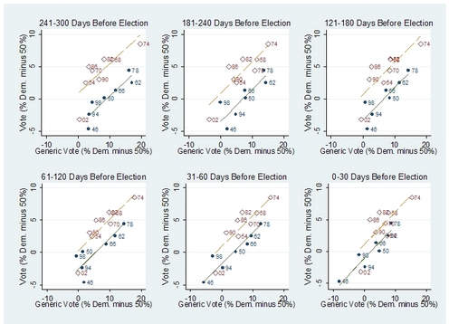
As I wrote a couple of weeks ago, the Republicans need something like a 7% swing in the national vote to take back the House of Representatives in 2010.

From Erikson, Bafumi, and Wlezien, here is a graph predicting the Democratic party's vote share in midterm elections, given their support in a generic party ballot from polls taken during the 300 days before the election:

congpolls2.jpg

The higher line in each graph (in red) corresponds to elections where the incumbent president is a Republican, and the lower line (in blue) corresponds to elections such as 2010, where the incumbent is a Democrat.

Poll data on health care opinions

Alan Reifman writes:

I [Reifman] have created a new website to compile poll results on specific provisions of the health care reform debate. Today, I review the polling on universality, personal/individual mandates, and employer mandates. I discuss in the Welcome Statement on my page how I aim to go beyond what is currently available on sites such as Pollster.com and Polling Report.

From a subscription card insert in the New Yorker:

EXTRA! REGISTER ONLINE NOW FOR YOUR CHANCE TO

WIN $50,000 CASH

FROM THE NEW YORKER

I guess I already knew that once they were affiliated with Dennis Miller, the New Yorker had already jumped it. . . .

The statistician over your shoulder

Xiao-Li wrote an article on his experiences putting together a statistics course for non-statistics students at Harvard. Xiao-Li asked for any comments, so I'm giving some right here:

I think the ideas in the article are excellent.

The challenges of getting students actively involved in statistics learning have motivated me to write a book on teaching statistics, develop a course on training graduate students to teach statistics, and even to offer general advice on the topic.

But I have not put it all together into a successful introductory course the way Xiao-Li has, and so I read his article with interest, seeking tips in how we can do better in our undergraduate teaching.

The only thing I really disagree with is Xiao-Li's description of statisticians as "traffic cops on the information highway." Sure, it sounds good, but often I find my most important role as a statistician is to tell people it's ok to look at their data, it's ok to fit their models and graph their inferences. There's always time to go back and check for statistical significance, but I've found the biggest mistakes are when scientists, fearing the statistician over their shoulder, discard much of their information and don't spend enough time looking at what they have left.

I'm certainly not arguing that simple methods are all we need. (See here for my recent advertisement for fancy modeling). What I'm saying is that I'm happier being an enabler than a police officer. I think I've done more good by saying yes than by saying no.

On the other hand, in Xiao-Li's defense, he's prevented three false discoveries (see bottom of page 206 of his article), whereas I've proved one false theorem. So perhaps we just put different values on our Type 1 and Type 2 errors!

To return to XL's article, on pages 207-208 he tells a story involving a scientist who was stopped just in time before making a big mistake, by discussing the questionable analysis with Policeman Meng, who noticed the problem. I assume we can all agree that the crucial step in this process was that the scientist was (a) worried that something might be wrong and (b) went to a statistician for help. I'd like to believe that many of the readers of this article would've been able to find the problem, but this sort of eagle-eyed criticism is different from what I think of as the most common bit of policing, which is statisticians giving scientists a hard time about technicalities.

Or, to put it another way, I don't mind the statistician as critic, but I don't think we should have the police officer's traditional power to arrest and detain people at will. Except maybe in some extraordinary cases.

To return to undergraduate education: I've taught undergraduate statistics several times at Berkeley and at Columbia. Berkeley had an exciting undergraduate program with about 15 juniors and seniors taking a bunch of topics classes. I have fond memories of my survey sampling and decision analysis classes and also of the department's annual graduation ceremony, which included B.A.'s, M.A.'s, and Ph.D.'s in one big celebration. I've heard that the program has since grown to about 50 students. At Columbia, in contrast, we have something in the neighborhood of 0 statistics majors. It's a feedback loop: few courses, few students, few courses, etc. I think this was the case at Harvard for many many years, although maybe it's changed recently.

My point? The intro courses at Berkeley for non-majors were very well organized, much more so than at Columbia, at least until recently. Perhaps no coincidence. I suspect it's easier to confidently teach statistics to non-majors if you have a good relationship with the select group of undergraduates who are interested enough in statistics to major in it. And, conversely, an excellent suite of introductory statistics classes is a great way to interest students in further study.

Teacher training is also important, as Xiao-Li indicates in the last sentence of his article. At Berkeley there was no formal course in statistics teaching, but most of the Ph.D. students went through the "boot camp" of serving as T.A.'s in large courses under the supervision of experienced lecturers such as Roger Purves; between this direct experience and word-of-mouth guidance from other students in the doctoral program, they quickly learned which way was up. At Columbia we have recently revived our course, The Teaching of Statistics at the University Level, and I hope that this course--and similar efforts at Harvard and other universities--will help move us in the right direction.

In addition, wider awareness of statistical issues outside of academia (for example, at our sister blog) will, I hope, make college students demand statistical thinking in all their classes, whether taught by statisticians or not. It wouldn't be a bad thing for a student in a purely qualitatively-taught history class to consider the role of selection bias in the gathering of historical data (see Part 2 of A Quantitative Tour for more on this sort of thing), just as it isn't a bad thing for a student in a statistics class to think about the social implications of some of the methods we use.

David Spiegelhalter and Ken Rice wrote this excellent short article on Bayesian statistics. I think it's far superior to the Wikipedia articles on Bayes, most of which focus too much on discrete models for my taste.

Peter Flom writes:

I am now up for a position which would require teaching some introductory statistics to people studying to work in health care. Mostly, these people will have only a HS diploma, and it may be a fairly old HS diploma (a lot of them are returning to school).

For the interview, though, I am assigned to give a 30 minute talk (no powerpoint or anything, just a white board).

Alan Bergland writes:

I am a graduate student studying evolutionary biology at Brown University. I am writing you with what I think is a simple question, but I cannot seem to find an answer I feel comfortable with.

I am trying to test a planned contrast using posterior distributions from a mixed model (the mixed model is calculated in lme4, and the simulations in arm). The model is fairly complicated, but at the end of the day, there are two fixed effect treatments with two levels each that I am interested in. Lets call these fixed effects "treatment A" (with levels A and a) and "treatment B" (with levels B and b). I am interested in the interaction between treatment A and treatment B, but have a specific hypothesis about the form of that interaction I would like to test. Specifically, I would like to test if ab is less than Ab & aB=AB.

As you and Jennifer Hill suggest in your Multilevel/Hierarchical models book (p. 20), I could test if ab

Once I can calculate the probability that Ab=AB, would it be reasonable to calculate the probability that (ab is less than Ab & aB=AB) as Pr(ab is less than Ab)*Pr(aB=AB)?

My reply:

1. Don't use the arm's sim() function for lmer() objects. The current version is wrong; we're fixing it now, and the replacement should be available in about a month.

2. I don't recommend testing if aB=AB. At least in the sorts of problems I work on, no two comparisons are exactly equal. I think it makes more sense to estimate the relevant comparison, get the confidence interval, and make a graph. You could also do things like calculate the posterior probability (based on simulations) that ab < AB & |aB - AB|

Ryan Richt writes:

I wondered if you have a quick moment to dig up an old post of your own that I cannot find by searching. I read an entry where you discussed if there really was a difference between a prior of 1/2 meaning that we have no knowledge of a coin flip, or meaning we are exactly certain that it's generative distribution is 1/2.

I'm only 24 and just got my masters last year, but I now have my own summer interns (who of course I encourage to read ET Jaynes and see the bayesian light) and one of them basically asked that question today.

My reply: The two original blog entries are here and here. Here's my published article. And here's a link discussing actual wrestlers and boxers. (Apparently the wrestler would win.)

The talks from the mini-conference are up on the website. The speakers:

Martin Lindquist (Dept of Statistics, Columbia)
Ed Vul (Dept of Brain and Cognitive Sciences, MIT)
Nikolas Krigeskorte (Laboratory of Brain and Cognition, NIH)
Tor Wager (Dept of Psychology, Columbia)
Andrew Gelman (Dept of Statistics, Columbia)
Daphna Shohamy (Dept of Psychology, Columbia)
Cosma Shalizi (Dept of Statistics, CMU)
Pat Shrout (Dept of Psychology, NYU)

The powerpoints are up, and also videos of our presentations. If you listen carefully, you can hear the raucous laughter in the background. . . .

Luc Sante has a blog

Here (I found it through a link from Jenny Davidson). Only one update in the past six months, but still, it's the great Luc Sante...

Cool pictures of parallel coordinates

Alfred Inselberg, the inventor of parallel coordinates, sent along this fascinating handout with a bunch of color graphs illustrating the power of the parallel-coordinates idea.

Here's a cool picture, along with Inselberg's caption:

par1.png

In the background is a dataset with 32 variables and 2 categories. On the left is the plot of the first two variables in the original order, on the right are the best two variables after classification. The algorithms discovers the best 9 variables (features) needed to describe the classification rule, with 4% error, and orders them according to their predictive power.

A couple more below:

Ian Fellows writes:

Being as you are an R user at the intersection of the social sciences and statistics, I thought some recent work I've done might be of interest to you. SPSS has long dominated the teaching and practice of statistics in the social sciences (at least among non-statisticians). I've created a new menu driven data analysis graphical user interface aimed at replacing SPSS (or at least that's the long term lofty goal). It has just been released under GPL-2 on CRAN. Feel free to check out some screen shots in the online wiki manual (not yet complete).

I don't know SPSS, but just yesterday someone told me that people can run R from SPSS and get a convenient menu system, so if this freeware would have the same capacity, that would be great. Here's the description:

I ran into John Barnard a few hours ago and he told me that he likes the blog but he hates the political stuff. So, John, you can skip this one. Although there is a bit of statistics near the end, so if you want you can click through and search for two asterisks (**); I've labeled the statistical content, just this once, to make your life slightly easier!

Following Paul Krugman, John Sides considers how one might measure the ideological position of conservative political commentator Michelle Malkin. I'd heard the name but I don't have any TV reception and didn't really know what she stood for. Going to her webpage, I see she's written three books: "Invasion: How America Still Welcomes Terrorists, Criminals, and Other Foreign Menaces to Our Shores," "In Defense of Internment: The Case for 'Racial Profiling' in World War II and the War on Terror," and "Unhinged: Exposing Liberals Gone Wild." From her blog, she also appears to have conservative economic views, although it's hard to separate this from partisanship without going back to posts from previous years.

Krugman wants a "scale of positions on political matters ... we might find that only 19 percent of Americans are to the right of Michelle Malkin, while 23 percent are to the left of Michael Moore." I don't have enough of a sense about Malkin, but I'm pretty sure that much less than 23% of Americans are to the left of Michael Moore. In chapter 8 of Red State, Blue State is this graph from Joe Bafumi and Michael Herron estimating the ideological positions of congressmembers and voters:

Aaron Edlin just sent me this article by Pinar Karaca-Mandic and himself from 2006:

We [Edlin and Karaca-Mandic] estimate auto accident externalities (more specifically insurance externalities) using panel data on state-average insurance premiums and loss costs. Externalities appear to be substantial in traffic-dense states: in California, for example, we find that the increase in traffic density from a typical additional driver increases total statewide insurance costs of other drivers by $1,725-$3,239 per year, depending on the model. High-traffic density states have large economically and statistically significant externalities in all specifications we check. In contrast, the accident externality per driver in low-traffic states appears quite small. On balance, accident externalities are so large that a correcting Pigouvian tax could raise $66 billion annually in California alone, more than all existing California state taxes during our study period, and over $220 billion per year nationally.

Interesting stuff. I don't have it in me right now to check all these numbers, but the argument looks to be laid out clearly enough that the experts in the area can work it out. Also, it all seems to be about accidents to other cars; I'm not sure where they factor in the costs due to running over pedestrians.

Kobi forwarded this on, I don't know anything about it but it looks like it could be interesting:

Undervalued graduate programs?

I received the following email:

Avi Feller and Chris Holmes sent me a new article on estimating varying treatment effects. Their article begins:

Randomized experiments have become increasingly important for political scientists and campaign professionals. With few exceptions, these experiments have addressed the overall causal effect of an intervention across the entire population, known as the average treatment effect (ATE). A much broader set of questions can often be addressed by allowing for heterogeneous treatment effects. We discuss methods for estimating such effects developed in other disciplines and introduce key concepts, especially the conditional average treatment effect (CATE), to the analysis of randomized experiments in political science. We expand on this literature by proposing an application of generalized additive models to estimate nonlinear heterogeneous treatment effects. We demonstrate the practical importance of these techniques by reanalyzing a major experimental study on voter mobilization and social pressure and a recent randomized experiment on voter registration and text messaging from the 2008 US election.

This is a cool paper--they reanalyze data from some well-known experiments and find important interactions. I just have a few comments to add:

Advice on writing research articles

The American Statistical Association organizes a program in which young researchers can submit writing samples and get comments from statisticians who are more experienced writers. I agreed to participate in this program, as long as the authors were willing to have their articles and my comments posted here.

I'm going to start with my general advice after reading and commenting on the two articles sent to me. I think this advice should be of interest to nearly all the readers of this blog. Then I'll link to the articles and give some detailed comments.

General advice

Both the papers sent to me appear to have strong research results. Now that the research has been done, I'd recommend rewriting both articles from scratch, using the following template:

1. Start with the conclusions. Write a couple pages on what you've found and what you recommend. In writing these conclusions, you should also be writing some of the introduction, in that you'll need to give enough background so that general readers can understand what you're talking about and why they should care. But you want to start with the conclusions, because that will determine what sort of background information you'll need to give.

2. Now step back. What is the principal evidence for your conclusions? Make some graphs and pull out some key numbers that represent your research findings which back up your claims.

3. Back one more step, now. What are the methods and data you used to obtain your research findings.

4. Now go back and write the literature review and the introduction.

5. Moving forward one last time: go to your results and conclusions and give alternative explanations. Why might you be wrong? What are the limits of applicability of your findings? What future research would be appropriate to follow up on these loose ends?

6. Write the abstract. An easy way to start is to take the first sentence from each of the first five paragraphs of the article. This probably won't be quite right, but I bet it will be close to what you need.

7. Give the article to a friend, ask him or her to spend 15 minutes looking at it, then ask what they think your message was, and what evidence you have for it. Your friend should read the article as a potential consumer, not as a critic. You can find typos on your own time, but you need somebody else's eyes to get a sense of the message you're sending.

Bob Shapiro, author of two important books on public opinion (The Rational Public, 1992, with Benjamin Page, and Politicians Don't Pander, 2000, with Lawrence Jacobs) sent me this report he just wrote with Sara Arrow, comparing public opinion for Obama's health care initiative with opinion in 1993-94, when Bill Clinton's health plan crashed and burned. They write:

John Sides links to an (unintentionally, I assume) hilarious peer-reviewed article by C. K. Rowley, which begins:

More on Medicare costs

Following up on our earlier discussion of the administrative costs of Medicare and private insurers, Robert Book sent me a report on Illusions of Cost Control in Public Health Care Plans, which is full of numbers and argues that "Medicare's administrative costs are a lower percentage of the total not because Medicare has cheaper administration, but because it has more expensive patients." I don't know enough to evaluate these arguments, but I like that he has a lot of numbers and graphs right out there, so that any disputes can be on specific points.

I do have one question, which probably reflects my ignorance of heath-economics terminology more than anything else. Book writes, "Claims processing is the only category that is at all sensitive to the level of health care utilization." From my personal experience with the health care system, I associate "administrative costs" with the many levels of clerks and paper-pushers you have to deal with before you get to see a doctor or nurse. I'm not quite sure how "claims processing" is defined, but I see a lot of full-time employees (as well as, I assume, some higher-paid full-time employees in some back room) who aren't doing anything health-related; they're just minding the store. And this all seems pretty much proportional to health care utilization: I assume that if people are going to the doctor twice as often, or doing more complicated procedures, there are that many extra visits, that many extra forms to fill out, etc. I've been in hospital wards at night where there is no doctor to be seen, maybe no nurse, but three or four administrative employees appear to be continously busy with something or another.

This is not intended as a criticism of Book's argument, just a thought some of these seemingly neutral terms such as "administrative costs" can be confusing.

Nate Silver links to a Congressional Quarterly list of ratings for 2010 congressional races and concludes that, although these listings give a sense of which races are more likely to be competitive, the CQ chart doesn't really say much about the chance that there will be a "wave" election that would switch partisan control to the Republicans.

The same day, Matthew Yglesias links to a recent Congressional Quarterly report entitled, "2010 House Outlook: Democrats Look Secure" and concludes that, yes, the Democrats look secure to keep their House and Senate majorities.

What should we believe? For the purpose of campaign strategy, you need to look at the races in each district, but to get a sense of what's going to happen overall, I think the best approach is to look at the national vote. There's lots of variation, but, overall, swings occur nationally.

Here's a graph I made after the election, showing the average Democratic share of the two-party vote for the House of Representatives and for president for the past sixty years:

adv.png

From this picture, it looks possible but unlikely that there will be a 6% swing toward the Republicans (which is what it would take for them to bring their average district vote from 44% to 50%). Historically speaking, a 6% swing is a lot. The biggest shifts in the past few decades appear to be 1946-48, 1956-58, and 1972-74 (in favor of the Democrats) and 1964-66 and 1992-194 (for the Republicans). I don't know if any of these would quite be enough to swing the House majority. A more likely outcome, if the Republicans indeed improve in next year's election, is for them to make some gains but still be in the minority.

The other factor helping the Democrats is incumbency, which helps lock in a congressional majority (as it did for the Republicans after 1994) by bumping up the vote shares of the new congressmembers elected in swing districts. In 2008, John Kastellec, Jamie Chandler, and I estimated that the Republicans would need something like 51% of the average district vote to have an even shot of winning a majority of House seats.

The counterintuitive style of economic analysis is typically set up to make one of two points:

1. Some seemingly stupid thing that people do actually is rational. (For example, see the notorious "rational addiction" model.) Of course, it's gotta be rational, right? Otherwise why would people do it?

2. Some seemingly reasonable thing that people do actually is irrational. I came across a recent example of this sort of argument in a discussion of the sunk cost fallacy by Dan Reeves on Sharad's blog. Of course people are irrational, right? After all, we're bundles of flesh, not calculating machines.

Both these sorts of points are reasonable (although, I have to admit, I'm pretty skeptical both on the "rational addiction" and the "sunk cost" stories).

But what really interests me is that both sorts of arguments below are, as we say in the social sciences, "normative"; that is, they are about what we should do (in the first case, we "should" be less bothered by certain behavior that seems irrational, we should be less inclined to regulate seemingly irrational or predatory behavior, etc; in the second case, we "should" change our behaviors so as not to violate some key theoretical axiom). And both sorts of arguments make sense. But they go in the opposite direction! And I can easily imagine just about any behavior analyzed in either of these two directions. Obviously, we can analyze addiction by discussing the inconsistency of the actions of an addict; similarly, we can rationalize the sunk-cost examples by postulating more complicated goals.

As I wrote last year:

I'm still disturbed by the lack of connection that is made between the fundamental principles of economics (under which $5,000 worth of expensive wine has the same value as $5,000 worth of Cheetos) and the sort of technocratic reasoning (the kind of thing that makes me, as a statistician, happy) where you try to assign a cost to each thing.

Really this applies to economics, or "freakonomics," in general: For example, you can do some data analysis to see if sumo wrestlers are cheating, or you can just say that sumo wrestling supplies an entertainment niche and leave it to the wrestlers to figure out how to optimally collude. Either sort of analysis is ok, but I rarely see them juxtaposed--it's typically one or the other, and the conclusions seem to depend a lot on which mode of analysis is chosen.

P.S. I'm not trying to criticize economics, or economic analysis, in general. I do the stuff myself. (See, for example, this article of ours on cost-benefit tradeoffs in radon measurement and remediation). I'm just pointing out what I see as a difficulty with some of the normative arguments out there.

This is just sad

Daniel Lakeland writes:

You may be astounded that people are still reporting 26% more probability to have daughters than sons, and then extrapolating this to decide that evolution is strongly favoring beautiful women... Or considering the degree of innumeracy in the population perhaps you wouldn't be astounded.... in any case... they are still reporting such things.

If anyone out there happens to know Jonathan Leake, the reporter who wrote this story for the (London) Sunday Times, perhaps you could send him a copy of our recent article in the American Scientist. Or, if he'd like more technical details, this article from the Journal of Theoretical Biology?

Thank you. I have nothing more to say at this time.

It's been a dramatic month: A month ago, a coalition of some of the leading teams qualifies for the $1 million grand prize for improving the accuracy of the movie-recommending model by more than 10%. But, they would close the competition 30 days afterward, in case someone else is able to improve upon the result. This happened less than a day before the deadline, by The enormous Ensemble, composed of 23 previously separate teams and individuals. Of course, most of the progress towards the victory was through the models making use of new significant patterns in the data, such as that of time.

The development of an ensemble from many separate teams was another accomplishment, and the GPT's inclusion rules provide some insight into the process: "shares" of the winnings were distributed based on how much was a contribution able to improve the result in terms of percentage points. Simon Owens describes what it was like to participate in The Ensemble.

Bayesian statistics always works with ensembles: the posterior is a weighted average of all models, the weight being based on the fit of each model times the prior quality of the model. There are some additional Bayesian elements that could be a part of future competitions, such as Bayesian scoring functions.

In the past I was asked to contrast Occam's razor with the Epicurean principle. Occam's razor is the Bayesian prior, or the the yang principle: simpler models have greater a priori weight (because we tend to economize that what is useful). Occam's razor goes back to Aristotle, who wrote "For the more limited, if adequate, is always preferable," and "For if the consequences are the same, it is always better to assume the more limited antecedent" in his Physics. We mathematically express it as the prior.

Epicurean principle is the yin, or mathematically expressed as the integral over the model space. Ensembles go back to Epicurus' letter to Herodotus: "When, therefore, we investigate the causes of [...] phenomena, [...] we must take into account the variety of ways in which analogous occurrences happen within our experience." Thus, Bayesian statistics combines the yin and the yang, balancing the pursuit of simplicity with the limitations of uncertainty.

[7/31/09: Added a link to Simon Owens' interview with The Ensemble.]

The science of wishful thinking

I just read Charles Seife's excellent book, "Sun in a bottle: The strange history of fusion and the science of wishful thinking." One thing I found charming about the book was that it lumped crackpot cold fusion, nutty plans to use H-bombs to carve out artificial harbors in Alaska, and mainstream tokomaks into the same category: wildly-hyped but unsuccessful promises to change the world. The "wishful thinking" framing seems to fit all these stories pretty well, much better than the usual distinction between the good science of big-budget lasers and tokomaks and the bad science of cold fusion and the like. The physics explanations were good also.

The only part I really disagreed with. On page 220, Seife writes, "Science is little more than a method of tearing away notions that are not supported by cold, hard data." I disagree. Just for a few examples from physics, how about Einstein's papers on Brownian motion and the photoelectric effect? And what about lots of biology, chemistry, and solid state physics, figuring out the structures of crystals and semiconductors and protein folding and all that? Sure, all of this work involves some "tearing away" of earlier models, but much of it--often the most important part--is constructive, building a model--a story--that makes sense and backing it up with data.

I really like this post of Nate Silver's. Ideal-point models and other fancy statistical techniques are fine, but I'm a big fan of using the simple, directly-interpretable summary when it makes the point.

Mike Barnicle's already on the case. So now it's time for the classy upscale take on the story.

After six entries and 91 comments on the connections between Judea Pearl and Don Rubin's frameworks for causal inference, I thought it would be good to draw the discussion to a (temporary) close. I'll first present a summary from Pearl, then briefly give my thoughts.

Pearl writes:

That modeling feeling

It goes like this: there's something you want to estimate and you have some data. Maybe, to take my favorite recent example, you want to break down support for school vouchers by religion, ethnicity, income, and state (or maybe you'd like to break it down even further, but you have to start somewhere).

Or maybe you want to estimate the difference between how rich and poor people vote, by state, over several decades--but you're lazy and all you want to work with are the National Election Studies, which only have a couple thousand respondents, at most, in any year, and don't even cover all the states.

Or maybe you want to estimate the concentration of cat allergen in a bunch of dust samples, while simultaneously estimating the calibration curve needed to get numerical estimates, all in the presence of contamination that screws up your calibration.

Or maybe you want to identify the places in the United States where it's cost-effective to test your house for radon gas--and the data you have across the country are 80,000 noisy measurements, 5,000 accurate measurements, and some survey data and geological information.

Or maybe you want to understand how perchloroethylene is absorbed in the body--a process that is active at the time scale of minutes and also weeks--given only a couple dozen measurements on each of a few people.

Or maybe you want to get a picture of brain activity given indirect measurements from a big clanking physical device encircling a person's head.

Or maybe you want to estimate what might have happened in past elections had the Democrats or Republicans received 1% more, or 2% more, or 3% more, of the vote.

Or maybe . . . or maybe . . .

What all these examples have in common is some data--not enough, never enough!--and a vague sense arising in my mind of what the answer should look like. Not exactly what it would look like--for example, I did not in any way anticipate the now-notorious pattern of vouchers being more popular among rich white Catholics and evangelicals and among poor blacks and Hispanics (maybe I should've anticipated it; I'm not proud in the level of ignorance that I had that allowed this finding to surprise me, I'm just stating the facts)--but what it could look like. Or, maybe it would be more accurate to say, various things that wouldn't look right, if I were to see them.

And the challenge is to get from point A to point B. So, you throw model after model at the problem, method after method, alternating between quick-and-dirty methods that get me nowhere, and elaborate models that give uninterpretable, nonsensical results. Until finally you get close. Actually, what happens is that you suddenly solve the problem! Unexpectedly, you're done! And boy is the result exciting. And you do some checking, fit to a different dataset maybe, or make some graphs showing raw data and model estimates together, or look carefully at some of the numbers, and you realize you have a problem. And you stare at your code for a long long time and finally bite the bullet, suck it up and do some active debugging, fake-data simulation, and all the rest. You code your quick graphs as diagnostic plots and build them into your procedure. And you go back and do some more modeling, and you get closer, and you never quite return to the triumphant feeling you had earlier--because you know that, at some point, the revolution will come again and with new data or new insights you'll have to start over on this problem, but, for now, yes, yes, you can stop, you can step back and put in the time--hours, days!--to make pretty graphs, you can bask in the successful solution of a problem. You can send your graphs out there and let people take their best shot. You've done it.

But, not so deep inside you, that not-so-still and not-so-small voice reminds you of the compromises you've made, the data you've ignored, the things you just don't know if you believe. You want to do more, but that will require more computing, more modeling, more theory. Yes, more theory. More understanding of what these things called models do. Because, just like storybook characters take on a life of their own, just like Gollum wouldn't die and Frank Bascombe comes up with wisecracks all on his own, and Ramona Quimby won't stay down even if you try to make her, and so on and so on and so on, just like these characters, each with his or her internal logic, so any statistical model worth fitting also has its internal logic, mathematical properties latent in its form but, Turing-machine-like, impossible to anticipate before applying it to data--not just "real data" (how I hate that phrase), but data from live problems. And then comes Statistical Theory--the good kind, the kind that tells us what our models can and cannot do, when they can bend with the data and when they snap. (Did you know that doubly-integrated white noise can't really turn corners? I didn't, until I tried to fit such a model to data that went up, then down.) And you do your best with your Theory, and your simulations, and even your computing (yuck!). But you move on. And you hope that when it's time to come back to this problem, you'll have some better models at hand, things like splines and time series cross sectional models, and you'll have a programming and modeling environment where you can just write down latent factors and have them interact, and you'll be able to include three-way interactions, and four-way interactions, and . . . and . . . you hope that in ten years you'll be fitting the models that, ten years ago, you thought you'd be fitting in five years. And you take a rest. You write up what you found and you write up exactly what you did (not always so easy to do). And a new question comes along. You want a quick answer. You try putting together available data in a simple way. You try some weighting. But you don't believe your answer. You need more data. You need more model. You get to work.

That's how it feels, from the inside.

Congressional counterfactuals

John Sides links to this quote from Barney Frank:

Not for the first time, as a -- a -- an elected official, I envy economists. Economists have available to them, in an analytical approach, the counterfactual. Economists can explain that a given decision was the best one that could be made, because they can show what would have happened in the counterfactual situation. They can contrast what happened to what would have happened.

No one has ever gotten reelected where the bumper sticker said, "It would have been worse without me." You probably can get tenure with that. But you can't win office.

I have two thoughts on this. First, I think Frank is a bit too confident in economists' ability to "show what would have happened in the counterfactual situation." Maybe "estimate" or "guess" or "hypothesize" would be a bit stronger than "show." Recall this notorious graph, which shows the unintentional counterfactual of some economic predictions:

stimulus-vs-unemployment-april.gif

Second, I don't know how Frank can say that about "no one has ever gotten reelected . . ." In Frank's district in Massachusetts, it would take a lot--a lot--for a Democrat to not get reelected.

There is no utility function

Alex Tabarrok and Matthew Yglesias comment on "the marginal utility of money income." I'll have to write something longer about this some day, but for now let me just reiterate my current understanding that there is no such thing as a utility function. Rather than people arguing over the shape of the utility function, I hope they can move forward to thinking more directly about what people will do with their money.

From my earlier blog entry:

Titling

Original title of article: "Estimating turnout, vote intention, and issue attitudes in subsets of the population"

New title: "Who votes? How did they vote? And what were they thinking?"

I was getting my haircut today, and the TV in the barbershop was set to some kids' channel that was featuring a show about some weird form of basketball where the players can bounce on a trampoline on the way to dunking the ball into the basket. Sort of a cool idea, should definitely appeal to the targeted demographic of 10-year-old boys. It was set up as though it was what we might call a "real" professional sports league, with teams, won-lost records, upcoming games, announcers calling plays, and with players including some retired NBA stars. Not quite as over-the-top as professional wrestling, but that sort of thing.

Anyway, what puzzled me about all this was how little action there was on the screen. There were lots of interviews with players, video features, highlights of previous games, replays, and logos, but very little actual basketball.

Is this what 10-year-old boys want? I'm sure they've done lots of marketing surveys, so the answer is probably yes. But it left me extremely confused. Here you have a made-for-TV sport, the rules can be anything they want--I'd think they'd want there to be as much action as possible--passing, dunking, running, jumping and all the rest. While the ball was in play, the players were impressively athletic. But the ball was almost never in play. To me, it was much less exciting than any random basketball game you might see on ESPN. Again, they can make any rules they want--so why do they do it this way? I'd think kids would prefer to see live action rather than a series of disconnected highlights and replays. Perhaps someone could explain to me?

Freedom House is currently seeking individuals with demonstrated professional experience to work with civil society organizations in Egypt through the International Executive Volunteers (IEV) program for 3 months beginning in September 2009.

Volunteers must have a minimum of five years of relevant professional experience, the ability to commit to 3 months of service, and a resourceful, innovative personality. Previous overseas experience, particularly in Egypt and in the Middle East and North Africa is preferred.

Statistician/Polling Specialist
A statistician/polling specialist has been requested to provide support in the preparation and analysis of survey methodology and questionnaire data. Tasks will include designing work plans, managing logistics, reporting results to targeted groups, and developing relationships with key constituencies. Additional knowledge or expertise is needed for volunteer management - recruiting, retaining, and training for key projects. Arabic language skills are preferred but not required.

Great moments in publishing (not)

Recently I was invited to write an article on the philosophy of Bayesian statistics. For a long time I've been unhappy with the discussions of philosophy offered by Bayesian statisticians and also with the perspectives on Bayesian statistics coming from philosophers. I'd been planning for about fifteen years to write an article on the topic but had never gotten around to it, so I welcomed this opportunity.

I thought it made sense to do some reading, and I thought I'd start with Lakatos, whom I think of as a sort of rationalized Popper (Lakatos actually attributes some of his own ideas to a hypothetical Popper_2). In retrospect, I think this was a good choice. I like a lot of what Lakatos had to say--even though he didn't write much about statistics, or Bayesian statistics, most of the ideas transfer over fine, I think.

But that's not the reason for this note.

I'm writing here to tell you what happened when I ordered the two volumes of Lakatos's collected writings, published by Cambridge under the titles, "The Methodology of Scientific Research Programmes" and "Mathematics, Science, and Epistemology," paperbacks selling on Amazon for about $50 bucks each. I eagerly awaited their arrival in my mailbox, but when they finally came, and I opened them . . . they were really hard to read! The type was blurry.

I guess they took the original book and did some sort of crappy photoimaging . . . Hey! This is Cambridge University Press we're talking about, reprinting a classic academic book and not even taking the trouble to do it right! What's with that??? I can see that it might be a pain to retype the original book, but can't they scan in the text and reset it? Or, maybe even simpler, take their photoimaged text and run it through some software to unblur it? The current version is a joke, and I was embarrassed to even have it in my office.

I returned the volumes to Amazon and ordered the books from the Columbia library. (That was a pain too, but that's another story. I doubt the readers of my blog need to hear about my problems with the Columbia library.) These original hardcovers are fine. Not the greatest print job in the world, actually--I find the font pretty hard to read--but much better than the blur-o-matic that Cambridge was charging $100 for. (Oddly enough, the printing in my paperback copy of Proofs and Refutations is fine.)

P.S. Yes, yes, I know this is unimportant compared to all the hunger and strife in the world, etc etc. But still . . . what ever happened to professionalism?

Tobias Verbeke writes:

I just noticed in your blog post you use Sharon Lohr's book on sampling design and analysis for your course.

Some time ago I made an R package with the datasets and a vignette which reproduces part of the analyses with Thomas Lumley's survey package.

This could be useful.

Comments

We're having some problem with the blog, where we get comments but they don't show up on the blog. We're trying to figure out what's going on. In the meantime, feel free to post your comments; they'll show up soon, I hope.

My class on survey sampling

I wasn't actually so thrilled with how the course went--I last taught it a few years ago--but I thought it might help to share some of my experiences.

1. I used the excellent book by Lohr. And students always like when you follow the book.

2. That said, whenever I deviated from the straight sampling stuff and talked about modeling (for example, forecasting or missing data imputation or just an overview of regression), they loved it. Our students are much more interested in modeling than in sampling.

3. You have to decide ahead of time how much you want them to do with real data on the computer, and how much you want to have them deriving formulas. Either is ok, you just need to figure that out.

4. Stata is the standard software for survey sampling. I use R because that's what I know.

5. Lohr's book, like all books on surveys, is strongest on design, and weakest on analysis of surveys collected by others (survey weights and the like).

6. I assigned the Groves et al book as a supplementary text. It's a great book, but it didn't work so well to teach out of. It's still probably a good idea to assign it, just so students have it as a reference.

Here's a syllabus, a schedule of homework assignments, and some notes.

Impact factors

A bunch of years ago, I published an article (using some of the material in my Ph.D. thesis) in the Journal of Cerebral Blood Flow and Metabolism. It's ranked as the #25 journal in neuroscience, and has a pretty crappy impact factor of 5.7.

By comparison, the impact factors of the top statistics journals a few years ago were:
JASA 1.6, JRSS 1.5, Ann Stat 1.3, Ann Prob 0.9, Biometrika 1.8, Biometrics 1.1, Stat Sci 2.0, Technometrics 1.3.

So now you know why statisticians don't like impact factors.

  1 2 3 4 5 6 7 8 9 10 11 12 13 14 15 16 17 18 19 20 21 22 23 24 25 26 27 28 29 30 31 32 33 34 35 36 37 38 39 40 41 42 43 44 45 46 47 48  

Recent Comments

  • hz: IF, well, is a good measure of popularity. The IFs read more
  • Daniel Habtemariam: quantity vs. quality? There's a lotta crap getting published out read more
  • Martyn: Impact factors only count citations in the 2 calendar years read more
  • Andrew Gelman: Alex: Point taken. But still . . . the #25 read more
  • Alex Cook: Impact factors (IFs) aren't designed to compare across disciplines: they're read more
  • Alex F: What's the ratio of citations (impact factor) per coauthor across read more
  • Mikael: Econometrica 3.865 read more
  • Andy: JRSS B is doing a little better these days - read more

Find recent content on the main index or look in the archives to find all content.