Results matching “R”

As part of his continuing campaign etc., Jimmy points me to this and wrote that "it seemed a little creepy. I [Jimmy] was reminded of blinky, the 3-eyed fish from the simpsons."

Jimmy's one up on me. I remember the fish but didn't know it had a name.

What I was reminded of was this story about the Siamese dandelions and the four-leaf clovers.

P.S. to Jimmy: Don't you have a job? Who has the time to search the web for Siamese eggs??

The Triumph of the Thriller

Patrick Anderson is a sometime novelist, speechwriter, and book reviewer who wrote a book, The Triumph of the Thriller, a couple of years ago--I just recently encountered it in the library. His topic: how crime thrillers have taken over the bestseller list.

Top-selling crime novels are not new. Between 1947 and 1952, Mickey Spillane, amazingly, came out with 7 of the 28 bestselling books in the history of U.S. publishing. The titles of his books: "I, the Jury," "The Big Kill," "My Gun is Quick," "One Lonely Night," "The Long Wait," "Kiss Me, Deadly," and "Vengeance is Mine." I think you get the picture. Meanwhile, from the 1930s onward, Erle Stanley Gardner published over 100 crime novels, among which an incredible 91 sold over a million copies each. So, not new at all.

What's new is not the presence of the thriller but its triumph. James Patterson's books sold 14 million copies in a single year more than Grisham, King, and Brown combined. (And, of course, each of these benchmarks is himself a writer of thrillers.)

How locavores could save the world?

Felix Salmon vs. Freakonomics, round 2.

See here and here (my comments here).

I don't think the two sides are directly communicating with each other--yet.

Hey, statistics is easy!

Kent Holsinger sends along this statistics discussion from a climate scientist. I don't really feel like going into the details on this one, except to note that this appears to be a discussion between two physicists about statistics. The blog in question appears to be pretty influential, with about 70 comments on most of its entries. When it comes to blogging, I suppose it's good to have strong opinions even (especially?) when you don't know what you're talking about.

P.S. Just to look at this from the other direction: I know next to nothing about climate science, but at least I recognize my ignorance! This is perhaps related to Kaiser's point that statisticians have to be comfortable with uncertainty. In contrast, I could well believe that someone who goes into physics would find complete certainty to be appealing. The laws of physics are pretty authoritative, after all.

P.P.S. Further discussion here. (We seem to have two parallel comment threads. I'd say that we could see how long they need to run before mixing well, but this note has induced between-thread dependence, so the usual convergence diagnostics won't be appropriate.)

pretty() ain't always so pretty

As part of his continuing campaign to destroy my productivity, Aleks sporadically sends me emails such as the following: the subject line was "algorithm for graph labels" and the message read, in its entirety:

http://books.google.com/books?id=fvA7zLEFWZgC&pg=PA61&lpg=PA61#v=onepage&q=&f=false

I had to look, and what I found was a three-page article by someone named Paul Heckbert, published in a 1990 book called Graphics Gems. The article was called "Nice numbers for graph labels" and, through the magic of Google Books + Print-Screen + Paint + Movable Type, I'm able to share it with you:

heckbert1.png

heckbert2.png

heckbert3.png

Aleks knows this would interest me because he's always hearing me complain about the R graphics defaults: The tick marks are too long, the axis labels are too far from the axes, there are typically too many tick marks (for my taste) on the graphs, blah blah blah. A bunch of unfair complaints, given that I get R for free, but complaints nonetheless. I see right away that Heckbert (at least, as of 1990) also had the problem of long tick marks, but of course that's trivial. What's more relevant is the rule for setting up where the numbers go on the axis.

R does this using the pretty() function. What exactly does prettty() do, I wondered? Back from the days when R was S, I learned that the way to learn what a function does is type its name in the console. So I'll give that a try:


> pretty
function (x, n = 5, min.n = n%/%3, shrink.sml = 0.75, high.u.bias = 1.5,
u5.bias = 0.5 + 1.5 * high.u.bias, eps.correct = 0)
{
x <- as.numeric(x)
if (length(x) == 0L)
return(x)
x <- x[is.finite(x)]
if (is.na(n <- as.integer(n[1L])) || n < 0L)
stop("invalid 'n' value")
if (!is.numeric(shrink.sml) || shrink.sml <= 0)
stop("'shrink.sml' must be numeric > 0")
if ((min.n <- as.integer(min.n)) < 0 || min.n > n)
stop("'min.n' must be non-negative integer <= n")
if (!is.numeric(high.u.bias) || high.u.bias < 0)
stop("'high.u.bias' must be non-negative numeric")
if (!is.numeric(u5.bias) || u5.bias < 0)
stop("'u5.bias' must be non-negative numeric")
if ((eps.correct <- as.integer(eps.correct)) < 0L || eps.correct >
2L)
stop("'eps.correct' must be 0, 1, or 2")
z <- .C("R_pretty", l = as.double(min(x)), u = as.double(max(x)),
n = n, min.n, shrink = as.double(shrink.sml), high.u.fact = as.double(c(high.u.bias,
u5.bias)), eps.correct, DUP = FALSE, PACKAGE = "base")
s <- seq.int(z$l, z$u, length.out = z$n + 1)
if (!eps.correct && z$n) {
delta <- diff(range(z$l, z$u))/z$n
if (any(small <- abs(s) < 1e-14 * delta))
s[small] <- 0
}
s
}

Damn. That didn't work. I'd briefly forgotten that a modern R function looks like this:

1. Lots and lots of exception-handling, handshaking, data-frame-handling, and general paperwork.

2. A call to the C or Fortran program that does the real work.

But I have other recourses. Let's try Googling "R pretty." No, that doesn't work (you can try it yourself and see). Neither does "cran pretty," "cran pretty()," or anything else I can think of.

But wait! There's the online help function! Just type "?pretty" from the console and you get a nice man page (as we used to say). Here it is:

Let d <- max(x) - min(x) >= 0. If d is not (very close) to 0, we let c <- d/n, otherwise more or less c <- max(abs(range(x)))*shrink.sml / min.n. Then, the 10 base b is 10^(floor(log10(c))) such that b <= c < 10b.

Now determine the basic unit u as one of \{1,2,5,10\} b, depending on c/b \in [1,10) and the two 'bias' coefficients, h =high.u.bias and f =u5.bias.

I'm too lazy to read this and Heckbert's pseudocode and compare, but they certainly seem to be doing the same thing. We can try it on Heckbert's example:


> pretty (c(105,543))
[1] 100 200 300 400 500 600

Hey, it works! And, indeed, pretty() has an argument called "n"--the desired number of intervals--so I could just set n=3 or 4 and probably be happy. I'm not quite sure how to alter R's plotting functions to work with a modified default parameter for pretty(), but there's probably a way--maybe in ggplot2?

Let's try it out:


> pretty (c(105,543), n=3)
[1] 0 200 400 600
>

Much better. I wasn't happy with that axis starting at 100. If the data range from 105 to 543, I'd rather take that axis all the way down to 0. I'm not a Darrell Huff-style fanatic on taking the axis down to 0, but I'd prefer to include 0 (or other natural boundaries or reference points, for example 100 if you're plotting numbers on a percentage scale, or 1.0 if you're plotting odds ratios).

I'm pretty sure that the next generation of pretty() or its equivalent should have a slightly more elaborate objective function to allow a preference for inclusion of special points such as 0.

More generally, I suspect it's helpful to think of this sort of "AI"-like task as an statistical inference problem, or as a minimization problem, rather than to frame it as a search for an algorithm. I mean, sure, it all comes down to an algorithm at some point, but the inference and minimization frameworks seem better to me--more flexible and more direct--than the approach of going straight for an algorithm.

I suspect the above point is very well understood in computer science, but I also suspect it bears repeating. I say this because statisticians are certainly aware of the benefits of framing decision problems as inference problems, but we still sometimes slip into a lazy algorithmic mode of thinking when we're not careful. Almost always, it's better to ask "what are we estimating?" or, at the very least, "what are we trying to minimize?", rather than jumping to "what do we want our answer to look like." I think there's more to be said on this point, but rather than try to come up with it all myself from scratch, I'll let youall fill me in on the relevant literature.

There's also some other weird thing that goes on in R, where it will put tick marks at, say, 10,12,14,16,18 rather than 10,15,20. The problem here, I think, is a combination of (a) too many intervals as a default setting, and (b) an idea that numbers divisible by 2 are as clean to interpret as numbers divisible by 5. I don't think the latter assumption is correct. To me when reading a graph, 10,15,20 is much much easier to scan than 10,12,14,16,18.

P.S. OK, since we're on the topic of R defaults, howzabout this one:


> a <- 1:5
> hist (a)

Which produces the following:

histo.png

You notice anything funny about this? Oh, yeah:

1. The data are uniformly distributed but the histogram isn't.
2. The histogram is virtually impossible to read because all of the data fall between the histogram bars.

OK, sure, histograms can't be perfect. But this isn't an isolated case. We deal with integer data all the time, and it's not good to have a default that fails in these settings. There's always a question of how complicated you want a histogram function to be, but I'd think that with integer data it would be a good idea to use integers as the centers of the bars rather than as their boundaries.

P.P.S. Usually I'd put most of this sort of long, technical, code-filled entry under the fold, but there was something about the pointlessness of all of this . . . I couldn't resist splashing it all over the front page.

Interviewer effects

I just spoke on the phone with Olivia Ward, a foreign affairs writer for the Toronto Star. I don't usually think of myself as an expert on foreign affairs, but, in Canada, U.S. politics is foreign affairs, so there you have it.

I don't always express myself coherently over the phone--I'm better in writing, when I have the freedom to rearrange my sentences into something logical, and where I can see what I'm saying. This particular interview went well, because when I started to ramble and get lost, she asked some relevant questions and got be back on track. I've also done well on radio interviews, I think, again for the same reason, that the interviewers knew what they are doing. I should remember two key principles:

1. Keep your answers short. This works in live radio and also for phone interviews that will be cut up and used for a newspaper article.

2. When you can't answer the question they ask, say "I don't know" but then don't just give up. Follow up by (briefly) telling something related that you do know. This is what they might be interested in anyway, and they would certainly prefer to hear something that you know about rather than listening to empty speculations.

P.S. Here's the news article.

As you may have heard, the Democratic Congress just passed a big health care bill on a close-to-party-line vote, the Democratic President is about to sign it, and--oh yeah--the Democrats are expected to get slaughtered in the upcoming November elections.

But, as the timing of the above links reveals--the 2010 election prediction was made in September, 2009--it would be a mistake, when November 2010 rolls around, to attribute a Republican sweep to the events of March, 2010. During all those months from September through Feburary, a period when passage of the heath care bill was far from certain, the Republicans maintained their lead in the polls and thus their anticipated midterm election gains.

And I think that, when November rolls around, the pundits will realize this. Sure, one or two might say something about how the voters were punishing Obama and the Democrats for going too far in March, but then the more clueful pundits will get on their case and say: "No! Remember, the Republicans were expected to do well in the midterms, with authoritative predictions being made as early as September, 2009."

One thing that interests me here is the role of the political science profession in this story. By laying out our 2010 predictions early, we short-circuited what could otherwise have been a popular narrative about the election. This is something I've been thinking about for over 20 years--ever since Michael Dukakis's election loss was attributed (inappropriately, according to our research) to campaign strategies rather than to general economic and political conditions.

It feels good for once to be ahead of the story. And I think we as quantitative researchers should be proud of this, whether we're happy or sad about the new health bill, and whether we're happy or sad about the possibility of a Republican takeover in November.

Quantitative research is not just about making predictions; it's also about changing the storyline.

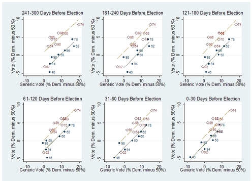
P.S. Here's the key graph (from Bafumi, Erikson, and Wlezien):

congpolls2.jpg

Follow the first link above for more discussion of the research.

P.P.S. Yeah, yeah, I know this post could use a better title. I just couldn't figure out what that title should be! Nate would be able to come up with something snappy, I'm sure.

P.P.P.S. As a commenter at 538 noted, the above assumes that the 2010 election goes roughly as expected. If things are much different, one way or another, then, sure, it might make sense for the events of March 2010 to be part of the story.

The man in the gray flannel hypothesis

"We have to be comfortable with gray to be a statistician; there's no way around it." -- Kaiser Fung.

The other day I commented on a new Science News article by Tom Siegfried about statistics and remarked:

If there were a stat blogosphere like there's an econ blogosphere, Siegfried's article would've spurred a ping-ponging discussion, bouncing from blog to blog.

In response, various people pointed out to me in comments and emails that there has been a discussion on statistics blogs of this article; we just don't have the critical mass of cross-linkages to maintain a chain reaction of discussion.

I'll try my best to inaugurate a statistics-blogosphere symposium, though.

Before going on, though . . . Note to self: Publish an article in Science News. Tom Siegfried's little news article got more reaction than just about anything I've ever written!

OK, on to the roundup, followed at the end by my latest thoughts (including a phrase in bold!).

One thing that I remember from reading Bill James every year in the mid-80's was that certain topics came up over and over, issues that would never really be resolved but appeared in all sorts of different situations. (For Bill James, these topics included the so-called Pesky/Stuart comparison of players who had different areas of strength, the eternal question (associated with Whitey Herzog) of the value of foot speed on offense and defense, and the mystery of exactly what it is that good managers do.)

Similarly, on this blog--or, more generally, in my experiences as a statistician--certain unresolvable issues come up now and again. I'm not thinking here of things that I know and enjoy explaining to others (the secret weapon, Mister P, graphs instead of tables, and the like) or even points of persistent confusion that I keep feeling the need to clean up (No, Bayesian model checking does not "use the data twice"; No, Bayesian data analysis is not particularly "subjective"; Yes, statistical graphics can be particularly effective when done in the context of a fitted model; etc.). Rather, I'm thinking about certain tradeoffs that may well be inevitable and inherent in the statistical enterprise.

Which brings me to this week's example.

Multilevel modeling, lots of levels

Alexis Le Nestour writes:

I am currently fitting a model explaining the probability of seeking a treatment in Senegal. I have 4513 observations at the individual level nested in 505 households. Our sampling was a two stage stratified sampling procedure. Our clusters are farming organizations picked up in function of their size, then we randomly chose 5 households per farming organization and finally we interviewed all the household members.

This page intentionally left blank

I see that somebody wrote a book about 4'33". It would be cool if the book were completely empty, but I have a horrible feeling that there are actual words in it. For one thing, the Amazon listing says it's 272 pages and retails for $24. If it were really what I hope it was, it would be 433 pages long and retail for $4.33, a low enough price that it might actually sell a few copies as a gag.

P.S. A few years ago Bob and Mitzi, I think, performed 4'33" at the gong show. The crowd totally didn't get it. After about 30 seconds, everybody was getting completely uncomfortable, there were shouts of "Gong Them!," and the judges duly complied. Cage was ahead of his time, and he's ahead of our time too.

Goofy Fox News poll questions

Nate's got the goods. Some questions from a recent Fox News poll:

After noticing an event for my first stats prof

I made the mistake of downloading one of his recent papers

After suggesting that Bayes might have actually been aiming at getting confidence intervals - the paper suggests "Bayes posterior calculations can appropriately be called quick and dirty" means to obtain confidence intervals.

It avoids obvious points of agreement "There are of course contexts where the true value of the parameter has come from a source with known distribution; in such cases the prior is real, it is objective, and could reasonably be considered to be a part of an enlarged model."

Uses an intuitive way of explaining Bayes theorem that I think is helpful (at least in teaching) "The clear answer is in terms of what might have occurred given the same observational information: the picture is of many repetitions from the joint distribution giving pairs (y1; y2), followed by selection of pairs that have exact or approximate agreement y2 = y2.obs, and then followed by examining the pattern in the y1 values in the selected pairs. The pattern records what would have occurred for y1 among cases where y2 = y2.obs; the probabilities arise both from the density f(y1) and from the density f(y2|y1). Thus the initial pattern f(y1) when restricted to instances where y2 = y2.obs becomes modified to the pattern f(y1|y2.obs) = cf(y1)f(y2.obs|y1)"

And (with added brackets) makes a point I can't disagree with "conditional calculations does not produce [relevant] probabilities from no [relevant] probabilities.

Perhaps this is very relevant to me as I am just wrapping up a consulation where a 1,000 plus intervals were calculated and the confidence ones were almost identical to the credible ones - except for a few with really sparse data where the credible intervals were obviously more sensible.

But the concordance bought me something - if only not to worry about the MCMC convergence. (By the way these computations were made almost easy and fully automated by Andrew's R2WinBugs package.)

The devil is in the details (nothing gets things totally right) - or so I am confident.

K

Lojack for Grandpa

No statistical content here but it's interesting. I remain baffled why they can't do more of this for people on probation, using cellular technology to enforce all sorts of movement restrictions.

Following up on our recent discussion of p-values, let me link to this recent news article by Tom Siegfried, who interviewed me a bit over half a year ago on the topic. Some of my suggestions may have made their way into his article.

The main reason why I'm linking to this is that four different people emailed me about it! When I get four emails on the same topic, I'll blog it. (With one exception, of course: as you know, there's one topic I'm never blogging on again.)

I agree with most of what Siegfried wrote. But to keep my correspondents happy, I'll mention the few places where I'd amend his article:

Confusion about Bayesian model checking

As regular readers of this space should be aware, Bayesian model checking is very important to me:

1. Bayesian inference can make strong claims, and, without the safety valve of model checking, many of these claims will be ridiculous. To put it another way, particular Bayesian inferences are often clearly wrong, and I want a mechanism for identifying and dealing with these problems. I certainly don't want to return to the circa-1990 status quo in Bayesian statistics, in which it was considered virtually illegal to check your model's fit to data.

2. Looking at it from the other direction, model checking can become much more effective in the context of complex Bayesian models (see here and here, two papers that I just love, even though, at least as measured by citations, they haven't influenced many others).

On occasion, direct Bayesian model checking has been criticized from a misguided "don't use the data twice" perspective (which I won't discuss here beyond referring to this blog entry and this article of mine arguing the point).

Here I want to talk about something different: a particular attempted refutation of Bayesian model checking that I've come across now and then, most recently an a blog comment by Ajg:

The example [of the proportion of heads in a number of "fair tosses"] is the most deeply damning example for any straightforward proposal that probability assertions are falsifiable.

The probabilistic claim "T" that "p(heads) = 1/2, tosses are independent" is very special in that it, in itself, gives no grounds for preferring any one sequence of N predictions over another: HHHHHH..., HTHTHT..., etc: all have identical probability .5^N and indeed this equality-of-all-possibilities is the very content of "T". There is simply nothing inherent in theory "T" that could justify saying that HHHHHH... 'falsifies' T in some way that some other observed sequence HTHTHT... doesn't, because T gives no (and in fact, explicitly denies that it could give any) basis for differentiating them.

Hong Jiao writes:

I work in the area of educational measurement and statistics. I am currently using the MCMC method to estimate model parameters for item response theory (IRT) models. Based on your book, Gelman and Hill (2007), the scale indeterminancy issue can be solved by constraining the mean of item parameters or the mean of person parameters to be 0. Some of my colleagues stated that by using the priors for either the item or person parameters, we do not need to set any constraints for the scale indeterminancy when using the MCMC for the IRT model estimation. They thought the use of the priors determine the scale. I am somewhat in disagreement with them but have nobody to confirm.

My response:

I recommend fitting the model with soft constraints (for example, by setting one of the prior means to 0 and imposing an inequality constraint somewhere to deal with the sign aliasing) and then using summarizing inferences using relative values of the parameters. The key idea is to post-process to get finite population inferences. We discuss this in one of the late chapters of our book and also in our Political Analysis article from 2005. (In particular, see Section 2 of that article.)

Constraining the prior mean is fine but it doesn't really go far enough, I think. Ultimately it depends on what your inferential goals are, though.

A whole new kind of z-statistic

Here.

More pretty pictures

Aleks points us to this page by Mindy McAdams with 21 examples of graphics made using Adobe Flash. (I guess this is a computer language? Or a computer package? I'm not actually sure what the distinction is between these concepts.)

They're mostly excellent: functional and attractive without being too, well, flashy. I like them much more than the so-called "5 Best Data Visualization Projects of the Year."

My only complaint is that there are no blank spaces or divisions between the examples. I was having difficulty remembering that the description of each item went below the display, not above. A minor point, but one that I think about a lot because I often make graphs with small multiples, and it's important to be able to know which is which. If I could convey this one little point to the data visualization pros, I'd have done something useful today.

P.S. to Aleks: Next time you can just blog this sort of thing yourself directly; no need to have me as a middleman!

P.P.S. Link above fixed. (I bet Aleks would've done it right the first time.)

Test failures

Jimmy brings up the saying that the chi-squared test is nothing more than "a test of sample size" and asks:

Would you mind elaborating or giving an example? Hypothesis tests are dependent on sample size. but is the chi-squared test more so than other tests?

And setting aside the general problems of hypothesis testing, off the top of your head, what other tests would you consider useless or counterproductive? (For new and infrequent readers, Fisher's exact test.)

My reply:

I like chi-squared tests, in their place. See chapter 2 of ARM for an example. Or my 1996 paper with Meng and Stern for some more in-depth discussion.

To answer your later question, I think that most "named" tests are pointless: Wilcoxon, McNemar, Fisher, etc. etc. These procedures might all have their place, but I think much harm is done by people taking their statistical problems and putting them into these restricted, conventional frameworks. In contrast, methods such as regression and Anova (not to mention elaborations such as multilevel models and glm) are much more open-ended and allow the user to incorporate more data and more subject-matter information into his or her analysis.

Sifting and Sieving

Following our recent discussion of p-values, Anne commented:

We use p-values for something different: setting detection thresholds for pulsar searches. If you're looking at, say, a million independent Fourier frequencies, and you want to bring up an expected one for further study, you look for a power high enough that its p-value is less than one in a million. (Similarly if you're adding multiple harmonics, coherently or incoherently, though counting your "number of trials" becomes more difficult.) I don't know whether there's another tool that can really do the job. (The low computing cost is also important, since in fact those million Fourier frequencies are multiplied by ten thousand dispersion measure trials and five thousand beams.)

That said, we don't really use p-values: in practice, radio-frequency interference means we have no real grasp on the statistics of our problem. There are basically always many signals that are statistically significant but not real, so we rely on ad-hoc methods to try to manage the detection rates.

I don't know anything about astronomy--just for example, I can't remember which way the crescent moon curves in its different phases during the month--but I can offer some general statistical thoughts.

My sense is that p-values are not the best tool for this job. I recommend my paper with Jennifer and Masanao on multiple comparisons; you can also see my talks on the topic. (There's even a video version where you can hear people laughing at my jokes!) Our general advice is to model the underlying effects rather than thinking of them as a million completely unrelated outcomes.

The idea is to get away from the whole sterile p-value/Bayes-factor math games and move toward statistical modeling.

Another idea that's often effective is to select as subset of your million possibilities for screening and then analyze that subset more carefully. The work of Tian Zheng and Shaw-Hwa Lo on feature selection (see the Statistics category here) might be relevant for this purpose.

Jeremy Miles pointed me to this article by Leonhard Held with what might seem like an appealing brew of classical, Bayesian, and graphical statistics:

P values are the most commonly used tool to measure evidence against a hypothesis. Several attempts have been made to transform P values to minimum Bayes factors and minimum posterior probabilities of the hypothesis under consideration. . . . I [Held] propose a graphical approach which easily translates any prior probability and P value to minimum posterior probabilities. The approach allows to visually inspect the dependence of the minimum posterior probability on the prior probability of the null hypothesis. . . . propose a graphical approach which easily translates any prior probability and P value to minimum posterior probabilities. The approach allows to visually inspect the dependence of the minimum posterior probability on the prior probability of the null hypothesis.

I think the author means well, and I believe that this tool might well be useful in his statistical practice (following the doctrine that it's just about always a good idea to formalize what you're already doing).

That said, I really don't like this sort of thing. My problem with this approach, as indicated by my title above, is that it's trying to make p-values do something they're not good at. What a p-value is good at is summarizing the evidence regarding a particular misfit of model do data.

Rather than go on and on about the general point, I'll focus on the example (which starts on page 6 of the paper). Here's the punchline:

At the end of the trial a clinically important and statistically significant difference in survival was found (9% improvement in 2 year survival, 95% CI: 3-15%.

Game, set, and match. If you want, feel free to combine this with prior information and get a posterior distribution. But please, please, parameterize this in terms of the treatment effect: put a prior on it, do what you want. Adding prior information can change your confidence interval, possibly shrink it toward zero--that's fine. And if you want to do a decision analysis, you'll want to summarize your inference not merely by an interval estimate but by a full probability distribution--that's cool too. You might even be able to use hierarchical Bayes methods to embed this study into a larger analysis including other experimental data. Go for it.

But to summarize the current experiment, I'd say the classical confidence interval (or its Bayesian equivalent, the posterior interval based on a weakly informative prior) wins hands down. And, yes, the classical p-value is fine too. It is what it is, and its low value correctly conveys that a difference as large as observed in the data is highly unlikely to have occurred by chance.

P.S. This story is related to the Earl Weaver theme mentioned in a recent entry.

Secret weapon and multilevel modeling

Neil D writes:

I'm starting to work on a project which I think might benefit from some multilevel modeling, but I'm not sure. Essentially it is a multiple regression model with two explanatory variables. The intercept is expected to be close to zero.

Over the time the data has been collected there have been six changes to the relevant tax rules in my country, and what has been done so far is to fit a model where the regression coefficients are different in the seven tax regimes. I'm thinking that some partial pooling might be helpful, and might improve the estimate of the the regression coefficients in the last tax regime, which really is of major interest.

I haven't done the analysis yet, but I'm assuming that such an analysis would be worthwhile and relatively straigtforward assuming that the regression coefficients in the different tax regimes are bivariate normal. What worries me a little, particularly as the analysis is sure to be scrutinized and criticized by various interested parties, is the assumption of exchangability, since as the different tax regimes are introduced there was an expectation that the regression coefficients would both go up in some cases, or both go down, or one would go up but the other would likely be unaffected. I'm not sure if it is possible to incorporate this information.

My reply: I'd start with the secret weapon.

P.S. Whenever I put "multilevel" in the title of a blog entry, I get spam from multilevel marketing companies. Could you guys just cut it out, please?

This reminds me--a lot--of the online training courses we need to follow as part of the IRB process.

irb.png

Here.

Cute idea. I should try this with my next book.

This plot is perhaps an interesting start to pinning down experts (extracting their views and their self assessed uncertainties) - contrasting and comparing them and then providing some kind off overall view.

Essentially get experts to express their best estimate and its uncertainty as an interval and then pool these intervals _weighting_ by a pre-test performance score on how good they are at being experts (getting correct answers to a bank of questions with known answers).

For those who are not familiar with consensus group work, a very good facilitator is needed so that experts actually share their knowledge instead of just personalities and stances.

The experts' intervals could easily be plotted by their performance score, and weighting schemes of %correct, versus (%correct)^2, or ( (%correct)^2 or 0 if %correct< 50% ) considered.

Better still - some data mining and clustering of experts' pre-test answers and best estimates.

Note these could be viewed as univariate priors and points towards the much more challenging area of extracting, contrasting and combining multivariate priors.

K

P-p-p-p-popper

Seth writes:

I [Seth] have always been anti-Karl Popper. His ideas seemed to point in the wrong direction if you wanted to do good science. For example, his emphasis on falsification. In practice, quite often, I don't "test" theories, I assess their value -- their value in finding solutions to problems, for example. When I use evolutionary ideas to suggest treatments to try, I'm not testing evolutionary theory. Nothing I know of Popper's work shows any sign he understood this basic point. As someone has said, all theories are wrong but some are useful.

I've discussed Popper quite a bit on this blog already (starting here) but wanted to add one thing to clarify, in response to Seth's remark.

What's relevant to me is not what Popper "understood." Based on my readings, I think Lakatos understood things much better, and in fact when I speak of Popperian ideas I'm generally thinking of Lakatos's interpretation. (Lakatos himself did this, referring to constructs such as Popper_1 and Popper_2 to correspond to different, increasingly sophisticated versions of Popperianism.)

What's relevant to me is not what Popper "understood" but what he contributed. I think his ideas, including his emphasis on falsification, have contributed a huge amount to our understanding of the scientific process and have also served as a foundation for more sophisticated ideas such as those of Lakatos.

When considering contributors to human knowledge, I think it's best to take an Earl Weaver-esque approach, focus on their strengths rather than their weaknesses, and put them in the lineup when appropriate. (As the publisher of two theorems, one of which is true, I have a natural sympathy for this attitude.)

Regarding the specific question of how Popper's ideas of falsification relate to applied statistics (including the quote at the end of Seth's comment), you can take a look at my 2003 and 2004 papers and my recent talk. The basic idea is that, yes, we know our models are wrong before we start. The point of falsification is not to discover that which we already know, but rather to reveal the directions in which our models have problems.

I typically get irritated by "the economics of"-style arguments, which to me look more like intellectual turf-grabbing than anything else. But this one, by Adam Ozimek, is good. Nothing deep--nor does he claim depth for his argument--but amusing and completely reasonable.

Clippin' it

The other day I was talking with someone and, out of nowhere, he mentioned that he'd lost 20 kilos using Seth's nose-clipping strategy. I asked to try on his nose clips, he passed them over to me, and I promptly broke them. (Not on purpose; I just didn't understand how to put them on.)

I'll say this for Seth: I might disagree with him on climate change, academic research, Karl Popper, and Holocaust denial--but his dieting methods really seem to work.

P.S. to Phil: Yes, I'll buy this guy a new set of noseclips.

P.P.S. Another friend recently had a story about losing a comparable amount of weight, but using a completely different diet. So I'm certainly not claiming that Seth's methods are the only game in town.

P.P.P.S. As discussed in the comments below, Seth's publisher should have a good motive to commission a controlled trial of his diet, no?

P.P.P.P.S. Seth points out that we agree on many other things, including the virtues of John Tukey, David Owen, Veronica Geng, Jane Jacobs, Nassim Taleb, and R. And to that I'll add the late great Spy magazine.

The 1870 census

Elissa Brown points us to this reproduction of the 56 beautiful pages of the Statistical Atlas of the Ninth Census, published in 1874. Takes forever to download it but it's worth it.

Here's a bit from page 38 (chosen for its humor value, but also because it's pretty):

census1870.png

Page 46 is nice too.

Some of the designs are pretty good, some not so much. I'm not going to give lots of examples--hey, these guys were working back in 1870 and had to do everything by hand! I just wanted to point out that, no, these old graphs are not perfect--many of them could be improved upon in obvious ways--just to avoid the implication that these represent some sort of perfection. They represent an impressive level of effort and also remind us how far we've come.

Last year, we heard about "maths expert" and Oxford University prof who could predict divorces "with 94 per cent accuracy. . . His calculations were based on 15-minute conversations between couples."

At the time, I expressed some skepticism because, amid all the news reports, I couldn't find any description of exactly what they did. Also, as a statistician, I have some sense of the limitations of so-called "mathematical models" (or, worse, "computer models").

Then today I ran across this article from Laurie Abraham shooting down this research in more details, so I'd share it with you.

First, she reviews the hype:

He and his colleagues at the University of Washington had videotaped newlywed couples discussing a contentious topic for 15 minutes to measure precisely how they fought over it: Did they criticize? Were they defensive? Did either spouse curl his or her lip in contempt? Then, three to six years later, Gottman's team checked on the same couples' marital status and announced that based on the coding of the tapes, they could predict with 83 percent accuracy which ones were divorced. . . .

"He's gotten so good at thin-slicing marriages," Malcolm Gladwell enthused in Blink, "that he says he can be at a restaurant and eavesdrop on the couple one table over and get a pretty good sense of whether they need to start thinking about hiring lawyers and dividing up custody of the children."

In a 2007 survey asking psychotherapists to elect the 10 most influential members of their profession over the last quarter-century, Gottman was only one of four who made the cut who wasn't deceased.

Then the good news:

Of psychiatrists and statisticians

Sanjay Srivastava writes:

Below are the names of some psychological disorders. For each one, choose one of the following:

A. This is under formal consideration to be included as a new disorder in the DSM-5.

B. Somebody out there has suggested that this should be a disorder, but it is not part of the current proposal.

C. I [Srivastava] made it up.

Answers will be posted in the comments section.

1. Factitious dietary disorder - producing, feigning, or exaggerating dietary restrictions to gain attention or manipulate others

2. Skin picking disorder - recurrent skin picking resulting in skin lesions

3. Olfactory reference syndrome - preoccupation with the belief that one emits a foul or offensive body odor, which is not perceived by others

4. Solastalgia - psychological or existential stress caused by environmental changes like global warming

5. Hypereudaimonia - recurrent happiness and success that interferes with interpersonal functioning

6. Premenstrual dysphoric disorder - disabling irritability before and during menstruation

7. Internet addiction disorder - compulsive overuse of computers that interferes with daily life

8. Sudden wealth syndrome - anxiety or panic following the sudden acquisition of large amounts of wealth

9. Kleine Levin syndrome - recurrent episodes of sleeping 11+ hours a day accompanied by feelings of unreality or confusion

10. Quotation syndrome - following brain injury, speech becomes limited to the recitation of quotes from movies, books, TV, etc.

11. Infracaninophilia - compulsively supporting individuals or teams perceived as likely to lose competitions

12. Acquired situational narcissism - narcissism that results from being a celebrity

In academic research, "sudden wealth syndrome" describes the feeling right after you've received a big grant, and you suddenly realize you have a lot of work to do. As a blogger, I can also relate to #7 above.

. . . and statisticians

It's easy to make fun of psychiatrists for this sort of thing--but if statisticians had a similar official manual (not a ridiculous scenario, given that the S in DSM stands for Statistical), it would be equally ridiculous, I'm sure.

Sometimes this comes up when I hear about what is covered in graduate education in statistics and biostatistics--a view of data analysis in which each different data structure gets its own obscurely named "test" (Wilcoxon, McNemar, etc.). The implication, I fear, is that the practicing statistician is like a psychiatrist, listening to the client, diagnosing his or her problems, and then prescribing the appropriate pill (or, perhaps, endless Gibbs sampling^H^H^H^H^H^H^H^H^H^H^H^H^H^H^H talk therapy). I don't know if I have a better model for the training of thousands of statisticians, nor maybe do I have a full understanding of what statistical practice is like for people on the inferential assembly line, as it were. But I strongly feel that the testing approach--and, more generally, the approach of picking your method based on the data structure--is bad statistics. So I'm pretty sure I'd find much to mock in any DSM-of-statistics that might be created.

Another uncomfortable analogy between the two professions is that statistical tests, like psychiatric diagnoses, are trendy, despite their supposed firm foundation in mathematics and demonstrated practical success (just as psychiatry boasts a firm foundation medicine along with millions of satisfied customers over the decades). Compounding the discomfort is that some of the oldest and most established statistical tests are often useless or even counterproductive. (Consider the chi-squared test, which when used well can be helpful--see chapter 2 of ARM for an example--but is also notorious as being nothing more than "a test of sample size" and has let many researchers to disastrously oversimplify their data structures in order to fit the crudest version of this analysis.)

Instead of a DSM, the statistical profession has various standard textbooks, from Snedecor and Cochran to . . . whatever. But our informal DSM, as defined by practice, word-of-mouth, and our graduate curricula, is nothing to be proud of.

Bring out the rabbit ears

Rajiv Sethi reports that, with digital TV, you can now get a good signal even in Manhattan. For years I told people, accurately, that I had no TV because I lived on the seventh floor and could get no reception. Cable TV always seemed silly to me, to have all these wires running around when the signal was already in the air to be picked up for free. Bob Shapiro once told me that not having a TV was bad for me as a political scientist, because I didn't have a sense of what Americans were seeing. Maybe on our return we'll get a digital TV receiver so we can watch the Super Bowl, Olympics, State of the Union Address, Miss America, and other spectacles as they come up. Or maybe people don't watch Miss America anymore? I don't really have a sense of this. When I was a kid it was a big deal, but now it seems like the Oscars get much more attention. The last time I watched the Oscars, though (about ten years ago), it was excruciating. I can't imagine doing it again any time soon.

Daniel Kramer writes:

In your book, Data Analysis Using Regression and Multilevel..., you state that in situations when little group-level variation is observed, multilevel models reduce to classical regression with no group indicators. Does this essentially mean that with zero group-variation, predicted coefficients, deviance, and AIC would be the same to estimates obtained with classical regression? I ask because I have been asked by an editor to adopt a multimodel inference approach (Burnham and Anderson 2002) in my analysis. Typically a small set of candidate models are ranked using an information theoretic criterion and model averaging may be used to derive coefficient estimates or predictions. Thus, would it be appropriate to compare single-level and multi-level models derived from the same data set using AIC? I am skeptical since the deviance for the null models are different. Of course, there may be no reason to compare single and multi-level models if there is no cost (i.e. reduced model fit) in adopting a multi-level framework as long as the case can be made that the data are hierarchical. The only cost you mention in your book is the added complexity.

My reply: If you're fitting multilevel models, perhaps better to use DIC than AIC. DIC has problems too (search this blog for DIC for discussion of this point), but with AIC you'll definitely run into trouble counting parameters. (BIC has other, more serious problems: it's not a measure of predictive error the way that AIC and DIC are.) More generally, I can see the appeal of presenting and averaging over several models, even if I've rarely ended up doing that myself. Indeed, I'd prefer to let everything of interest vary by group.

P.S. What's the deal with the 256-character limit on titles, anyway?

Some zombies, some of the time

Blake Messer writes:

I read your blog frequently, and just wanted to show you this model I made, revisiting the "Smith?" publication's findings on zombie outbreak dynamics.

I've only met Eliot Spitzer once, back when he was the state Attorney General. I was part of a group presenting the findings of a study of racial patterns of police stops in the city. (See here for a writeup of our findings.) Spitzer asked a few questions during the meeting, and I was impressed by his intelligence. Maybe that's how people feel after meeting Bill Clinton, I dunno.

Recently, I had an opportunity for another interaction with Spitzer, this time indirectly, when Sarah Binder, John Sides, and I wrote a brief discussion of an article he wrote in the Boston Review on government's proper role in the market. Spitzer argues for a clearer definition of the role of government as a setter and enforcer of rules in the financial marketplace; as he puts it, "even though private companies compete, only government can ensure that there is competition. Everybody in business wants to be a monopolist. There's nothing wrong with wanting more market share. That's how you make money." He has lots of good stories:

Wittgenstein would be amused

When writing this comment, I learned that it isn't so easy to spell "Wittgenstein." I had to try several times. Luckily, it's in the spell-checker so I eventually got it by trial and error. Quine's in the spell-checker (but, oddly enough, not "Quine's"), but Tarski isn't.

Some others:

wittgenstein (lower-case): fails the spell-checker.
Wittgenstein's is ok, though. As it should be. So I don't know why Quine works but Quine's didn't.
Knuth. Yes.
Russell. Yes.
Whitehead. Yes.
Gelman. No.
Meng. No.
Rubin. Yes.

Hey, that's not fair!

We're doing a project involving political representation in different countries (related to the USA Today effect), and one thing we need is a measure of the relative power of the lower and upper house in each country. In the U.S., the power is divided roughly evenly between House and Senate; in the U.K., it's nearly all in the House of Commons; in other countries, ...? Is there a standard measure of this somewhere?

Regular readers will know the importance I attach to model checking: to the statistical paradigm in which we take a model seriously, follow its implications, and then look carefully for places where these implications don't make sense, thus revealing problems with the model, which can then trace backwards to understand where your assumptions went wrong.

This sort of reasoning can be done qualitatively also. From Daniel Drezner, here's a fun example, an analysis of a recent political bestseller:

I [Drezner] hereby retract any and all enthusiasm for Game Change-- because I don't know which parts of it are true and which parts are not. . . . It was on page 89 that I began to wonder just how much Game Change's authors double-checked their sources. This section of the book recounts entertainment mogul David Geffen's "break" with Hillary Clinton's presidential campaign:
The reaction to the column stunned Geffen. Beseiged by interview requests, he put out a statement saying Dowd had quoted him accurately. Some of Geffen's friends in Hollywood expressed disbelief. Warren Beatty told him, She's going to be president of the United States--you must be nuts to have done this. But many more congratulated Geffen for having the courage to say what everyone else was thinking but was too afraid to put on the record. They said he'd made them feel safer openly supporting or donating to Obama. Soon after, when Geffen visited New York, people in cars on Madison Avenue beeped their horns and gave him the thumbs-up as he walked down the street (emphasis added [by Drezner]).

A self-refuting sentence indeed. Don't these guys have an editor? This reminds me of our recent discussion of the economics of fact checking.

Another hypothesis is that John Heilemann and Mark Halperin--the authors of Game Change--realized all along that the thumbs-up-on-Madison-Avenue story was implausible, but they felt that it was a good quote to include in order to give a sense of where Geffen was coming from. From this perspective, it should be obvious to the reader that the sentence beginning "Soon after, when Geffen visited New York" was a Geffen quote, nothing more and nothing less. In a book based on interviews, it would just be too awkward to explicitly identify each quotation as, for example, writing, "Geffen told us that soon after he visited New York, people in cars . . ." Sure, that latter version would be more accurate but would disrupt the flow.

Similar reasoning might explain or excuse David Halberstam's notorious errors in his baseball book that were noted by Bill James: Halberstam's goal was not to convey what happened but rather to convey the memories of key participants. Similarly, maybe the point of Game Change is to tell us what people recall, not what was actually happening. An oral history presented in narrative form.

P.S. For more on model checking from a Bayesian statistical perspective, see chapter 6 of Bayesian Data Analysis or this article. Or, if you prefer it in French, this.

This is what is done

This is from a commercial software package:

[image removed to avoid embarrassing anybody]

This is page 1 of a 66-page document. This was essentially impossible to follow on the screen, so I printed it out in 6-pages-per-sheet format, at which size the tiny text was difficult but barely possible to read.

Now here's a fun assignment. How many flaws can you find in this display? Here's what I noticed (in no particular order):

Sanjay Srivista draws some interesting connections between a recent Obama speech and a paper by P. E. Tetlock published in a psychology journal in 1981 (!). In general, I think we as political scientists don't interact enough with research in psychology.

That said, it's an interesting discussion.

P.S. Yes, I know the phrase has a technical meaning, but my impression is that it's more used as a generalized put-down.

I had occasion to revisit this graph:

unempnew.png

And then, it suddenly struck me: what if everything had gone as planned? From the perspective of Obama's reelection chances, the light blue graph ("without recovery plan") is much better than the dark blue ("with recovery plan"). By Election Day, 2012, the two curves are nearly at the same point. But in the year from 2011 to 2012, the economy is improving much faster with the top curve than the bottom curve. And, as Doug Hibbs, Bob Erikson, Steven Rosenstone, and others have taught us, year-to-year change in the economy is what it's all about.

I'm not exactly saying that Obama and his team actually want unemployment in 2011 to be any higher than necessary; it's just funny how, from a crude curve-extrapolation perspective, the above graph is looking like it could be good news for them in two and a half years.

Once again, it's the Hoover-or-Reagan story.

Cutting chartjunk and red tape

Jared points me to this report that Ed Tufte was appointed by the government to help visualize stimulus funds:

The purpose of the panel is to advise the Recovery Accountability and Transparency Board, whose aim is "To promote accountability by coordinating and conducting oversight of Recovery funds to prevent fraud, waste, and abuse and to foster transparency on Recovery spending by providing the public with accurate, user-friendly information."

Cool. I've been on many government panels but never anything so important. Once I was asked to serve on a panel to evaluate the evidence regarding a particular health risk. I agreed and they promptly sent me about 25 pages of paperwork to fill out. This seemed like too much, so I told them I'd be happy to serve for free. Turning down all compensation and reimbursement helped, but I still was left with about 6 complicated forms. I don't think I ever got around to completing them all. On the upside, the government has supported my research with many millions of dollars over the years, so they must be doing something right!

Seriously, though, this is wonderful news. It's great to see someone like Tufte involved with communication of public data.

This note on charter schools by Alex Tabarrok reminded me of my remarks on the relevant research paper by Dobbie and Fryer, remarks which I somehow never got around to posting here. So here are my (inconclusive) thoughts from a few months ago:

Graph of the week

Brendan Nyhan links to this hilariously bad graph from the Wall Street Journal:

young.png

It's cute how they scale the black line to go right between the red and blue lines, huh? I'm not quite sure how $7.25 can be 39% of something, while $5.15 is 10%, but I'm sure there's a perfectly good explanation . . .

Brendan Nyhan passes along an article by Don Green, Shang Ha, and John Bullock, entitled "Enough Already about 'Black Box' Experiments: Studying Mediation Is More Difficult than Most Scholars Suppose," which begins:

The question of how causal effects are transmitted is fascinating and inevitably arises whenever experiments are presented. Social scientists cannot be faulted for taking a lively interest in "mediation," the process by which causal influences are transmitted. However, social scientists frequently underestimate the difficulty of establishing causal pathways in a rigorous empirical manner. We argue that the statistical methods currently used to study mediation are flawed and that even sophisticated experimental designs cannot speak to questions of mediation without the aid of strong assumptions. The study of mediation is more demanding than most social scientists suppose and requires not one experimental study but rather an extensive program of experimental research.

That last sentence echoes a point that I like to make, which is that you generally need to do a new analysis for each causal question you're studying. I'm highly skeptical of the standard poli sci or econ approach which is to have the single master regression from which you can read off many different coefficients, each with its own causal interpretation.

No comment

How come, when I posted a few entries last year on Pearl's and Rubin's frameworks for causal inference, I got about 100 comments, but when yesterday I posted my 12-page magnum opus on the topic, only three people commented?

My theory is that the Pearl/Rubin framing of the earlier discussion personalized the topic, and people get much more interested in a subject if it can be seen in terms of personalities.

Another hypothesis is that my recent review was so comprehensive and correct that people had nothing to say about it.

P.S. The present entry is an example of reverse causal inference, in the sense described in my review.

In a post about "Climategate" back in December, I drew an analogy between people who are convinced anthropogenic climate change isn't happening and people who don't believe in evolution. Like all analogies, that one is imperfect, although I think the main point I was trying to make with the analogy is valid: both evolution and anthropogenic climate change have been adequately proven, to the extent that problems with some data or the work of individual scientists are not enough to call them into question, but some people refuse to accept these phenomena for ideological or religious reasons. (In a later post I explained one of the reasons I'm so convinced about climate change.)

I later came to regret focusing on that analogy, though, since of course people who believe in evolution but not climate change don't agree that the analogy is a good one. But here's one way in which it is better than I thought: a recent item in the New York Times says "Critics of the teaching of evolution in the nation's classrooms are gaining ground in some states by linking the issue to global warming, arguing that dissenting views on both scientific subjects should be taught in public schools."

I find it amusing (but a little sad).

Building a Better Teacher

Elizabeth Green writes a fascinating article about Doug Lemov, a former teacher and school administrator and current education consultant who goes to schools and tells teachers how they could do better. Apparently all the information is available in "a 357-page treatise known among its hundreds of underground fans as Lemov's Taxonomy. (The official title, attached to a book version being released in April, is 'Teach Like a Champion: The 49 Techniques That Put Students on the Path to College.')." I'd like to see the list of 49 techniques right now, but maybe you have to buy the book.

Green writes:

Central to Lemov's argument is a belief that students can't learn unless the teacher succeeds in capturing their attention and getting them to follow instructions. Educators refer to this art, sometimes derisively, as "classroom management." . . . Lemov's view is that getting students to pay attention is not only crucial but also a skill as specialized, intricate and learnable as playing guitar.

A lot of this resonated with my own experience in several roles:
- Student
- Teacher
- Author of a book on teaching tricks
- Teacher of teachers

Hal Daume pointed me to this. Could be useful, no?

Causality and Statistical Learning

[The following is a review essay invited by the American Journal of Sociology. Details and acknowledgments appear at the end.]

In social science we are sometimes in the position of studying descriptive questions (for example: In what places do working-class whites vote for Republicans? In what eras has social mobility been higher in the United States than in Europe? In what social settings are different sorts of people more likely to act strategically?). Answering descriptive questions is not easy and involves issues of data collection, data analysis, and measurement (how should one define concepts such as "working class whites," "social mobility," and "strategic"), but is uncontroversial from a statistical standpoint.

All becomes more difficult when we shift our focus from What to What-if and Why.

Thinking about causal inference

Consider two broad classes of inferential questions:

1. Forward causal inference. What might happen if we do X? What are the effects of smoking on health, the effects of schooling on knowledge, the effect of campaigns on election outcomes, and so forth?

2. Reverse causal inference. What causes Y? Why do more attractive people earn more money, why do many poor people vote for Republicans and rich people vote for Democrats, why did the economy collapse?

In forward reasoning, the potential treatments under study are chosen ahead of time, whereas, in reverse reasoning, the research goal is to find and assess the importance of the causes. The distinction between forward and reverse reasoning (also called "the effects of causes" and the "causes of effects") was made by Mill (1843). Forward causation is a pretty clearly-defined problem, and there is a consensus that it can be modeled using the counterfactual or potential-outcome notation associated with Neyman (1923) and Rubin (1974) and expressed using graphical models by Pearl (2009): the causal effect of a treatment T on an outcome Y for an individual person (say), is a comparison between the value of Y that would've been observed had the person followed the treatment, versus the value that would've been observed under the control; in many contexts, the treatment effect for person i is defined as the difference, Yi(T=1) - Yi(T=0). Many common techniques, such as differences in differences, linear regression, and instrumental variables, can be viewed as estimated average causal effects under this definition.

In the social sciences, where it is generally not possible to try more than one treatment on the same unit (and, even when this is possible, there is the possibility of contamination from past exposure and changes in the unit or the treatment over time), questions of forward causation are most directly studied using randomization or so-called natural experiments (see Angrist and Pischke, 2008, for discussion and many examples). In some settings, crossover designs can be used to estimate individual causal effects, if one accepts certain assumptions about treatment effects being bounded in time. Heckman (2006), pointing to the difficulty of generalizing from experimental to real-world settings, argues that randomization is not any sort of "gold standard" of causal inference, but this is a minority position: I believe that most social scientists and policy analysts would be thrilled to have randomized experiments for their forward-causal questions, even while recognizing that subject-matter models are needed to make useful inferences from any experimental or observational study.

Reverse causal inference is another story. As has long been realized, the effects of action X flow naturally forward in time, while the causes of outcome Y cannot be so clearly traced backward. Did the North Vietnamese win the American War because of the Tet Offensive, or because of American public opinion, or because of the skills of General Giap, or because of the political skills of Ho Chi Minh, or because of the conflicted motivations of Henry Kissinger, or because of Vietnam's rough terrain, or . . .? To ask such a question is to reveal the impossibility of answering it. On the other hand, questions such as "Why do whites do better than blacks in school?", while difficult, do not seem inherently unanswerable or meaningless.

We can have an idea of going backward in the causal chain, accounting for more and more factors until the difference under study disappears--that is, is "explained" by the causal predictors. Such an activity can be tricky--hence the motivation for statistical procedures for studying causal paths--and ultimately is often formulated in terms of forward causal questions: causal effects that add up to explaining the Why question that was ultimately asked. Reverse causal questions are often more interesting and motivate much, perhaps most, social science research; forward causal research is more limited and less generalizable but is more doable. So we all end up going back and forth on this.

We see three difficult problems in causal inference:

Tom Clark writes:

House effects, retro-style

Check out this graph of "house effects" (that is, systematic differences in estimates comparing different survey organizations) from the 1995 article, "Pre-election survey methodology," by D. Stephen Voss, Gary King, and myself:

houseeffects.png

(Please note that the numbers for the outlying Harris polls in Figure 1b are off; we didn't realize our mistake until after the article was published)

From the perspective of fifteen years, I notice two striking features:

1. The ugliness of a photocopied reconstruction of a black-and-white graph:

2. The time lag. This is a graph of polls from 1988, and it's appearing in an article published in 1995. A far cry from the instantaneous reporting in the fivethirtyeight-o-sphere. And, believe me, we spent a huge amount of time cleaning the data in those polls (which we used for our 1993 paper on why are campaigns so variable etc).

3. This article from 1995 represented a lot of effort, a collaboration between a journalist, a statistician, and a political scientist, and was published in a peer-reviewed journal. Nowadays, something similar can be done by a college student and posted on the web. Progress, for sure.

Also, to return to a recent discussion with Robin Hanson, yes, this was a statistics paper that was just methods and raw data and, indeed, I think my colleagues in the Berkeley statistics department probably gave this paper zero consideration in evaluating my tenure review. This work really was low-status, in that sense. But this project felt really really good to do. We had worked so hard with these data that it seemed important to really understand where they came from. And it had an important impact on my later work on survey weighting and regression modeling, indirectly leading to our recent successes with Mister P.

High school interview

A student wrote:

Hello, I've been researching a career in the field of statistics. I'm writing a high school paper on my career field which requires interviews of people working in that field. Would you consider scheduling a fifteen minute phone interview to help me with the paper? Please let me know if you would be willing to participate and when you are available. Thanks in advance.

I asked him to send me questions by email and received the following:

Who's your favorite expert?

Dan Kahan writes:

A while back you had some posts on how it is that we know we can trust science on climate change, & even more interestingly, how we know which scientists to trust, and how much we rely on our own understandings of the science. Here's a paper relating to that attached--results showing that people have a tendency to identify someone as an "expert scientist" on an issue (climate change, gun control, nuclear power) only if the putative expert expresses a position congruent with people's cultural predisposition on the issue.

Ooohh--ugly tables and graphs! I should still probably read this sometime, though--it looks important. Perhaps it relates to this story.

Update on zombie dynamics

Daniel Lakeland fits some nonlinear models. His key conclusion: "Hollywood plays a vital role in educating the public about the proper response to zombie infestation."

Rasmussen razzmatazz

David Shor writes:

Rasmussen polls are consistently to the right of other polls, and this is often explained in terms of legitimate differences in methodological minutiae.

4384143265_c6f0bfb6e5.jpg

But there seems to be evidence that Rasmussen's house effect is much larger when Republicans are behind, and that it appears and disappears quickly at different points in the election cycle.

[More graphs at the above link.]

I don't know anything about this particular polling organization and haven't looked at house effects since 1995 (see page 123 of this article, but please note that the numbers for the outlying Harris polls in Figure 1b are off; we didn't realize our mistake until after the article was published). It seems like a good idea to keep pollsters honest by checking this sort of thing, and I like David Shor's approach of trying to break down the effect by seeing where it varies. As we always say around here, interactions are important.

Lluis Bermudez writes:

I'm from University of Barcelona and I've using "arm" package to obtain posterior estimates of glm parameters. I usually worked with "glm" function, but I need more than a point estimation. The problem is that when using "bayesglm" function, I don't get the same results as with "glm" funtions. Actually, I've found differences with dispersion parameter estimates.

Yu-Sung took a look, and it turned out that what was happening was just what you'd expect--although we didn't actually think about it until we'd received this email. Lluis's example had a sparse enough data structure that the weak default prior distribution in bayesglm made a difference in the coefficient estimates. As a result, the Bayesian estimates didn't quite fit the data as well. That's fine--we don't want to overfit!--and it's good for us to understand what's going on.

Cauty and Drummond and DeWitt

In their classic The Manual: How to Have a Number One the Easy Way, Jimmy Cauty and Bill Drummond emphasize that having a #1 record might make you (somewhat) famous but it probably won't make you rich. I was thinking about this the other day after seeing The Last Samurai on someone's shelf. It's a cult classic (if not a #1) but it didn't make its author rich. Life is much easier for those who are lucky enough to have permanent jobs.

Freakonomics 2: What went wrong?

Following up on Kaiser's death-by-a-thousand-cuts (see here and here),
Mark Palko adds an entry in the "What happened with Freakonomics 2?" sweepstakes.

Palko's theory is that Levitt and Dubner's most logical decision, from a cost-benefit perspective, was to avoid peer review (here I'm using the term generally, considering statisticians such as Kaiser Fung as "peers" whether or not the reviewing is done in the context of a formal journal submission) so as to get a marketable product out the door with minimal effort:

I [Palko] am not saying that Levitt and Dubner knew there were mistakes here. Quite the opposite. I'm saying they had a highly saleable manuscript ready to go which contained no errors that they knew of, and that any additional checking of the facts, the analyses or logic in the manuscript could only serve to make the book less saleable, to delay its publication or to put the authors in the ugly position of publishing something they knew to be wrong.

I think this theory has a lot going for it, although maybe it could be framed in a slightly more positive way. Consider my favorite of Kaiser's comments on Freakonomics 2:

Bayesian survey sampling

Michael Axelrod writes:

Do you have any recommendations for articles and books on survey sampling using Bayesian methods?

The whole subject of survey sampling seems not quite in the mainstream of statistics. They have model-based and designed-based sampling strategies, which give rise to 4 combinations. Do Bayesian methods impact both strategies?

My quick answer is that you can fit your usual Bayesian regression models. Just make sure to condition on all variables that affect the probability of inclusion in the sample. Of course you won't really know what these variables are, but a quick start is to use whatever variables are used in the survey weights (if these are provided). You might be adjusting for a lot of variables, so you might want to fit a multilevel regression--that's usually the point of doing Bayes in the first place. And then you have to average up your estimates to get inferences about the population. That's poststratification. Put it together and you have multilevel regression and poststratification: Mister P.

To answer your original question of what to read on this: No books, really--well, maybe my two books. They're strong on Bayes but don't really focus on survey methods. We do have some survey-analysis examples, though.

For something on the theoretical side, there's this article. For something more methods-y, this article by Lax and Phillips. Or this article that shows Mister P in application.

Perhaps commenters have other suggested readings.

Self-restraint

Everytime you-know-who publishes a paper, I seem to get an email about it. But this time I'm not responding.

Some recent interest has been raised by the following publication

zombies

by an seemingly unknown author - well not quite

Smith?


I have not had anything to do with predator/prey models since reading Gregory Bateson's Steps towards an Ecology of Mind - but a question mark in one's name - that just too cool to pass by!

K?

PS Favourite article title - also by Bateson with his daughter when she was a young child - "Why do French?"


In his forthcoming book, Albert-László Barabási writes, "There is a theorem in publishing that each graph halves a book's audience." If only someone had told me this two years ago!

More seriously, this tongue-in-cheek theorem, if true, defines an upsetting paradox. As we discussed at the beginning of the Notes section of Red State, Blue State, we structured the book around graphs because that seemed to be the best way to communicate our findings. Tables are not a serious way of conveying numerical information on the scale that we're interested in, and, sure, we could've done it all in words (even saying things like "We ran a regression and it was statistically significant"), but we felt that this would not fully involve readers in our reasoning. The paradox--or maybe it's not such a paradox at all--is that graphs are grabby, they engage the reader, but this makes reading the book a slower, more intense, and more difficult endeavor.

P.S. Barabási apparently believes the theorem himself. His research publications are full of graphs, but his book has none at all (and no tables either). Well, it has one diagram, I guess. He may very well be making the right call on this one. People who want to see the graphs can follow the references and look up the scientific research articles that underlie the work described in the book.

Austin Lacy writes:

I read your post on school gardens [see also here]. A close friend of mine taught a grade in which this was part of the curriculum. After he changed grades his successor continued the program, but instead had the middle-schoolers plant and harvest tobacco, yes tobacco. Not sure if the ATF ever caught wind of it, but his reaction to your post is below.
Thanks for sending this along; I genuinely enjoyed the article very much, which surprised me a bit (that a statistics blog should so engage me). However, I do think that both Gelman (and, by extension, Flannagan) miss both an opportunity (to extol school tobacco gardens that provide both a highly salable and potentially lucrative crop and the opportunity to scientifically prove, before the product's sale, that tobacco is bad for you and stuff) and the larger point (ridiculousness=memorability=good pedagogy). But it's a good start. I especially liked the idea that the composition of recipes makes one more capable of insights into the Crucible. I assume that same holds true for Shakespeare, and will look to implement a lesson to this effect shortly. And in this school climate, the following conversation could actually get me a raise, rather than a demotion:
Concerned Parent One: Mr. is at it again. He's doing a unit asking students to devise and compose the perfect recipe for spinach and parmesan risotto. And this right after he insisted that watching DIEHARD 4 was a worthwhile method of discussing effective character development in Romeo and Juliet.

Concerned Parent Two: Yes, but little Jimmy's recipe IS delicious. And he's giving extra credit if students devise a way to make their recipe low-sodium.

Concerned Parent One: Well, I guess. And little Suzy HAS been more interested in seeking out genuinely organic produce lately . . .

Eavesdropping School Administrator in Carpool Line: Hmmmmm. I like what I'm hearing . .

.

Kaiser goes through the first chapter of Freakonomics 2 with a statistician's reading, picking out potentially interesting claims and tracking where they come from. It's actually the kind of review I might write--although in this particular instance I chose not to actually read the book, instead speculating on its authors' motivations (see here, here, and here).

Here's Kaiser:

p.20 -- was surprised to learn that women used to have shorter life expectancy than men. I have always thought women live longer. This factoid is used to show that throughout history, "women have had it rougher than men" but "women have finally overtaken men in life expectancy". I'm immediately intrigued by when this overtaking occurred. L&D do not give a date so I googled "female longevity": first hit said "it appears that women have out survived men at least since the 1500s, when the first reliable mortality data were kept."; the most recent hit cited CDC data which showed that U.S. females outlived males since 1900, the first year of reporting. In the Notes, L&D cite an 1980 article in the journal Speculum, published by the Medieval Academy. In any case, the cross-over probably occurred prior to any systematic collection of data so I find this minor section less than convincing.

. . .

p.29 -- They cite statistics about "the typical prostitute in Chicago." In what ways are the subjects of the study "typical" and in what ways are they not typical? The sample size was 160. They don't say much about the selection process of the subjects, except that they all came from three South Side neighborhoods. Would like to know more about the selection.

p.30 -- After much buildup, we get to their surprise: "Why has the prostitute's wage fallen so far?" I'm looking for the data, what does it mean by "so far"? All we have is the assertion "the women's wage premium pales in comparison to the one enjoyed by even the low-rent prostitutes from a hundred years ago." On the previous page, we learn that modern "street prostitutes" earn $350 per week. On p.24, we learn that in the past, Chicago prostitutes took in $25 a week, "the modern equivalent of more than $25,000 a year". Unfortunately, neither of these two numbers is comparable to $350. Dividing $25,000 by 50 weeks (approx.) gives $500 per week. So the drop is $150 off $500, or 30%. But... this is a comparison of wages from prostitution, not of "wage premium". On p.29, the modern study found "prostitution paid about four times more than [non-prostitution] jobs." On p.23, they say "a tempted girl who receives only $6 per week working with her hands sells her body for $25 per week" so we can compute the historical ratio as $25/$6 = 4.17 times. So, I must have gotten the wrong data.

. . .

p.46 -- Some of the language is overdone. They say the men "blew away" the women in a version of an SAT-style math test with twenty questions. What does "blowing away" mean? Scoring 2 more correct questions out of 20.

. . .

The rest of the chapter -- They discuss Allie, a high-end prostitute. This section has little interest for a statistician since it is a sample of one.

This last bit reminded me of my dictum that the activity we call "statistics" exists in the middle of the Venn diagram formed by measurement, comparison, and variability. No two of the three is enough.

Not a debunking

Kaiser's comments do not represent a trashing, or debunking, of the much-criticized new Freakonomics book; rather, they represent a careful reading of the sort that someone might do if he was interested in taking its claims seriously.

My first thought was that it's too bad that Levitt and Dubner didn't send a draft of their book to a careful reader like Kaiser for comments. (It's hard to get people to comment; I routinely send draft copies of my books to zillions of friends and colleagues but usually only get a few responses. Which is understandable; people are busy.)

But then I thought, What a minute! ne person who'd I think is eminently qualified to examine the numbers in Freakonomics is . . . Levitt himself! Did he just not notice the issues that Kaiser mentioned, or was it a communication problem, that Levitt and Dubner were just too close to the material and didn't realize that their readers might not share their knowledge base? Or perhaps they're focused more on the concepts than the details--they like their theories and are not so concerned about the quantitative details. This can work if you're Arnold Toynbee or Susan Sontag but maybe is riskier if part of your reputation is that of supplying your readers with interesting-but-true facts. It's the nature of interesting-but-true facts that they're most interesting if true, and even more interesting if they're convincingly true.

The first two or three paragraphs of this post aren't going to sound like they have much to do with weight loss, but bear with me.

In October, I ran in a 3K (1.86-mile) "fun run" at my workplace, and was shocked to have to struggle to attain 8-minute miles. This is about a minute per mile slower than the last time I did the run, a few years ago, and that previous performance was itself much worse than a run a few years earlier. I no longer attempt to play competitive sports or to maintain a very high level of fitness, but this dismal performance convinced me that my modest level of exercise --- a 20- to 40-mile bike ride or a 4-mile jog each weekend, a couple of one-hour medium-intensity exercise sessions during the week, and an occasional unusual effort (such as a 100-mile bike ride) --- was not enough to keep my body at a level of fitness that I consider acceptable.

So after that run in October, I set some running goals: 200 meters in 31 seconds, 400m meters in der 64 seconds, and a mile in 6 minutes. (These are not athlete goals, but they are decent middle-aged-guy-with-a-bad-knee goals, and I make no apology for them). Around the end of October, I started going to the track 5 or 6 days per week, for an hour per workout. I started with the 200m goal. I alternated high-intensity workouts with lower-intensity workouts. All workouts start with 20 minutes of warmup, gradually building in intensity: skips, side-skips, butt-kicks, , a couple of active (non-stationary) stretching exercises, leg swings, high-knee running, backward shuffle, backward run, "karaokas" (a sort of sideways footwork drill), straight-leg bounds, and finally six or seven "accelerations", accelerating from stationary to high speed over a distance of about 30 meters. After the 20-minute warmup, I do the heart of the program, which takes about 30 minutes. (The final ten minutes, I do "core" work such as crunches, and some stretching). A high-intensity workout might include running up stadium sections (about 12 seconds at very close to maximum effort, followed by a 20- to 30-second break, then repeat, multiple times), or all-out sprints of 60, 100, or 120 meters...or a variety of other exercises at close to maximum effort. Every week or so, I would do an all-out 200m to gauge my progress. My time dropped by about a second per week, and within about 6 weeks I had run my sub-31 and shifted my workouts to focus on the 400m goal (which I am still between 1 and 2 seconds from attaining, almost three months later, but that's a different story).

So where does weight loss come in? I was shaving off pounds at about the same rate that I shaved off seconds in the 200m: I dropped from around 206 - 208 pounds at the end of October to under 200 in early December, and contined to lose weight more slowly after that, to my current weight of about 193-195. About twelve pounds of weight loss in as many weeks.

Larry sent me this review of a book on the philosophy of statistics that Christian and I reviewed recently, which I'll paste in below. Then I'll offer a few comments of my own.

Larry writes:

After reading the reviews of Kris Burzdy's book "The Search for Certainty" that appeared on the blogs of Andrew Gelman and Christian Robert, I was tempted to dismiss the book without reading it. However, curiosity got the best of me and I ordered the book and read it. I am glad I did. I think this is an interesting and important book.

Both Gelman and Robert were disappointed that Burzdy's criticism of
philosophical work on the foundations of probability did not seem to
have any bearing on their work as statisticians. But that was
precisely the author's point. In practice, statisticians completely
ignore (or misrepresent) the philosophical foundations espoused by de
Finetti (subjectivism) and von Mises (frequentism). This is itself a
damning criticism of the supposed foundational edifice of statistics.
Burdzy makes a convincing case that the philosophy of probability is a
complete failure.

The dentist and the statistician

Kaiser reports his conversation with his dentist:

Dentist: You need a deep cleaning.

Statistician: I don't believe in deep cleaning.

Dentist: I only manage to clean the exposed part of the teeth. In your X-ray, we can see tartar buildup underneath the gums. Your teeth will fall out eventually if we don't clean it up now.

Statistician: My teeth feel fine, in fact, the best in years. I don't like the cost-benefit tradeoff of deep cleaning. . . .

The funny thing is that I don't act like a statistician when I go to the dentist. In particular:

1. I believe whatever my dentist tells me.

2. When I switch dentists, the new dentist typically gives me completely different advice than I received from all the previous dentists.

I'd like to think that I'm practicing what I. J. Good calls Type 2 rationality--that is, the rationality that tells me that I'm not realistically going to make a fully rational decision in this area, hence it's most rational to make a decision using a fast and frugal heuristic (in this case, trusting whatever my dentist tells me).

When considering my long-term happiness and comfort, however, maybe I'd be better off putting some more time into research on dentistry and less time on . . . I dunno, blogging? For some reason, I'm full of confidence in evaluating all sorts of arguments about social science and causality, but I'm completely intimidated when it comes to something such as dental care that affects me personally.

Update on gardens in school

Sebastian comments:

Take the claim that there were no claims of improvements in English or Math - that might be technically true (although there are studies that at least claim overall improvements in test scores). But I [Sebastian] hope everyone would agree that science is important?
Science achievement of third, fourth, and fifth grade elementary students was studied using a sample of 647 students from seven elementary schools in Temple, Texas. Students in the experimental group participated in school gardening activities as part of their science curriculum in addition to using traditional classroom-based methods. In contrast, students in the control group were taught science using traditional classroom-based methods only. Students in the experimental group scored significantly higher on the science achievement test compared to the students in the control group.

There are a bunch of others as far as I can tell - but contrary to what [Flanagan] seems to suggest, the empirical literature is actually quite small and mostly focused on nutritional benefits, the declared central goal of the school gardens.

So maybe the evidence on school gardens is more favorable than we thought. It makes sense that the literature would focus on nutritional benefits. But it also makes sense to look at academic outcomes to address the concern that the time being spent in the garden is being taken away from other pursuits. If Caitlin Flanagan sees this, perhaps she can comment.

Gardens in school

I'd heard a few years ago that celebrity chef Alice Waters had started a program at her local junior high school (in Berkeley, California) where the kids grow and cook their own vegetables. Here's a description from a recent article by Caitlin Flanagan:

The Edible Schoolyard program was born when Waters noticed a barren lot next to the Martin Luther King Jr. Middle School in Berkeley. Inspired by the notion that a garden would afford students "experience-based learning that illustrates the pleasure of meaningful work, personal responsibility, the need for nutritious, sustainably raised, and sensually stimulating food, and the important socializing effect of the ritual of the table," and spurred on by the school principal, Waters offered to build a garden and help create a curriculum to go along with it. . . . soon the exciting garden had made its influence felt across the disciplines. In English class students composed recipes, in math they measured the garden beds, and in history they ground corn as a way of studying pre-Columbian civilizations. Students' grades quickly improved at King, which makes sense given that a recipe is much easier to write than a coherent paragraph on The Crucible.

This sounds pretty cool to me, a lot better than what we did in junior high (I don't think we got to The Crucible until 10th grade), and I was just sad to hear that this gardening programming was happening at only one school.

But then I kept reading Flanagan's article--a review of a book about Alice Waters by Thomas McNamee--and I learned that the school gardens program is happening all over:

In the 1990s, Waters found a powerful ally in Delaine Eastin, the newly elected state superintendent of instruction . . . Together, the bureaucrat and the celebrity paved the way for an enormous movement: by 2002, 2,000 of the state's 9,000 schools had a garden, and by 2008 that number had risen to 3,849, and it continues to grow.

To Flanagan, though, this is not good news at all:

[The school gardening curriculum] is responsible for robbing an increasing number of American schoolchildren of hours they might other wise have spent reading important books or learning higher math . . . one manifestation of the way the new Food Hysteria has come to dominate and diminish our shared cultural life . . . a way of bestowing field work and low expectations on a giant population of students who might become troublesome if they actually got an education.

This last bit just seems silly--no, I don't think that educational reformers are trying to keep the lower classes down on the farm!--but Flanagan is raising a real question, and a difficult one, regarding the cost-benefit calculation of starting a new curriculum.

Costs:
- Most obviously, time during the school day (according to Flanagan, "an hour and a half a week in the garden or the kitchen," which represents a far-from-trivial 5% of a 30-hour school week.
- Beyond this, there is the work required to create the curriculum and to get it set up in each school.
- And then there's the political effort that was needed to make this a statewide program--political effort that could perhaps have otherwise been spent on literacy, or math skills, or whatever.

Benefits:
- Kids learning about gardening. Not a major educational goal in our urban/suburban society, but it's something..
- The gardening curriculum motivating students in their studies of English, math, and science.
- Kids being in a better mood because they're getting outdoors and eating healthier food. (Do they still serve that "lunch lady" food in schools nowadays?)

Laying it out like this, it really seems like it will be be impossible to come to a firm conclusion about the desirability of such programs, and, indeed, Flanagan's review suggests the evidence is unclear:

What evidence do we have that participation in one of these programs--so enthusiastically supported, so uncritically championed--improves a child's chances of doing well on the state tests that will determine his or her future (especially the all-important high-school exit exam) and passing Algebra I, which is becoming the make-or-break class for California high-school students? I [Flanagan] have spent many hours poring over the endless research on the positive effects of garden curricula, and in all that time, I have yet to find a single study that suggests classroom gardens help students meet the state standards for English and math.

I haven't read this literature myself--part of my privilege as an unpaid blogger is that I don't have to do the research if I don't feel like it (or if, in this case, I'm on the train with no internet access), so I'll trust Flanagan on this. Gven the generally negative tone of her article, I think it's safe to assume that, just as the above-cited studies found no positive effects of the garden curricula on passing rates for English and math, that they also found no negative effects either.

Now throw in the harder-to-measure judgment calls--Do you think it's cool that the students get to grow their own food, or do you think it's a distraction from classwork? Do you think it's a good thing that the gardening movement has involved volunteers in the public schools or do you think it saps citizen energy that could be better used to help the schools in other ways? Do you think gardens in school will encourage these kids' families to eat healthier, or would it be better, as Flanagan suggests, to have students "build the buses that will take them to and from school, or rotate in shifts through the boiler room"?

As a junior high student, I would've loved to build buses and work in the boiler room. All we ever did in shop class was build silly things out of wood, but even that was ok.

With the main evidence equivocal and plausible theories pointing in both directions, and with all these other issues floating around, it doesn't look like there will be any easy answer in the short term to questions about the effects of school gardens. My inclination would be for different schools to do it different ways, with some having gardening during the school day and others after school--or maybe making it universal as an after-school program but keeping it out of the main 6-hour school day--maybe the gardening program is at a good level now in California with about half of the schools doing it--but, then again, that's just my sketchy thinking. I don't really have any more justification for my attitudes on this than Flanagan has for hers.

When I was in school, I liked the serious stuff--advanced English class, calculus, economics, French (in the years that we had serious teachers who actually expected us to learn), physics--and I liked the non-academic classes such as gym, chorus, shop, and home ec. I'm guessing that gardening would've been a plus, especially if it had replaced our U.S. history classes and the useless stuff they called "science"--that is, everything up to and including 10th-grade biology. Or maybe I would've found it really annoying, I don't know. It might be interesting in a follow-up article for Flanagan to visit some garden classrooms and interview some students, teachers, and parents to see what they think about it. (Even if they think the programs are great, this doesn't mean the programs really are great--learning isn't always fun, after all--but it would be interesting to know more about what these programs are about.) A magazine article is sometimes the first step in a book, and if Flanagan is writing a book on the California schools, it would be great to have more of a sense of what's happening on the ground.

Whassup?

The interesting question to me--after I got over my disappointment that the data appear too weak to evaluate the success of the school gardens program--is why Flanagan so strongly hates the program.

I can see how enthusiasts can be strongly in favor of school gardens, even if there's no evidence they improve test scores. Some people just luuuve gardening. (Oddly enough, Flanagan quotes George Orwell in her anti-garden-curriculum argument (quoting the bit from The Road to Wigan Pier where writes that poor people prefer unhealthy food), but given Orwell's own enthusiasm for gardening, I wouldn't be surprised it he'd be a big supporter of the California program.) And I can certainly see the sense in opposing the program, if you take the reasonable position that it is diverting resources that could better be used elsewhere. If it was up to me, I'd radically strip down the elementary school curriculum and teach each kid 3 foreign languages--at that age, they could learn it! Others I'm sure will disagree with me on this one.

But to hate hate hate school gardens . . . What's going on to explain such strong opposition?

Flanagan brings a diverse range of personal experiences to this article: she lives in the Los Angeles area, has taught in schools there, has kids in elementary school (it's not clear whether private or public, but I'm guessing that there's no garden in their school, or else Flanagan would've mentioned it, no?), and also has volunteered in schools and at a food bank. She's interviewed a bunch of people, stopped by a couple of supermarkets in Compton (which seems to have changed a bit since the days of Eazy-E and the rest), and has even eaten a $95 dinner at Waters's restaurant in Berkeley. (Quick summary: The food was delicious, the service was terrible, the people at the next table were yammering on about the political organization ACORN, and the $95 did not include the cost of wine or tax.)

I was struck by how Flanagan identifies herself as being in the bull's-eye of Waters's target audience:

The weird, almost erotic power she wields over a certain kind of educated, professional-class, middle-aged woman (the same kind of woman who tends to light, midway through life's journey, on school voluntarism as a locus of her fathomless energies)--has widened so far beyond the simple cooking and serving of food that it can hardly be quantified.

I wonder if this is the source of so much of Flanagan's irritation, that she resists the appeal of something that is aimed particularly at people like her.

Flanagan's resistance has taken such a strong form as to lead her to contradict herself, at one point giving reasons why poor people don't eat healthy food and then elsewhere taking a tour of low-income Compton where she finds "poor people living in an American inner city who desire a wide variety of fruits and vegetables and who are willing to devote their time and money to acquiring them," at one point writing that if you "propel students into a higher economic class" then "they will live better and therefore eat better," but elsewhere discussing low-income immigrants who come to America for economic opportunity and then eat unhealthily (in the manner described by George Orwell).

My point here is not to trap Flanagan in contradictions--we each contain multitudes, etc.--but rather to highlight the difficulty that any of us are in when we have strong feelings for something without a lot of evidence to back us up. If we're not careful, we're reduced to grabbing whatever arguments are close to hand. When done well, you're Tom Wolfe and this works great. (Two of my favorite nonfiction books are Wolfe's delightfully over-the-top The Painted Word and From Bauhaus to Our House; some of Wolfe's others aren't far down on this list; and I like lots of Paul Fussell too.) Flanagan fits in well with the Tom Wolfe tradition, and I suspect she's well aware of his influences. (I'm thinking of touches such as the Aztec dance troupe, the framing of her article within an imaginary novel, and the strategic use of exclamation marks.) It was somewhere between the amused detachment and the overkill that Flanagan lost me. To put it another way, the place where I was ready to walk out of this particular movie was at this particular juxtaposition of quasi-statistical arguments:

Hispanics constitute 49 percent of the students in California's public schools. Ever since the state adopted standards-based education (each child must learn a comprehensive set of skills and material) in 1997--coincidentally, at the same moment that garden learning was taking off--a notorious achievement gap has opened between Hispanic and African American students on the one hand, and whites and Asians on the other.

Is she really saying that there was no gap before 1997? Or that the gap was small before then? I find that hard to believe. To take the above paragraph literally, it would seem that Flanagan views garden learning as innocuous (she says "concidentally," after all) and that she's really saying the culprit is standards-based education. Reading the rest of the article, though, gives me the impression that Flanagan things standards are a good thing. So I don't really know what to think.

In summary, perhaps Flanagan's article served its purpose. It got me thinking, and I learned some surprising facts, including that California has 9000 schools--this surprised me, I'd have thought it was more, maybe she's not counting all the elementary schools?--and nearly half have gardens. And, by revealing the near-impossibility of any sort of useful evidence-based evaluation of the school gardens program, coupled with her passionate opposition to what I'd always thought of vaguely as a good, if innocuous, idea, Flanagan made clear the strong political nature of this policy question (and, by implication, so many others).

P.S. Ever since my sister told me that it is Irish for "Kathleen," I've never been sure how to say "Caitlin." Should I pronounce it as it looks in English ("Kate-Lynn") or just say "Kathleen" on the assumption that I'm supposed to go with the original language? (Along similar lines of pointless confusion, here in France they pronounce our last name with a soft G ("Jell-mann"), which seems wrong to me, but back in the old country it was probably pronounced "Hellman" (with a rough, guttural H), so "Gelman" isn't quite right either. In any case, I've been told that these last names were all made up in the 1800s and aren't really family names at all.)

P.P.S. I hate gardening. I sometimes helped out in the backyard as a kid and never liked it. The only time I had a garden of my own was when I lived in Berkeley (oddly enough). It was ok but I didn't work very hard at it--I just bought some flowering plants--and then one day some snails came and killed everything. I tried again with some sort of snail repellent but the same thing happened. Gardening's great, but I'd just as soon not do it myself. If we'd had a garden in our elementary school, though . . . who knows? Maybe I'd be producing more tomatoes and fewer blog entries.

P.P.P.S. This one took 2 hours also! Damn. And this one I do feel bad about, it really was a waste of time for me. At least the last blog was related to my work and might at some point make its way into one of my books. This one, all I can hope is that someone sends it to Caitlin Flanagan and maybe it will improve one of her books. Not the same thing at all!

So here's the rule. From now on, no more blogging on the train. Ever. I'd rather spend two hours curled up with a good book.

P.P.P.P.S. I don't get homesick very often, but the description of the tomatillos etc. in the surprisingly safe-sounding supermarket in Compton made me miss the U.S. a bit. You just can't get that sort of thing over here. And just try to find a good tortilla or the masa to make one yourself.

The Democrats are gonna get hammered

A few months ago, I wrote that, based on the so-called generic ballot (surveys that as, "If the elections for Congress were being held today, which party's candidate would you vote for in your Congressional district?") and some research by Bafumi, Erikson, and Wlezien, the Republican Party looked to be in good shape in 2010.

Kaiser talks about an altogether different sort of superhero:

austin.png

In his completely reasonable discussion, Kaiser forgets one truly mockable point, which is that the most notable, eye-catching features of the graphs are the flags. Chartjunk indeed.

I just finished reading The Aesthetics of Junk Fiction, by Thomas Roberts; and it's the most thought-provoking book I've encountered since Taleb. (By "thought provoking," I mean just that: These books provoked more thoughts from me than any other books I've read recently.)

It's a book all about literary genres, and what people get out of reading detective stories, romances, science fiction, and westerns.

With genres on my mind, my reaction to receiving Kaiser's new book, Numbers Rule Your World, was that this is the latest in the increasingly popular genre of pop-statistics books.

And then this got me thinking about different sorts of genres. Roberts discusses how a reader will go through detective stories, say, like potato chips--actually, he criticizes the food analogy, but you get the picture, with some people reading book after book by the same author or even the same series, others reading more broadly within a genre, and others dipping into a genre from time to time.

Books are different from T.V., where it's so easy to just flip the channels and encounter something new. With books, it's easier to stay within your preferred genre or genres.

Anyway, here's the thing. People who love mysteries will read one after another. People who love science-fiction will read libraries of the stuff. But, even if you looove pop-statistics books, you probably won't read more than one or two. Unlike mysteries, romances, westerns, etc., pop-statistics books are designed not for addicts but for people who aren't already familiar with the area.

Because of my familiarity with applied statistics, I'm in some ways the worst possible reviewer for Kaiser's book. It's hard for me to judge it, because these ideas are already familiar to me, and I don't really know what would work to make the point to readers who are less statistically aware. (Christian Robert had a similar reaction.)

The book has a blurb on the back from someone from SAS Institute, but I looked at it anyway. And I'm glad I did.

My favorite part was the bit about "How steroid tests miss ten dopers for each one caught." I liked how he showed it with integers rather than probabilities--and I think there's some research that this sort of presentation is helpful. And, more than that, I liked that Kaiser is sending the message that this all makes sense: rather than trying to portray probability as counterintuitive and puzzle-like, he's saying that if you think about things in the right way, they will become clear. The story of the college admissions test questions was interesting too, in the same way.

There is an inherent tension in all these pop-statistics books, which send two messages:

1. The statistician as hero, doing clever things, solving problems, and explaining mysteries.

2. The method as hero, allowing ordinary people (just plain statisticians) to do amazing things.

Superman or Iron Man, if you will.

As a statistician myself, I prefer the Iron Man story: I like the idea of developing methods that can help ordinary people solve real problems. My impression is that Kaiser, professional statistician that he is, also prefers the Iron Man frame, although it can be hard to convey this, because stories work better when the heroes are humans, not methods. The next book to write, I guess, should be called, not Amazing Numberrunchers or Fabulous Stat-economists, but rather something like Statistics as Your Very Own Iron Man Suit.

P.S. I didn't understand Kaiser's description of how they handle the waiting lines at Disneyland. When I went there, you'd buy a packet of tickets, ranging from A (lame rides like It's a Small World that nobody ever wanted to go on), through intermediate rides like the teacups, up to the E tickets for the always-crowded rides like Space Mountain. Apparently they changed the system at some point and now have something called a Fast Pass, which sounds like a take-a-number sort of system with beeper that tells you when it's your turn to go on to your ride. Kaiser describes this as a brilliant innovation, which I guess it is--it seems like an obvious idea, but they certainly don't do it in most doctor's waiting rooms!--but he also describes it as more of a psychological trick in crowd management than an efficiency gain. That's where he loses me. Sure, I accept the point that the rides have a finite capacity, so in that sense you can't really shorten waiting times very much, but if you can wander around while waiting for your ride instead of standing on line, that's a positive gain, no? Standing on line is generally pretty unpleasant.

P.P.S. Do youall like this kind of rambling blog that goes through several ideas, or would it be better for me to split this sort of thing into multiple entries (for example, a review of Kaiser's book, a question about Disneyland, the discussion of genres, and the Superman/Iron Man issue)? I kinda feel that multiple entries would work better on the blog; on the other hand, the sort of single wide-ranging discussion you see here is more interesting in a published review. Maybe I can send this to the American Statistician or some other such publication.

Jaynesiana

Aleks points me to this set of commentary on E. T. Jaynes's book on Bayesian inference. Although I don't see Jaynes as a guru, I've been strongly influenced by his ideas (in particular the idea of taking a model seriously--not as a belief or set of betting probabilities, but as a scientific model--a necessarily oversimplified stylized description of reality that can be rigorously tested and eventually refuted, with said refutation providing useful clues into additional information that had not so far been included).

Status and statistical graphics

I recently posted on statistical graphics, making the following points:

1. "Exploratory" and "confirmatory" data analysis (that is, statistical graphics and statistical hypothesis tests) are not opposites; rather, they go together and represent two ways of summarizing model checks, two ways of comparing data to a fitted model. (In Tukey's writings on EDA, the models tend to be hidden and implicit, but I think they're there nonetheless, underlying the choices of graphs.)

2. Statistical graphics are useful, especially when used in combination with complex models. Graphs of raw data are fine, but graphs can be much more effective when model-guided. And, conversely, complex models can be much more effective when accompanied by useful graphs.

3. Researchers in social science, even otherwise very good researchers, appear to be unaware of points 1 and 2 above. Instead, they tend to plot the raw data (if they do any plotting at all), then jump to the model and never look back. The result, it seems to me, is (a) models that do not fit the data--and thus, do not learn from the data--as much as they could, and (b) a much reduced ability to find interesting unexpected patterns, compared to what could be learned from post-model exploratory graphics.

4. Good statistical graphics are hard to do, much harder than running regressions. I made last point in response to Seth, who'd argued that graphics are easy to do, that scientists avoid graphs (and statisticians avoid research on graphical methods) because graphs are so easy and thus graphics are low in status. Seth claimed that when something (such as, in this case, statistical graphics) is useful, it will be low in prestige.

Economist and former co-blogger Robin Hanson picked up on my remark that, in my experience, statisticians--even those who teach at universities!--generally prefer to do work that is useful rather than useless. I think Robin misunderstands the fundamentally methodological nature of statistical research--and he also seems to have missed my point about graphics and modeling going together--but you can read our back-and-forth and draw your own conclusions.

In any case, my predominant interest here is not in academics and status-seeking, but rather in exploratory graphics. My only point in bringing up the issue of the prestige of graphical methods was to dispute Seth's claim that graphs are easy to do. Once we recognize that it is hard to make good graphs, we get some insight (perhaps) into why exploratory statistical methods are not used as often as they should be.

I wanted to emphasize this so as to focus the discussion back to statistics and graphics and away from less interesting (to me, although not to Seth or Robin) arguments about the purported status benefits of useless research.

P.S. Regarding status-seeking and discussions thereof, this comment by "Popeye" says it all, I think.

Hey, does the BBC run corrections?

A few weeks ago I flagged a BBC broadcast in which political theorist David Runciman said:

It is striking that the people who most dislike the whole idea of healthcare reform - the ones who think it is socialist, godless, a step on the road to a police state - are often the ones it seems designed to help. . . . Right-wing politics has become a vehicle for channelling this popular anger against intellectual snobs. The result is that many of America's poorest citizens have a deep emotional attachment to a party that serves the interests of its richest.

I pulled up a bunch of graphs demonstrating that the people who dislike healthcare are primarily those over 65 (who already have free medical care in America) and people with above-average income and that, more generally, America's poorest citizens overwhelmingly vote for the Democratic party.

Runciman replied that he was talking not just about average attitudes but about the level of anger, and Megan Pledger wrote: "You are talking about groups of people with the highest proportion of people against health reforms. Runciman is talking about people with the higest degree of opposition to the health reforms. . . . But it's a big call to think degree of opposition amongst people who oppose is distributed the same between demographic groups.

In the meantime, there's been some polling of people involved in anti-Obama "tea party" protests. Evan McMorris-Santoro writes:

"Of this core group of Tea Party activists, 6 of 10 are male and half live in rural areas," CNN reports. "Nearly three quarters of Tea Party activists attended college, compared to 54 percent of all Americans . . . " Sixty-six percent of the tea party activists reported an income higher than $50,000 per year. Among the overall sample in the poll, that figure was 42%.

This is no surprise: we already know that conservative Republicans are likely to have high incomes:

pidideology2000_groupedSpaced.png

But I think it pretty much shoots down Runciman's claim that the rallies represent the popular anger of America's poorest citizens.

P.S. These statistics should not be taken as some sort of debunking of the tea party movement. Upper-middle-class people are allowed to express themselves politically, and these are often the people who have the free time to get involved in politics. The classic Verba, Schlotzman, and Brady book of 1995 has lots of evidence that all sorts of political participation are more common among higher-income Americans.

Aleks points me to this new article by the Stanford triplets:

We [Friedman, Hastie, and Tibshirani] develop fast algorithms for estimation of generalized linear models with convex penalties. The models include linear regression, two-class logistic regression, and multinomial regression problems while the penalties include L1 (the lasso), L2 (ridge regression) and mixtures of the two (the elastic net). The algorithms use cyclical coordinate descent, computed along a regularization path. The methods can handle large problems and can also deal efficiently with sparse features. In comparative timings we find that the new algorithms are considerably faster than competing methods.

I wonder if these methods could be applied to our problems, things like this. Here we're fitting a hierarchical model--yes, we have normal priors but I don't think it's quite right to call it "ridge regression." The algorithm of Friedman, Hastie, and Tibshirani might still be adapted to these more complex models. (I'm assuming that their algorithm is already way faster than lmer or bayesglm.)

P.S. Oooh, they have ugly tables. I'll know that Stanford Statistics has finally taken over the world when they fully switch from tables to graphs.

P.P.S. I'm glad to see these top guys publishing in the Journal of Statistical Software. We've been publishing there lately--sometimes it seems like just the right place--but we worried that nobody was reading it. It's good to see this journal as a place for new research.

  1 2 3 4 5 6 7 8 9 10 11 12 13 14 15 16 17 18 19 20 21 22 23 24 25 26 27 28 29 30 31 32 33 34 35 36 37 38 39 40 41 42 43 44 45 46 47 48