Alfred Inselberg, the inventor of parallel coordinates (pictured below) will be giving a talk at Columbia this Thursday at 11am. More information in the extended entry.

Continue reading Parallel Coordinates and a talk at Columbia.
Alfred Inselberg, the inventor of parallel coordinates (pictured below) will be giving a talk at Columbia this Thursday at 11am. More information in the extended entry.
The Venn Diagram Challenge which started with this entry has spurred exciting discussions at Junk Charts, EagerEyes.org, and at Perceptual edge. So I thought I will do my best to put them together in one piece.

Outcomes people created can be divided into 2 classes, first group dealt with the problem of expressing the "3-way Venn diagram of percentage with different base frequency". Second group went a little deeper to figure out the better way to express what the paper is trying to express in a graphical way. Our ultimate goal is the second one, however, first problem is it's self a interesting challenge and thus I will deal with them separately. ( Second group will be dealt with in the Venn Diagram Challenge Summary 2 which should come shortly after this article. )
Venn diagram converted into a table:

(For background you can look at the previous posts original entry, on Antony Unwin's Mosaic chart, and Stack Lee's bar chart.)
The great Bill James writes:
In sports, mathematical analysis is old news as applied to baseball, basketball, and football. . . . But it has not yet been applied to leagues. . . . Rather than beginning with the question "How does a team win?" - the query that has been the basis of all sports research to this point - what if we begin by asking "How does a league succeed?"Take the problem of what we could call NBA "sluggishness." In the regular season, players simply don't seem to be playing hard all the time. . . . The NBA's problem is that the underlying mathematics of the league are screwed up. . . . In the NBA, the element of predetermination is simply too high. Simply stated, the best team wins too often. If the best team always wins, then the sequence of events leading to victory is meaningless. Who fights for the rebound, who sacrifices his body to keep the ball from rolling out of bounds doesn't matter. The greater team is going to come out on top anyway. . . . Everybody knows who's going to win. Why do the players seem to stand around on offense? Why is showboating tolerated? Because it doesn't matter. . . .
So how should the NBA correct this? Lengthen the shot clock. Shorten the games. Move in the 3-point line. Shorten the playoffs.
If you reduce the number of possessions in a game by giving teams more time to hold the ball, you make it more likely that the underdog can win - for the same reason that Bubba Watson is a lot more likely to beat Tiger Woods at golf over three days than he is over four. It's simple math. The longer the contest lasts, the more certain the better team is to win. If the NBA went back to shorter playoff series - for example from best-of-seven games to best-of-three - an upset in that series would become a much more realistic possibility. A three-game series would make the homecourt advantage much more important, which, in turn, would make the regular season games much more important. The importance of each game is inversely related to the frequency with which the best team wins. . . .
I see James's point (and I continue to enjoy his writing style, so memorably and affectionately parodied by Veronica Geng a couple of decades ago), but I disagree with the remedy of adding more randomness. I don't think I really want to see the best team lose a lot. One appeal of a top-level sporting contest is seeing top players perform at their peak. Despite the popular models of the "binomial, p=.55" type, which team is "best" is not generally defined. In baseball, it depends so much on who is pitching; in football, some new plays can make the difference. Not to mention practice, discipline, teamwork, and getting some sleep the night before the game. Ideally (to me), the outcome of a game is unpredictable not because the worse team has a good chance of winning, but because it takes a special effort for a team to be the best. (Even in a deterministic game such as chess, the "best" (according to rankings) player does not always win.)
These issues lead into a larger question about scoring systems in games, a paradox of sorts that continues to confuse me: on one hand, you don't want the outcome to be random, on the other hand, you want the team that is behind to have a reasonable chance of catching up. I remember when I was a kid, my dad said that the tennis scoring system (games, set, match) was better than the ping-pong system (first player who gets 21 wins) because in tennis, you can always catch up. On the other hand, in a competitive game ping-pong, you should never be down 20-0 in the first place. There must be some principles here that can be stated mathematically, but I'm not quite how to state them. Perhaps someone has already looked into this.
P.S. I feel awkward disagreeing with Bill James, whose writings were one of the reasons I went into statistics. But I'm disagreeing with him about basketball, not baseball, so maybe it's ok.
Many of you buy and rank books, movies on the web, you click on links, bookmark them, blog about them. By doing this, you are leaving traces behind. The traces are of great help to those who will find themselves in the same situation as you. Personalization technology tries to help you navigate the choices using the actions of people who were there before you, and with the the implicit (clicks or purchases you've made) or explicit (preferences you've expressed) knowledge about yourself.
Greg Linden's blog is an excellent source of insightful posts on personalization technology. A while ago he posted a link to a collection of material from KDD about the Netflix Prize: a challenge where one has to predict how much you will like a particular movie based on your history of movies you've seen and based on others' ratings of movies they've seen.
What's notable is that some of the current competition leaders have written extensive papers about their approach. BellKor's approach is quite simple and combines nearest-neighbor ideas with a more global factor model. On the other hand, Gravity employs a diverse collection of tools, including matrix factorization, neural networks, nearest neighbor models and clustering. The Gravity team provides an interesting picture of their factor model for movie Constantine:

They assume adjacent factors to be correlated, they infer this matrix purely from the ratings data, and they named some of the factors manually in the end. Compare their annotations with the hand-designed list of genres (Action / Drama / Fantasy / Horror / Thriller) or keywords (Androgyny / Twin / Black Cat / Christian Horror / Electrocution / ...) assigned to the movie by human editors. Many of these keywords might rarely be relevant for determining whether the movie is worth seeing or not.
In recent weeks, the two currently leading groups (judging from the leaderboard) were formed by fusing the AT&T Labs group BellKor with another researcher into KorBell, and the Hungarian BME group with the Princeton into Gravity-Dinosaurs) have consolidated their efforts: as it is becoming clear that several models are better than just one. I am not sure either group used background knowledge that can be obtained by crawling the web or using other databases. At the moment, both groups are at around 8.4% improvement over baseline. They need 10% improvement over baseline to win the $1e6 grand prize, and a year ago the improvement was 4.5%.
This is just another piece of support for the Epicurus' principle of multiple explanations ("Keep all hypotheses that are consistent with the facts!", often used by proponents of algorithmic probability as a summary of a longer statement from his letter to Herodotus, "If then we think that an event could happen in one or other particular way out of several, we shall be as tranquil when we recognize that it actually comes about in more ways than one as if we knew that it happens in this particular way.") leads to superior practical results. This corresponds to the Bayesian practice of integrating over all possible parameter settings (but assigning them weights in proportion to their predictive power - likelihood - and in proportion to our a priori trust in them - prior) instead of picking just the best one. To the famous statement "All models are wrong, but some are useful." we should add "but use them all!"
[Correction 10/12:] Chris Volinsky kindly corrected my statement that BellKor combined their predictions with others groups (although other groups offered this). They did not do that, and they argue against this approach. They did, however, combine researchers Bell, Koren with researcher Volinsky into the KorBell approach.
Dana Kelly writes, "Here's a link to a NYT article on trends in commercial aviation accident rates. I particularly liked the interactive graphic in the article. Do you know how such graphics can be constructed in R?" The short answer is no, I don't know how to do it. But maybe someone who is reading this knows?
I received the following (unsolicited) email:
I was reminded of the varieties of Bayesians after reading this article by Robin Hanson:
[I]n our standard framework systems out there have many possible states and our minds can have many possible belief states, and interactions between minds and systems allow their states to become correlated. This correlation lets minds have beliefs about systems that correlate with the states of those systems. The exact degree of belief appropriate depends on our beliefs about the correlation, and can be expressed with exact but complex mathematical expressions.
This sounds reasonable but it doesn't actually fit how I do statistics! as a Bayesian statistician--that is, someone who applies Bayesian methods to statistical analysis. I do not actually find the Bayesian approach to be useful in characterizing my belief states. To be more precise, I use Bayesian inference to summarize my uncertainty _within_ a model, but not to express my uncertainty _between_ models. Rather, I will hypothesize a model, use it to make predictions (forecasts and hindcasts) and then evaluate the model based on the fit of the predictions to data and prior information.
We discuss this issue a bit more in chapter 6 of Bayesian Data Analysis, in the discussion of model checking, discrete model averaging, and continuous model averaging.
To take a historical example, I don't find it useful, from a statistical perspective, to say that in 1850, say, our posterior probability that Newton's laws were true was 99%, then in 1900 it was 50%, then by 1920, it was 0.01% or whatever. I'd rather say that Newton's laws were a good fit to the available data and prior information back in 1850, but then as more data and a clearer understanding became available, people focused on areas of lack of fit in order to improve the model.
In the areas where I work, models are never correct or even possibly correct, but it can be useful to use Bayesian inference as a tool to assess uncertainty within a fitted model. Also, and perhaps just as importantly, Bayesian inference is useful in creating probabilistic forecasts and hindcasts that can be compared to real data in order to assess aspects of model misfit. I know that other people have found Bayesian methods useful more directly for model selection (i.e., discrete model averaging, computing the posterior probability that each particular candidate model is true) but this has just about never worked for me; see the aforementioned chapter 6 or this article from Sociological Methodology for more discussion.
Where does the disagreement come from?
I have two stories on this. First, different methods are useful in different domains. Robin and his colleagues are particularly interested in logical coherence, a general philosophy of knowledge, and applications such as prediction markets, whereas I am more focused on studying particular phenomena (typically in social science and public health), analyzing particular datasets, and developing robust statistical methods (robust in the sense of working well in a wide variety of problems). Specific concerns (e.g., the dependence of Bayes factors on untestable aspects of the prior distribution, discussed in our chapter 6 as a reason for not liking discrete model averaging) might seem like minor technicalities to Robin but seem like major methodological problems to me.
My second story, which I think is also true, is that different statistical methods can be used successfully in applications--there are many roads to Rome--and so it is natural for anyone (myself included) to believe that our methods are particularly good for applications. For example, Adrian Raftery does excellent applied work using discrete model averaging, whereas I don't feel comfortable with that approach. Brad Efron has used bootstrapping to help astronomers solve their statistical problems. Etc etc. I don't think that Adrian's methods are particularly appropriate to sociology, or Brad's to astronomy--these are just powerful methods that can work in a variety of fields. Given that we each have successes, it's unsurprising that we can each feel strongly in the superiority of our own approaches. And I certainly don't feel that the approaches in Bayesian Data Analysis are the end of the story. In particular, nonparametric methods such as those of David Dunson, Ed George, and others seem to have a lot of advantages.
But I don't see that I'd gain much out of slapping a subjective probability on to that last statement.
The 46656
P.S. I tried to locate this within I. J. Good's famous characterization of varieties of Bayesians but, as with other such categorizations, the points of debate have moved so much over the years that it was hard to align the article to modern concerns. I should really write an updated version of the Good article.
The political science talk: Culture wars, voting, and polarization: divisions and unities in modern American politics. (Here's the higher-resolution powerpoint version.) Here's the handout that goes with the talk
The statistics talk: Interactions are important.
Commentators and experts have taken two positions on the allocation of votes in a two-stage voting system, such as block voting in the European Union or the Electoral College in the United States. From one side (for example, this article by Richard Baldwin and Mika Widgren), there is the claim that mathematical considerations of fairness demand that countries (or, more generally, blocks) get votes in proportion to the square root of their populations. From the other side (for example, this article by Gideon Rachman), there is the claim that such mathematical rules are irrelevant to the real world of politics. This debate has real-world importance, in particular because of Poland's recent lobbying for square-root allocation in the European Union, in opposition to Germany's support of something closer to proportionality.
I make a different claim, which is that mathematical rules are relevant to the real world, but that when the mathematics and statistics are done correctly, we find that proportional allocation is much more fair than square-root allocation, in the sense of giving more equal voting power--probability of decisiveness--to individual voters. This sense of voting power is the criterion used by the square-root-rule proponents. Thus, I am taking them at their own word and saying that, under their own rules, the square-root rule is not fair.
Aleks and I made some progress on a small part of our Bayesian Assay Analysis project, and I said, we should write a paper: "Estimating the Maximum Slope of a Curve." Aleks said, No, we should do a website. Websites get linked to and noticed, papers disappear. Me, I'm used to making everything into a paper, but maybe Aleks has a point.
Aleks sent me an example of a successful webpage of his; he wrote:
Alfred Cuzan, Randy Jones, and Scott Armstrong announces that the International Institute of Forecasters will make a $1,000 award to the designer(s) of the empirical model that best forecasts the results of the 2008 American presidential election. There will be an official announcement soon; in the meantime you can look at this webpage for some background.
For $1000, it's more about the glory than the bucks, but that's fine.
Here's an interesting and informative rant I received recently in the email:
David Afshartous writes,
What is the difference between sim() and mcsamp(), if any? If there is a difference, what should I expect in terms of difference in results?
My reply:
Shane Murphy writes,
I am a graduate student in political science (interested in economics as well), and I was reading your recent blog posts about significance testing, and the problems common for economists doing statistics. Do you know of and recommend any books to students learning econometrics or statistics for social science? Also, just in case your answer is your own book, "Data Analysis Using Regression and Multilevel/Hierarchical Models," is this book an appropriate way to learn "econometrics" (which is just statistics for economists, right?)?
My reply: Yes, I do recommend my book with Jennifer Hill. I also think it's the right book to learn applied statistics for economics. However, within economics, "econometrics" usually means something more theoretical, I think. You could take a look at a book such as Wooldridge's, which presents the theory pretty clearly.
After I posted this discussion of articles by McCloskey, Ziliak, Hoover, and Siegler, I received several interesting comments, which I'll address below. The main point I want to make is that the underlying problem--inference for small effects--is hard, and this is what drives much of the struggles with statistically significance. See here for more discussion of this point.
Scott Cunningham writes,
Today I was rereading Deirdre McCloskey and Ziliak's JEL paper on statistical significance, and then reading for the first time their detailed response to a critic who challenged their original paper. I was wondering what opinion you had about this debate. Is statistical significance and Fisher tests of significance as maligned and problematic as McCloskey and Ziliak claim? In your professional opinion, what is the proper use of seeking to scientifically prove that a result is valid and important?
Aleks came across this somewhere.
I don't think I should've spent any time on this, but I couldn't resist . . . I was looking up George V. Higgins and it listed his book "Style vs. Substance" as about writing when it was really about politics. So I fixed it.
Actually, I like the book "Style vs. Substance" a lot. But I couldn't ever convince my political scientist friends to read it.
We'll be considering applications for more postdocs in the Applied Statistics Center. As far as I can tell, this is the best statistics postdoctoral position out there: you get to work with fun, interesting people on exciting projects and make a difference in a variety of fields. You'll be part of an active an open community of students, faculty, and other researchers. It's a great way for a top Ph.D. graduate to get started in research without getting overwhelmed right away by the responsibilities of a faculty position. If this job had existed when I got my own Ph.D. way back when, I would've taken it.
Just email me your application letter, c.v., and your papers and have three letters of reference emailed to me. We will hire 0, 1, or more people depending on who applies and how they fit in with our various ongoing and planned projects in statistical methods, computation, and applications in social science, public health, engineering, and other areas.
What I [Lakeland] would like to see is a graph that shows the importance of diseases relative to the number of expected person-years they eliminate each year. A disease that kills 1000 people age 10 eliminates about 680000 person years, whereas a disease that kills 100000 people age 85 eliminates about the same 660000 person years. . . . this means that a really important killer in the US is automobile accidents, suicide, and childhood cancers, even though many many more people die of cancer and heart disease.
I imagine this has been done somewhere but I've never seen it tallied. You also have to decide where to draw the line, for example do you count diseases that kill fetuses.
P.S. His art is ok but these other paintings are more my style.
David Kim writes,
John Hull sends along this article from Chance News. From The Economist:
In this week's Physical Review Letters, Yoshiharu Yamamoto of the University of Tokyo and his colleagues explain how the movements of people suffering from clinical depression can be described by a power law—and how this law is so different from that of healthy people that it looks truly diagnostic.
Further discussion is in the Chance News article. But my question is: why is this in Physical Review Letters? Shouldn't it be in a journal of medicine, psychiatry, or psychology?
A friend who used to live in New York writes,
I had the occasion the other day to be on the street outside my dentist's office using all kinds of tools to try to break my own bicycle lock (which had gotten jammed or something and wouldn't open as normal, very annoying). It felt a little bit like New York to be out in public doing something highly suspicious and be totally ignored. Eventually I got the biggest pair of bolt cutters I could find, which eventually worked.
Mike Frank writes,
Hi, I'm a graduate student at MIT in Brain and Cognitive Sciences. I'm an avid reader of your blog and user of your textbook and so I thought I would email you this question in the hopes you have thoughts on it. I'm in a strange position in my research in that I do a lot of Bayesian modeling of cognitive processes but then end up doing standard psychology experiments to test predictions of the models where I have to use simpler frequentist statistical methods (which are standard in psychology, hard to publish without them) to analyze those data.
I saw the following article by Jo Becker in the New York Times. There's something about it that doesn't seem right at all! I'll explain after first providing an excerpt:
Neal Lesh is speaking on this tomorrow (Monday) in the CS department:
It is increasingly possible to apply computer innovation to improve aspects of health care delivery in low-income countries. The urgency of this effort is underscored by the unprecedented health inequities that exist between today's poor and wealthy populations. For example, almost 10% of infants die during their first year in poor countries, compared to 0.5% in wealthy countries. In this talk, I [Lesh] will discuss opportunities for computer science in global health, reporting on the last few years I have spent working in Rwanda, Tanzania, and South Africa on a variety of health delivery projects. These include electronic patient record systems for public AIDS treatment programs, PDAs to guide health workers step-by-step through medical treatment algorithms, and simple solutions to improve the management of blood tests and other laboratory data. Additionally, I will try to give some background on global health inequities, as well the ups and downs of being an ex-pat worker in donor-funded non-profit organizations in low-income countries.
Steve Sailer sends in some more thoughts on the issue of cost-of-living adjustments. (See here for background.):
Here's the link to the latest Accra numbers, which are a little different from my [Sailer's] table from a couple of years ago. My vague impression is that Accra sells its cost of living data to large corporations concerned about transferring employees and adjusting their pay so that they feel they aren't being disadvantaged by the move.
Jeff Miller pointed me to his website. He offers statistical consulting. I'll also use this occasion to refer you again to Rahul.
Andrew Oswald sends along this updated version of his paper with Blanchflower on happiness over the life course:
Alex Tabarrok writes,
Ayres argues that large experimental studies have shown that the teaching method which works best is Direct Instruction (here and here are two non-academic discussions which summarizes much of the same academic evidence discussed in Ayres). In Direct Instruction the teacher follows a script, a carefully designed and evaluated script. As Ayres notes this is key:DI is scalable. Its success isn't contingent on the personality of some uber-teacher....You don't need to be a genius to be an effective DI teacher. DI can be implemented in dozens upon dozens of classrooms with just ordinary teachers. You just need to be able to follow the script.
I'll buy this--it fits with my own experience (yes, the usual n=1 reasoning that we follow in our lives). My teaching has improved over the years as I've tried more and more to follow the script (a script that I write, but still...). I've also tried to encourage new teachers to follow the textbook more--even if it's a crappy textbook, it seems to work better to follow it rather than jumping around or going with improvised lecture notes.
Regarding Ayres's advice, I would add only that it helps to have student involvement. Thus, the "script" is not a pure lecture, it includes class-participation activities, students working in pairs, etc.
Finally, one of Alex's commenters writes, "DI might be effective, but it sounds inhumanely boring." No! Not at all. A good script allows for creativity. In fact, the creativity can be well spent in getting the students involved, rather than in the preparation of lecture materials etc.
Jeff Lax sends along this article:
Are the polls obscuring the reality that Barack Obama is beating Hillary Clinton in the race for the Democratic nomination for president? Drew Cline, the editorial page editor of New Hampshire's Union Leader thinks so.Based on money-raising and visible support on the streets of New Hampshire, "the evidence shows that Obama has broader support than is being picked up by the polls," Cline writes at his Union Leader blog. "So the polls must be wrong."
. . .
"Think of it like a House, M.D. episode. When you have a test result you know is accurate (in this case, the fund-raising numbers) that contrasts with a symptom or test result you can't explain (the poll numbers), you go with what you know is right and keep testing the other one until they match." . . .
Much as I hate to contradict anyone named "Drew," I have to admit that a natural explanation for the discrepancy is that the visible support he's seen on the "streets of New Hampshire" does not represent a random sample of primary voters. Of course, as I never tire of saying, a poll is a snapshot, not a forecast, and things can definitely change.
In response to this query on how to reexpress Venn-diagram data graphically, Antony sends along this picture:

and writes:
I was corresponding with a friend about R being great but having some problems (see here). My friend wrote,
I have this hypothesis, though, that ugly/improper/hodgepodge languages will always bury pretty/proper/curated languages. Ugly languages get things done and attract those who are looking to get things done. These adoptees modify the language to do new things and so the ugly languages quickly evolve to handle cutting-edge problems with little, albeit inefficient, code. We've seen this happen with PHP, which is very inelegant, but is the most useful and widely-used language for web development. Unless you are a professional programmer (working on a team, maintaining code, concerned with execution speed) uglier languages are better for almost every project.I think it has something to do with the way human languages evolve. When a langauge accepts bottom-up adaptations (from the users) it will handle new topics and new problems more efficiently than when it need to wait for top-down approval of such adaptations. For programming languages, this means that the bottom-up adapted language will be less thought out, but in a greater state of readiness for new problems.
I agree that, for my purposes, R is usually better than the alternative. I use R almost exclusively. But I don't necessarily agree with the categorization "ugly/improper/hodgepodge." In particular, some of the difficulties with R arise because of efforts to make it "pretty"--I'm thinking particularly of the S4 structure but also of the pain-in-the-butt exception handling and other "paperwork" that take up 90% of the space in functions such as glm().
P.S. I removed the discussions of English and other human languages since they were a distraction from the main point which was about R.
Errol Morris is a genius. He's just so persistent and hard-working, something notable in his films. He writes here on the question of which of the photos below came first? (Link from Jenny Davidson.)


Check out this (from Dan Goldstein):
We've been trying to figure out how to set up a weekly lab meeting--something where people take turns giving updates on their research, along with a "Hill Street Blues" sort of summary of progress on ongoing projects. My impression is that lots of science labs do this effectively, but I've struggled to set this up with my own research groups.
My current thought is that what's most important is that each person knows his or her role and also knows what to expect in the meeting. Also, the "lab meeting" is not the only way I meet with collaborators and students. We also have various weekly seminars, open Playroom time when people can come in and share ideas, and various meetings of two, three, or four people on specific projects.
Anyway, I received the following suggestions after a recent attempt at a lab meeting:
Igor sends along this graph on autism diagnosis

and asks whether this information can be presented better graphically. The answer is definitely yes, although I don't have time in the next 15 seconds to figure out exactly how to do it. My intuition is to do some sort of line plot, showing the probability of autism given different factors which can interact, perhaps using a structure of multiple graphs as in Figure 2 of this paper. Even with binary factors, a graph with the factor on the x-axis can work well, especially if you use small multiples to display different conditions.
I'm not sure, though, since I haven't read enough to have figured out what the substantive goal is here.
Any other thoughts?
P.S. I still like this Venn diagram, though:
Someone writes in with a question that I can't answer but which reminds me of a general point about interactions between statisticians and others.
A comment on Paul Krugman's blog led me to this chart compiled by Steve Sailer of median income and cost of living by state. Sailer worked with median income for families of 4 and the Accra cost-of-living index and found the highest cost-adjusted incomes to be in Minnesota, Illinois, and Wisconsin, and the lowest in Hawaii, California, and New Mexico.
Roland Fryer spoke here last week on this interesting paper.
New York (actual redistricting):

New York (compact districting algorithm):

David Nickerson gave a wonderful talk at our quantitative political science seminar last week. He described three different experiments he did, and it was really cool. Here's the paper, and here are Alex's comments on it.
I've never really done an experiment. I like the idea but somehow I've never gotten organized to do one. I want to, though. I feel like an incomplete statistician as things currently stand.
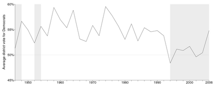
Paul Krugman writes:
For some reason a couple of people who have written to me . . . that the Democrats won a “narrow victory” in 2006. . . . In fact, it’s quite strange how the magnitude of the Democratic victory has been downplayed. . . . You might assume that this was because the Democrats barely eked out a victory. In fact, Democrats had an 8.5 percentage point lead, substantially bigger than the GOP win in 1994. . . .
Here's some historical perspective:
and here's an estimated seats-votes curve for the 2006 election:
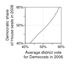
Journalists respond to seats more than votes, I think, so that's one reason they might have understated what happened in 2006.
More on seats and votes in 2006 in our article here (to appear next year in PS).
I don't know anything about this but it could be useful, I think. From the Bugs mailing list, David Stivers writes:
Adam Kramer, a student in social psychology at the University of Oregon, writes,
The great David Owen reviewed a history of bridge (the card game) recently in the New Yorker. Among other things, he noted the decline in popularity of bridge and the rise of poker. But the fall of bridge and rise of poker were not simultaneous. Poker has never really gone away, but its recent ESPN-level popularity postdates bridge's decline by decades. More to the point, I prefer poker to bridge. At my weak-amateur level, I think poker is more of a skill game than bridge is. To put it another way, both poker and bridge have routine elements. But in bridge, the routine elements are crucial and require a lot of focus--play out those cards right, or you lose. In poker, the key routine element is to fold crappy cards (most of the time), and that's easy. This is one reason I find poker to be more fun--I can focus on the important moments. (Yes, I'm sure it's different for good players of either game.)
NY Times published an awful article 25th Anniversary Mark Elusive for Many Couples that deserves a comment. Here is a quote:
Among men over 15, the percentage who have never been married was 45 percent for blacks, 39 percent for Hispanics, 33 percent for Asians and 28 percent for whites.Among women over 15, it was 44 percent for blacks, 30 percent for Hispanics, 23 percent for Asians and 22 percent for whites.
While they didn't control for age here, they did unnecessarily control for sex in this highly uninformative table-of-many-numbers:

The gross JPEG artifacts that blur the fonts are theirs, not mine: they should have known to use PNG or GIF for figures with lots of text. Does anyone gain any insight from the difference between women and men's probability other than noise? A similar nonsensical control appeared in Men with younger women have more children where the difference in optimum age difference between men (6) and women (4) is purely a statistical artifact if you go and read the paper.
Yuck. I wouldn't have posted this if this hadn't made it to the 6th place of most emailed articles in past 24 hours.
In summary, when displaying the data control for things when 1) you need to remove a known effect, 2) controlling for things tells you something you didn't know before. And use graphs not tables! And educate journalists about the basics of statistics!
Seth writes about this epidemiology class taught by Leonard Syme:
Every week there was a new topic. For every topic Syme would assign a paper laying out the conventional wisdom — that high cholesterol causes heart disease, for example — plus three or four papers that cast doubt on that conclusion. I think he even had American Heart Association internal emails. Several students would present the material and then there would be debate — what’s to be believed? The debates were intense. If ever the students seemed to be reaching agreement, he would say something to derail it. “You know, there was a study that found . . . ”Practically all classes make you think you know more at the end of them than you knew when they began. Practically all professors believe this is proper and good and cannot imagine anything else. With Syme’s class, the opposite happened: Your beliefs were undermined. You walked out knowing less than when you walked in. You had been sure that X causes Y; now you were unsure. At first, Syme said, many students found it hard to take. A three-hour debate with no resolution. They did not like the uncertainty that it produced. But eventually they got used to it.
The overall effect of Syme’s class was to make students think that epidemiology was important and difficult — even exciting. It was important because we really didn’t know the answers to big questions, like how to reduce heart disease; and it was difficult and exciting because the answers were not nearly as obvious as we had been told. . . .
This sounds great and leads me to a few thoughts:
1. Seth and I tried to do something similar over 10 years ago when we taught our seminar in left-handedness: before every week's class, the students had to read a book chapter and a couple of articles on some topic of handedness. Two of the students were given the assignment to present the week's reading to the class, then we had discussion. It didn't go quite as well as Syme's class is described to have gone. Some differences:
a. Handedness is less important than public health.
b. We didn't focus so strongly on controversies. We tried, but sometimes it's hard to get articles on two sides of an issue.
c. When we did get articles on two sides of an issue, it was difficult for the students to evaluate the articles, beyond a high-school-essay sort of reasoning where you can give three reasons to support or oppose any argument. There was no sense of how to weigh the evidence. Of course, that's the kind of skill you want to teach in an epidemiology class. I assume that Syme covered some methods in his class also, to move the discussion beyond nihilistic platitudes.
d. Syme's class was 3 hrs/week; ours was 2 hrs, I think. We also didn't have homework (beyond the readings and some data collection) and we barely taught any methods.
e. Syme's class had grad students in public health, whom I assume were more motivated to work hard, compared to our class of undergrads.
f. Syme is an expert on epidemiology, Seth and I had no particular expertise in handedness.
Looking at a-e above, the key difference, I think, is that I bet Syme's students worked a lot harder in the class. Syme deserves credit for this: motivating students to work hard and teach themselves is a fundamental challenge of teaching.
2. Regarding the discussion of whether universities should teach classes on office politics, and relating to point f above, I want to emphasize that we are not experts in this area. I'm an expert in statistical graphics. I've made thousands of graphs and done both applied and theoretical research in the area. Even if I were good at office politics (which I'm not), I wouldn't be an expert, I wouldn't have done research in the area, I wouldn't be familiar with the literature, etc. At a place like Berkeley or Columbia, the profs are world experts in what they teach. Giving the students training in office politics might be a good idea, but I would clearly distinguish it from the main academic material.which is based on research and scholarship, not just anecdotes, opinions, and personal experience.
3. Thinking about point f above: I think it would be fun to follow Syme's format in teaching a course on Controversies in Statistics. That's a topic I'm an expert on!
A colleague writes with a statistics question:
I want to make a point about a bayesian interpretation of confidence intervals. I recall that there is a result (Bernstein-von mises thm?) that links uninformative prior distributions to normal posterior distributions with a variance equal to the inverse of the fisher information. My concern is to say something like if you have no or little prior knowledge your regression estimates and standard errors can be translated into a normal posterior distribution with a mean equal to the regression estimate and variance equal to the estimated variance. Is this on the right track?
My reply: Yes, this is discussed in Chapter 4 of Bayesian Data Analysis, with some technical details in Appendix B of that book. One thing we did in chapter 4 which was pretty fun was to come up with lots of counterexamples--the theory is basically true, but there are issues with estimates on the boundary of parameter space, unbounded likelihoods, and various other pathologies.
Yu-Sung writes,
This is going to be a letdown after this grand title . . . . Lingzhou Xue writes,
I just finished reading the excellent book, "The Dream Life: Movies, Media, and the Mythology of the Sixties," by J. Hoberman. But I was disappointed the book didn't mention "Deliverance," which struck me as the ultimate Vietnam War era artifact, in that it took place during that period but had so few specific details that it could almost have taken place at any time. Also, Deliverance would fit into Hoberman's political themes since it features the sort of upscale suburban Southerners who were crucial to the political transformations of the 1960s and 70s. (But I've only read the book, haven't seen the movie, so maybe the film version doesn't fit into Hoberman's story, I dunno.)
A colleague writes,
Now that I work for a large software company, my computer code is heavily scrutinized: there are style guides, rules for indenting, conventions for variable naming, etc. I've come around to it--it really does make my code a lot better. blah blah blah. But my company doesn't really have formal rules for R because hardly any engineers use it. I'm working on writing said rules, and it seems incomplete not to include something about writing efficient code: avoiding nested loops, etc. Do you know of any good references on how to write good R code?
My reply:
1. I'm curious what the R experts say. My own stylistic preferences differ slightly from what appears to be the default in R packages: in particular, I like to indent 2 characters, but R seems to indent a lot more, which to my taste makes the code hard to read in a text editor. (My own stylistic preferences can be deduced from the examples of R code in my books.)
2. I know that there is general advice to avoid global variables--it's better to pass information in function arguments. When writing Umacs we found this to be awkward and so we used global variables instead, but since then somebody explained to me how to do it all using local variables (without requiring a huge effort in passing lists of variables). Unfortunately I can't remember now how I was going to do it. Maybe the idea was to put all the arguments in a list.
3. I personally like to fill up arrays with NA's when I set them up, so that if something goes wrong, I'll get lots of NA's in the result, and I can track back where the problem is.
4. I think R has a debugger but I've never used it. I probably should.
5. As you know, I've been moving toward the idea of simulating fake data for every problem as a test of the algorithm and code. I call this the self-cleaning oven principle: a good package should contain the means of its own testing. We haven't yet done this with "arm" but we should.
6. I agree about avoiding nested loops--when it causes programs to be slow. On the other hand, sometimes a matrix implementation can just be mysterious, and I find it helpful to spell things out with loops. (Again, we discuss this in our book--we even have a footnote or two explaining why we have some loops.)
7. I like to follow the general principle that lines of code should (almost) never be repeated. I'm always seeing students write scripts with cut and pasted code, and I'm always telling them to use a function and a loop instead.
8. A silly little thing: with if () statements, I recommend always using braces (curly brackets), even if the conditional command is just one line. If you or someone else wants to modify a function, it's much easier to do so if the braces are already there.
9. R functions are getting uglier and uglier. I'd say the typical R function is 90% "paperwork" (exception handling, passing of names, etc) and only 10% "meat" (to mix analogies). I attribute some of this to the S4 system of objects with sockets etc. For one thing, it's typically no longer possible to see what a function does by typing its name. I don't know what to say here, except to recommend not drinking the Kool-Aid: maybe you can try to keep your functions clean rather than putting all the effort into the paperwork. (Unfortunately, we didn't really follow this advice with bayesglm: we made the mistake of adapting the existing glm function.)
10. Scalability is a big issue in R. Ideally any new function would be accompanied by a statement explaining how it scales as the inputs increase in size.
11. When summarizing the results of your output, I recommend working with "display()" (from the arm package) rather than "summary()". The summary() function always seems to give a lot of crap, and we've tried to be cleaner and more focused with display(). One option is to set up functions for both so that users can typically use display(), with some extra information in summary().
12. It's a good idea to graph inferences. Graphs aren't just for raw data.
This seems like too much advice; maybe some of the above rules are unnecessary or can be written more generally.
In any case, if you're writing guidelines, I recommend giving examples of the recommended approach and also the bad approach for each rule.
Perhaps others have suggestions too (or comments on my ideas)? Once you've written your guidelines, I hope you can publish them, with discussion, in a statistics journal so all can see. There may already be some R style guide that you can adapt and react to.
I told Phil Stark about this paper on Type S error rates and this paper on statistical challenges in estimating small effects, and he replied with these references on Type S errors and multiple comparisons:
Benjamini, Y. and Stark, P.B., 1996. Non-equivariant simultaneous confidence intervals less likely to contain zero, J. Am. Stat. Assoc., 91, 329-337.
Benjamini, Y., Y. Hochberg, and P.B. Stark, 1998. Confidence Intervals with more Power to determine the Sign: Two Ends constrain the Means, J. Amer. Stat. Assoc., 93, 309-317.
This is how researchers communicate: we just send links to our papers back and forth.
Seth has an interesting discussion of this article by Gary Taubes. Seth calls it the best article on epidemiology he's read. I have nothing to add to Taubes's article and Seth's discussion except to say that it's good to see this issues raised for a general audience.
Gregor points me to this paper by Tom Louis and Scott Zeger. It's fine--definitely an improvement over the usual tabular displays--but I agree with Gregor that graphical display is better.
Seth quotes an MIT professor who writes, "one of our mathematics majors, who had accepted a lucrative offer of employment from a Wall Street firm, telephoned to complain that the politics in his office was “like a soap opera.” More than a few MIT graduates are shocked by their first contact with the professional world after graduation. There is a wide gap between the realities of business, medicine, law, or applied engineering, for example, and the universe of scientific objectivity and theoretical constructs that is MIT." Seth then writes,
It’s Veblen again: MIT professors would rather teach “scientific objectivity and theoretical constructs” than “the [dirty] realities” of the world in which their students will spend the rest of their lives.
I'm sympathetic to Seth's goal of teaching real-world content--I certainly try to do this in my books and in my classes--but should we really be teaching courses in office politics? I think it's more important to teach things in a university that students will not necessarily be able to learn elsewhere. Perhaps more to the point, profs have to teach what they know. I think my students who take a class from me will be better off learning high-quality statistics rather than low-quality office politics.
That said, maybe a couple lectures on office politics, given by an actual expert in that area, could be useful, as a supplement to the regular curriculum. But I think we should distinguish between applied research one one hand and job skills on the other. I don't see why a student should come to a place like MIT or Columbia to learn office politics, grantwriting, etc etc.
One of my favorite essays is "The Musical Husbands," written about 20 years ago by Adam Gopnik. His recent stuff, though (for example, his recent book of essays about New York), is spoiled by spelling things out too much. He explains every idea in too much detail, beyond what these little insights can support. Gopnik is not a public utility (in the memorable words of Bill James) and he can do what he wants, but I strongly recommend that he loosen up a bit, let the reader figure things out more, and not take his own ideas so seriously.
Boris pointed me to this article by Robert Lee Hotz:
We all make mistakes and, if you believe medical scholar John Ioannidis, scientists make more than their fair share. By his calculations, most published research findings are wrong. . . . "There is an increasing concern that in modern research, false findings may be the majority or even the vast majority of published research claims," Dr. Ioannidis said. "A new claim about a research finding is more likely to be false than true."The hotter the field of research the more likely its published findings should be viewed skeptically, he determined.
Take the discovery that the risk of disease may vary between men and women, depending on their genes. Studies have prominently reported such sex differences for hypertension, schizophrenia and multiple sclerosis, as well as lung cancer and heart attacks. In research published last month in the Journal of the American Medical Association, Dr. Ioannidis and his colleagues analyzed 432 published research claims concerning gender and genes.
Upon closer scrutiny, almost none of them held up. Only one was replicated. . . .
Ioannides attributes this to "messing around with the data to find anything that seems significant," and that's probably part of it. The other part is that, even if all statistics are done according to plan, the estimates that survive significance testing will tend to be large--this is what we call "Type M error." See here for more discussion.
I got the following forwarded email:
Meg Lamm writes,
I and the market research firm I work for (Nancy Dodd Research) are looking for someone to hire who could meet with me a few times to train me in using SPSS and/or Excel for doing data analysis, and in survey writing techniques. If you or anyone you know might be interested, please contact me at meg@nancydodd.com or 212-366-1526.
Aleks said I should link to this article on redistricting by Tim O'Reilly. O'Reilly suggests that computers be used to redistrict automatically. O'Reilly links to this page by Brian Olson. I think this method would be fine. Actually, many different methods would be fine. I think that the U.K. had some sort of nonpartisan boundary commissioners and that worked ok also. Of course the biggest imbalance is the U.S. Senate.
E. T. Jaynes was a physicist who applied Bayesian inference to problems in statistical mechanics and signal processing. He was an excellent writer with a dramatic style, and some of his work inspired me greatly. In particular, I like his approach of assuming a strong model and then fixing it when it does not fit the data. (This sounds obvious, but the standard Bayesian methodology of 20 years ago did not allow for this.) I don't think Jaynes ever stated this principle explicitly but he followed it in his examples. I remember one example of the probability of getting 1,2,3,4,5,6 on a roll of a die, where he discussed how various imperfections of the die would move you away from a uniform distribution. It was an interesting example because he didn't just try to fit the data; rather, he used model misfit as information to learn more about the physical system under study.
That said, I think there's an unfortunate tendency among some physicists and others to think of Jaynes as a guru and to think his pronouncements are always correct. (See the offhand mentions here, for example.) I'd draw an analogy to another Ed: I'm thinking here of Tufte, who made huge contributions in statistical graphics and also has a charismatic, oracular style of writing. Anyway, back to Jaynes: I firmly believe that much of one's statistical tastes are formed by exposures to particular applications, and I could imagine that Jaynes's methods worked particularly well for his problems but wouldn't directly apply, for example, to data analyses in economics and political science. The general principles still hold--certainly, our modeling advice starting on page 3 of Bayesian Data Analysis is inspired by Jaynes as well as other predecessors--but I wouldn't treat his specific words (or anyone else's, including ours) as gospel.
One of the early mantras one hears in statistics is "Plot the data." When I first heard it, it was followed by "by hand"; I suspect that part gets elided these days. Still, the advice is good. It's often easier to make sense of a list of numbers if you can visualize them.Most of the time, that takes time we don't have.
A recent New Yorker article about Ian McKellen reports that in a gay rights campaign he was opposed by a journalist named Peregrine Worsthorne. What's with those British names? Marquess of Queensberry, Peregrine Worsthorne, . . . I just can't imagine that people with names like this in the U.S. could be anti-gay. Probably more an indication of my lack of imagination than anything else.
Seth Wayland writes,
In Chapter 14.1 of your new book, the example uses only predictors for which you have census data at the state level. In the postratification step, you just plug the values of those covariates into the model, and viola, you have an estimate for that poststratification cell! What about including further individual level predictors in the model to account for probability of selection such as household size and number of phones in the household, or even an individual-level predictor that might improve the model? How do you then calculate the estimate for each poststratification cell?
My response: yes, this is something we are struggling with.
The long answer is that we would treat the population distribution of all the predictors, Census and non-Census variables (those desirable individual-level predictors which are only observed in the sample and not in the population), as unknown. We'd give it all a big fat prior distribution and do Bayesian inference. This sounds like a lot but I think it's doable using regression models with interactions. We're working on this now, starting with simple models with just one non-Census variable. The closest we've come so far with is this paper with Cavan and Jonathan on poststratification without population inference (see blog entry here).
The short answer is that it should be possible to do a quick-and-dirty version of the above plan, estimating the joint distribution of Census and non-Census variables using point estimates for the distribution of non-Census variables given the Census variables, based on weighting using the survey data within each Census post-stratification cell. This is only an approximation because it ignores uncertainty (for example, if a particular cell includes 4 people in single-phone households and 3 people in multiple-phone households, the weighted totals become 4 and 1.5, so the quick-and-dirty approach would use the point estimate of 1/(4+1.5) as the proportion in single-phone households in that cell, ignoring the uncertainty arising from sampling variability).
I do think that this (the quick version, then the full version) is ultimately the way to go, since the poststratification strategy allows us to model the data and get small-area estimates, such as state-level opinions from national polls.
As is often the case, the challenge in statistics is to include all relevant information (from the Census as well as the survey, and maybe also from other surveys), and to do this while setting up a model that is structured enough to take advantage of all these data but not so structured that it overwhelms this information.
My former student Rahul Dodhia (actually Dave Krantz's former student, but I was on his committee and we did write a paper together) lives in Seattle and is a full-time statistical consultant. Here's the website for his company. He actually took the statistical consulting course from me at Columbia so I'm probably to blame for this! Anyway, I haven't actually seen him consult recently, but I expect he's doing a good job. He's located in Seattle but also works remotely.
Bill Fulton has this interesting discussion of a debate about urban planning:
Someone writes in with the following question:
From the British Psychological Society Research Digest:
Children with Tourette's syndrome, the motor disorder characterised by involuntary tics, are more skilled than healthy control children at processing certain forms of grammar. That's according to Matthew Walenski at the Brain and Behaviour Lab at Georgetown University and colleagues, writing in Neuropsychologia. . . .The children with Tourette's responded more quickly than the controls on those aspects of the tasks that were considered to depend on procedural memory – such as when producing past tenses of regular verbs and naming objects that can be manipulated, but they responded with similar speed to the controls when performance depended on declarative memory – such as when giving the past tense of irregular verbs or naming non-manipulable objects.
Procedural memory is rooted in the frontal/basal ganglia circuits of the brain and these areas are known to be structurally abnormal in people with Tourette's. The researchers said it was likely this association explained the superior performance of the children with Tourette's.
Past studies involving children and adults with Tourette's have tended to focus on their involuntary verbal tics, rather than investigating their actual language abilities. . . . The new findings follow a study published last year that showed people with Tourette's have enhanced cognitive control relative to healthy participants, as shown by their ability to switch task sets without the usual reaction time cost.
This makes sense to me.
Greg Mankiw links to this article by Peter Lawrence on the mismeasurement of science. Lawrence writes:
Modern science, particularly biomedicine, is being damaged by attempts to measure the quantity and quality of research. Scientists are ranked according to these measures, a ranking that impacts on funding of grants, competition for posts and promotion. The measures seemed, at first rather harmless, but, like cuckoos in a nest, they have grown into monsters that threaten science itself. . . .The journals are evaluated according to impact factors, and scientists and departments assessed according to the impact factors of the journals they publish in. Consequently, over the last twenty years a scientist's primary aim has been downgraded from doing science to producing papers and contriving to get them into the "best" journals they can. Now there is a new trend: the idea is to rank scientists by the numbers of citations their papers receive. Consequently, I predict that citation-fishing and citation-bartering will become major pursuits. . . .
I have a few scattered thoughts on this. First, it is kind of funny to rate a paper based on the citation counts of the journal where it appears. But I guess that might make sense for a fresh new paper that hasn't had a chance to get cited. (An exception would be this paper, which got cited a lot before it ever was published, but that was an unusual case due to unforeseen delays with a journal that was just starting up.)
Second, I think it makes sense to separate two concerns: (a) criticisms of citation indexes for evaluating existing research, and (b) concerns about incentives that will distort future research. I expect that there is a high correlation between the quality of scientists' research programs and their citation counts. But I could see problems heading into the future.
Another issue is citation inflation. At least if you check on Google Scholar, you'll find that citations have increased lots just in the past few months--I assume they've either added new journals to the database or gotten better at linking citations to articles.
You also have to be careful comparing researchers in different fields. Biology and computer science get lots more citations than statistics.
Finally, I don't quite understand Mankiw's response. He links to Lawrence's article, which would seem to indicate some agreement with it, but then he also links to a list which puts him at #6 among all economists. These views aren't necessarily inconsistent--it's possible for a measurement system to be crappy but to still give reasonable results in individual cases--but it's not clear to me what Mankiw's actual views are. In particular, as an economist he might have some view of the importance of these rules as incentives. (The list itself is interesting to look at. I've heard of only a few people on the list, so I can't be sure, but it looks like you have to go down to #66 to find a woman. (Not that things would be much different in a list of statisticians.) I have to say, though, the idea of such a list is pretty unpleasant to me. I mean, how would it feel to be, say, #124 on the list? Would it be frustrating to be so low, or just cool to be on the list at all?
For some reason Aleks pointed me to this description of Bayes' theorem. Just in case anyone stumbles across this, let me say for the record that this description has very little to do with applied Bayesian statistics as I know it. For example, "The probability of a hypothesis H conditional on a given body of data E . . ." I just about never estimate the probability of a hypothesis. Rather, I set up a model and perform Bayesian inference within the model.
To be fair, this is from an encyclopedia of philosophy, not statistics, but I could imagine people getting confused by this and thinking it has something to do with Bayesian inference in applied statistics. (See here for more on Bayesian data analysis: what it is and what it is not.)
Jeff writes,
Can you suggest some (simple) material on the differences between ML MLM and Bayesian MLM? Since we are using LMER, and not winbugs etc., then Justin and I are NOT doing Bayesian MLM?
My reply: The only real difference is when the unexplained group-level variance is hard to estimate, which typically occurs when this variance is low and the number of groups is small (in which case, classical point estimates won't work well, and even a small amount of prior information will help; see Sections 5.1 and 5.2 of this paper). I think we discuss this issue in the new book, also see this from 1996, for example.
I think this story, by Tom Crippen, is brilliant:
Dragomir Radev is visiting from the University of Michigan and teaching this cool course, which I highly recommend to our computationally-minded statistics students:
Roberto Gutierrez sends along this presentation describing new multilevel modeling options in Stata 10. There's some interesting discussion of computation time. Also, when they introduce the models, I'd suggest looking at the 5 different ways of writing a multilevel model (as in Chapter 12 of our book).
When you look at presidential election returns by state, they jump all over, but when you subtract the national vote and group by region, some clear patterns jump out:

I've ordered the regions roughly from strongest Democrat-trending to strongest Republican-trending, and only cheated slightly by putting Colorado in the southwest and Alaska in with the mountain west. I'm also embarrassed to say that I adjusted the state labels by hand to stop them from overlapping; I really need to write a program to do this. If it were really important to identify which state was which, I'd probably label the states on the left of each plot also. Overall I think it came out pretty well, though.
To the R users out there (not to mention the people who set the R defaults), please also note the relatively few tick marks, the narrow space between the plots, and the internal titles for the subplots.
This (from Ben Goldacre) is pretty funny.

As Goldacre and his commenters discuss, the actual research might be (ultimately) useful and increase our scientific understanding, but the interpretation is way over the top.
P.S. More here.
I'm not old enough to be a cranky old man but I'm old enough to be just plain cranky, as can be evidenced by my irritation at this passage:
By the early 2000s, Whitestone was again filling up with young families eager to make homes for themselves on its quiet, leafy streets. But prices had soared. In October 2005, the Sheas sold the house, for which they had paid $28,000 nearly 40 years ago, for more than $600,000.
The inflation calculator here reveals that prices have indeed soared, but not quite as much as implied by the gaudy comparison of nominal prices.


Recent Comments