Results matching “R”

Here's something else from Frank Morgan:

The Prime Number theorem says that the probability P(x) that a large integer x is prime is about 1/log x. At about age 16 Gauss apparently conjectured this estimate after studying tables of primes. Greg Martin suggested to me [Morgan] the following heuristic way to approach the same conjecture, which appeared in my Math Chat column on August 19, 1999:

Suppose that there is a nice probability function P(x) that a large integer x is prime. As x increases by \Delta x = 1, the new potential divisor x is prime with probability P(x) and divides future numbers with probability 1/x. Hence P gets multiplied by (1 - P/x),\Delta P = - P^2/x,
or roughly

P' = - P^2/x.

The general solution to this differential equation is P(x) = 1/log cx.

Interesting. Every now and then when I've been stuck in a boring meeting, I've amused myself by trying to come up with a heuristic derivation of the prime number theorem but never with any success.

Frank Morgan is a wonderful teacher. I took a course from him in college and was impressed by his ability to help students of varying ability levels. (This was MIT so I guess the abilities were all on the high end, but still I think this is a challenge in any group.)

A few years ago I invited Frank to come to give a seminar on teaching to the mathematics and statistics departments at Columbia. One message I got from his talk was that much of teaching success comes from hard work. For example, every semester Frank would put the names and photos of his students on flash cards and memorize who was who.

This sort of thing was impressive to me. Any expert can demonstrate how great he is, but it takes someone very special to convey that anyone could achieve that level of success by just working hard.

That said, hard work is not enough. For example, statistics T.A.'s often spend dozens of hours preparing elaborate handouts for their students; this is almost always (in my impression) a waste of time. Better to adapt to the textbook, I think.

Anyway, I noticed this note by Frank on how he helps students prepare for their senior presentations:

At Williams every senior math major chooses a faculty advisor and gives a 35/40-minute colloquium talk. Since we currently have over fifty senior majors, this keeps us pretty busy, but we think it well worth the effort.

Here is how I like my advisees to prepare, starting a month before the talk and consulting with me every day or two . . .

Every day or two . . . that's impressive!

Blog upgrade from MT 3.3 to MT 4.2

We have upgraded the blog software from MT 3.3 to MT 4.2. There might be some hiccups, but we hope to have it operational as quickly as possible. Let us know if there are any problems!

Visualizing election polls

A colleague points me to these supremely ugly pie-like graphs by Richard Riesenfeld and Geoff Draper. On the other hand, who am I to say they're ugly? I'm sympathetic to the goal of "exposing complex relationships that are not obvious by usual methods of statistical analysis." And it's hard to argue with "Eighty-eight percent said they enjoyed using the software and 71 percent completed all the tasks without errors." I've certainly never performed such an evaluation of my own graphical methods, instead relying, Tufte-like, on my introspective judgment.

The score

Occasionally I post comments here on other people's books or articles, and sometimes I email the authors to get their feedback. Here's the score:

Responded:

John Clute
Richard Florida
Malcolm Gladwell
Sander Greenland
Daniel Gross
Mickey Kaus
Paul Krugman
Andrew Leonard
John Lott
Jay Nordlinger
Andrew Oswald
Ed Park
Steve Sailer
John Seabrook
Nassim Taleb
Josh Tenenbaum

Did not respond:

Robert Frank
Satoshi Kanazawa
George Packer
Russ Alan Price
David Runciman

I think I've missed a few here (in both categories). Also, some people I'm still waiting to hear from, and some respond but not in a useful way.

P.S. I just noticed: all these people are male (and most are white)! I'll have to diversify a bit!

Political engagement on the web

The Compete Blog (which posts a wealth of interesting data charts mined from monitoring web surfers) posted statistics
about proportion of web surfers that visit political websites:

webpolitics.png

Colorado, Connecticut and New Jersey are at the top. Colorado was a battleground state.

A question about the youth vote

Shivaji Sondhi writes:

I had a question for you about the youth vote. What are its ethnic and red/blue composition? The reason I ask is that I was trying to integrate the apparently growing Democratic dominance in this segment with various other beliefs I have seen expressed, e.g

a) that red states have larger fertility (affordable family formation or whatever)

b) that families have an impact on the political beliefs of children (more than educators, as educators insist - at least at the college level, I haven't really seen a discussion of school teachers) which would then provide a mechanism for (a) to affect voting share to the right of the spectrum

c) that the minorities form a growing share of the young which would tilt the playing field to the left.

My reply:

1. I don't yet have raw survey data. The exit polls on the web do break down the vote by age and race. Among blacks, Obama won about the same among all age groups. Among Hispanics, Obama did 8% better among the young than the old, and among whites, Obama did 14% better among the young than the old.

But . . . if you believe the exit polls (which I don't, completely), there was an interaction between age and race: many more of the young voters were ethnic minorities. Among blacks and Hispanics, there were three times as many under-30's as over-65's. (By comparison, among whites, there were more old voters than young voters.)

So the age effect partly arose from lots of young ethnic minorities coming out to vote.

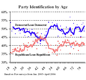
2. People do tend to vote like their parents--children of Republicans are, on average, more likely to vote Republican--but cohort effects go on top of this. The recent economy and George W. Bush's approval ratings aren't likely to make the Republican Party popular with young people--especially those who are ethnic minorities. Any differences in birth rates between states are small compared to these big political swings, which are not just about Obama; see this graph from 2006:

27-4.gif

Malcolm Gladwell recounts the story of Sidney Weinberg, a kid who grew up in the slums of Brooklyn around 1900 and rose to become the head of Goldman Sachs and well-connected rich guy extraordinaire. Gladwell conjectures that Weinberg's success came not in spite of but because of his impoverished background:

Why did [his] strategy work . . . it's hard to escape the conclusion that . . . there are times when being an outsider is precisely what makes you a good insider.

Later, he continues:

It’s one thing to argue that being an outsider can be strategically useful. But Andrew Carnegie went farther. He believed that poverty provided a better preparation for success than wealth did; that, at root, compensating for disadvantage was more useful, developmentally, than capitalizing on advantage.

At some level, there's got to be some truth to this: you learn things from the school of hard knocks that you'll never learn in the Ivy League, and so forth. But . . . there are so many more poor people than rich people out there. Isn't this just a story about a denominator? Here's my hypothesis:


Pr (success | privileged background) >> Pr (success | humble background)

# people with privileged background << # of people with humble background


Multiply these together, and you might find that many extremely successful people have humble backgrounds, but it does not mean that being an outsider is actually an advantage.

Here's more from Gladwell's article:

NY Times has a good article on the state of recommender systems: "If You Liked This, Sure to Love That ". This is a description of one of the problems:

But his progress had slowed to a crawl. [...] Bertoni says it’s partly because of “Napoleon Dynamite,” an indie comedy from 2004 that achieved cult status and went on to become extremely popular on Netflix. It is, Bertoni and others have discovered, maddeningly hard to determine how much people will like it. When Bertoni runs his algorithms on regular hits like “Lethal Weapon” or “Miss Congeniality” and tries to predict how any given Netflix user will rate them, he’s usually within eight-tenths of a star. But with films like “Napoleon Dynamite,” he’s off by an average of 1.2 stars.

The reason, Bertoni says, is that “Napoleon Dynamite” is very weird and very polarizing. [...] It’s the type of quirky entertainment that tends to be either loved or despised.

And here is the stunning conclusion by fortunately anonymous computer scientists:


Some computer scientists think the “Napoleon Dynamite” problem exposes a serious weakness of computers. They cannot anticipate the eccentric ways that real people actually decide to take a chance on a movie.

Actually, computers do quite a good job modeling probability distributions for those more eccentric and unpredictable of us. Yes, the humble probability distribution, the centuries-old staple of statisticians is enough to model eccentricity! The problem is that Netflix makes it hard to use sophisticated models the scoring function is the antiquated and not just pre-Bayesian but actually pre-probabilistic root mean squared error or RMSE. For all practical purposes, the square root in RMSE is a monotonic transformation that won't affect the ranking of recommender models, and we can drop it outright.

So, if one looked at the distribution of ratings for Napoleon Dynamite on Amazon, it has high variance:
napoleondynamite.png

On the other hand, Lethal Weapon 4 ratings have lower variance:
lethalweapon4.png

If we use the average number of stars as the context-ignorant unpersonalized predictor (which I've discussed before), ND will give you mean squared pain of 3.8, and LW4 will give you the mean squared pain of 2.7. Now, your model might choose not to make recommendations with controversial movies - but this won't help you on Netflix Prize - you're forced to make errors even when you know you're making them. (R)MSE is pre-probabilistic: it gives no advantage to a probabilistic model that's aware of its own uncertainty.

The Earth Institute is looking for applicants for its postdoctoral fellows program, and if you're doing statistics you can work with me. It's a highly competitive program, deadline is 1 December so apply now:

Thanh Nguyen writes:

Could you tell me what is the difference between "uncertainty" and "ignorance" in this theory [of belief functions]? Some authors define "ignorance" as the "uncommitted belief" which is assigned to the whole frame of discernment, others define it as the difference between Plausibility and Belief (Pl() - Bel()). Some authors define value assigned by Belief function for elements as "uncertainty".

I don't know. All I know about belief functions is in my article about the boxer, the wrestler, and the coin flip, which is actually a writeup of something I did 20 years ago. So no new thoughts, unfortunately.

The Future of Data Analysis

Introduction A few days ago I was trying to explain the benefits of the Bayesian approach to a physicist who didn't care about the religion of truth and inference but primarily about solving a particular detection problem in particle physics. The probabilistic approach is rather standard and requires little persuasion, but the Bayesian aspect is is a level further than the probabilistic approach. So what is the benefit of the Bayesian approach? This posting will attempt to provide several reasons, from the most obvious to the least.

Frequentist Probability Probability is easily justified as a very elegant way of dealing with uncertainty in cases and variables. But probability is not observed directly but instead inferred - as are the parameters in contrast to observable predictors and outcomes. Frequentists state that the probability should be measured through the gold standard of an infinite sequence of observations, and question the benefit of Bayesian approach while criticizing the fact that inferring a parameter Bayesianly can yield worse accuracy than their favored method of "estimators" - and a bad prior can totally mess up inference. So why not use estimators if their asymptotic properties are good and the methodology often simpler than Bayes?

Overfitting Dividing the number of positive outcomes with the number of all outcomes to estimate the probability of the positive outcome is a very simple estimator: it's easy to have enough data to calculate this. But most interesting questions are not as simple: it is not interesting to calculate the probability of getting cancer, and the probability of getting cancer given smoking also requires removing the obvious effect of age. All these additional variables make a model more complicated, and the number of parameters greater. Without care and attention the model can start hallucinating properties that aren't there. The problem is shown in the following picture:

why-bayes.png

If your modeling problem is in the green area, you can happily use estimators or maximum likelihood. If you're entering the yellow area and want to retain some generalization power, you need some sort of regularization, epitomized by L1 and L2 regularization, AIC, feature selection or support vector machines. So why shouldn't we just regularize?

Priors Priors are how a Bayesian would perform regularization. After seeing a large number of regression problems from medical domains, we can safely assign a prior distribution to the size of a regression coefficient, as we have done in our paper. But then, what is the advantage over regularization? A prior is just a distribution of what the parameters should be over a particular category of problems! Isn't this a nice way to formulate regularization?

Model Uncertainty The crux of Bayes is in using probability to represent the uncertainty about the Platonic - the model, its parameters, the probability. The Bayesian approach truly starts paying a dividend when there is uncertainty in models and parameters, when we have insufficient data to accurately fit the model. Even if an estimator could rather accurately match the predictions obtained by a posterior, the variance in the posterior allows us to understand when the model can't be fit. To the best of my knowledge, no other methodology can automatically detect such problems.

Another problem that Andrew identified is that there might be situations where the data doesn't match the model very well - and even though there might be lots of data and a relatively simple model - it just doesn't fit, and the posterior will be vague.

Language of Modeling WinBUGS is an example of a higher-level modeling language. Just as programming languages have been celebrated as improving programmers' productivity: they do not require the programmer to think in terms of individual statements such as SET or JMP but in terms of functions, procedures, loops. Similarly, with Bayesian models we no longer have to think in terms of derivatives and fitting algorithms, but in terms of parameters having distributions and tied together in models. Gibbs sampler is a general-purpose fitter and proto-compiler. Of course, it's not nearly as efficient as a hand-written optimizer, but in the future tools like the Hierarchical Bayes Compiler (HBC) will create custom fitters given a higher-level specification of the model.

Summary The primary value of the Bayesian paradigm is its formal elegance which allows automation of key problems: probability takes care of unpredictability in phenomena, priors help prevent overfitting by providing outside experience (AI practitioners would refer to it as background knowledge), the use of model uncertainty helps determine the reliability of predictions, and applied Bayesians are beginning to develop model compilers!

Future The theory and practice of data analysis is currently all mixed up among a number of overlapping disciplines: (applied/mathematical/geo/medical/...)statistics, machine learning, data mining, (econo/psycho/bio)metrics, bioinformatics. All of them pursue the same problems with different but qualitatively similar tools, lacking the scale to build tools that would help them get to the next level. It is important to disentangle them. The future of data analysis should lie on these four fronts:


  1. reliable compilers and samplers that will work with large databases, provide reliable sampling (see BUGS, HBC - empowered by the new generation of programming languages such as Haskell)
  2. internet databases intended to manage background knowledge and related data sets, where the same variable appears and the same phenomenon appear in multiple tables, allowing priors to be based on more than a single data set. Research should be presented as raw data in a standardized form, not as reports and aggregates that prevent others from building on top of the finished work. Too many people are working on the same problems but not sharing the data because of an unsolved issue of the rights of the collectors of data who can only gain credit for publications (see FreeBase, Machine Learning Repository, Trendrr, Swivel, OECD.Stat)
  3. visualization & modeling environments that make it easier to clean and transform data, experiment with models, to present insights, to reduce the amount of time needed to turn data into a model that can be communicated. (see R Project, Processing, Gapminder)
  4. interpretable modeling is important to bring formal models closer to human intuition. It is still not clear what is the importance of a predictor for the outcome - the regression coefficient is close, but yet often confusing. With more powerful modeling frameworks, it is going to be possible to focus on this - not being worried about what one can fit, but instead with model choice, model selection, model language, visual language.

What do you think? What links did we miss?

John Seabrook writes:

There is also little consensus among researchers about what causes psychopathy. Considerable evidence, including several large-scale studies of twins, points toward a genetic component. Yet psychopaths are more likely to come from neglectful families than from loving, nurturing ones.

I'm confused here. If there's a big genetic component, wouldn't it stand to reason that parents of psychopaths are more likely to be neglectful and less likely to be loving and nurturing? So why the "Yet" in the quote above? Or is there something I'm missing?

P.S. in response to commenters: Yes, I agree that it's possible for psychopathy to be largely genetic without parents of psychopaths being much more likely to be neglectful.

What I didn't understand was Seabrook's implication that this would be surprising, the idea that if (a) a trait is genetically linked, and (b) a trait can be (somewhat) predicted by parental behavior, that the combination of (a) and (b) should be considered puzzling. By default, I'd think (a) and (b) would go together.

Kevin Denny writes:

Depressive symptoms are significantly higher amongst left-handed men. While 19% of right handed men report experiencing depressive symptoms for at least a two week period, the figure for left handed men is almost 25%. For women the corresponding percentages are 33% and 36% respectively but the difference is not statistically significant.

The analysis is of "a new large population survey from twelve European countries," a random sample of 27000 non-institutionalized people aged 50 and older. Handedness was classified based on self-reporting, and depression is measured using standard questions. Of the sample, about 7% of men and 6% of women were classified as left-handed.

My only suggestion (beyond reporting fewer significant digits in the tables) is to rescale the depression scale by dividing by two standard deviations; this would allow the coefficients to be interpretable on the same scale as those for the binary outcome (see Table 2).

Estimated votes by county among non-blacks

Ben Lauderdale writes:

I [Ben] had this map [see below] on my door for the last week. Based on exactly the same calculation using constant 95% black support and census-proportional representation. The white counties are the ones whose census names didn't match properly with the names used in the library(maps) package in R, I was too lazy to fix them.

ben1.png

Cool. I'd only suggest using light gray rather than heavy black lines between counties; the map as it is overemphasizes the county borders, I think. But I respect his laziness; there's always time later to fix the details.

Ben continues:

[Below are] the state-by-state county share plots for the lower 49, Obama vote share as a function of black population share. V.O. Key's observation that whites who live near blacks in southern states are less positively inclined towards them is *still* visible in several states.

ben2.png

The circle areas are proportional to county voter turnout. (The biggest circle is L.A. county in California, and so forth.)

Ben also had this comment about his map:

It reminded me of something Bob Putnam would say every time someone presented an empirical talk in our Center for the Study of Democratic Politics series during the year he was a fellow here at Princeton: "You should include miles to the Canadian border as a variable in your regression, it is the most important proxy for political culture in America!" At least in the eastern half of the country, he has a point.

Except for New Hampshire and Vermont, I think.

P.S. For graphics enthusiasts, here are some earlier graphs that I gave the thumbs-down on before Ben came up with the 50 plots above:

For teaching a course in the comic novel

A colleague was asking for suggestions for teaching a course in the comic novel. Beyond the obvious (Waugh, Wodehouse, Roth, Nabokov), I thought of:Our Man in Havana, by Graham Greene. Twain is another obvious call, except that his funny novels are also serious. The funniest non-serious thing I know of by Twain is Adam's Diary, but that's just a short story. We also discussed End Zone by Don DeLillo. And I've also heard that Gulliver's Travels is pretty good; I've never read it. I also think much of The Sportswriter and Independence Day by Richard Ford are hilarious, but I don't think they'd be classified as comic novels.

My latest thought is Little Children by Tom Perotta. It's an excellent book but it's not a great work of art, but that's the point: when teaching a class, maybe it's better to have something where the seams show a little.

P.S. See comments below. Also, Bridget Jones's Diary. And some kids' humor book: not something like Lemony Snicket that's supposed to be good, but something more lowbrow such as Goosebumps or Captain Underpants, to get a sense of what people think is funny. Also, something funny but completely non-novel-like, for example Chris Rock's book. Students can compare how the comic novels differ from the quick jokes.

Drew Conway pointed me to this:

The article entitled, "Bayesian Analysis for Intelligence: Some Focus on the Middle East," was written by Nicholas Schweitzer . . . JIOX provides no information on the essay's origins, but . . . it appears to be a declassified CIA piece written sometime in the 1970's (note mentions of Presidents Asad and Sadat, and Prime Minister Rabin on page one). . . . Schweitzer concludes that in general the Bayesian technique was able to more quickly predict "non-events" (i.e., when no hostilities would occur among Middle Eastern nations) than analysts using only their expertise and intuitions. The research design included no baseline for comparison to an actual event; therefore, we are left wondering if the Bayesian technique described here would be able to predict when something will actually happen. Despite this obvious shortcoming, it is very encouraging to observe the level of sophistication being implemented by CIA analysts some thirty-odd years ago.

I actually participated a couple years ago in an (unclassified) meeting on Bayesian analysis for military intelligence, so I know that these ideas are still out there. My only comment, regarding the Bayesian issue per se, is that the key to good statistical methods is typically making use of relevant information; non-Bayesian methods can also be effective if they can be adapted to use the info that goes into a Bayesian procedure.

Too loose

Will Wilkinson interviewed me for Bloggingheads today, and it was a disaster. I was too relaxed and I treated it as a conversation rather than a formal presentation or interview. As a result, I did too much b.s.-ing and too much conversational yapping, and not enough presentation of our research findings. I also said a bunch of things that are interesting or funny in informal conversation but probably come off as obnoxious or off-the-cuff in an interview that can be viewed interactively.

It's too bad, because my Red State, Blue State presentation is fun and informative, and I think the radio interviews I've done (with lengths ranging from 5 minutes to an hour) have gone well also. The two things that threw me off:
1. I've met Will before and I felt comfortable with him, hence too relaxed. Will was an excellent interviewer and gave me many opportunities to explain things; it wasn't his fault that I spouted off too much.
2. I've already spoken with Will about the book and so it was hard for me to remember to start from scratch--the audience won't necessarily be familiar with it.
3. Seeing my image in front of me while I was talking made me extra-focused on not twitching--always a bad thing. In a face-to-face or telephone interview, I usually forget about the twitching after a minute or so. Trying to suppress it takes a lot of mental effort that would be better used to think about my responses.

It would've been better to have some written talking points in front of me to keep me focused. The funny thing is, I did that for my early radio interviews but as I got more used to the format, I started speaking more off the cuff and it was going fine. This was just an interview too far. I had fun while it was happening, but afterward I realized what had gone wrong.

Anyway, it felt good to get this off my chest.

Someone went to our radon site and asked:

I'm thinking of mitigating my basement radon of 7.75 pci/l. It's a parcel slab with a crawl space. Why can't I just install an exhaust fan in the basement? Instead of PVC piping, drilling into the slab and sucking out the air underneath the membrane in the crawl space, etc. I have a high efficiency furnace with a fresh air inlet that wouldn't create negative pressure.

Phil's reply:

I said I wouldn't do more posts on the election, but . . . Eric Rauchway merged our provisional county data with Census numbers on %black and made some graphs, which I played with a little to get the following:

eric1.png

Percent black acts as a floor on Obama's vote share; beyond that, it predicts his vote better in some regions than others.

But really there are two things going on. First, Obama's getting nearly all the black vote; second, depending on the region, whites are voting differently in places with more or fewer African Americans.

Then I had a thought. Obama got 96% of the black vote. If he got 96% in every county--which can't be far from the truth--then we can use simple algebra to figure out his share of the non-black vote in every county. If B is the proportion black in the county and X is the (unknown) Obama vote share among non-blacks, then, for each county,

obama.vote = 0.96*B + X*(1-B)

And so

X = (obama.vote - .96*B) / (1 - B)

This is only an approximation--for one thing, it assumes turnout rates are the same among blacks and others--but it can't be too far off, I think. And it leads to the following graph:

eric2.png

(Lowess lines are shown in blue.) None of this is a huge surprise: outside the south, places with more African Americans tend to be liberal urban areas where people of other ethnicities also vote for Democrats; in the south, many African Americans live in counties where the whites are very conservative.

Notes:
1. These graphs are non-blacks, not whites. Some of the variation has to be explainable by the presence of other minority groups.
2. For a few of the southern counties, our estimates of X are negative; that just means that Obama got less than 96% of the black vote there, or there was differential turnout, or some combination of these.

Sign in the Chicago L:

Soliciting and Gambling are Prohibited on CTA Vehicles

I had no idea this would be a concern.

Postdoctoral research opportunity in Paris

Christian Robert writes:

Objet: lancement de la campagne de post-doc 2009 de la Fondation

La Fondation Sciences Mathématiques de Paris offre quinze positions post-doctorales en mathématiques et en informatique fondamentale. D'une durée d'un an - éventuellement renouvelable - ces postes sont à pourvoir à partir du 1er octobre 2009 dans les laboratoires de recherche affiliés à la Fondation.

L'appel d'offre du programme post-doctoral sera ouvert du 31 octobre au 17 décembre 2008, sur le site de la Fondation et en anglais.

He says they pay well, too! And if you do statistics, maybe you can work with me next year...

John Kastellec made this graph of seats and votes in 2006 and 2008. For each year, the dot is what actually happened and the line is our estimated seats-votes curve based on modeling from the previous election year.

sv1.png

The Democrats did well in both years, but they didn't get as many seats as we would've expected, given their vote share. As I've already discussed, the Democrats' 56% share of the average district vote was pretty impressive, a 5.7 percentage point gain since 2004:

adv.png

But the Democrats performed less well than expected in converting votes to seats. This explains to me why Charlie Cook et al. felt that the Democrats' performance was disappointing. At the level of voters, however (and of public opinion), the party did fine in congressional voting.

Election decided by toss of a coin

I just love these stories.

Michael Herron sent me this article-in-progress by Jonathan Chapman, Jeffrey Lewis, and himself on residual votes in the 2008 Minnesota Senate race. They conclude:

In the Minnesota Senate case there is no doubt that the number of residual votes dwarfs the margin that separates Coleman from Franken. We show using a combination of precinct voting returns from the 2006 and 2008 General Elections that patterns in Senate race residual votes are consistent with, one, the presence of a large number of Democratic-leaning voters, in particular African-American voters, who appear to have deliberately skipped voting in the Coleman-Franken Senate contest and, two, the presence of a smaller number of Democratic-leaning voters who almost certainly intended to vote validly in the Senate race but for some reason did not do so. . . . At present, though, the data available suggest that the recount will uncover many of the former and that, of the latter, a majority will likely prove to be supportive of Franken.

Computational Finance with R

Jan Vecer is co-organizing a conference here at Columbia on 4 Dec on computational finance with R. Registration information is at the link.

Modeling growth

Charles Williams writes,

In a number of your examples in the multilevel modeling book you use growth as an outcome. I'm doing this in a study of firm growth in the cellular industry. In this setting, we need to control for firm size since firm's propensity to grow is definitely affected by its size. Someone suggested to me that I may have correlation between the size variable and the error term, since size is effectively in the denominator of the growth variable. They suggested using just the numerator of the growth term (subscribers added) as the outcome, since the denominator will be controlled for in the regression.

Have you run into this? Do you agree that there is a potential for bias in using size as a regressor for growth?

My reply: Yes, it makes sense to control for size (at the beginning of the study) in your regressions, probably on the log scale. I'd still use the ratio as an outcome because I think it would help the coefficients be more directly interpretable (which is a virtue in itself and also helps with efficiency if you have a hierarchical or Bayesian model).

"Not a few" = 6?

In a discussion of the historic nature of Barack Obama's election, Christopher Hitchens writes, "there were not a few elected black American representatives 40 years ago."

This claim surprised me, so I looked it up. In 1968, there were 5 African Americans in the House of Representatives and 1 in the Senate. This sounds like only "a few" to me! Was Hitchens just confused here, or am I missing something?

P.S. Somebody pointed out that there were black state and local officeholders as well. I guess it all turns on what is meant by "not a few." Blacks were certainly a very low percentage of all U.S. elected officials back then.

Information and application instructions are posted on the ETS Web site at http://www.ets.org/research/fellowships.html. The deadline for applying for the summer internship and postdoctoral fellowship programs is February 1, 2009. The deadlines for applying for the Harold Gulliksen program are December 1, 2008 for the preliminary nomination materials and February 1, 2009 for the final application materials.

Tyler Cowen's recent remark against team players reminded me of my paper a few years ago, Forming Voting Blocs and Coalitions as a Prisoner's Dilemma: A Possible Theoretical Explanation for Political Instability:

Individuals in a committee or election can increase their voting power by forming coalitions. This behavior is shown here to yield a prisoner's dilemma, in which a subset of voters can increase their power, while reducing average voting power for the electorate as a whole. This is an unusual form of the prisoner's dilemma in that cooperation is the sefil sh act that hurts the larger group. Under a simple model, the privately optimal coalition size is approximately 1.4 times the square root of the number of voters. When voters' preferences are allowed to di ffer, coalitions form only if voters are approximately politically balanced. We propose a dynamic view of coalitions, in which groups of voters choose of their own free will to form and disband coalitions, in a continuing struggle to maintain their voting power. This is potentially an endogenous mechanism for political instability, even in a world where individuals' (probabilistic) preferences are fixed and known.

Cool jargon, huh? Here's a pretty picture from the article:

pris2.png

And here's a schematic of the reasoning:

pris1.png

It's about who you are and where you live

Richard Florida writes:

The critical feature of the creative economy is that it makes place the fundamental feature of politics, culture, and economics.

This isn't literally true, at least not in Alabama and Mississippi, where whites went 8 to 1 for McCain and blacks went something like 25 to 1 for Obama. But I think what Florida means is that place is more important than it used to be within demographically defined subgroups of the population (in particular, upper-middle-class whites).

The question is: how to state this hypothesis carefully, how to test it, and how to understand where (in space and time) it's largely true and where it's not. This is an important research project, I think.

More on the swing in the House vote

In yesterday's blog entry I looked that the swing in congressional voting nationally (House Democrats gained 5.7%, on average, compared to 2004) and by state (compared to 2004, House Democrats gained in nearly every state). My graphs elicited several interesting comments including this from Steve Sailer:

Perhaps the reason that the GOP House losses of seats were considered not so bad compared to 2006 was because in 2008 the Democrats ran up huge turnouts in black-represented Congressional districts, which were already all Democratic?

Let's look at some district-by-district swings, starting in 2002:

congswings.png

Here, I'm excluding uncontested elections and those in which the challenger got less than 10% of the vote; dots indicate incumbents running for reelection, circles are open seats, and red points are those with black representatives as of 2008. (I just pulled the names off the Congressional Black Caucus website and didn't try to go back to earlier years on this.)

What happened? Overall, the Democrats gained a bit in 2004, a lot in 2006, and some in 2008. But we knew that (see the time series plot in the blog entry linked above). We also see a bit of scatter. Beyond this, yes, there are some patterns. In 2006, the Democrats particularly gained in Republican areas--see how those dots in the lower left of the second graph are way above the 45-degree line? In 2008, the swing is more uniform. (In addition, the black Democrats did pretty well in 2008 compared to 2006, but it doesn't seem like a big part of the story.)

Returning to the "How well did the Democrats actually do in 2008" question, I think that one problem is that people are comparing Obama's vote to Kerry's vote but then comparing the congressional Democrats in 2008 to the congressional Democrats in 2006. I think it's more appropriate to compare 2008 to 2004 in both cases. As Paul Krugman put it, "Maybe the reason people don’t see this is that the Democratic House gains were spread over two elections."

P.S. This is about it for now, I think. Time to return to regular statistics posting.

The Department of Statistics at Columbia University invites applications for an Assistant Professor position, commencing Fall 2009. A PhD in statistics or a related field and commitment to high quality research and teaching in statistics and/or probability are required. Outstanding candidates in all areas are strongly encouraged to apply. You should apply before December 1, 2008.

This is cool stuff (by Jeff Lax and Justin Phillips).

Mark Schmitt writes:

The long election cycle featured as many theories about how the election would turn out as there were presidential candidates in those first debates in 2007. Let's give some of the theories a post-final-exam assessment.

He discusses a bunch of things here, but the one that interests me the most is:

Economic Determinism: B. Some political scientists and economists like to remind us that for all the Palin jokes and PUMAs and debate gaffes, elections are pretty simple -- a good economy benefits the party in power; a bad economy creates a change election. There are various models that, ignoring all polls, aggregate and weight economic data to predict the outcome. The best known model is that of Yale's Ray Fair, which predicted an Obama victory with 51.9 percent of the vote, off by just a percentage point. Other models were also accurate.

My comment: Regarding the political science theories, I think "economic determinism" is a bit strong. These models do have other predictors and they also acknowledge error. Also, I know that Ray Fair did this stuff early on, but nowadays I think that political scientists such as Bob Erikson, Chris Wlezien, Doug Hibbs, Jim Campbell, and Larry Bartels are the more serious researchers in this area. If you want to read a whole book about the topic, I recommend Steven Rosenstone's Forecasting Presidential Elections from 1983. "Economic determinism" may look kind of simplistic, but I think the work of Rosenstone and his successors captures important truths.

Voter turnout update

Michael McDonald posts his updated estimate of voter turnout. Here's the updated graph:

turnout.png

And here are McDonald's comments. They are interesting from the standpoint of statistical inference as well as politically:

My [McDonald's] revised national turnout rate for those eligible to vote is 61.2% or 130.4 million ballots cast for president. This represents an increase of 1.1 percentage points over the 60.1% turnout rate of 2004. . . .

The Earth Institute is looking for applicants for its postdoctoral fellows program:

A Democratic swing, not an Obama swing

There's an idea going around that the Democrats turned in a disappointing performance in Congressional races this year. For example, a politically-minded friend of mine of the liberal persuasion wrote: "The election was good news, although the Democrats did not do quite as well in the Senate and House as I expected. Obama did not have very long coattails--given how anti-Republican Americans are these days."

Some of the pros say this too; for example, Charlie Cook writes, "given the strength of the top of the ticket nationally, one might have thought that the victory would have been more vertically integrated. . . . what happened down-ballot was not proportional to what happened at the top."

And Mickey Kaus attributes this to moderate ticket-splitters who, expecting that Obama would win, decided to support Republicans in Congress: "swing voters compensated for the bold, hopeful risk they took on Obama (including for overcoming any race prejudice) by gravitating back toward Republicans in their local Senate and House races."

The only trouble with this theory is that it's not supported by the data. Obama won 53% of the two-party vote, congressional Democrats averaged 56%. The average swing of 5.7% from Democratic congressional candidates in 2004 to Dems in 2008 was actually greater than the popular vote swing of 4.5% from Kerry to Obama.

Let's look at what happened state by state. Here I'm plotting the swing in average district vote in each state, comparing the congressional elections of 2004 to those of 2008, ordering the states by Kerry's share in 2004:

swings1.png

The horizontal blue line shows the average swing of 5.7%. The Democrats gained in nearly every state, with, unsurprisingly, some big swings in some of the small states that have only one or two congressional districts.

Now let's compare this to the state-by-state swing in the presidential vote:

swings2.png

Obama beat Kerry nearly everywhere, fairly uniformly with only a few exceptions--we knew that--but my point here is that Obama's swings weren't quite as large, on average, as the state congressional delegations'.

If you want, you can look at both swings at once:

swings3.png

In the states in the upper left of this graph, the Democrats improved more in the congressional than in the presidential vote; the states in the lower right are those where the Obama-Kerry swing was greater than the Democrats' swing in House races.

There are a lot more states in the upper left than in the lower right. Each state has its own story--for example, I wouldn't attribute Don Young's squeaker in Alaska to Barack Obama's coattails--but given the graphs above, I think it's hard to make the case that, overall, the voters were saying No to the Democrats in Congress. On the contrary, congressional Democrats averaged 56% of the vote--their best showing since 1976 (and far more than the Republicans' 52% in 1994).

Here's the story in a map:

swingmap.png

For some historical perspective, here are the Democrats' two-party vote share in presidential elections and average two-party vote in congressional elections since 1946:

adv.png

Presidential voting has been much more volatile than congressional voting (incumbency and all that). This makes the Democrats' 5.7-point gain over two elections even more impressive.

Summary

I think Charlie Cook was closer to the mark when he wrote, "The political environment and momentum that Democrats seemed to have in recent months may have led to an unrealistic set of expectations. In this, perhaps we pundits share some blame." I don't think it makes a lot of sense to consider Obama's 53% "enormously impressive" and congressional Democrats' 56% a disappointment.

The data demolish the idea that voters in 2008 were pulling the lever for Barack but not for the Dems overall (not for "Nancy Pelosi," if you will).

Notes

1. I thank John Kastellec and Jared Lander for gathering the data and sharing their thoughts.

2. I'm counting uncontested House candidates at 75% of the vote (see our earlier article for discussion of this and similar technical issues).

3. We use average district vote rather than total vote because congressional vote totals vary a lot, and we're trying to assess national public opinion (as judged, for example, in Kaus's quote above).

4. The Democrats won resoundingly; this means that the voters preferred them to the alternative; it does not necessarily mean the voters want the specific policies proposed by the Democrats. Recall the Democrats' surprising lack of popular success after 1976 and the Republicans' struggles after their 1994 sweep.

5. I'm talking about public opinion here, not campaign strategy. I'm sure that Democratic leaders were disappointed in their party's performance in key congressional races, especially given their immense financial resources this year. At the level of public opinion, though, the Democrats in Congress outperformed Obama overall and in 38 states--and their swing beat Obama's overall and in 32 states--so I think you'd be hard pressed to argue that the voters were balancing toward the Republicans in congressional voting. This is not to say that the voters have given the Democrats a blank check, but it really was a Democratic swing, not an Obama swing.

Big city Barack

This note by Nate inspired me to check the vote swings by county population. I don't have the urban/suburban/rural status of counties in an easily grabbable form (maybe Boris has these and can send to me) and so as something quick I plotted vote swing vs. county population. Actually, I don't have county population right here either and so I used total number of votes in the county in 2004. Many of the large-population counties are urban (such as Los Angeles, the largest); others are major suburban counties. Anyway, here's what we see:

swingspop.png

The blue line is the lowess curve fit to the data. There's a lot of variation--county size is not such a good predictor of swing--but there is indeed a pattern of bigger Obama swings in larger counties. (The counties are already ordered by size so there's no need to use larger circles to indicate larger counties as I did in the plots of county income posted earlier.)

To understand this better, let's break up the data by region of the country. Also, since we're at it, let's look at swings in the past couple of elections as well.

Here are the swings broken up by region of the country for the past few elections. The left column shows 1996/2000, the middle column shows 2000/2004, and the right column shows 2004/2008.

swingspop_more.png

What do we see?
1. The large-county/small-county differential in Obama's gains was particularly strong in the south and did not occur at all in the northeast. For example, Obama won 84% of the two-party vote in Philadelphia--but Kerry got 80% there four years ago. This 4% swing was about the same as Obama's swing nationally. Part of the issue here is that Obama had almost no room for improvement in these places.

2. The pattern of Democrats improving more in large-population counties is not unique to 2008. Gore did (relatively) well in big counties in all regions in 2000.

Vote swings in rich and poor counties

I got ahold of the county-level election returns from 2008 (as of a few days ago, so lots of precincts missing, but that's what I have to go with for now) and crosstabbed it with county income, dividing the counties into poorest, middle, and upper third, with cutpoints set so that approximately one-third of the U.S. population is in each category.

What happened in each lower, middle-income, and rich America?

countyswings.png

Obama did better than Kerry in all three graphs, but he did most uniformly better in the rich counties. (In this and subsequent graphs, the area of the circle is proportional to the number of voters in that county in 2004. It turns out that Obama did the worst, compared to Kerry, in low-population poor counties, so the graphs actually look a bit different if you plot all counties with equal-sized circles.)

These patterns are new to 2008. Checking the corresponding plots from 2000/2004 and 1996/2000, we don't see much of anything different comparing poor, middle-income, and rich counties.

The next step is to break things up by region of the country. Here's what we see:

swings2008.png

In the midwest and west, Obama outperformed Kerry in all sorts of counties. In the northeast, Obama did just a bit better than Kerry (who had that northeastern home-state advantage). In the south, Obama did almost uniformly better in rich counties, also did well in middle-income counties (although less so in Republican-leaning areas), and basically showed no improvement from Kerry in poor counties.

So, region and income are both part of the story here. As we already know from those maps of vote swing by county. These scatterplots are another way to look at it.

What happened in the two previous elections?

Let's take a look at the swings from 2000 to 2004:

Carlin and Louis, third edition

Brad Carlin and Tom Louis recently came out with a third edition of their book, originally called Bayes and Empirical Bayes Methods for Data Analysis with a plain green cover, now called Bayesian Methods for Data Analysis with a red cover with graphs on it. In title and appearance they are thus converging to our book. They even use the "Bugs code" and "R code" marginal notation that is in my book with Jennifer (see Carlin and Louis, page 178, for example).

What's fun, though, is how different their book is from ours. I highly recommend that anyone interested in Bayesian statistics buy their book as well as Bayesian Data Analysis. This review focuses on the features of Brad's and Tom's book that differ from ours.

bayesglm in Matlab?

I received the following email:

They had an advertisement for horse feed

My post-election interview with Kathleen Dunn on Wisconsin Public Radio. It was fun. I blame Zacky for all my coughing.

Affordable family formation

Steve Sailer writes:

Based on the extremely similar results in 2000 and 2004, I [Sailer] had invented a novel and ambitious theory explaining why American states vote in differing proportions for Republican or Democratic candidates. My Affordable Family Formation theory isn't about who wins nationally, it's about how, given a particular national level of support, which states will be solid blue (Democrat), which ones purple (mixed), and which ones solid red (Republican). . . .

I have to say I prefer a college freshman's plot to yours, Andrew. Although, you did hack it together at 3am after strolling around Grant Park. And drawing the y axis from 0 is a mistake which you didn't make, too.

I wrote here here that the red/blue map was not redrawn; it was more of a national partisan swing.

In comment #39 to that entry, Scott de B. wrote: "How else would you define 'redrawing the red/blue map' other than 'a nationwide partisan swing'? By your definition, Reagan didn’t redraw the national map, but if Mondale’s lone state in 1984 had been Alabama instead of Minnesota, he would have."

My first response is that, yes, Obama's national swing was important, but it didn't much change the relative positions of the states. Let's see what happened in 1980/1984:

1980_1984.png

and in 1976/1980 (newly added):

1976_1980.png

These changes were indeed less uniform in their swings as compared to 2004/2008.

I graded this week's homeworks (from chapter 12 of ARM). When I write homework problems, I think about what they will be like to do. I don't think about what they will be like to grade. I'll try to write better homework problems in future books.

Henry posted some great links to voter turnout data and discussions of the topic by Michael McDonald. Henry's graph is here.

Just for fun, I decided to redisplay the information; here is my version:

turnout.png

I've updated it with the latest estimate as of 9 Nov 2008.

Key differences between my graph and Henry's:

1. I go back to 1948, Henry starts at 1980.
2. My y-range goes from 45% to 65%; Henry goes all the way from 0 to 100.
3. Henry's graph labels every election; I label every 20 years.
4. Henry's graph is in gray with many black horizontal lines and a blue line with data; mine is black and white with a line and with data points indicated by dots.

Items 1 and 2 above are the most important; I think: by showing a shorter time range and compressing the y range, Henry makes the changes look less impressive. I understand the rationale for including the whole y-range here, but in this case, since changes are being discussed, and a 5% change is, historically, a big deal, I prefer my graph. I did extend the y-scale out to the [45%,65%] range, though, because I wanted to give a little bit of perspective; it would somehow seem misleading for the data to cover the entire y-range in this case.

In any case, I'm not trying to criticize Henry here; making graphs is just something I like to do, and something I like to think about.

P.S. Below is my (updated) R code, for those of you who want to play at home:

Software update question

I was writing something in MS Word on the election and I suddenly noticed . . . all my instances of Obama had that red underline, indicating a misspelling. Oddly enough, neither McCain nor Kerry were flagged in this way. I wonder how long this will last. . .

P.S. "Palin" is also flagged by the spell-checker but "Biden" is ok.

P.P.S. Movable Type is currently flagging Obama, Palin, and Biden, but not McCain or Kerry.

Location, location, location

Yes, I'm a nerd. Yes, I'm sitting in a hotel room at my computer typing in data (too early to have anything in downloadable form) and doing scatterplots and regressions. But the hotel room is in Chicago.

Election 2008: what really happened

I was just in Grant Park . . . it was pretty cool but I couldn't actually hear anything. So I went back to my hotel room and crunched some numbers.

Here are the take-home points:
1. The election was pretty close.
2. As with previous Republican candidates, McCain did better among the rich than the poor. But the pattern has changed among the highest-income categories.
3. The gap between young and old has increased–a lot. But there was no massive turnout among young voters.
4. Obama gained the most among ethnic minorities.
5. The red/blue map was not redrawn; it was more of a national partisan swing.
6. The pre-election polls did well, both for the national vote and for the states.

Here's the full story (with graphs!).

This is sort of silly but I couldn't resist doing a couple hours of programming today. . . . I took Nate Silver's latest simulations and computed the forecast of the national election (popular vote and electoral vote), conditional on various scenarios as of 7pm Eastern time.

The states whose polls close earliest are Virginia, Indiana, Georgia, South Carolina, and Kentucky (and also Vermont, which I'll ignore because of its atypicality).

I worked out a few scenarios, such as the five early states going as expected, McCain doing 5 points better than expected in those states, Obama doing 5 points better in those states, McCain winning Virginia, etc. Also some pretty pictures. For next election I want an interactive widget so people can really play at home, but these offline calculations are a start.

See here for details, or here for the longer article.

A bootstrap by another name

Yes, there are topics other than the U.S. election . . . 'Richard Sperling writes:

I'm having a little problem discerning the difference(s) between the parametric bootstrap and Monte Carlo simulation. I'd appreciate it if you would clarify the distinction.

This reminds me in grad school, when Raghu said that in the future, instead of saying "I took a sample of size n from a normal distribution" or whatever, he'd say "I took a bootstrap of size n . . ." and it would sound so much cooler.

2000/2004

I realized just realized that our maps of states won by Republicans and Democrats by income group (see here, for example, also recently posted by Matthew Yglesias) are from 2000, not from 2004. We also mislabeled these in Plate 3 of the Red State, Blue State book. My bad. Here are the maps and scatterplots based on exit polls in 2004:

6graphs2004.png

Not so different from 2000 (especially when you look at the scatterplots), with the most notable difference being Kerry's strength in New England.

John Kastellec sends in this blog entry by Jay Nordlinger, entitled "Dept. of Enduring Myths":

I’ve just come back from a weekend in Vermont — and here’s how I understand it: Modestly off people — “real Vermonters,” as some people say — are voting for McCain and Palin. Comfortably off people, such as those who own ski chalets, are voting for Obama and Biden. And the following has been frequently noted about the city of my residence, New York: The rich are voting Democratic. And those who work for them — driving cars, cleaning rooms, and so on — are voting Republican.

Yet, when I was growing up, the Republican party was always called the party of the rich, and it still suffers from that label. Over and over, that which I was taught is contradicted by the evidence of my lived experience.

Here are the results from the 2000 and 2004 exit polls:

newengland.png

At a national level, Republicans did much better among the rich than the poor. In New England, the relation between income and voting is weak, with richer voters being slightly more likely to vote Republican. We'll have to see what happens in 2008.

P.S. As statisticians we're taught to rely less on our lived experience and on impressions from a weekend visit to Vermont, and more on random-sample survey data. And that's what I'm doing here. But I have to admit that in many areas of my professional life (for example, in considering strategies for teaching and for research), I rely pretty much only on my lived experience and on the research equivalents of weekend visits to Vermont. Somehow, for things that affect me directly, statistical principles become less important. So I can see how, for a political journalist such as Nordlinger, it can be difficult to discount one's personal impressions. Nonetheless, I hope he can do so.

From S. V. Subramanian and Jessica Perkins.

subu.png

P.S. See John's comment below. He seems to have a good point. More here from Steve Kass.

My bad in not screening this more carefully before posting. In defense of Subramanian and Perkins, they sent me the paper and it was my idea to blog it. They were planning all along to do more systematic analysis of the raw data (which they haven't yet received).

At Red State, Blue State it's about politics, here at Statistical Modeling it's about survey sampling. Was it all based on a sample of size 6?

Rationality of voting, again

Dear Mr. Leonard,

A colleague pointed me to your article about our paper on why it is rational to vote. I'm glad you think our article is "pretty funny." We try to be entertaining even in our most serious writings. I agree with your comment that "we don't need a rational choice framework to provide a reason for participating in the process." And, in a world where nobody was making rational choice arguments, our article might not be necessary. But with prominent economic writers such as Steven Levitt telling people that it's irrational to vote, we think our article offers a useful corrective.

Beyond this, we are making a point which I believe you overlooked, which is that if you _are_ voting for rational reasons, than what is rational is to be voting for (perceived) social benefits, not for your own pocketbook. It is indeed irrational to vote if the gain that you're expecting is a potential $300 tax cut or better health insurance for yourself or whatever. But it is _not_ necessarily irrational to vote if your goal is to help the country as a whole.

Yours,
Andrew Gelman

P.S. If you're interested, our longer research article on rational voting is here.

Deception blog

I've linked to this before, but it's worth a reminder. Maybe one reason this stuff interests me is that I'm so bad at deception myself.

Sure, I knew it was a desert. But I didn't realize that so few people lived there.

Let's get conjugate

David Shor writes:

I'm working on a projection system on election night, and came across a case where I have a binomial distribution with an unknown number of trials.

Is there a good conjugate prior in such a situation?

My reply: There are some articles on this by Adrian Raftery in the late 1980s, you can find references in Bayesian Data Analysis, including a homework assignment in chapter 3, I believe.

Len "RSA" Adleman looks at the polls.

More on scaling regression inputs

Tom Knapp writes:

I have four questions and one correction about your article about scaling regression inputs in Statistics in Medicine:

I just received by email a request to review a manuscript called "Acute Inflammatory Proteins Constitute the Organic Matrix of Prostatic Corpora Amylacea and Calculi in Men with Prostate Cancer." The abstract is below:

Phoenix Suns shooters

Yair sends in this plot of the week:

suns-wings.png

He writes:

This displays the smoothed distribution of shots taken by wing players for the Phoenix Suns in the '07-'08 regular season (Matt Barnes played for the GS Warriors that year). Raja Bell seems like the perfect wing player for the Suns, because he plays defense and then basically sits at the 3-pt line waiting for Steve Nash to give him the ball for a good shot. Leandro Barbosa is similar, but he drives a bit more (especially when Nash is off the floor). Grant Hill didn't fit this mold because he has no 3-pt shot; he is more of a mid-range guy. From this standpoint, Matt Barnes (their free-agent pickup) looks like he could be a better fit. Of course, this plot says nothing about whether he actually hits the threes, but at least his heart is in the right place. Then again, if their offensive system changes because of the new coach, all bets are off.

Pretty graphs, huh? The color scheme seems good for a team called the Suns.

Multiply Pr(decisive vote) by 2, perhaps

Greenspan said (on the topic of the present financial crisis):

"The whole intellectual edifice, however, collapsed in the summer of last year because the data inputted into the risk management models generally covered only the past two decades — a period of euphoria."

2004/2008

How is the 2008 election different from 2004, beyond the (currently predicted) national swing of about 4 percentage points (enough to move from Kerry's 49% of the vote to 53% for Obama)?

Here's a graph of Obama's predicted share of the two-party vote in each state (based on Nate Silver's recent poll aggregation) compared to Kerry's in 2004:

2004_2008.png

I then fit a simple linear regression; here's a map of the residuals, showing where Obama is doing particularly well or poorly, compared to last time:

2004_2008_map.png

See here for further discussion and more graphs.

See here for more (including the link to the article by Nate Silver, Aaron Edlin, and myself describing what we did).

decisive1.png

decisive2.png

[Typo in caption to figure 1 fixed, thanks to commenters.]

Sequence of homeworks and instruction

Bill Harris writes:

When I taught a graduate course at UW last year, I followed this sequence:

- - Student reading assignment
- - Student homework on the reading
- - Lecture and peer instruction on the reading
- - Homework graded and returned

Many reported they'd much prefer something like

- - Student reading assignment
- - Lecture and peer instruction on the reading
- - Student homework on the reading
- - Homework graded and returned

Do you have any pointers to evidence as to which sequence works best? I had been concerned that the latter approach involved students in three sets of work each week:

- - Reading the new material to prepare for class
- - Reviewing the previous week's material to do the homework
- - Reviewing the material from two weeks ago to understand the feedback on the returned homework

but I guess there could be advantages in that. Thoughts?

I'm embarrassed to admit I don't have any thoughts on this at all, but, yes, there must be some research on the topic. Can anybody help here?

Red State, Blue State this week

Good Roads Everywhere

This formula is so, so important. It tells you that when you have two sources of variation, only the larger one matters (unless the variances are very close to each other). It comes up all the time in multilevel modeling.

Bill Richardson and Dick Williams

I was reading a book by William Manchester--he's great, by the way, just like George V. Higgins said--and then I started thinking about his alternative name. I'm thinking that "Henry Birmingham" is the best match.

P.S. Or maybe "Rich Williamson" is better. But I think that the Dick/Bill parallel is best. "Rich" is more like "Will."

Google analytics versus random variation

Ted Dunning writes:

Google analytics normally does a pretty good job of dealing with statistical issues. For instance, the Google website optimizer product does a correct logistic regression complete with error bars and (apparently) Bayesian analysis of how likely one setting is to actually be better than another.

But their demo of their latest visualization product is worth a write-up. They seem to ascribe volumes of meaning to a variations in small count statistics.

Check out the video.

As Aleks knows, I can't bear to watch videos. I like the idea of dynamic graphics, but I can't stand the lack of control that comes from watching a video. I like to read something that I can see all of at once.

But the Google tool looks pretty cool. Also, I didn't know they did Bayesian logistic regression. I wonder what prior distribution they use? This is a topic that my colleagues and I have thought about.

Ted continues:

I hate BIC blah blah blah

It's all in chapter 6 of Bayesian Data Analysis. Anyway, Sam Gershman wrote to me:

The election is coming up so this is our last DC event . . . I'll be speaking on Red State, Blue State this Mon, 27 Oct, at the New America Foundation. The event will be from 12.15-1.45, and there will be a discussion by David Frum. Frank Micciche of the New America Foundation will moderate. Info is here.

Below is the description of the event. (My coauthors won't be present at the talk but they will be implicitly there, as I'm presenting our joint research.)

"Binky Urban"

J. Robert Lennon writes about the end of the publishing industry, a story in which the improbably named "Binky Urban" plays a role. The most interesting aspect, to me, is the difference between having a paying job and not. It's gotta be so difficult to do your work in a setting where you feel you need to make money from it in order for you to keep doing it.

Roosevelt and Reagan as statisticians

Why Model?

Stan pointed me to a short article "Why Model?" by J. M. Epstein. The default principle, both in statistics and in machine learning, is to predict. Any act of statistical fitting that involves likelihood is inherently predictive in its nature.

Visualization is in no way different from predictive modeling - it's just that the (sometimes implicit) model is transparent and interpretable. Visualization is not the only type of interpretable model: even a table with regression coefficients is interpretable, a decision tree is an interpretable model, a list of typical cases is an interpretable model. A 2D scatter plot that nicely shows the difference in outcomes is a model, because the two dimensions used by the plot indeed help distinguish the outcomes.

Most priors are grounded purely in the desire to capture the truth, as such they are predictive priors. But the interpretable models involve priors that are not grounded in prediction - but rather in the human cost of interpretation. The more difficult it is to interpret a parameter, the lower prior probability of interpretation it should have.

In summary, while most mathematical treatment of statistical modeling tends to be focused purely on prediction, there is a good reason why the cost of interpretation should be considered. Epstein's list of why interpretability matters should motivate us to care:

  1 2 3 4 5 6 7 8 9 10 11 12 13 14 15 16 17 18 19 20 21 22 23 24 25 26 27 28 29 30 31 32 33 34 35 36 37 38 39 40 41 42 43 44 45 46 47 48