Who wrote the music for In My Life? Three Bayesian analyses

A Beatles fan pointed me to this news item from a few years ago, “A Songwriting Mystery Solved: Math Proves John Lennon Wrote ‘In My Life.'” This surprised me, because in his memoir, Many Years from Now, Paul McCartney very clearly stated that he, Paul, wrote it.

Also, the news report is from NPR. Who you gonna trust, NPR or Paul McCartney? The question pretty much answers itself.

But I was curious, so I read on:

Over the years, Lennon and McCartney have revealed who really wrote what, but some songs are still up for debate. The two even debate between themselves — their memories seem to differ when it comes to who wrote the music for 1965’s “In My Life.” . . .

Mathematics professor Jason Brown spent 10 years working with statistics to solve the magical mystery. Brown’s the findings were presented on Aug. 1 at the Joint Statistical Meeting in a presentation called “Assessing Authorship of Beatles Songs from Musical Content: Bayesian Classification Modeling from Bags-Of-Words Representations.” . . .

The three co-authors of this paper — there was someone called Mark Glickman who was a statistician at Harvard. He’s also a classical pianist. Another person, another Harvard professor of engineering, called Ryan Song. And the third person was a Dalhousie University mathematician called Jason Brown. . . .

[Regarding In My Life,] it turns out Lennon wrote the whole thing. When you do the math by counting the little bits that are unique to the people, the probability that McCartney wrote it was .018 — that’s essentially zero. In other words, this is pretty well definitive. Lennon wrote the music. And in situations like this, you’d better believe the math because it’s much more reliable than people’s recollections.

Wait a minute . . . Mark Glickman! He’s a serious statistician. I know Mark (or, as we called him in grad school, Smiley). He’s knows what he’s doing. If Smiley says the probability is 0.018, that’s saying something.

On the other hand . . . my inclination is believe Paul, as John was so notoriously screwed up.

The above link only pointed to an abstract, so I sent an email to Mark asking if he had a paper written up on this. He pointed me to this published article he wrote with Brown and Song (great name for this paper, by the way!), (A) Data in the Life: Authorship Attribution in Lennon-McCartney Songs. Here’s what they say about In My Life:

Our model produces a probability of 18.9% that McCartney wrote the verse, and a 43.5% probability that McCartney wrote the bridge.

Also this:

[The song] may in fact have been written by McCartney who stated he composed the song in the style of Smokey Robinson and the Miracles (Turner, 1999), but actually wrote in the style of Lennon, whether consciously or subconsciously.

Neither of these sounds like 0.018 or “this is pretty well definitive. Lennon wrote the music.” Whassup?

Mark replied:

That 0.018 estimate came from an early version of our analysis well before the paper was published – we realized after those early interviews that the model at that point was overfitting, so we needed to back up and be more principled with the analysis.

Fair enough. In the final paper, they give a probability of 19%, which could go either way, also they cover their bets by saying that Paul could’ve written it anyway, if he’d been following a Lennon style, which would make sense given that they were Lennon’s words.

One other thing. The Bayesian analysis by Glickman et al. used lots of musical information—I’ll leave it to the music theorists in the audience (you know who you are!) to assess that. I’m also wondering whether it would be possible to incorporate the written testimony, in particular my impression that Paul is a more reliable narrator than John. The fact that Paul said one thing and John said another, that should provide some information too, no? Maybe not a lot, but a Bayes factor of 2, say, would shift the Paul/John odds from 0.19/0.81 to (0.19/0.81)*2, which would bring Pr (song is by Paul | data) to 0.32.

I asked the authors if their data were posted anywhere so others could try their own analyses, and they said no.

In any case, it’s good they revised their analysis and it’s just too bad that the news media overreacted to the press release.

Moral of the story: Don’t trust NPR.

Bayesian Workflow, Causal Generalization, Modeling of Sampling Weights, and Time: My talks at Northwestern University this Friday and the University of Chicago on Monday

Fri 3 May 2024, 11am at Chambers Hall, Ruan Conference Room – lower level:

Audience Choice: Bayesian Workflow / Causal Generalization / Modeling of Sampling Weights

The audience is invited to choose among three possible talks:

Bayesian Workflow: The workflow of applied Bayesian statistics includes not just inference but also building, checking, and understanding fitted models. We discuss various live issues including prior distributions, data models, and computation, in the context of ideas such as the Fail Fast Principle and the Folk Theorem of Statistical Computing. We also consider some examples of Bayesian models that give bad answers and see if we can develop a workflow that catches such problems. For background, see here: http://www.stat.columbia.edu/~gelman/research/unpublished/Bayesian_Workflow_article.pdf

Causal Generalization: In causal inference, we generalize from sample to population, from treatment to control group, and from observed measurements to underlying constructs of interest. The challenge is that models for varying effects can be difficult to estimate from available data. We discuss limitations of existing approaches to causal generalization and how it might be possible to do better using Bayesian multilevel models. For background, see here: http://www.stat.columbia.edu/~gelman/research/published/KennedyGelman_manuscript.pdf and here: http://www.stat.columbia.edu/~gelman/research/published/causalreview4.pdf and here: http://www.stat.columbia.edu/~gelman/research/unpublished/causal_quartets.pdf

Modeling of Sampling Weights: A well-known rule in practical survey research is to include weights when estimating a population average but not to use weights when fitting a regression model—as long as the regression includes as predictors all the information that went into the sampling weights. But what if you don’t know where the weights came from? We propose a quasi-Bayesian approach using a joint regression of the outcome and the sampling weight, followed by poststratifcation on the two variables, thus using design information within a model-based context to obtain inferences for small-area estimates, regressions, and other population quantities of interest. For background, see here: http://www.stat.columbia.edu/~gelman/research/unpublished/weight_regression.pdf

Topic will be chosen live by the audience attending the talk.

Mon 6 May 2024, 11:30am at Jones Hall, Room 303:

It’s About Time

Statistical processes occur in time, but this is often not accounted for in the methods we use and the models we fit. Examples include imbalance in causal inference, generalization from A/B tests even when there is balance, sequential analysis, adjustment for pre-treatment measurements, poll aggregation, spatial and network models, chess ratings, sports analytics, and the replication crisis in science. The purpose of this talk is not to go over traditional time-series models, important as they are, but rather to consider how adding time into our models can change how we think about many different problems in theoretical and applied statistics.

If you can come, please be prepared with some tough questions!

Does this study really show that lesbians and bisexual women die sooner than straight women? Disparities in Mortality by Sexual Orientation in a Large, Prospective JAMA Paper

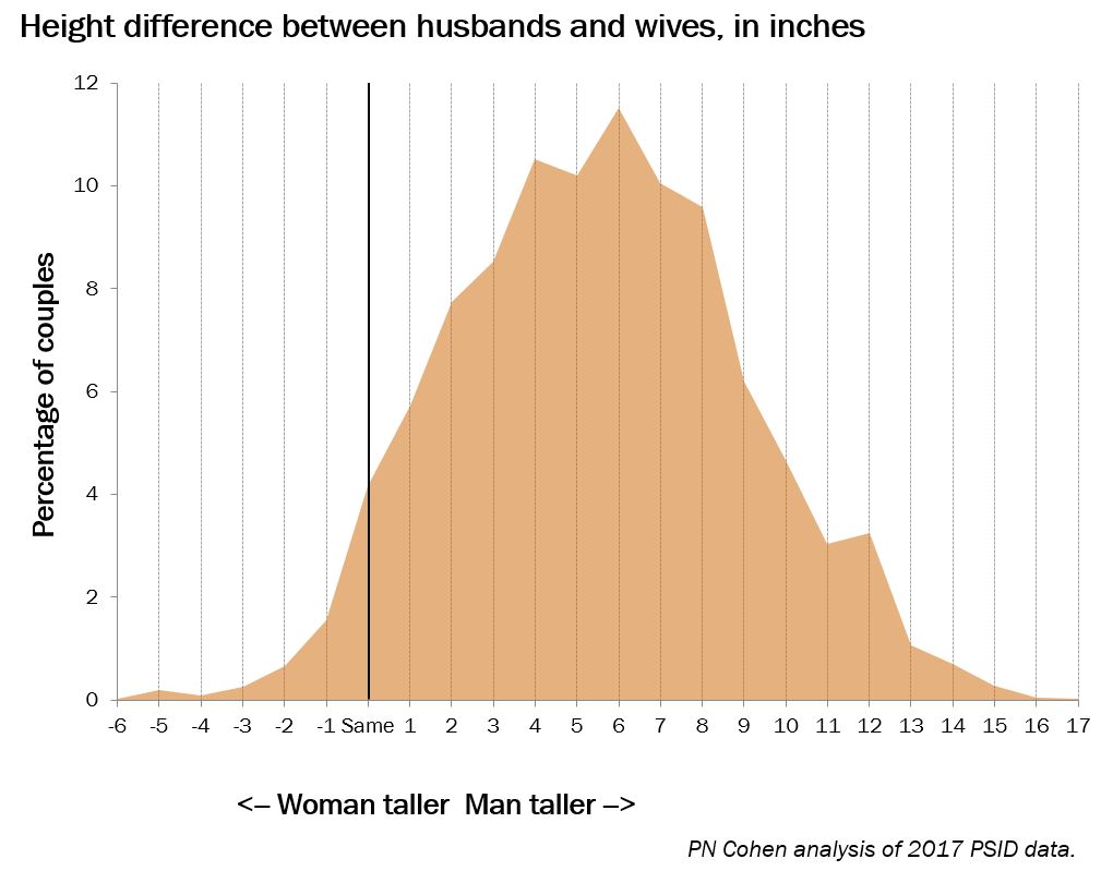
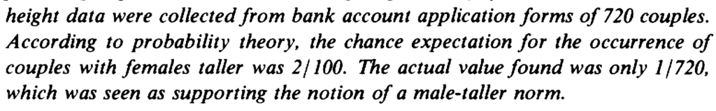
This recently-published graph is misleading but also has the unintended benefit of revealing a data problem:

Jrc brought it up in a recent blog comment. The figure is from an article published in the Journal of the American Medical Association, which states:

This prospective cohort study examined differences in time to mortality across sexual orientation, adjusting for birth cohort. Participants were female nurses born between 1945 and 1964, initially recruited in the US in 1989 for the Nurses’ Health Study II, and followed up through April 2022. . . .

Compared with heterosexual participants, LGB participants had earlier mortality (adjusted acceleration factor, 0.74 [95% CI, 0.64-0.84]). These differences were greatest among bisexual participants (adjusted acceleration factor, 0.63 [95% CI, 0.51-0.78]) followed by lesbian participants (adjusted acceleration factor, 0.80 [95% CI, 0.68-0.95]).

The above graph tells the story. As some commenters noted, there’s something weird going on with the line for heterosexual women 25+ years after exposure assessment. I guess these are the deaths from 2020 until the end of data collection in 2022.

Maybe not all the deaths were recorded? I dunno, it looks kinda weird to me. Here’s what they say in the paper:

The linkages to the NDI [National Death Index] were confirmed through December 31, 2019; however, ongoing death follow-up (eg, via family communication that was not yet confirmed with the NDI) was assessed through April 30, 2022. In the sensitivity analyses, only NDI-confirmed deaths (ie, through December 31, 2019) were examined.

Given the problem in the above graph, I’m guessing we should just forget about the main results of the paper and just look at the estimates from the sensitivity analyses. They say that sexual orientation was missing for 22% of the participants.

Getting back to the data . . . Table 1 shows that the lesbian and bisexual women in the study were older, on average, and more likely to be smokers. So just based on that, you’d expect they would be dying sooner. Thus you can’t really do much with the above figures that mix all the age and smoking groups. I mean, sure, it’s a good idea to display them—it’s raw data, and indeed it did show the anomalous post-2000 pattern that got our attention in the first place—but it’s not so useful as a comparison.

Regarding age, the paper says “younger cohorts endorse LGB orientation at higher rates,” but the table in the paper clearly shows that the lesbians and bisexuals in the study are in the older cohorts in their data. So what’s up with that? Are the nurses an unusual group? Or perhaps there are some classification errors?

Here’s what I’d like to see: a repeat of the cumulative death probabilities in the top graph above, but as a 4 x 2 grid, showing results separately in each of the 4 age categories and for smokers and nonsmokers. Or maybe a 4 x 3 grid, breaking up the ever-smokers into heavy and light smokers. Yes, the data will be noisier, but let’s see what we’ve got here, no?

They also run some regressions adjusting for age cohort. That sounds like a good idea, although I’m a little bit concerned about variation within cohort for the older groups. Also, do they adjust for smoking? I don’t see that anywhere . . .

Ummmm, OK, I found it, right there on page 2, in the methods section:

We chose not to further control for other health-related variables that vary in distribution across sexual orientation (eg, diet, smoking, alcohol use) because these are likely on the mediating pathway between LGB orientation and mortality. Therefore, controlling for these variables would be inappropriate because they are not plausible causes of both sexual orientation and mortality (ie, confounders) and their inclusion in the model would likely attenuate disparities between sexual orientation and mortality. However, to determine whether disparities persisted above and beyond the leading cause of premature mortality (ie, smoking), we conducted sensitivity analyses among the subgroup of participants (n = 59 220) who reported never smoking between 1989 and 1995 (year when sexual orientation information was obtained).

And here’s what they found:

Among those who reported never smoking (n = 59 220), LGB women had earlier mortality than heterosexual women (acceleration factor for all LGB women, 0.77 [95% CI, 0.62-0.96]; acceleration factor for lesbian participants, 0.80 [95% CI, 0.61-1.05]; acceleration factor for bisexual participants, 0.72 [95% CI, 0.50-1.04]).

I don’t see this analysis anywhere in the paper. I guess they adjusted for age cohorts but not for year of age, but I can’t be sure. Also I think you’d want to also adjust for lifetime smoking level, not just between 1989 and 1995. I’d think the survey would also have asked about whether participants’ earlier smoking status, and I’d think that smoking would be asked in followups?

Putting it all together

The article and the supplementary information present a lot of estimates. None of them are quite what we want—that would be an analysis that adjusts for year of age as well as cohort, adjusts for smoking status, and also grapples in some way with the missing data.

But we can triangulate. For all the analyses, I’ll pool the lesbian and bisexual groups because the sample size within each of these two groups is too small to learn much about them separately. For each analysis, I’ll give the reported 95% adjusted acceleration factor as an estimate +/- margin of error:

Crude analysis, not adjusting for cohort: 0.71 +/- 0.10
Main analysis, adjusting for cohort: 0.74 +/- 0.10
Using only deaths before 2020, adjusting for cohort: 0.79 +/- 0.10
Imputing missing responses for sexual orientation, adjusting for cohort: 0.79 +/- 0.10
Using only the nonsmokers, maybe adjusting for cohort: 0.77 +/- 0.17

Roughly speaking, adjusting for cohort adds 0.03 to the acceleration factor, imputing missing responses adds 0.05, and adjusting for smoking adds 0.03 or 0.06. I don’t know what would happen if you add all three adjustments; given what we have here, my best guess would be to add 0.03 + 0.05 + (0.03 or 0.06) = 0.11 or 0.14, which would take the estimated acceleration factor to 0.82 or 0.85. Also, if we’re only going to take the nonsmokers, we’ll have to use the wider margin of error.

Would further adjustment do more? I’m not sure. I’d like to do more adjustment for age and for smoking status; that said, I have no clear sense what direction this would shift the estimate.

So our final estimate is 0.82 +/- 0.17 or 0.85 +/- 0.17, depending on whether or not their only-nonsmokers analysis adjusted for cohort. They’d get more statistical power by including the smokers and adjusting for smoking status, but, again, without the data here I can’t say how this would go, so we have to make use of what information we have.

This result is, or maybe is not, statistically significant at the conventional 95% level. That is not to say that there is no population difference, just that there’s uncertainty here, and I think the claims made in the research article are not fully supported by the evidence given there.

I have similar issues with the news reports of this study, for example this:

One possible explanation for the findings is that bisexual women experience more pressure to conceal their sexual orientation, McKetta said, noting that most bisexual women have male partners. “Concealment used to be thought of as sort of a protective mechanism … but [it] can really rot away at people’s psyches and that can lead to these internalizing problems that are also, of course, associated with adverse mental health,” she said.

Sure, it’s possible, but shouldn’t you also note that the observed differences could also be explained by missing-data issues, smoking status, and sampling variation?

And now . . . the data!

Are the data available for reanalysis? I’m not sure. The paper had this appendix:

I don’t like the requirement of “co-investigator approval” . . . what’s with that? Why they can’t just post the data online? Anyway, I followed the link and filled out the form to request the data, so we’ll see what happens. I needed to give a proposal title so I wrote, “Reanalysis of Disparities in Mortality by Sexual Orientation in a Cohort of Female Nurses.” I also had to say something about the scientific significance of my study, for which I wrote, “The paper, Disparities in Mortality by Sexual Orientation in a Cohort of Female Nurses, received some attention, and it would be interesting to see how the results in that paper vary by age and smoking status.” For my “Statement of Hypothesis and Specific Aims,” I wrote, “I have no hypotheses. My aim is to see how the results in that paper vary by age and smoking status.” . . .

Ummmm . . . I was all ready to click Submit—I’d filled out the 6-page form, and then this:

A minimum of $7800 per year per cohort?? What the hell???

To be clear, I don’t think this is the fault of the authors of the above-discussed paper. It just seems to be the general policy of the Nurses Health Study.

Summary

I don’t think it’s bad that this paper was published. It’s pretty much free to root around at available datasets and see what you can find. (OK, in this case, it’s not free, it’s actually a minimum of $7800 per year per cohort, but this isn’t a real cost; it’s just a transfer payment: the researchers get an NIH grant, some of which is spent on . . . some earlier recipient of an NIH grant.) The authors didn’t do a perfect statistical analysis, but no statistical analysis is perfect; there are always ways to improve. The data have problems (as shown in the graph at the top of this post), but there was enough background in the paper for us to kind of figure out where the problem lay. And they did a few extra analyses—not everything I’d like to see, but some reasonable things.

So what went wrong?

I hate to say it because regular readers have heard it all before, but . . . forking paths. Researcher degrees of freedom. As noted above, my best guess of a reasonable analysis would yield an estimate that’s about two standard errors away from zero. But other things could’ve been done.

And the authors got to decide what result to foreground. For example, their main analysis didn’t adjust for smoking. But what if smoking had gone the other way in the dataset, so that the lesbians and bisexuals in the data had been less likely to smoke? Then a lack of adjustment would’ve diminished the estimated effect, and the authors might well have chosen the adjusted analysis as their primary result. Similarly with exclusion of the problematic data after 2020 and the missing data on sexual orientation. And lots of other analyses could’ve been done here, for example adjusting for ethnicity (they did do separate analyses for each ethnic group, but it was hard to interpret those results because they were so noisy), adjusting for year of age, and adjusting more fully for past smoking. I have no idea how these various analyses would’ve gone; the point is that the authors had lots of analyses to choose from, and the one they chose gave a big estimate in part because a lack of adjustment for some data problems.

What should be done in this sort of situation? Make the data available, for sure. (Sorry, Nurses Health Study, no $7800 per year per cohort for you.) Do the full analysis or, if you’re gonna try different things, try all of them or put them in some logical order; don’t just pick one analysis and then perturb it one factor at a time. And, if you’re gonna speculate, fine, but then also speculate about less dramatic explanations of your findings, such as data problems and sampling variation.

It should be no embarrassment that it’s hard to find any clear patterns in these data, as all of it is driven by a mere 81 deaths. n = 81 ain’t a lot. I’d say I’m kinda surprised that JAMA published this paper, but I don’t really know what JAMA publishes. It’s not a horrible piece of work, just overstated to the extent that the result is more of an intriguing pattern in a particular dataset rather than strong evidence of a general pattern. This often happens in the social sciences.

Also, the graphs. Those cumulative mortality graphs above are fine as data summaries—almost. First, it would’ve been good if the authors had noticed the problem post-2020. Second, the dramatic gap between the lines is misleading in that it does not account for the differences in average age and smoking status of the groups. As noted above, this could be (partly) fixed by replacing with a grid of graphs broken down by cohort and smoking status.

All of the above is an example of what can be learned from post-publication review. Only a limited amount can be learned without access to the data; it’s interesting to see what we can figure out from the indirect evidence available.

Job Ad: Spatial Statistics Group Lead at Oak Ridge National Laboratory

Robert Stewart, of Oak Ridge National Lab (ORNL), who we met at StanCon, is looking to fill the following role:

It’s a research group leader position with an emphasis on published research that’s relevant for the Department of Energy (the group that runs the national labs). Robert came and gave a talk here at Flatiron Institute and the scale and range of problems they’re tasked with solving is really interesting (e.g., inferring the height, construction, and use of every human-constructed building in the world). They’ve got access to the computing to tackle this kind of thing, too.

After meeting Robert, I invited him out to Flatiron Institute to give a talk to our group (Center for Computational Mathematics). They’re working on a fascinating range of problems around climate science, energy, etc. In all cases, there is a challenging mix of measurement uncertainty, missing data, and prior knowledge to combine.

ORNL is looking for someone with a Ph.D. and 6 years of experience—that is, about the point where you’d get tenure in academia. Unlike academia, they also list an M.S. with 15 years of experience as an alternative.

The visa sponsorship” section says “not available”, so I assume that means you have to be a U.S. citizen.

Boris and Natasha in America: How often is the wife taller than the husband?

Shane Frederick, who sometimes sends me probability puzzles, sent along this question:

Among married couples, what’s your best guess about how often the wife is taller than the husband?
• 1 in 10
• 1 in 40
• 1 in 300
• 1 in 5000

I didn’t want to cheat so I tried to think about this one without doing any calculations or looking anything up. My two sources of information were my recollection of the distributions of womens’ and mens’ heights (this is in Regression and Other Stories) and whatever I could dredge up from my personal experiences with friends and couples I see walking on the street.

I responded to Shane as follows:

I’m embarrassed to say I don’t know the answer to this question of yours. I’d guess 1 in 10, but I guess that 1 in 40 is not entirely out of the question, given that the two heights are positively correlated. So maybe I’d guess 1 in 40. But 1 in 10 is not out of the question…

Shane responded:

It’s roughly 1 in 40 if you assumed non assortative mating (just randomly picked men and women from the respective height distribution of men and women).

In reality, it is closer to 1 in 300. (Women don’t like shorter men; men may not like taller women, and shorter men don’t marry as often, in part because they earn less.)

1 in 300 didn’t sound right to me. So I did some calculating and some looking up.

First the calculating.

compare_heights <- function(mu, sigma, rho, n=1e6){
  Sigma <- diag(sigma) %*% cbind(c(1,rho), c(rho, 1)) %*% diag(sigma)
  library("MASS")
  heights <- mvrnorm(n, mu, Sigma)
  p_wife_taller <- mean(heights[,1] > heights[,2])
  cat("Assuming corr is", rho, ":  probability the wife is taller is", p_wife_taller, ":  1 in", 1/p_wife_taller, "\n")
}
mu <- c(63.7, 69.1)
sigma <- c(2.4, 2.9)
options(digits=2)
for (rho in c(0, 0.3, 0.5, 0.7)){
  compare_heights(mu, sigma, rho)
}

And here's the output:

Assuming corr is 0 :  probability the wife is taller is 0.076 :  1 in 13 
Assuming corr is 0.3 :  probability the wife is taller is 0.044 :  1 in 23 
Assuming corr is 0.5 :  probability the wife is taller is 0.022 :  1 in 45 
Assuming corr is 0.7 :  probability the wife is taller is 0.0052 :  1 in 191 

Using simulation here is overkill---given that we're assuming the normal distribution anyway, it would be easy enough to just compute the probability analytically using the distribution of the difference between husband's and wife's heights (from the numbers above, the mean is 69.1 - 63.7 and the sd is sqrt(2.4^2 + 2.9^2 - 2*rho*2.4*2.9), so for example if rho = 0.5 you can just compute pnorm(0, 69.1 - 63.7, sqrt(2.4^2 + 2.9^2 - 2*0.5*2.4*2.9)), which indeed comes to 0.22.)---but brute force seems safer. Indeed, I originally did the simulation with n=1e4 but then I upped the draws to a million just to be on the safe side, since it runs so fast anyway.

A correlation of about 0.5 sounds right to me, so the above calculations seems to be consistent with my original intuition that the probability would be about 1 in 10 if independent or 1 in 40 accounting for correlation.

Next, the looking up. I recalled that sociologist Philip Cohen had posted something on the topic, so I did some googling and found this press release:

The average height difference between men and women in the U.S is about 6 inches. . . . Cohen also analyzed the height of 4,600 married couples from the 2009 Panel Study of Income Dynamics and found that the average husband's height was 5'11" while the average wife was 5'5". Moreover, he found that only 3.8 percent of the couples were made up of a tall wife and a short husband . . .

Fiona Macrae and Damien Gayle of the Daily Mail picked up this story and compared it to similar research on couples in the U.K, where they found that for most couples - 92.5 percent - the man was taller.

Hmmm . . . 5'5" and 5'11" are taller than the numbers that I'd been using . . . perhaps the people in the PSID were wearing socks?

I also found this post from Cohen based on data from the 2017 wave of the PSID. He supplies these graphs:

There's something weird about these graphs---if heights are given to the nearest inch, they should be presented as histograms, no?---but I think we can read off the percentages.

If you round to the nearest inch, it appears that there is a 4% chance that the two members of the couple have the same height, a 3% chance that the wife is taller, and a 93% chance the husband is taller. So for discrete heights, the probability the wife is taller is approximately 1 in 30. If you allow continuous heights and you allocate a bit less than half the ties to the "wife taller than husband" category, then the probability becomes something like 1 in 25.

Given all this, I wondered how Shane could ever had thought the frequency was 1 in 300. He replied that he got his data from this paper, "The male-taller norm in mate selection," published in Personality and Psychology Bulletin in 1980, which reports this:

Just as an aside, I find it a bit creepy when researchers use the term "mate" when referring to married couples. Wouldn't "spouse" be more appropriate? "Mate" has this anthropological, scientistic feel to it.

To return to the substance, there are two mysteries here. First, how did they calculate that the probability of the woman being taller should be only 2%? Second, how is it that only 1 of 720 of their couples had the wife taller than the husband?

The answer to the first question is supplied by this table from the 1980 paper:

Their standard deviations (2.3" within each sex) are too low. That sort of thing can happen when you try to estimate a distribution using a small and nonrepresentative sample. They continued by assuming a correlation of 0.2 between wives' and husbands' heights. I think 0.2 is too small a correlation, but when you combine it with the means and standard deviations that they assumed, you end up getting something reasonable.

As to the second question . . . I don't know! Here's what they say about their data:

My best guess is that people did some creative rounding to avoid the husband's recorded height being lower than the wife's, but it's hard to know. I don't fault the authors of that paper from 1980 for using whatever data they could find; in retrospect, though, it seems they were doing lots of out-of-control theorizing based on noisy and biased data.

I did some more googling and found this paper from 2014 with more from the Panel Study of Income Dynamics. The authors write:

Height was first measured in the PSID in 1986 and then at every wave starting in
1999. . . . In 1986, 92.7% of men were taller than their spouses; in 2009, 92.2% were taller.

They break the data up into couples where the husbands is shorter than the wife and couples where they are the same height. In 1986, 3.14% of husbands were shorter and 4.13% were the same height. In 2009, 3.78% were shorter and 4.00% were the same height. From these data, if you include something less than half of the "same height" group, you'll get an estimate of approximately 5%, or 1 in 20, couples where the wife is taller than the husband.

So, yeah, between 1 in 10 and 1 in 40. Not 1 in 300.

To be fair to Shane on this one, this was just an example he used in one of his classes. It's an interesting example how it's easy to get confused if you just look at one source, reminiscent of some examples we've discussed earlier in this space:

- What is Russia's GDP per capita?

- The contradictory literature on the effects on political attitudes of having a son or daughter.

- Various claims about the relation between age and happiness.

All these examples feature contradictory claims in the literature that are each made very strongly. The problem is not so much in the disagreement---there is legitimate uncertainty on these issues, along with real variation---but rather that the separate claims are presented as deterministic numbers or as near-certain conclusions. Kinda like this notorious story from Hynes and Vanmarcke (1977) and retold in Active Statistics:

Shane summarizes:

The general message has become even more cynical; transmogrifying from “You can’t trust everything you read,” to “You can’t trust anything you read.”

I wouldn't quite put it that strongly; rather, I'd say that it's a good idea to find multiple data sources and multiple analyses, and don't expect that the first thing you find will tell the whole story.

“Often enough, scientists are left with the unenviable task of conducting an orchestra with out-of-tune instruments”

Gaurav Sood writes:

Often enough, scientists are left with the unenviable task of conducting an orchestra with out-of-tune instruments. They are charged with telling a coherent story about noisy results. Scientists defer to the demand partly because there is a widespread belief that a journal article is the appropriate grouping variable at which results should “make sense.”

To tell coherent stories with noisy data, scientists resort to a variety of underhanded methods. The first is simply squashing the inconvenient results—never reporting them or leaving them to the appendix or couching the results in the language of the trade, e.g., “the result is only marginally significant” or “the result is marginally significant” or “tight confidence bounds” (without ever talking about the expected effect size). Secondly, if good statistics show uncongenial results, drown the data in bad statistics, e.g., report the difference between a significant and an insignificant effect as significant. The third trick is overfitting. A sin in machine learning is a virtue in scientific storytelling. Come up with fanciful theories that could explain the result and make that the explanation. The fourth is to practice the “have your cake and eat it too” method of writing. Proclaim big results at the top and offer a thick word soup in the main text. The fifth is to practice abstinence from interpreting “inconsistent” results as coming from a lack of power, bad theorizing, or heterogeneous effects.

The worst outcome of all of this malaise is that many (expectedly) become better at what they practice—bad science and nimble storytelling.

But storytelling is great! Stories are interesting when they have twists and turns, surprises that represents anomalies that confound our expectation. Telling a good story reveals these anomalies and also gives insight into those expectations, which derive from our implicit models of the world. I think all this is super-important for the social sciences.

I guess people just have different takes on what’s an interesting story. To me, the story that a creaking attic door or an intermittently-working radio is caused by ghosts, or the story that being exposed to elderly-related words causes you to walk more slowly, or the story that women are three times more likely to wear red during certain times of the month, or the story that Cornell students have ESP, . . . these are all boring. Or I guess we could characterize them as big if true. The real world in its complexity, that’s interesting. I study social science because it’s interesting and important, not because I think there are buttons we can push to get people to do things.

Evaluating MCMC samplers

I’ve been thinking a lot about how to evaluate MCMC samplers. A common way to do this is to run one or more iterations of your contender against a baseline of something simple, something well understood, or more rarely, the current champion (which seems to remain NUTS, though we’re open to suggestions for alternatives).

Reporting comparisons of averages (and uncertainty)

Then, what do you report? What I usually see is a report of averages over runs, such as average effective sample size per gradient eval. Sometimes I’ll see medians, but I like averages better here as it’s a fairer indication of expected time over multiple runs. What I don’t often see is estimates of uncertainty in the estimate of the average (std error) or across runs (std deviation). I can’t remember ever seeing someone evaluate something like the probability that one sampler is better than another for a problem, though you do occasionally see those “significance” asterisks (or at least you used to) in ML or search evaluations.

NUTS ESS has high variance

The range of errors we get from running NUTS on even mildly difficult problems implies variations of effective sample size of an order of magnitude. This variance is a huge problem for evaluation. If you follow Andrew Gelman’s advice, then you will run multiple chains and wait for them all to finish. That makes the run time an order statistic which is going to depend strongly on the cross-chain variance.

Time-bound runs?

In the past, Andrew asked about running for a fixed time rather than a fixed number of iterations, but we were worried about inducing bias. Chains tend to slow down in speed when they adapt to a too-small step size or when they wander around big flat regions for too long. It’d be nice if we could fulfill Andrew’s request to figure out how to combine timed runs in a way that doesn’t introduce bias. Suggestions more than welcome! If you run 1024 chains in the style of Matt Hoffman and Charles Margossian, then the order statistics for timing become very sensitive to tails.

Within-class versus across-class variation

This is a classic statistical comparison problem. In the sampler I’m evaluating now that is inspiring me to rethink evals, the within-group variance of NUTS and the within-group variance of the contender is greater than the difference between the mean time of NUTS and the mean time of the contender.

Distributions of ratios?

So I’m thinking that rather comparing ratios of average run times, we should look at histograms of ratios of draws from NUTS’s statistics and draws for the contender’s statistics. This will give us a much wider range of values, which for some of which will have NUTS taking twice as long and for some of them will have the contender taking twice as long. Luckily, it shouldn’t be as bad as a ratio of two normals, as we don’t expect values near zero in the denominator giving us massive values like in generating Cauchy variates (as the ratio of two normals). Averaging ratios doesn’t make a lot of sense because it’s sensitive to direction, but averaging log odds might make sense, because it’s symmetric around even odds.

Just show everything

We don’t need to try to reduce things to a single statistic. I often argued when I was in NLP that I’d rather see a confusion matrix than an accuracy (sensitivity, F-measure, etc.) and I’d rather see the ROC curve than just get the single value for AUC. These reductions to single statistics are very lossy and a single number is often a poor summary of a complex multivariate situation. And in NLP, a client often has a specific operating point in mind (high sensitivity, high specificity, etc.).

RMSE of standardized parameters

What I’m currently doing is showing the boxplots of root mean square error for standardized parameters. Standardizing is a trick I learned from Andrew that brings everyone’s scales into alignment. That is, standard error is just standard deviation divided by the square root of effective sample size. Scaling the parameters normalizes all parameters to have a standard deviation of 1, so they’ll be weighted equally when comparing results.

Why not minimum ESS?

The problem with minimum ESS is that it’s an extreme order statistic in high dimensional models, and is thus going to be difficult to estimate. It also ignores the errors on all the other parameters.

Direct standard error calculation

If you know the true value and can perform multiple estimation runs, you can calculate standard error empirically as the standard deviation of the errors. Given the standard error, we can back out expected ESS from the relation that standard error is standard deviation divided by the square root of ESS. I learned that technique from Aki Vehtari, who used it to calibrate our new ESS estimators that discount for approximate convergence (actually a few years old as of now).

Something multivariate?

Maybe I should be thinking of something that’s more multivariate, like the multivariate ESS from Vats, Flegal, and Jones? I’m afraid that would introduce a scaling problem in dimensionality.

“When are Bayesian model probabilities overconfident?” . . . and we’re still trying to get to meta-Bayes

Oscar Oelrich, Shutong Ding, Måns Magnusson, Aki Vehtari, and Mattias Villani write:

Bayesian model comparison is often based on the posterior distribution over the set of compared models. This distribution is often observed to concentrate on a single model even when other measures of model fit or forecasting ability indicate no strong preference. Furthermore, a moderate change in the data sample can easily shift the posterior model probabilities to concentrate on another model.

We document overconfidence in two high-profile applications in economics and neuroscience.

To shed more light on the sources of overconfidence we derive the sampling variance of the Bayes factor in univariate and multivariate linear regression. The results show that overconfidence is likely to happen when i) the compared models give very different approximations of the data-generating process, ii) the models are very flexible with large degrees of freedom that are not shared between the models, and iii) the models underestimate the true variability in the data.

This is related to our work on stacking:

[2018] Using stacking to average Bayesian predictive distributions (with discussion). {\em Bayesian Analysis} {\bf 13}, 917–1003. (Yuling Yao, Aki Vehtari, Daniel Simpson, and Andrew Gelman)

[2022] Bayesian hierarchical stacking: Some models are (somewhere) useful. {\em Bayesian Analysis} {\bf 17}, 1043–1071. (Yuling Yao, Gregor Pirš, Aki Vehtari, and Andrew Gelman)

[2022] Stacking for non-mixing Bayesian computations: The curse and blessing of multimodal posteriors. {\em Journal of Machine Learning Research} {\bf 23}, 79. (Yuling Yao, Aki Vehtari, and Andrew Gelman)

Big open problems remain in this area. For choosing among or working with discrete models, stacking or other predictive model averaging techniques seem to work much better than Bayesian model averaging. On the other hand, for models with continuous parameters we’re usually happy with full Bayes. The difficulty here is that discrete models can be embedded in a continuous space, and continuous models can be discretized. What’s missing is some sort of meta-Bayes (to use Yuling’s term) that puts this all together.

Whooping cough! How to respond to fatally-flawed papers? An example, in a setting where the fatal flaw is subtle, involving a confounding of time and cohort effects

Matthieu Domenech de Cellès writes:

I am a research group leader in infectious disease epidemiology at the Max Planck Institute for Infection Biology in Berlin. I read your recent post on how to respond to fatally flawed papers.

Here is a personal anecdote from my field, which you might find interesting.

The flawed paper in question was published in the New England Journal of Medicine (NEJM), supposedly one of the most prestigious medical in the world (at least if one cares about its impact factor, which was 158.5 in 2022). The study (https://pubmed.ncbi.nlm.nih.gov/22970945/) was a case-control study aiming to estimate how the risk of pertussis varied over time after receipt of 5 doses of pertussis vaccines in children aged 4–12 in California. The main result was that, in this fully vaccinated population, the risk of pertussis increased by 42% each year after the fifth dose. The analysis itself was OK, but the fatal flaw came from the interpretation of this result, as reported in the discussion: “[…] we estimated that the fifth dose of DTaP became 42% less effective each year […]”. From this flawed interpretation, they claimed that the protection conferred by pertussis vaccines waned very fast (maybe on a time scale of a few years), hence the title. As I write this, this paper has been cited 606 times (according to Google Scholar) and has largely led the field to believe these vaccines are no good.

As the authors acknowledged, however, their study did not include an unvaccinated group, which is needed to estimate vaccine effectiveness (VE). In other words, it was impossible to conclude about the rate of waning VE from the 42% increase they estimated. Incidentally, this basic fact should have been obvious to the editor and the reviewers from the NEJM (but as you wrote in another blog post, sometimes the problem with peer review is the peers). In a follow-up study (https://pubmed.ncbi.nlm.nih.gov/31009031/), we showed that, given the high transmissibility of pertussis, this 42% was entirely consistent with vaccines with sustained effectiveness whose protection wanes, on average, slowly. More generally, we demonstrated that their claim (i.e., a 42% annual increase in pertussis risk after vaccination is equivalent to a 42% yearly decrease in VE) was baseless.

Overall, we adopted a strategy close to option 5 in your post. We initially submitted the paper to NEJM, which rejected it immediately (probably for the reasons you mentioned). Our paper was ultimately published in 2019 (in JAMA Pediatrics), with 28 citations so far. Although this was a good outcome, I don’t expect our paper ever to reach the impact of the NEJM paper, whose damage is probably irreversible.

I took a look at the JAMA Pediatrics paper, and . . . wow, this is complicated! These cohort issues really confound our intuitions. This fits into our recently-discussed “It’s About Time” theme. I feel like there should be some clever graph that could make this all clear to me. The paper does have some graphs, but not quite what it takes for me, in that I still struggle to hold this model in my head. I kinda believe that Domenech and his colleagues are correct—they sent me the email, after all!—but I don’t have the energy right now to try to untangle all this. Given that, I can see how the NEJM editors could’ve thrown up their hands here. I’d be interested in seeing their stated reasons for rejecting the Domenech et al. paper.

P.S. When I was a kid, I never heard of anyone who had whooping cough. We all wanted to get it, though, because the only thing anyone knew about whooping cough was from the school rules that they would give out every year which had a list of the minimum number of days of absence from school if you had various illnesses: measles, etc. For some of these, the minimum period of absence was 1 week or 2 weeks. The thing I remember was that whooping cough was the only illness where you’d have to stay out of school for a full 4 weeks—or maybe it was 8 weeks, I can’t recall the exact number, just that whooping cough was the longest. From a logical standpoint, this should’ve made us super-scared of whooping cough—it’s so dangerous you have to miss a month or two of school—but, to us, the lure of getting to miss 4 or 8 weeks of school was so appealing. Recess and gym class aside, elementary school was such a horrible waste of time.

Also, we had no idea whether it was supposed to be pronounced “wooping cough” or “hooping cough.”

Population forecasting for small areas: an example of learning through a social network

Adam Connor-Sax sent this question to Philip Greengard:

Do you or anyone you know work with or know about (human) population forecasting in small geographies (election districts) and short timescales (2-20 years)? I can imagine just looking at the past couple years and trying to extrapolate but presumably there are models of population dynamics which one could fit and that would work better.

The thing that comes up in the literature—cohort component models—seem more geared to larger populations and larger timescales, countries over decades, say. But maybe I’m just finding the wrong sources so far.

Philip forwarded this to me, and I forwarded it to Leontine Alkema, a former Columbia colleague now at the University of Massachusetts who’s an expert in Bayesian demographic forecasting, and Leontine in turn pointed us to Monica Alexander at the University of Toronto and Emily Peterson at Emory University.

Monica and Emily had some answers!

Here’s Emily:

I can just speak to what we work on at Emory biostatistics. Lance Waller and myself have worked together with other collaborators in population estimation and forecasting for small areas (e.g., counties and census tracts) accounting for population uncertainty, mainly for US small areas but have also done some work in the UK. We have looked at the use of multiple data sources including official statistics and WorldPop across small administrative units.This works commonly combines small area estimation and measurement error models.

And Monica:

Here’s a few different approaches I’m aware of:

– A common approach is the Hamilton-Perry Method, which is sort of a cut down version of the cohort component projection method. David Swanson and others have published a lot about this, see eg https://www.ncbi.nlm.nih.gov/pmc/articles/PMC2822904/ This is mostly deterministic projection; I’ve started some work with a student incorporating this approach into Bayesian models.

– Emily and others’ work, as she mentioned; my understanding of this is that they incorporate various data/estimates on population counts, and project those, accounting for different error sources (see eg here: https://arxiv.org/abs/2112.09813)

– A recent paper by Crystal Yu (Adrian Raftery’s student) describes a model that builds off the UN population projections approach: https://read.dukeupress.edu/demography/article/60/3/915/364580/Probabilistic-County-Level-Population-Projections

– Classical cohort component models at small geographic areas are tricky, because there’s so many parameters to estimate and the data often aren’t very good (even in the US, particularly for migration), which is why @Adam you aren’t seeing much for small areas — migration makes things hard. Leontine and I did a subnational cohort component model (see paper here: https://read.dukeupress.edu/demography/article/59/5/1713/318087/A-Bayesian-Cohort-Component-Projection-Model-to) but the focus was low- and middle-income countries, and women of reproductive age.

Adam followed up:

I’m working with an organization that directs political donations to Democratic candidates for US state-legislature. They are interested in improving their longer-term strategic thinking about which state-legislative districts (typically 40,000 – 120,000 people) may become competitive (or cease being competitive) over time and also, perhaps, in the ways that changing demographics might lead to changing campaign strategies.

From the small bit of literature search that I’ve done—which included most helpfully “Methods For Small Area Population Forecasts: State-of-the-Art and Research Needs” on which Dr. Alexander is a co-author!—I see various things I might try, likely starting with a simplified cohort-component model of some sort. I will look at all the references below.

One wrinkle I am struggling with is that for political modeling (in my case, voter turnout and party preference), there are mutable characteristics, e.g., educational-attainment, which are important. But in my brief look so far, none of these models are trying to project mutable characteristics. Which makes sense, since they are not simply a product of births, deaths and migration. So, because this is all new to me, I’m not quite sure if I should be trying to find a model which is amenable to the addition of education in some way, or choose an existing model for the population growth and then somehow try to model educational-attainment shifts separately and then combine them.

BTW, Dr. Peterson, I just looked a bit at your paper “A Bayesian hierarchical small-area population model accounting for data source specific methodologies from American Community Survey, Population Estimates Program, and Decennial Census data” and that is helpful/interesting in a different way! The work Philip and I do together is about producing small area estimates of population by combining various marginals at the scale of the small area (state-legislative district) and then modeling the correlation-structure using dataat larger geographic scales (state & national). This is driven by the limits of what the ACS provides at scales below Public Use Microdata Areas. I’ve also thought some about trying to incorporate the more accurate decennial census but hadn’t gotten very far. Your paper will be a good motivation to return to that part of the puzzle!

I’m sharing this conversation with all of you for three reasons:

1. Demographic forecasting is important in social science.

2. The problem is difficult and relates to other statistical challenges.

3. It’s hard to find things in the literature, and personal connections can help a lot.

I guess that the vast majority of you don’t have the personal connections that would allow you to easily find the above references. (You have your own social networks, just not so focused on quantitative social science.) The above post is a service to all of you, also a demonstration of how these connections can work.

GIST: Gibbs self-tuning for HMC

I’m pleased as Punch to announce our new paper,

We followed the mathematician alphabetical author-ordering convention.

The basic idea

The basic idea is so simple, I’m surprised it’s not more popular. The general GIST sampler couples the HMC algorithm tuning parameters (step size, number of steps, mass matrix) with the position (model parameters) and momentum. Each iteration of the Markov chain, we resample momentum using a Gibbs step (as usual in HMC), then we sample the tuning parameters in a second Gibbs step, conditioning on the current position and resampled momentum. The proposal is generated by the leapfrog algorithm using the sampled tuning parameters. The accept/reject step then uses the ratio of the joint densities, which now includes the tuning parameters. Of course, we need to specify a conditional distribution of tuning parameters to make this concrete.

The same idea could be applied to other Metropolis samplers.

Some prior art

We were inspired by a combination of NUTS and some negative results from Nawaf regarding acceptance bounds in delayed rejection generalized HMC (more on that later).

Radford Neal used the coupling idea for the Metropolis acceptance probability in his recent paper Non-reversibly updating a uniform [0,1] value for Metropolis accept/reject decisions. This is for generalized HMC, which is one-step HMC with partial momentum refresh. The partial refresh means the momentum flips in HMC matter and will typically thwart directed movement. Neal’s appraoch groups the acceptances together so that generalized HMC can make directed movement like HMC itself. Although this easily fits within the GIST framework, the proposal for acceptance probability doesn’t depend on the current position or momentum.

We (Chirag Modi, Gilad Turok and I) are working on a follow-up to my recent paper with Chirag and Alex Barnett on delayed rejection HMC. The goal there was to properly sample multiscale and varying scale densities (i.e., “stiff” Hamiltonians). In the follow up, we’re using generalized HMC with delayed rejection rather than Radford’s coupling idea, and show it can also generate directed exploration. The paper’s drafted and should be out soon. Spoiler alert! DR-G-HMC works better than DR-HMC in its ability to adjust to local changes in scale, and it’s competitive with NUTS in some cases where there are varying scales, but not in most problems.

Algorithms that randomize the number of steps (or stepsize), like those in Changye Wu and Christian Robert’s Faster Hamiltonian Monte Carlo by Learning Leapfrog Scale, can also be seen as an instance of GIST. From this view, they are coupling the number of steps and sampling that number from a fixed uniform distribution each iteration. This doesn’t condition on the current position. The general framework immediately suggests biasing those draws toward longer jumps, for example by sampling uniformly from the second half of the trajectory.

Sam Livingstone was visiting Flatiron Institute for the last couple of weeks, and when I ran the basic idea by him, he suggested I have a look at the paper by Chris Sherlock, Szymon Urbas, and Matthew Ludkin, The apogee to apogee path sampler. This is a really cool idea that uses U-turns in potential energy (negative log density), which is univariate, rather than in position space. They evolve the Hamiltonian forward and backward in time for a given number of U-turns in log density, and then sample from among the points on the path (like NUTS does). One issue is that a regular normal distribution on momentum can have trouble sampling through the range of log densities (see, e.g., Sam et al.’s paper on kinetic energy choice in HMC). Because we were going to be discussing his paper in our reading group, I wrote to Chris Sherlock and he told me they have been working on the apogee to apogee idea since before NUTS was released! It’s a very similar idea, with similar forward/backward in time balancing. The other idea it shares with NUTS is a biasing toward longer jumps—this is done in a really clever way that we can borrow for GIST. Milo and Nawaf figured out how NUTS and the apogee-to-apogee sampler can be fit into the GIST framework, which simplifies their correctness proofs. Once you’ve defined a proper conditional distribution for GIST, you’re done. The apogee-to-apogee paper is also nice in evaluating a randomized stepsize version of HMC they call “blurred” HMC (and which of course, fits into the general GIST framework the same way the Wu and Robert sampler does).

If you know of other prior art or examples, we’d love to hear about them.

Our concrete alternative to NUTS

The alternative to NUTS we discuss in the GIST paper proposes a number of steps by iterating the leapfrog algorithm until a U-turn, then randomly sampling along the trajectory (like the improvement to the original NUTS that Michael Betancourt introduced or the apogee-to-apogee sampler). We then use a crude biasing mechanism (compared to the apogee-to-apogee sampler or NUTS) toward longer paths. That’s it, really. If you look at what that means for evaluating, we have to run a trajectory from the point sampled backwards in time until a U-turn—you don’t really get away from that forward-and-backward thing in any of these samplers.

We evaluate mean-square jump distance, rejections, and errors on parameter estimates and squared parameter estimates. It’s a little behind NUTS’s performance, but mostly in the same ballpark. In most cases, the variance among NUTS runs was greater than the difference between the mean NUTS and new algorithm run times. The evals demonstrate why it’s necessary to look at both parameter and squared parameter estimates. As draws become more anti-correlated, which happens by maximizing expected square jump distance, estimates for parameters improve, but error goes way up on estimates of squared parameters. I provide an example in this Stan forum post, which was inspired by a visit with Wu and Robert to discuss their randomized steps algorithm. Also, before we submit to a journal, I need to scale all the root mean-square-error calculations to Z scores.

What we’re excited about here is that it’s going to be easy to couple step size adaptation. We might even be able to adapt the mass matrix this way and get a cheap approxmation to Riemannian HMC.

Try it out

The evaluation code is up under an MIT License on my GitHub repo adaptive-hmc. I’m about to go add some more user-facing doc on how to run the evaluations. I’m really a product coder at heart, so I always find it challenging to hit the right level of doc/clarity/robustness/readability with research code. To get log densities and gradients from Stan models to develop our algorithm, we used BridgeStan.

I’m always happy to get suggestions on improving my code, so feel free to open issues or send me email.

Thank you!

This project would’ve been much harder if I hadn’t gotten feedback on the basic idea and code from Stan developer and stats prof Edward Roualdes. We also wouldn’t have been able to do this easily if Edward hadn’t developed BridgeStan. This kind of code is so off-by-one, numerator-vs-denominator, negative vs. positive, log vs. exponent mistake prone, that it makes my head spin. It doesn’t help that I’ve moved from R to Python, where the upper bounds are exclusive! Edward found a couple of dingers in my original code. Thanks also to Chirag for helping me understand the general framework and on the code. Both Edward and Chirag are working on better alternatives to our simple alternative to NUTS, which will be showing up in the same adaptive HMC repo—just keep in mind this is all research code!

What’s next?

Hopefully we’ll be rolling out a bunch of effective GIST samplers soon. Or even better, maybe you will…

P.S. In-person math and computing

The turnaround time on this paper from conception to arXiv is about the fastest I’ve ever been involved with (outside of simple theoretical notes I used to dash out). I think the speed is from two things: (1) the idea is easy, and (2) Milo, Nawaf and I spent four days together at Rutgers about a month ago working pretty much full time on this paper (with some time outs for teaching and talks!). We started with a basic idea, then worked out all the theory and developed the alternative to NUTS and tried some alternatives over those four days. It’s very intense working like that, but it can be super productive. We even triple coded on the big screen as we developed the algorithm and evaluated alternatives. Then we divided the work of writing the paper cleanly among us—as always, modularity is the key to scaling.

For that price he could’ve had 54 Jamaican beef patties or 1/216 of a conference featuring Gray Davis, Grover Norquist, and a rabbi

It’s the eternal question . . . what do you want, if given these three options:

(a) 54 Jamaican beef patties.

(b) 1/216 of a conference featuring some mixture of active and washed-up business executives, academics, politicians, and hangers-on.

(c) A soggy burger, sad-looking fries, and a quart of airport whisky.

The ideal would be to put it all together: 54 Jamaican beef patties at the airport, waiting to your flight to the conference to meet Grover Norquist’s rabbi. Who probably has a lot to say about the ills of modern consumerism.

I’d pay extra for airport celery if that’s what it took, but there is no airport celery so I bring it from home.

P.S. The above story is funny. Here’s some stuff that makes me mad.

Postdoc Opportunity at the HEDCO Institute for Evidence-Based Educational Practice in the College of Education at the University of Oregon

Emily Tanner-Smith writes:

Remote/Hybrid Postdoc Opportunity—join us as a Post-Doctoral Scholar at the HEDCO Institute for Evidence-Based Educational Practice in the College of Education at the University of Oregon!

The HEDCO Institute specializes in the conduct of evidence syntheses that meet the immediate decision-making demands of local, state, and national school leaders. Our work is carried out by a team of faculty and staff who work collaboratively with affiliated faculty at the UO and an external advisory board. The HEDCO Institute also provides research and outreach training and experience to students from across the COE and the UO.

We are looking for a new Post-Doctoral Scholar to join our team and contribute to our work aiming to close the gap between educational research and practice. The postdoc will work with Dr. Sean Grant on creating, maintaining, and disseminating living systematic reviews on school-based mental health prevention. Principal responsibilities include organizing and analyzing evidence synthesis data, collaborating with members from the larger institute team, participating in project meetings and conference calls, and working closely with Dr. Grant and other team members to achieve institute goals. Examples of these responsibilities include:
– Implementing protocols for evidence synthesis research data collection, data management, data analysis, and data presentation.
– Collecting and archiving evidence synthesis research data, ensuring integrity of data collection and archival procedures to ensure reproducibility and reuse.
– Analyzing data, interpreting results, and disseminating evidence to researchers and decision-makers (e.g., authoring/co-authoring technical reports, peer-reviewed journal articles, and policy briefs; delivering conference presentations and webinars).
– Assisting Dr. Grant with guidance for and oversight of undergraduate and graduate students at the institute.

We are seeking a highly motivated individual with a Ph.D. in relevant scientific field (including education, psychology, prevention science, or quantitative methodology) by start of position. Competitive candidates will have experience participating in evidence synthesis research projects (such as authoring or co-authoring a published systematic review), training in quantitative methods (particularly meta-analysis and data science), and proficiency with statistical analysis software (particularly R, RStudio, and Shiny) and evidence synthesis software (particularly DistillerSR).

This position is full-time for 1 year, with multi-year appointments possible contingent upon receipt of ongoing funding. This position is housed in the Eugene COE building, though remote/hybrid working options are also available for the entirety of the position (several current team members work remotely). The desired start date is August 2024 and expected salary range is $60,000 – $69,000. The position will have a formal mentor plan and involve professional development opportunities throughout the appointment to improve evidence synthesis and knowledge mobilization skills.

The University of Oregon is an equal opportunity, affirmative action institution committed to cultural diversity and compliance with the ADA. All qualified individuals are encouraged to apply! Applications will be reviewed on a rolling basis. For full consideration, please apply to our open pool by May 24, 2024. Please contact [email protected] if you have any questions about this opportunity.

I don’t post every job ad that’s sent to me, but this one seemed particularly relevant, as it has to do with evidence synthesis in policy analysis. The announcement doesn’t mention Stan, but I can only assume that experience with Bayesian modeling and Stan would be highly relevant to the job.

What is your superpower?

After writing this post, I was thinking that my superpower as a researcher is my willingness to admit I’m wrong, which gives me many opportunities to learn and do better (see for example here or here). My other superpower is my capacity to be upset, which has often led me to think deeper about statistical questions (for example here).

That’s all fine, but then it struck me that, whenever people talk about their “superpower,” they always seem to talk about qualities that just about anyone could have.

For example, “My superpower is my ability to listen to people,” or “My superpower is that I always show up on time.” Or the classic “Sleep is your superpower.”

A quick google yields, yields, “The superpower question invites you to single out a quality that has made it possible for you to achieve, and to give an example of a goal that you were able to reach as a result. Our first tip is to choose a simple but strong and effective superpower, for example: Endurance, strength or resilience.”

And “My superpower is the fact I am STRONG, DETERMINED, AND RESILIENT.”

And this: “Your superpower is your contribution—the role that you’re put on this Earth to fill. It’s what you do better than anyone else and tapping into it will not only help your team, but you’ll find your work more satisfying, too.” Which sounds different, but then it continues with these examples: Empathy, Systems Thinking, Creative Thinking, Grit, and Decisiveness.

I’m reminded of that Ben Stiller movie where he played a superhero whose superpower was that he could get really annoyed. Kinda like a Ben Stiller character, actually!

How it could be?

OK, superheroes aren’t real. So it’s not like people can say their superpower is flying, or invisibility, or breathing underwater, or being super-elastic, etc.

But . . . lots of people do have special talents. So you could imagine people saying that their superpower is that they have a really good memory, or they’re really good at learning languages, or that they’re really flexible, or some other property which, if not superhuman or even unique, is at least unusual and special. Instead you get things like “grit” or “sleep.”

And, as noted above, even in own thinking, I was saying that my superpower is the commonplace ability to admit I’m wrong, or the characteristic of being easily upset. I could’ve said that my superpower is my mathematical talent or my ability to rapidly spin out ideas onto the page—but I didn’t!

I don’t know what this all means, but it seems like a funny thing that “superpower” is so often used to refer to commonplace habits that just about anyone could develop. I mean, sure, it fits with the whole growth-mindset thing: If I say that my superpower is that I can admit I’m wrong or that I work really hard, then anyone can emulate that. If I say that my superpower is that math comes easy to me, well, that’s not something you can do much with, if you don’t happen to have that superpower yourself.

So, yeah, I kind of get it. Still it seems off that, without even thinking about it, we use the term “superpower” for these habits and traits that are valuable but are pretty much the opposite of superpowers.

Storytelling and Scientific Understanding (my talks with Thomas Basbøll at Johns Hopkins this Friday)

Fri 26 Apr, Basbøll speaks at 10am in Shriver Hall Boardroom, and I speak at 5pm in Gilman Hall 50 (see also here):

Storytelling and Scientific Understanding

Andrew Gelman and Thomas Basbøll

Storytelling is central to science, not just as a tool for broadcasting scientific findings to the outside world, but also as a way that we as scientists understand and evaluate theories. We argue that, for this purpose, a story should be anomalous and immutable; that is, it should be surprising, representing some aspect of reality that is not well explained by existing models of the world, and have details that stand up to scrutiny.

We consider how this idea illuminates some famous stories in social science involving soldiers in the Alps, Chinese boatmen, and trench warfare, and we show how it helps answer literary puzzles such as why Dickens had all those coincidences, why authors are often so surprised by what their characters come up with, and why the best alternative history stories have the feature that, in these stories, our “real world” ends up as the deeper truth. We also discuss connections to chatbots and human reasoning, stylized facts and puzzles in science, and the millionth digit of pi.

At the center our framework is a paradox: learning from anomalies seems to contradict usual principles of science and statistics where we seek representative or unbiased samples. We resolve this paradox by placing learning-within-stories into a hypothetico-deductive (Popperian) framework, in which storytelling is a form of exploration of the implications of a hypothesis. This has direct implications for our work as a statistician and a writing coach.

Basbøll and I have corresponded and written a couple papers together, but we’ve never met before this!

I posted on these talks a few months ago; reposting now because it’s coming up soon.

Decorative statistics and historical records

Sean Manning points to this remark from Matthew “not the musician” White:

I [White] am sometimes embarrassed by where I have been forced to find my statistics … Often, the only place to find numbers is in a newspaper article, almanac, chronicle or encyclopedia which needs to summarize major events into a few short sentences or into one scary number, and occasionally I get the feeling that some writers use numbers as pure rhetorical flourishes. To them, “over a million” does not mean “>106”; it’s just synonymous with “a lot”.

White was sooooo close to picking up on the concept of decorative statistics.

Now here’s a tour de force for ya

In social science, we’ll study some topic, then move on to the next thing. For example, Yotam and I did this project on social penumbras and political attitudes, we designed a study, collected data, analyzed the data, wrote it up, eventually it was published—the whole thing took years! and we were very happy with the results—and then we moved on. The idea is that other people will pick up the string. There were lots of little concerns, issues of measurement, causal identification, generalization, etc., and we discussed these in our paper, again hoping that these will be useful leads to further researchers.

And that’s how it often goes. Sometimes we return to old problems (for example, we wrote a paper on incumbency advantage in 1990 and followed up 18 years later), and we’re still working on R-hat, over 30 years after I first came up with the idea), but, even there, we’re typically not working with continuous focus.

The opposite approach in science is to drill down obsessively on a single phenomenon, to really pin it down. I think this is what historians do when they immerse themselves in some archive for a decade and then emerge to write the definitive book on the topic.

Here’s an example, not from history but from cognitive psychology, by Andrew Meyer and Shane Frederick:

This paper presents 59 new studies (N=72,310) which focus primarily on the “bat and ball problem.” It documents our attempts to understand the determinants of the erroneous intuition, our exploration of ways to stimulate reflection, and our discovery that the erroneous intuition often survives whatever further reflection can be induced. Our investigation helps inform conceptions of dual process models, as “system 1” processes often appear to override or corrupt “system 2” processes. Many choose to uphold their intuition, even when directly confronted with simple arithmetic that contradicts it – especially if the intuition is approximately correct.

The paper contains the charming Ascii graphic reproduced above (for example, page 8 here). I love Ascii graphics! Regarding the paper, Frederick writes:

One thing I’m proud of is summarizing 59 studies in just 9 pages. Another thing I like, and you’ll probably like, is that when sample sizes get large enough (and we have some pretty large ones), psychology starts to look like physics.

What really impresses me about the paper is not the sample size but the obsessiveness of the project. And I mean that in a good way.

Analogy between (a) model checking in Bayesian statistics, and (b) the self-correcting nature of science.

This came up in a discussion thread a few years ago. In response to some thoughts from Danielle Navarro about the importance of model checking, I wrote:

This makes me think of an analogy between the following two things:

– Model checking in Bayesian statistics, and

– The self-correcting nature of science.

The story of model checking in Bayesian statistics is that the fact that Bayesian inference can give ridiculous answers is a good thing, in that, when we see the ridiculous answer, this signals to us that there’s a problem with the model, and we can go fix it. This is the idea that we would rather have our methods fail loudly than fail quietly. But this all only works if, when we see a ridiculous result, we confront the anomaly. It doesn’t work if we just accept the ridiculous conclusion without questioning it, and it doesn’t work if we shunt the ridiculous conclusion aside and refuse to consider its implications.

Similarly with the self-correcting nature of science. Science makes predictions which can be falsified. Scientists make public statements, many (most?) of which will eventually be proved wrong. These failures motivate re-examination of assumptions. That’s the self-correcting nature of science. But it only works if individual scientists do this (notice anomalies and explore them) and it only works if the social structure of science allows it. Science doesn’t self-correct if scientists continue to stand by refuted claims, and it doesn’t work if they attack or ignore criticism.

In short, science is self-correcting, but only if “science”—that is, the people and the institutions of science—do that correction.

Similarly, statistical methods are checkable, but only if the users of these methods actually check them, and only if the developers of these methods develop methods for users to perform these checks. Which is where I come in, as a methodologist.

As Thomas Bayes famously said, with great power comes great responsibility.

The data are on a 1-5 scale, the mean is 4.61, and the standard deviation is 1.64 . . . What’s so wrong about that??

James Heathers reports on the article, “Contagion or restitution? When bad apples can motivate ethical behavior,” by Gino, Gu, and Zhong (2009):

There is some sentiment data reported in Experiment 3, which seems to be reported in whole units.

They also indicated how guilty they would feel about the behavior of the person who took all the money along with some unrelated emotional measures (1 = not at all, 5 = very much)… participants in the in-group selfish condition felt more guilty (M = 4.61, SD = 1.64) about the person’s selfish behavior than the participants in the out-group selfish condition (M = 3.26, SD = 1.54), t(80) = 3.82, p < .001.

If you have a 1 to 5 scale, it isn’t possible to have M = 4.61, SD = 1.64.

Huh? Really? Yeah!

Let’s work it out. If your measurements are on a 1-5 scale, the way to maximize their standard deviation for any given mean is to put the data all at 1 and 5. If the mean is 4.61, that would imply that (4.61 – 1)/(5 – 1) = 0.9025 of the data take on the value 5, and 1 – 0.9025 = 0.0975 take on the value 1. (Just to check, 0.0975*1 + 0.9025*5 = 4.61.)

For this extreme dataset, the standard deviation is sqrt(0.0975*(1 – 4.61)^2 + 0.9025*(5 – 4.61)^2) = 1.19. So, yeah, there’s no way to get a standard deviation of 1.64 from these data. Just not possible!

Just to make sure, we can check our calculation via simulation:

n <- 1e6
y <- sample(c(1,5), n, replace=TRUE, prob=c(0.0975, 0.9025))
print(c(mean(y), sd(y)))

Here's what we get:

[1] 4.610172 1.186317

Check.

OK, let's try one more thing. Maybe b is so small that there's some kinda 1/sqrt(n-1) thing in the denominator driving the result? I don't think so. The trouble is that, to get a mean of 4.61, you need enough data (in his post, Heathers guesses "n=41 (as 189/41 = 4.6098)") that the difference between 1/sqrt(n) and 1/sqrt(n-1) wouldn't be enough to take you from 1.19 all the way up to 1.64 or even close. Also, it's kinda implausible that all the observations would be 1's and 5's anyway.

So what happened?

It's always easier to figure out what didn't happen than to figure out what did happen.

Here are some speculations.

One possibility is a typo, but Heathers doubts that because other calculations in that paper are consistent the above-reported impossible numbers.

A related possibility is that this was a typo that was then propagated into the rest of paper. For example, the mean was 3.61, it was typed in the paper as 4.61, and then this typed-in number was used in later calculations. This would be bad workflow---you want all the computations to be done in a single script---but people use bad workflow all the time. I use bad workflow myself sometimes and end up with wrong numbers or wrongly-labeled graphs.

Another possibility is that the mean and standard deviation were calculated from two different datasets. That might sound kind of weird, but it can happen all the time, due to sloppiness or because of goofs in data processing. For example, you read in the data, calculate the mean and standard deviation for each variable, then perform some data-exclusion rule, perhaps removing data with incomplete responses to some of the questions, then you do further statistical analysis, recalculating the mean and standard deviation, among other things---but then when you pull together your numbers, you take the mean from some place and the standard deviation from the other place.

Yet another possibility is that someone involved in the data analysis or writeup was cheating in order to get a statistically-significant and thus publishable result, for example changing 3.61 to 4.61 to get a big fat difference but not touching the standard deviation. This would be a great way to cheat, because if you get caught, you can just say that you made a typo!

In any case, it's a fun little statistics example. And it's worth checking your data, even if you have no suspicion of cheating. I've often had incoherent data in problems I've worked on. Lots of things can go wrong in data processing and analysis, and we have to check things in all sorts of ways.