A key principle in applied statistics is that you should be able to connect between the raw data, your model, your methods, and your conclusions.
Unfortunately, this principle isn’t often well understood. We’ve all seen it a zillion times: someone shows you a regression analysis with a counterintuitive result, but then when you ask to see where in the data this is happening, you’re told: Don’t worry, it’s a regression, we controlled for everything. Or you’ll see a regression or some other analysis backed up (if you could say that) by a couple of anecdotes. Again, though, you have to put full trust in the statistical analysis, because you can select an anecdote to support almost any point.
It is possible, however, to do better. IIn my own work, I try to link data to results in several ways: most obviously, with scatterplots showing data and fitted models (lots of examples in ARM) but also with graphical model checking. Your model’s wrong, you know, and it can be a good idea ot explore the ways it doesn’t match the data used to fit it, and to explore the ways it doesn’t jibe with other information you have.
Anyway, this was really all just by way of introducing a beautiful little example from Seth Masket on the topic of national unemployment rates and congressional elections. After Masket posted a graph showing zero correlation between unemployment rates and the President’s party’s losses in midterm elections, Ross Douthat responded skeptically in the New York Times:
In the last 50 years, there’s only been one midterm election fought with unemployment above 8 percent, let alone 10. (That would be 1982, when Reagan’s Republicans lost 22 House seats.) The sample size of relevant races is way too small to draw any useful generalizations, in other words, and it’s better to fall back on common sense . . .
Masket responded:
I agree with you that the lack of historical cases with very high unemployment should give us some humility in predicting next year’s election. . . . As it happens, the average midterm seat loss for the president’s party over the past sixty years is 22 seats. So if we knew nothing else about next year’s election, the Democrats losing 22 House seats would be a reasonable guess. The fact that the one case with unemployment over nine percent (1982) produced precisely the average number of seat losses suggests that unemployment really isn’t a factor.
Very nice.
P.S. For another example of the power of combining models with simple numbers, and also on the topic of unemployment rates, see Greg Mankiw’s useful discussion of the difficulties of evaluating interventions when n=1:

Updated graph is here.
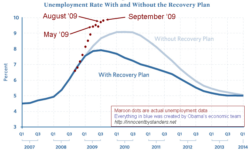
Also this scary, scary picture. Here I’d prefer to go back a few years on the x-axis. The graph with the forecast pretty much had to start near 2009–that’s when the with/without-recovery-plan lines come from. But the historical jobs graph would be much better going back ten years or longer. Sure, you want enough resolution so you can see the trend in the past year, but you also want enough context to have a sense of the fluctuations, so you can see how often it is that 5 million jobs disappear like this.
[Quote] Your model's wrong, you know, and it can be a good idea ot explore the ways it doesn't match the data used to fit it..[EndQuote]
Interesting piece of writeup. I never thought this way!
In re the scary picture, here are the same data plotted over 20 years: here
The chart I find more instructive is the employment-to-population ratio: here
My bonus last year was keeping my job.
Enayet: Thanks.
Wcw: Yes, the longer series tells a much better story!
Ross's comment reminds me of my 1999 Slate debate with Steven Levitt over his theory that legalizing abortion cut the crime rate. I pointed out that the national juvenile homicide rate among those born soon after Roe v. Wade was the highest in recorded history. Levitt's response, in effect, was: Trust me, I've looked at the state by state data.
Six years later Foote & Goetz tried to reproduce Levitt's state by state analysis and discovered he had a bug in his code that caused him to get a false positive result.
General rule: if you can't make real world sense of the model, don't believe the model.