Here are some graphs Yu-Chieh made from data from the National Election Studies, extending Manza and Brooks’s analysis of voting by occupation up to 2004.
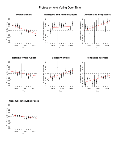
Within each occupation class, we’re plotting Republican presidential vote (relative to the national mean each year); you can see some striking trends, with professionals (doctors, lawyers, teachers, etc) going to the Democrats and business owners going to the Republicans, among other patterns.
Our next step is to throw income into the analysis and see income tracks with Republican vote more in some occupation categories than others. (A quick analysis found the difference in voting patterns of rich and poor to be similar in the different occupation categories.)
P.S. There was some problem with the coding for 1972. We’ll have to go back and see what we did wrong for that year. (I’m hoping the other years are ok. They’re roughly consistent with what Manza and Brooks found, so I expect they’re fine.)
"See how income tracks. . . ." I wonder if it will turn out that those who did very well thank you in the Clinton years trended towards the Republicans. If only you also had data for years 2000 to the present to show which groups fell away from the Republicans soonest and farthest.
The 1972 excursion to the Democrats of the "Managers and Administrators" and the "Owners and Proprietors" occupations is very curious, especially in view of the Nixon landslide that year. Would this have been a reaction to the apostasy of his imposition of price controls in 1971?
1972 does look very odd – unusual estimates and standard errors. Any explanations? Did anything show up in your initial exploratory data analysis?
Do you have a link to the paper this is from, or is this a work-in-progress that you are coauthoring?
Jay:
I don't know about that, but you can see our recent blog entry for income inequality by state. Different things were happening to rich and poor in different states.
Minnesota, Hadley:
I think 1972 had a smaller sample size, but I'm not sure. I agree that it looks funny that the standard errors are so large for all groups that year except professionals and non-full-time-labor-force. Maybe some error???
Anon,
The graphs are basically extensions to 2004 of a set of graphs in a book by Manza and Brooks. We're planning to include them in our forthcoming book on Red and Blue America.
Looking at those trend lines, it's amazing that a Democrat would ever win and election, let alone two of them.
What's the distinction being made between "Professionals" and "Routine White-Collar"?
This may make cell sizes too small, but have you considered a cross of profession by geography (or at least profession by some measure of urbanicity) as well? That would essentially give you a "profession type" by "culture" breakout.