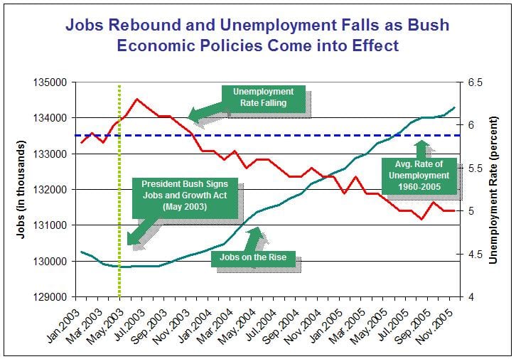
Eric Tassone sent me the this graph from a U.S. Treasury Department press release. The graph is so ugly I put it below the fold.
Anyway, it got me to thinking about a famous point that Orwell made, that one reason that propaganda is often poorly written is that the propagandist wants to give a particular impression while being vague on the details. But we should all be aware of how we write:
[The English language] becomes ugly and inaccurate because our thoughts are foolish, but the slovenliness of our language makes it easier for us to have foolish thoughts.
Tufte made a similar point about graphs for learning vs. graphs for propaganda.
Here are (some) of the errors in the Treasury Department graph:
1. Displaying only 3 years gives minimal historical perspective. This is particularly clear, given that the avg rate of unemployment displayed is from 1960 to 2005.
2. Jobs are not normalized to population. Actually, since unemployment rate is being displayed, it’s not clear that anything is gained by showing jobs also.
3. Double-y-axis graph is very hard to read and emphasizes a meaningless point on the graph where the lines cross. Use 2 separate graphs (or, probably better, just get rid of the “jobs” line entirely).
4. Axes are crowded. x-axis should be labeled every year, not every 2 months. y-axis could just have labels at 4%, 5%, 6%. And if you want to display jobs, display them in millions, not thousands! I mean, what were they thinking??
5. Horizontal lines at 129, 130, etc., add nothing but clutter.
To return to the Orwell article, I think there are two things going on. First, there’s an obvious political motivation for starting the graph in 2003. And also for not dividing jobs by population. But the other errors are just generic poor practice. And, as Junk Charts has illustrated many times, it happens all the time that people use too short a time scale for their graphs, even when they get no benefit from doing so. So, my take on it: there are a lot of people out there who make basic graphical mistakes because they don’t know better. But when you’re trying to make a questionable political point, there’s an extra motivation for being sloppy. This sort of graph is comparable to the paragraphs that Orwell quoted in “Politics and the English Language”: the general message is clear, but when you try to pin down the exact meanings of the words, the logic becomes less convincing.
OK, here’s the graph:
P.S. Following Orwell, I’m happy to criticize left or center as well as the right, so feel free to nominate other examples of propaganda graphs. (As I recall, “How to Lie with Statistics” has a nice example from some old Soviet propaganda.)
P.P.S. I’m not trying to say that the people who made this graph are “bad guys” who are “lying with statistics.” Rather, I’m making the Tufte-esque point that standard practice in statistical graphics is so bad that cluttery, low-information graphs are the norm, thus making it easy for people to mislead themselves (and others).
P.P.P.S. Brendan Nyhan made some nice plots in Stata of the employment and unemployment series. I still think it’s weird that employment is not adjusted for population (or for population aged 18-65, or whatever) but maybe that’s just the way people do it. As Bill James said of batting averages: for the purpose they were designed, other formulas (e.g., on-base average) are better, but people are so used to batting average, that these numbers have the power of words. Maybe that’s true (among economists) for absolute non-farm employment, I dunno.
Great graph! I love the drop-shadowed "jobs on the rise" label, and how the green and red lines fail to jag in the same ways.
Actually, I like the implied causality, which has nothing to do with the graphics. Instead of labeling the May 2003 vertical line with "President Bush signs Jobs and Growth Act" why not "Boise State Puts in Wi-Fi Network" (http://news.boisestate.edu/newsrelease/archive/2003/052003/0520network.html) or "Transportation System Receives funding boost" (http://www.engr.wisc.edu/news/headlines/2003/May19.html)
Propaganda or not, that's one DUMB and UGLY graph! The Bush administration needs a good design consultant to keep stuff like this from escaping into the wild; to my eyes this is like the President showing up for a press conference unwashed, in old bib overalls. I'm saving it for my Rogue's Gallery of How Not to Do Statistical Graphics.
While one may argue over the quality of the graph, I find it hard to see how one jumps to the term "propaganda". I have not seen you so quickly and decively pass judgment on others as in this case. Do you have an agenda?
Mike,
This graph is ugly but not much worse than many others (as can be seen at the Junk Charts website). But yes, somehow one might hope for better from the U.S. Treasury Dept.
Martha,
I was using the word "propaganda" in reference to the distinction, made by Tukey or Tufte I think, between "exploratory data analysis" and "propaganda data analyses." EDA is intended to reveal unexpected patterns in data, whereas PDA is intended to use the data to support a pre-existing argument. Thus, for example, if x and y are highly correlated, a plot of y vs x is PDA–showing a big obvious correlation–and a plot of residuals vs x is EDA–highlighting departures from the obvious pattern. Tufte pointed out that EDA graphs tend to have lots of information (lots of data-ink, in his term), whereas PDA graphs, by their very nature, tend to have very little information (lots of non-data-ink).
I characterize the Treasury plot as PDA, partly because of its title, partly because it has lots of lines but not so much info, and partly because it starts in 2003, thus removing the ability to show the bigger picture. I don't know that the makers of the graph did this on purpose (as "propaganda"); they very well might have been trying to make the best possible graph they could, using poor graphical practices because that is what is standard. (See the P.P.S. of my entry above.)
Finally, my agenda here is statistical, not political. As noted in my entry above, I'd be happy to display bad graphs made by other political parties. This was just a graph someone sent me in the email, and I thought it was a good illustration of the connections between graphical practices and political motivations. I'd be happy to have examples representing other political perspectives; in fact, that would make my argument clearer, I think.